
The Growth Vault
Each week we spend hours researching the best startup growth tactics.
We share the insights in our newsletter with 91,704 founders and marketers. Here's all of them.
Why you buy sh*t you don't need
Insight from Neal's Newsletter.
We’ve all bought something we shouldn’t have.
Especially during Black Friday & Cyber Monday 👀
Whether it was from an Instagram ad, a late-night infomercial, a BFCM promo email, a knee-jerk purchase at a store (possibly due to some sales pressure), or a major purchase we’ve spent weeks thinking about.
We’ve all dropped our hard-earned cash on dumb sh*t.
Here I analyze 6 ways that companies get you to buy sh*t you don't need.
(Or... 6 ways you can get people to buy legitimately good products.)
Painkillers and Vitamins
First, let's go over the two fundamental types of products:
- Painkillers
- Vitamins
If you have a splitting headache, and you're in the desert, and someone has a painkiller—you'd be willing to pay an irrational amount for it.
And you won't need convincing. You'll understand the benefits immediately. Because you’re actively feeling the pain it relieves.
“Get rid of my f*cking headache!”
You'll buy a painkiller when the time comes.
And you’ll curse the fact that you didn’t have any on hand for this moment.
The important thing for Advil and Tylenol is making sure they're the brand you reach for at the drug store. They do that through branding and lots of ads.
And through clever positioning.
"Back painkillers” have the same ingredients as "headache painkillers," but if your back hurts, guess which one you’re reaching for.
I wrote about this phenomenon back in Newsletter #133.
On the other hand, you don't NEED a vitamin.
You also can't feel the benefits (if there are any).
Instead, people have been convinced of a narrative that taking a vitamin will make them live a longer and healthier life. It may be true, but it’s still a narrative that needed to be sold to them—and needs to keep being sold to them.
Most products are vitamins.
You don’t NEED them to solve a horrible and debilitating pain right this second.
These 6 tactics apply mostly to vitamins.
Read my breakdown of the clever ways AG1 has convinced people to spend ungodly amounts on their vitamin.
1. Time pressure
This is one of the most effective and easiest to use.
It’s simple. If someone feels rushed, they'll more easily part with their money.
Hence the effectiveness of Black Friday and Cyber Monday deals.
There are plenty of products that people might need, but just not right now. Or they don’t need them, but they think they might.
Time pressure helps push them over the hump to buy.
This is why sales are for a "limited time only." This is why Ticketmaster adds a countdown clock and says how many other people are looking at the event.

You feel pressured into making the decision faster.
And generally, a fast decision is in their favor, not yours.
2. FOMO or "Fear Of Missing Out"
Here they convince you to take action because doing so will cause you to miss something exciting or important.
Or at least they make it seem exciting or important.
"Be at the event, or you'll miss Bill Gates leaping over a chair. We won't be recording."
Who would want to miss that?
And yes, Bill Gates was knowing for jumping over desk chairs:
3. Social proof
If you love and respect someone, and you found out they use a product you're considering, you're a lot more likely to buy it.
Especially if you see them say how much they love it.
This works whether they
- Actually love the product.
- Are friends of the owners.
- Were paid for the endorsement.

Note: The risk for brands like Tim Horton’s is that when you do celebrity deals, you better make sure that celebrity is a saint. Otherwise, it may come out that they loved frequently P Diddy’s parties.
4. It’s been engineered to be a habit
In Nir Eyal's Hooked, he talks about how companies turn vitamins into painkillers by making their product a habit.
For example, nobody NEEDS to check TikTok or Instagram. But try taking a teenager's phone away for a weekend and see how they handle it.
Or remove a crypto trader’s ability to check the price of Bitcoin for a few hours (especially as it skirts with $100k).
They'll likely have a mental breakdown.

The companies have engineered their product to be the solution to a need. Often the need to relieve negative feelings of boredom or anxiety.
That’s how they turn a vitamin (entertainment) into a painkiller (make the anxiety go away).
5. Fear
If you don't take your daily vitamin, you will die earlier.
Or at least that's what the vitamin industry is getting at.
Another example:
Diamonds are not as rare as the price indicates. De Beers controlled the supply and pulled off the best marketing campaign in history.
"Diamonds are forever." Just like your marriage should be.
And the larger the diamond, the more you love them.
If the size and purity of your diamond are a reflection of the size and purity of your love, you better pay up, or you'll lose them forever.
This is how they created the convention of spending 2 months’ salary on a diamond ring that cost them a fraction to produce.
6. You’ve been sold a dream
A Rolex isn't 1,000x better at telling time than a Casio. But it costs that much more.
Rolex has positioned itself as the watch people wear when they've "made it." So when people earn a lot of money and want to signal it, they drop 5 figures on a Rolex.
Google "rolex famous people" and you'll see some of the top male celebrities.

Rolex has worked for decades to make sure the biggest (male) names are wearing Rolex to make people dream of one day owning one.
They want to make you feel like you can join an exclusive club with members like Tom Hanks, Brad Pitt, James Bond, and Jay-Z.
It’s not just manipulations
Yes, these tactics are used every day to get people like you to buy sh*t they do not need at either inflated or deflated prices (depending if it’s BFCM sale or not).
But they also work to convince people to buy or use legitimately useful products at fair prices.
Products that are good for humanity also need marketing.
In fact, they generally need better marketing, because good is hard, and bad is easy.
So use these tactics for good.
And try to resist when someone is using them on you.
Note: I originally wrote this piece on my personal Substack.
Become a better marketer, in minutes.
Join 90,000 founders and marketers getting actionable, no-BS startup growth marketing advice each week.
Use Tipping Points to convert more
Insight derived from Bangaly Kaba's article.
Last week, we discussed Adjacent User Theory—a powerful growth framework for identifying opportunities to expand into tangential markets.
As a quick recap:
- Core Users: People your product was built for and who “get it.”
- Adjacent Users: People who could use it, but it needs to be modified or communicated differently to them. The goal of Adjacent User Theory is to identify the right adjacent users to expand into.
One of the powerful parts of this theory (that I didn’t cover last week because I think it muddied the conversation) is what I like to call “tipping points.”
Think of them as moments or conditions when a user is on the cusp of becoming more engaged or converting into a paid customer.
Products (ecomm and software) have tipping points at various stages.
Let’s dive into some examples.
Slack example of tipping points
The primary thresholds that a Slack user has to cross through are:
- Not Signed Up → Signed Up
- Ex: A friend invites them to Slack
- Signed Up → Casual (occasional free user)
- Ex: They open Slack whenever they’re pinged
- Casual Free → Core Free (active free user)
- Ex: They open Slack to speak regularly
- Ex: Maybe they even start their own Slack channel
- Core Free → Monetized (active paid user)
- Ex: They upgrade to a paid user on someone else’s or their own Slack.
A tipping point is when they’re on the line between one stage and the next.
For example, Slack determined that the tipping point between a “Casual Free” and a “Core Free” was their weekly active use. If they used Slack 3 out of the last 7 days, there was a 50/50 shot they’d either churn entirely or become an active user.

Armed with this information, they knew they had to do everything they could to push people to be active more than 3 days per week. Things like:
- Encouraging them to download the mobile app
- Encourage them to enable notifications (of any kind)
- If they don’t enable push notifications, send them emails
- Seamless onboarding that lets them discover the value of Slack quickly
They knew where to focus their efforts.
Instagram example of tipping points
Here are the thresholds for Instagram:
- Not Signed Up → Signed Up
- Signed Up → Activated
- Casual → Core Usage
They discovered that if a “Signed Up” user had more than 10 followers in the first 7 days, there was a >65% chance they became “Activated.”

This is the counterpoint to the famous Twitter example where if someone followed a certain number of people, they’d be more likely to stick. Here, Instagram users were more likely to be engaged the more followers they had.
If you’re an Instagram user, you’ve definitely received these notifications before:

These trigger in various scenarios, but a common one is when someone creates an account on Instagram. It can fire them out to:
- Facebook friends
- Contacts in your phone (or if you’re a contact on their phone)
- Mutual friends
- Shared educational background on Facebook
These were created so that new users would quickly gather followers so that people became activated users.
How to find and act upon tipping points
I’ll leave you with some tactical tips on how to take action here:
#1. Make sure you’re tracking everything.
You can’t make decisions if you don’t know what users/customers are doing. Every click should be recorded and associated with the user. Do that in GA4 and/or Mixpanel/Amplitude and/or your ESP.
#2. Identify the various stages that a user goes through from discovery to full converted.
A stage can be defined by either them taking action (signing up, subscribing, purchasing) or by a more complicated set of variables (daily active, does X things per month).
See the next step for examples of different variables.
#3. Analyze the behavior of people who blew through thresholds and those who did not.
Try to identify the variables of “things they did/didn’t do” that lead to someone significantly more likely progressing through the threshold.
For example, this could be things like:
- Purchased the consumable product X times
- Have used the product on X of the last days
- Have used X and Y features (either at all or a threshold amount)
- Have opened (or clicked) X of the last Y newsletters/product emails
- Have at least X team members
- Follow your account on social media
- Have downloaded the mobile/desktop app
There are a lot of variables to consider!
Since this comes from Adjacent User Theory, you’ll also want to try to learn who these people are. Are specific personas getting stuck while others are not? If so, that could be an opportunity to change the flow/messaging to convert them better.
#4. List strategies for how to get people to reach and exceed the tipping points.
For example, if you identify that customers who buy at least 6 of your consumable DTC products are X% more likely to become paid subscribers (or loyal repeat purchasers), then list strategies to increase the likelihood they order at least 6 of the product (either all at once or in separate orders):
- Bulk discounts (shipping or discount)
- Sell a starter bundle
- Send reminder emails or texts to stock up
- Inserts into product deliveries that encourage repeat purchases
- Surprise gift (like a sample of a new flavor)
Now, go put this into action!
There are infinite ways to adjust your marketing or product to increase conversions.
Identifying tipping points helps you learn exactly where to apply force to get the maximum leverage. They provide clarity and significantly increase the odds of success for a test.
Become a better marketer, in minutes.
Join 90,000 founders and marketers getting actionable, no-BS startup growth marketing advice each week.
Opinionated defaults loosely held
Insight from Adam Fishman.
The Airbnb host onboarding experience is a bit magical.
You click the CTA in the top navbar that says “Airbnb your home,” and instantly, you see this:

Whoa, I could make an extra $2k per month?
To give me this estimate, they had to make a lot of assumptions:
- That my home is where I’m accessing their site from (safe assumption)
- That I can charge $289/night for my place (average based on their data)
- That is has two bedrooms (median number of bedrooms)
- That I’d get 7 booked nights per month (average based on their data?)
- That my home is somewhat “average” and not crazy good or crazy bad (little do they know!)
- That I wanted to rent out my entire place and not just a private room
- That I’m even eligible to Airbnb my home
Some of those things could be horribly horribly wrong.
But they committed to reasonable assumptions that allowed me to immediately experience the “magic moment” of seeing how much money I could make.
A bad experience would be making me do a long onboarding form, selecting all of these before seeing my estimate. It would be terrible if I had to enter my email to see my results or, worse yet, book a call with someone to discuss them.
This is the power of opinionated defaults.
Opinionated defaults loosely held
Opinionated defaults are pre-selected choices within your product that nudge users toward desired actions—or that simply make the experience that much easier or more delightful. For example, Airbnb made several opionated defaults to show me my estimated monthly income.
Defaults are powerful for two reason:
- They anchor you. If $20 is the default on a donation field, that will be the most common donation.
- They make it smoother for the most common use cases. If chosen properly it can make the experience more seamless for the average user.
“Loosely held” meaning the user can easily change them. For example, I could easily change my location, number of bedrooms, stay type, and number of booked nights to get a more accurate estimate.
You can assume a bunch of different variables:
- Location
- Pricing
- of users
- Preferred login method
- Preffered payment method
- Template
- Pricing/tier
- More nuanced, product specific things (ex: # of bedrooms)
Let’s dive into some more real-world examples:
Uber/Lyft example
Both Uber, Lyft, and Google assume that you’re booking a ride or getting directions from your current location:

You can, of course, change this, but it defaults to your current location because 99%+ of rides/navigating likely start there. They’ve made it more annoying to use 1% of the time to make it easier to use 99% of the time—great trade off.
Patreon example
According to Adam Fishman, Patreon had the problem of all their creators choosing $1 as their support membership price—it just became culturally normal to do it after the default was set to $1—which shows the impact a default can have.
To combat this, they changed the default text to say $1 to $5, which they eventually changed to:
This change significantly increased the average monthly price of tiers—increasing revenue for both them and their users.
Figma example
One thing we’ve covered previously is Figma’s invite and billing mechanism.
Most SaaS tools work like this:
- A team member wants to invite someone to the tool so they can collaborate on a project
- But they can’t, they need an admin to approve it
- They get delayed waiting for the admin to approve it
- The admin responds 2 days later, saying, “No, we don’t want to pay for them!"
- The team member gets annoyed waiting and needs to find a workaround
Here’s what Figma does:
- Anyone can invite someone to a Figma file
- New people get added to the team but get the first month for free
- The admin gets an email reminding them of next monthly payment and tells them to check the users
- They go in (maybe) and see their team has added various people
- They either leave them or remove them
Figma made inviting someone to the paid membership the opinionated default.
And I imagine that change alone has contributed a lot to their MRR over the years because it’s significantly harder for the admin to revoke someone’s existing access than denying it in the first place.
Canva example

Templates are a common thing these days.
Pushing templates onto people is Canva saying, “Hey, you’re probably trying to do something that most other users have already done before; why not use this thing and save hours of work?”
In many cases, it works wonderfully—assuming you make templates for the most common use cases and legitimately solve the problem for most people.
Framework for Opinionated Defaults
Adam Fishman made an actionable framework for you. I could reword it for you but this image has all the necessary info.

Just remember, by thoughtfully choosing opinionated defaults, you can guide user behavior to benefit both your customers and your startup, leading to sustainable growth and a more intuitive product.
But always, ALWAYS, make sure to let people adapt things how they actually want it in case the default is wrong.
Get going, folks!
Become a better marketer, in minutes.
Join 90,000 founders and marketers getting actionable, no-BS startup growth marketing advice each week.
The perfect landing page checklist
Insight from Tuff Growth and Demand Curve.
Your marketing efforts are wasted if the landing page sucks.
Luckily, it's a good idea to use a proven template rather than get too creative.
Wait, don’t I constantly tell you to be creative?
Yes, 100%, your marketing needs to be creative to stand out.
But creative layouts confuse people.
So, be creative with marketing (ads/content/email) and practical with conversion.
Here's a checklist for nailing the perfect landing page (high-res version):

Thanks to our friends at Tuff Growth for creating this A+ infographic—particularly Sean Tremaine, the genius writer and designer behind it.Let’s dive into each of these sections some more.
✔️ Hero Section:
The hook is everything:
- Header: Clearly state what you do and why it matters.
- Subheader: Expand your headline. How do you do it?
- Image/Video: Visually communicate your product.
- Call-to-Action (CTA): Place an OBVIOUS button that guides the user to the next step.
- Navbar: Key conversion pages/sections only (Pricing, FAQ, Features)—and make it sticky.
✔️ Social Proof #1
Social proof is one of the biggest motivators:
- Display usage numbers or logos of well-known customers to build credibility and trust.
✔️ Benefits/Features Sections:
Features = talking about yourself.Benefits = talking about them.
- Benefit Headers: Clearly state your product or service's main benefits.
- Feature Subheaders: Explain how they get that benefit with your product’s features.
- Image: Use visuals to reinforce the benefits and show your product in action.
- Use bullet points & icons for easy reading.
- Repeat your CTA button for each section.
✔️ Social Proof #2
There’s no such thing as too much social proof.
Go deeper with testimonials/case studies/reviews.
- Testimonials: Include quotes from satisfied customers, ideally with names and photos, to add authenticity.
- Case Studies: Highlight the results your customers have had.
I dove deep into the science of using reviews here.
✔️ FAQ Section:
- Don’t assume they read the page. Repeat key details.
- Handle the most common objection.
- Don't lay on the marketing speak, just give the facts.
Tip: Ask support and sales for common customer questions and objections.
✔️ Final CTA Section:
Make it glaringly obvious how you can help and how they can take action:
- Hammer in the top value prop.
- Make the CTA clear and persuasive.
- If a form, use as few form fields as possible.
✔️ Footer Section:
- Only link to key conversion pages.
- Make it painfully obvious how to contact you.
- Privacy and Cookies Policies and Terms are mandatory.
Note: Of course, you can layer additional sections as appropriate for your startup. You can add pricing sections. Problem agitation. How it works. Product gallery. Your mission. And so on.This is a purely skeleton to build on top of.
Quick Tips
- 90% of the work is done by the hero. Make it hooky.
- Your CTA Button should be the most glaringly obvious thing on the page.
- Be short and clear. Optimize for scannability.
- Mobile friendly is mandatory.
- If you have the traffic volume, A/B test regularly to find the copy and images that convert best. If not, get a lot of feedback from people.
Check this off next time you build an LP, and you'll be ahead of 90+% of folks.
Want to get ahead of the rest?
Get our extremely detailed guide walking you through how to perfect each section.
Become a better marketer, in minutes.
Join 90,000 founders and marketers getting actionable, no-BS startup growth marketing advice each week.
Remind customers that the product is helping them
Even if someone uses your product a lot, they'll start to take it for granted. They'll forget what life was like without it.
Reminding them of that value helps make them value you.
Instacart, the grocery delivery app, does this for time and money.
They continuously remind you of the amount you’re saving due to being a premium user (free delivery and reduction in fees), as well as the time you’ve saved so far.

And to celebrate submitting an order, they show you how many hours you’ve saved and how many orders you’ve completed since you’ve started using Instacart:

This is clever because it makes me:
- Feel like my $100 per year Premium subscription is justified
- Appreciate how useful Instacart has been
- Realize just how many times I’ve used it. They use your past behavior as proof.
A few more rapid-fire examples
Opal tells you how much you’ve reduced screen time
.jpeg)
Imperfect Foods tells you the impact you’re making
“Groceries that help you fight food waste.”
So it makes sense to highlight the impact:

Toothpaste and mouthwash famously does this
Does mint make your mouth cleaner? No.
Does mint make your mouth feel cleaner? It sure does.
Just like manufacturers add palm oil to shampoo to make it foamier. Because foam is a cue that shampoo and soap is working, even if it doesn’t do anything.
Lastly, Wealthsimple reminds you how much interest you’re earning on your money:

Some quick tips
- Remind people of your value as they use it and asynchronously with emails, push notifications, and texts. Keep doing it for as long as they're a customer.
- Only focus on what they likely care about most:
- Time
- Money
- Impact
- Efficacy
- Remind people of the:
- Immediate value: what you’re getting now
- Historical value: what you’ve gotten so far
- Future value: what you’ll get if you keep doing it for life
- Make the impact seem larger by increasing the time scale.
- You’ve saved 300 hours since downloading the app.
- You’ll look at your phone 11 years less in your lifetime.
- If your product does things in the background (like Wealthfront’s tax loss harvesting), send push notifications indicating it’s working hard for them.
- Look for ways to make your product feel like it’s working. That could be both from clever psychological tricks (mint in toothpaste) or by leveraging the labor illusion (showing the effort you’re putting in).
Remind them how you’re helping them, and your customers will value you more and for longer.
Become a better marketer, in minutes.
Join 90,000 founders and marketers getting actionable, no-BS startup growth marketing advice each week.
Remind customers that the product is helping them
Convert more with your homepage
Insight from Demand Curve.
Buyer journeys aren’t nearly as clean as we like to imagine. Most people won’t see your ad → visit your landing page → buy immediately.
It’s more likely to go like this:
- They see your ad while doom-scrolling Instagram. They click.
- Something distracts them away from their phone.
- They remember later in the evening (or 3 weeks later) thanks to a Trigger Event.
- They google your company name.
- They visit your homepage—not the conversion-focused landing page you intended them to hit.
(At least, that’s how I tend to buy things online.)
Is your homepage optimized for conversion? If not, you may be leaving growth on the table.
Yes, your homepage has many jobs (too many). One is to orient people to your brand and everything you do. But don’t forget that high-intent visitors often visit your homepage late in the funnel.
Design it with conversion in mind.
Here are some quick ways to make sure your homepage converts:
1. Start by nailing the above-the-fold
Your above-the-fold (ATF) is the portion of your website that’s immediately visible to visitors—your hero header, subheaders, imagery, and calls to action.
Header and subheaders: Keep your copy short. Concisely convey what your product is and why they should care. Visitors shouldn’t have to scroll to understand what you offer and how they’ll get value from you.
Imagery: Static images, slides, video—whatever you choose, keep your products at the forefront. Photos with people are optional, but they have a proven track record of increasing conversion.
Call to action (CTA): Your ATF is the most important part of your most important page, and your CTA here might be the most important part of your entire site. This is what drives action. CTAs for ecommerce tend to be “shop now.” For services, “get started” and “try now” work well. Make sure your CTA is high-contrast and unignorable.
Here’s an example of an above-the-fold done well.

- Concise, punchy header and subheader explaining what Mosaic is and why you should care.
- Attractive visuals of the product
- Clear, high-contrast call to action (although they should depart from their monochrome design and make the CTA a contrasting color to make it pop).
We wrote an entire playbook on ATF alone. When you’re ready to create your ATF, you can follow our step-by-step process.
2. Handle objections in your below-the-fold.
Below the fold, you briefly address any objections visitors might have.
Some elements you might include here:
Social proof: Share reviews, press, user-generated content, testimonials, and endorsements, ratings, customer logos, and customer stats.
- Include social proof near your CTAs to handle their objections at the key moment where they’re deciding to click or not. Trust leads to action.
- There’s basically no such thing as too much social proof.
Product features: Highlight unique product features that address common concerns.
- Worried about quality? Here’s why we’re the best you can get.
- Worried it’ll take too long? We’ll have you onboarded in 5 minutes or less.
- Worried about not liking the product? If you don’t like it we’ll give you a full refund.
FAQ: Take it a step further and add an FAQ section.
- Start with the most common or highest-friction questions.
- Assume they didn’t read the whole page and repeat all the key points.
Bestsellers: If you have several products, highlight your flagship and most popular items. Or highlight a “starter pack” or samples.
Footer: Include pages in the footer that you want to give visitors access to but aren’t critical to the conversion journey, like your exchanges and returns policy.
I like how MUD\WTR uses their FAQ section to address common questions (objections):

Include CTAs throughout your homepage so visitors don’t have to scroll back to the ATF to take the next step in their buyer journey: the product, pricing, or sign-up pages. CTAs in a sticky nav work well, too.
3. Run an A/B test.
But wait, it’s easy to make changes and assume they’re better. Time to test that:
Filter for people who have already visited your ad landing pages—these are the warm visitors we’re experimenting with. Send half to your current homepage and the other half to your new, conversion-focused homepage. See which performs better.
Put a little love into your homepage, you might see a big bump in conversion.
Dive into our Above the Fold playbook and Landing Page guide.
Become a better marketer, in minutes.
Join 90,000 founders and marketers getting actionable, no-BS startup growth marketing advice each week.
The horrors of horizontal tabs
Insight from The Baymard Institute.
Here’s an example of my hatred:

As I said, it’s super common on ecommerce product pages, but I also see them on SaaS/service landing pages like this:

The thinking behind horizontal tabs is reasonable:
- We don’t want to overwhelm people.
- It’s vertically compact, so it doesn’t require loads of scrolling.
- For product pages, this allows all the info to be above the fold.
- Only people who care to see the info will click it.
But there are a few problems.
Let’s dive into each:
1. 1 in 4 users never find the info hidden in them
27% of users in a study of Sephora’s old product page never even discovered the content in the unopened horizontal tabs.
For REI’s old site, it was a staggering 43% never noticed the horizontal tabs:

Look at what’s contained in those tabs; Specs, Reviews, Shipping & Returns info, and Ingredients—all key pieces of info people use to make purchasing decisions.
18% of Sephora's users and 21% of Crutchfield's users never saw the tabs despite trying to find the information they contained.
That’s 1 in 5 users desperately trying to make an informed buying decision that will likely turn to a competitor.
2. They have an unclear ROI
When you see something listed in a horizontal tab, you don’t know what it contains or whether it’s worth it to click to see it.
Numerous users in the study were disappointed when they clicked the Reviews tab to find that it was completely empty. Or a Specs tab with three dinky bullet points.
Once they fail you once, you’re less likely to keep exploring.
3. They limit your ability to stumble upon info
As Baymard says it:
When content is hidden in “Horizontal Tabs” layouts it’s very difficult for users to “stumble” onto content that could end up being extremely valuable to their purchasing decision — for example, a fuller description of the materials used, or a discussion of production ethics (both of which were observed to be happy “accidental discoveries” some users had when exploring product pages).
Users have to actively choose to see the title of a tab and click it. So it better be clear and enticing
4. They can be confusing to navigate
Tabs like Reviews, Shipping, Specs, and Materials are really clear what they care.
Tabs like the ones below, however, are not immediately obvious what’s contained within them:

For example, where do you go if you want product dimensions? Maybe Details?
Well, they’re actually just in Overview.
5. The title is everything
As you can see, the title of the tab is really doing a ton of the work.
And due to design considerations, you often need to summarize it with a single word, which may not be enough to accurately convey what’s inside.
For example, “Details.” Details about what exactly?
6. It pigeon holes you to the horizontal tabs
Okay, you realize that maybe the horizontal tabs aren’t great for a lot of things.
So you decide to put some some info in the tabs, but other, more important information in separate sections below the fold.
Well this actually performs very poorly. This causes confusion because:
- Some people won’t find the horizontal tab info.
- Those that do might assume that all info is in there.
- Many will be confused due to the complexity of info being in different places.
These little confusions end up mattering a lot when you’re talking about thousands to millions of people navigating a page.
Alternate formats
There are two major formats to use instead:
#1. Vertically collapsed sections
This has become increasingly common on modern sites.
For example, this is what Sephora does today:

Here’s why it’s better:
- It’s far easier to find everything.
- They can auto-expand the critical sections and auto-collapse the rest.
- This decreases the importance of enticing titles.
- Each section can be designed to present the information best.
- There are no limitations on the number of words used in the titles.
#2. Long page, sticky TOC
Present all the info in separate vertical sections, with no collapsing.
Have a sticky nav that lets people bounce between them.
This has nearly the same benefits as above. The primary consideration is whether you want anything to be auto-collapsed or not.
Takeaway
Designers often create something because it:
- Looks good
- Feels efficient
In reality, it confuses and obfuscates essential information.
Confused people don’t convert.
So, the next time you design a page on your site or an app, prioritize usability and clarity above all else.
Become a better marketer, in minutes.
Join 90,000 founders and marketers getting actionable, no-BS startup growth marketing advice each week.
7 types of landing pages to test
Insight inspired by @oliviercroguy and adapted by us.
It's incredibly easy to waste money on ads (either by losing it or not getting the most out of it).
Sending your ads to a generic landing page is a surefire way to do just that.
The same concept applies to all marketing channels and campaigns, but it's particularly painful when you're paying for the clicks.
Top startups use custom funnels and landing pages for their ads to drive higher conversion rates.

This tactic is saying two things:
- Don’t reuse existing ads with new landing pages. Create custom ad creatives for each funnel type to match the user journey.
- Don't reuse the same landing page for all your ads. Match the landing page to the ad copy and creative.
Example: An ad creative comparing your product to a competitor should send them to a page that compares them to that competitor—not your homepage or a product page.
@oliviercroguy had a great thread about this a few years ago that shared 7 proven landing page types.
I've used it as inspiration and tweaked the list below.
Let's dive in.
#1. Interactive Calculators
Landing pages don't need to just do a hard sell. They can also be useful:

Offer a tool (e.g., ROI calculator, savings estimator) where users input data, see tailored outcomes, and are prompted to buy or sign up while using or after.
This is great for any company where the user has a complex question they're trying to answer that can be solved algorithmically. For example:
- Health/Fitness: Macros, BMI, protein needs, etc.
- Marketing: ad budget calculator, LTV calculator, growth calculator, etc.
- Finance: Rent or buy, mortgage, car loan, compound interest, etc
2. Competitor Comparison
If your ad directly calls out a competitor, send them to a page that directly compares and contrasts.
Webflow directly compares itself to Squarespace on a variety of metrics.
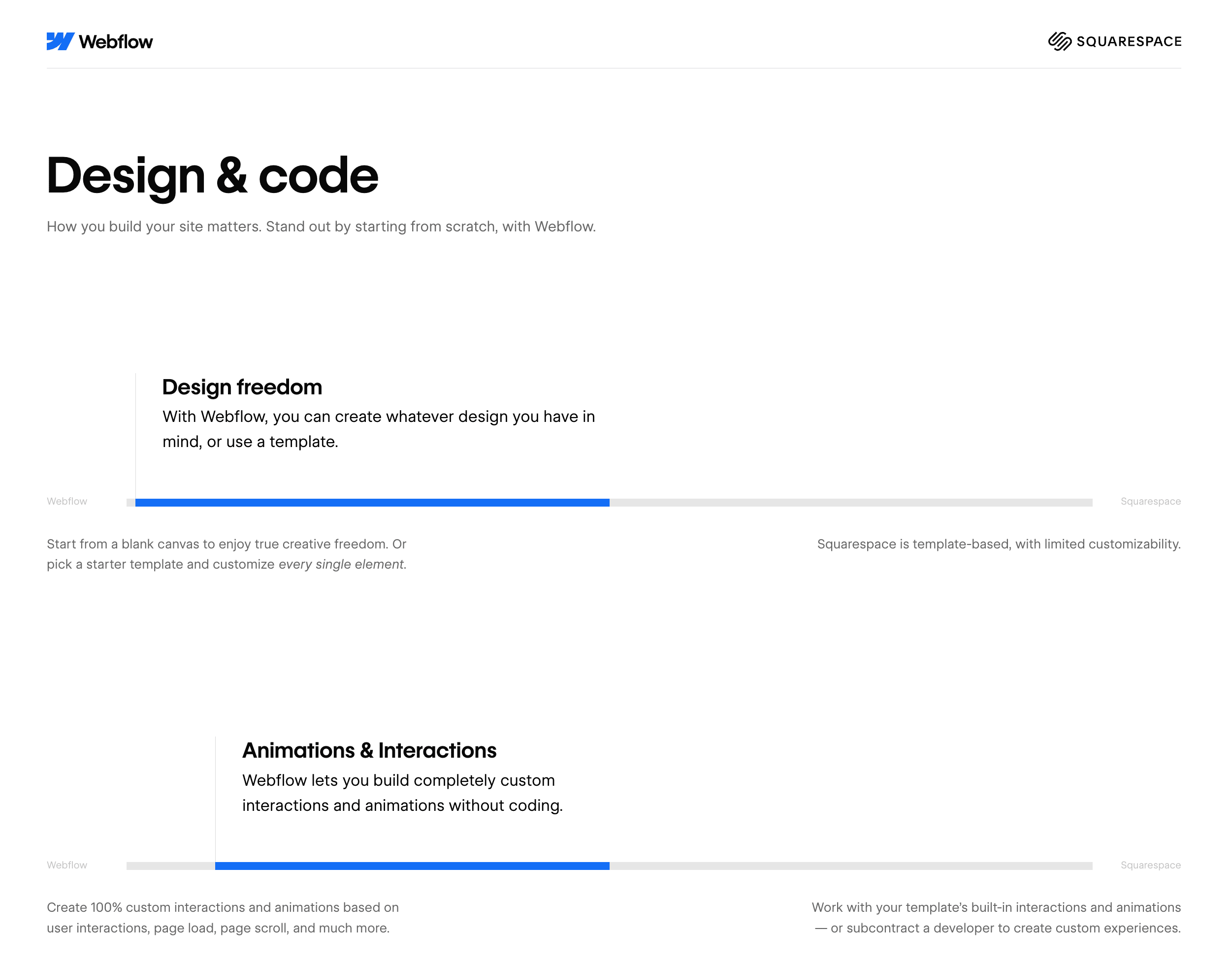
Note: If you're going to do that, make sure that you're honest and make your competitor win where it actually wins. If you win every single category, it becomes less believable.
Shopify does a great job showing all the reasons why people choose them over Woocommerce with this thorough landing page:

Takeaway: Don't just compare in the ad, go deep and compare yourself to your competitor side-by-side. Highlight your product’s superior features, pricing, or benefits, with a CTA to purchase or sign up.
#3. Pre-Sales Landing Page
Normally marketing advice is focused on reducing the number of steps. Here you're doing the opposite and purposefully putting a page in-between the ad and the product page (or the App/Play Store).
For example, Ritual had a page that tells a story about personalize nutrition, and then links to their product page for vitamins:

Takeaway: warm up cold traffic with storytelling and persuasive copy to build trust before redirecting to a product page (or App/Play Stores).
Use a narrative-driven approach (pains, product benefits, “why now”), visuals, and a clear CTA to transition to the product page.
#4. Free Trial/Welcome Offer
There's a reason why brands are constantly running promos—they work.
This landing page type's focus is getting them an exclusive welcome offer. For example, here's AG1:

And here an example of an ad they used to get there:

Takeaway: Test an exclusive welcome offer and make a landing page completely dedicated to it.
#5. Quiz Funnel
People hate risk.
A quiz is a great way to reduce the perceived risk in a purchase decision.
This is why bra brands like Third Love have quiz funnels to help you feel more comfortable committing to a purchase:

And here's an ad that links to this quiz.
Takeaway: A quiz funnel works best for products where personalization, education, or tailored recommendations increase conversions. Here's a comprehensive list of examples.
#6. Advertorial (a.k.a. Blog Post)
Another way to soft sell is to link to a piece of content that educates your audience and introduces your product naturally.
Here's an example from PetLabCo

We actually used to do this using my cofounder's old "Growth Guide" (which he's now turned into a Startup Guide on his site).
This guide was a primary driver of both agency leads and Growth Program students for 2+ years.
Because it had proven itself to generate leads, we sent both cold and retargeting traffic to it—which worked quite well.
Takeaway: Optimize the content for SEO and it can work both organically and for ads.
#7. Listicle
A listicle is one of the 10 primary types of content that is quite similar to an advertorial but it's more directly product focused.
Generally best used for retargeting since it is more of a hard sell.
A listicle, as the name implies, is a list of things (reasons, tools, ways).
Here's an example from baby food brand Yumi:

A classic listicle style is to compare the "best X tools" and then you include your own tool and present it as the best. Here the listicle that Kit/ConvertKit made about the 13 best newsletter tools that conveniently ranks Kit first.
A few other rapidfire ideas:
- Match the copy/imagery to the ad: A super simple hack is to simply tweak the copy and images on the landing page to match the ad copy and creative. Matching landing page copy to the keywords used on Google Ads is a classic tactic.
- Influencer: If you have a famous customer, affiliate, or super fan (and you have their permission), you can highlight them on the page.
- Demo video: Make the page's focus an in-depth demo of your product or service.
- Flash sale/limited promo pages: Make custom landing pages highlighting short-term promos.
- Super minimal: Try a hilariously short and to-the-point page.
- Super long: Try one of those insanely long ClickFunnels-esque landing pages that take 20 minutes to read.
- Social proof: A page where social proof is the star of the show with walls of testimonials, reviews, case studies, and stats.
- Case studies: An advertorial of sorts where it's entirely focused on the results your product/service has achieved for your customers
- No landing page: Lead-gen ads where you collect their contact info directly in the platform can also work wonders.
Start small, expand from there
Don't go out and create all of these right away. Here's how to start:
- Pick one funnel type and create custom ads and landing pages for it.
- Look at your existing top-performing ads and create ads that build off the copy and creative.
Once you see wins, iterate and expand to other funnel types.
Become a better marketer, in minutes.
Join 90,000 founders and marketers getting actionable, no-BS startup growth marketing advice each week.
10 science-backed tips for customer reviews
Insight from Ariyh (Academic Research in Your Hands).
Nothing sells better than a happy customer.
Here are 10 research-backed recommendations for getting and displaying reviews:
Encourage comparisons in reviews
A review that compares your product to another is far better than a regular review:
- Positive reviews that compare your product increase sales by up to 26%. They anchor your product as being better than competitors. For example, “The iPhone 15 has a better camera than my friend’s Google Pixel” is better than “The iPhone 15 camera is really good.”
- Negative reviews that compare are up to 47% less harmful. We attribute their dislike to their personal preferences. Example: “The iPhone’s battery life isn’t as good as the Pixel” is less harmful than “The iPhone battery life sucks.”

Encourage reviews to compare your product by asking: “How was it compared to a similar product you’ve tried?”
Expert recommendations vs customer reviews
Should you display simple customer reviews or expert recommendations?
It depends on how easy it is for people to judge the product's quality by using it:
- If it’s easy to judge the quality, then do customer reviews. Examples: T-shirts, food, hotels.
- If it’s hard to judge and requires expertise, do an expert recommendation. Examples: insurance, dentists, educational institutions, software, agencies.
- Would you trust “Bob Smith” to recommend a heart surgeon? Or would you trust your family doctor more?
How incentives boost reviews
Most happy customers will never bother to leave a review. Even if you ask them.
But incentivizing them with free products, cash, gift cards, or contest entries makes it much more likely that they will leave a review, and it’s more likely to be positive.
Here’s the data:
- Home improvement store product reviews were 83.4% more positive when incentivized via sweepstakes entries.
- Even a modest $0.25 incentive paid immediately for rating and reviewing a video proved effective, leading to a 20.6% increase in positivity
Do not ask for a positive review. That might backfire and is against Amazon TOS.
Don’t ask for reviews too soon

Getting asked to review a product you just got is like a popup modal asking you to subscribe before you even know what the website is.
Recommendation: Wait at least 10 days before asking for a review to increase the chance they review by 40-60%.
Additional recommendations for software reviews:
- Don’t do it based on time after signing up; do it based on milestones of usage (for example, they just hit their "aha" moment with your product.
- Don’t ask them when they’re clearly in the middle of something.
Some negative reviews are good for you
You see a 4.9-star-rated espresso machine and start reading the reviews. They’re all resoundingly positive…, but you start to get a little suspicious that they’re all fake.
You check the 1-star reviews and see: “There is a considerable difference in taste when mineral or filtered water is used rather than tap water”
You laugh and say, “That has nothing to do with the machine, you bozo!! Well, if that’s all people have to complain about, then it must be good.”
Oddly enough, a low, fairly irrelevant review will improve your perception of a highly-rated product by ~15%.
Takeaway: Don’t hide negative irrelevant reviews, or maybe even showcase them!
Show “likes” on the product page
Leverage the engagement your product has received on social media:

Oddly enough, this only increased sales during non-work hours. However, each additional like received increased sales by €0.26, about 0.14% of the product price.
Takeaway: Show a product’s likes and a few profile photos of people who liked it.
The first review sets the tone
We’re the pinnacle of herd animals.
If the first review is negative, you’ll get fewer sales, fewer reviews, and more negative reviews. This effect can last for 3 years or more.
And the opposite happens if the first review is positive.
Here are some recommendations:
- Launch products to a select group of customers mostly likely to rate it highly.
- Launch on new marketplaces (like Amazon or Walmart) the same way.
- Reach out to early customers that you think are happy and incentivize them to write a review about it.
- If you get a negative review early, do everything you can to correct it.
Order matters
Sales are up to 84% higher if the first review is 5-star versus 1-star, and we rarely read more than 10 reviews before deciding.
Takeaway: Display at least one positive review first before displaying others. Never display a negative review first.
4.3 is better than 4.9 (if it’s your own website)
Oddly, sales peak between 4.0 and 4.5 stars and dip down at 4.5 to 5.0. At really high ratings, we become skeptical and assume the results are manipulated (the study focused on specific retail websites and not a marketplace like Amazon).
Takeaway: Don’t delete or hide all reviews lower than 5.
Reply to all reviews
Replying to reviews has various benefits:
- It can make an upset customer change their mind and increase their rating (and maybe even stay a customer).
- It signals to people that you care about customers.
- And a study showed it increased the number of reviews by 12% and increased the average rating by 0.12 stars.
So make sure to reply to all of them!
–––
Use these 10 research-backed ways to get the most out of customer reviews.
Check our Growth Vault for 84 other CRO tactics (and 373 growth tactics).
Become a better marketer, in minutes.
Join 90,000 founders and marketers getting actionable, no-BS startup growth marketing advice each week.
Add friction to increase conversions
Insight from First 1000 by Ali Abouelatta.
Classic maxim: If you want to increase a behavior, make it easier and more fun.
But this tactic flies in the face of that. It’s about intentionally adding friction in the form of:
- Additional steps (more pages or more things to click or fill out)
- More information or reading (more text, less images)
- More decisions to be made (annual vs monthly, Pro vs Premium)
Here are examples curated by Ali Abouelatta of how adding friction increased conversions:
Additional steps + reading – Headspace
Headspace increased conversions by adding an intermediary page before the paywall to prime people with “why” they should subscribe.

Additional steps + decisions – Duolingo
Duolingo found that removing the 14-day pre-selected option increased retention. The pre-selected option is a quick “yeah, whatever, next!”
Having to stop and make a conscious decision causes you to take the goal seriously.

More reading + more decisions
Peloton used to have a super smooth one-click button to start their trial. Then they replaced it with a dense page with a lot to read. And you had to decide between two tiers. I suspect this did better because it highlights all the cool things you’re gonna to get, and you feel more in control.

People enjoy control.
So don’t just try to remove steps. Strategically make the process a little harder to get people to feel more in control and bought in.
The only way you find the best version is by experimenting.
Ali has a few more examples of Positive Friction here. I also recommend going through Growth.Design’s visual case studies.
Become a better marketer, in minutes.
Join 90,000 founders and marketers getting actionable, no-BS startup growth marketing advice each week.
How to run a promo people talk about
Insight from Contagious by Jonah Berger.
Promos work thanks to urgency and scarcity. You give people a reason to act now.
But most promos cause people to just quietly use them. Few cause people to talk about them.
Wharton professor, Jonah Berger's research tells us how to make a promo that people tell others about:
Make it big
5% off = meh
50% off = whoa
Big discounts are more share-worthy because:
- They’re more helpful than small ones. A 5% discount is barely helpful.
- They’re remarkable. They’re surprising, impressive, and exciting.
Note: People judge a deal based on the original price. Don't just say 50% off as that requires them to do math. Don't make them do math. Always show the original price.
Limit availability
Urgency causes action. Scarcity causes desire. Ideas:
- Limit time. Example: Deal last 37.5 hours.
- Specific, unrounded numbers are more believable and remarkable.
- Limit total quantity. Example: Limited to the first 420 copies sold.
- Limit quantity per customer. Grocery stores love this one. It makes it seem more valuable. And it’s a suggested quantity to buy, also know as “quantity anchoring.”
- Limit quantity at different discount tiers. Start at 50% for first 100. 40% for next 100. And so on. Creates urgency and shows social proof from past sales.
- Limit to "members only.” Example: Prime Days.
Note: If the promo isn't limited, it's interpreted as the regular price.
Apply the Rule of 100
$5 Product: $3 off seems like nothing. But 60% off seems like a lot.
$10,000 Product: 10% off seems minimal. But $1,000 off seems like a lot.
Rule of 100:
- Price < $100: use a % discount.
- Price > $100: use a $ discount.
Make it obvious and public
We mimic the behaviour of others. But most sellers don’t make the popularity of their promo obvious.
- Show a site notification every time someone purchases during the promo.
- Display how much people have already saved during the promo.
- Limit quantities and display how many are left.
- Automatically tweet for every sale.
- Encourage social sharing in exchange for a bonus gift after the purchase.
Become a better marketer, in minutes.
Join 90,000 founders and marketers getting actionable, no-BS startup growth marketing advice each week.
The upsell power of Remote OK
Insight derived from Remote OK.
Remote OK is a remote-only job board with ~3M page views and 1.1M unique visitors per month. (Note, I know this because their analytics are completely public, which is a genius idea for a job board.)
Their purchase page is an upsell and CRO gold mine. Let’s dive into it:

Some key things to pull from this:
- A ton of upsells. Massively increasing the LTV of each purchase. And they frame the upsells directly to the benefit you’ll get (and likely care about most). Bonus that a few of them are auto-applied so you have to click to remove them (and remove views), triggering loss aversion.
- A ton of social proof. Testimonials. Big name companies. Lots of positive reviews.
- A ton of objection handling. The number one concern job posters have is whether the job will get seen by a lot of people and get applicants.
Creating a job post requires quite a bit of work for the poster. Lots of form fields that will take quite a bit to fill out. All of the elements above help to encourage people to put in the effort by proving to them it’s worth the effort.
Use this page for inspiration for your own checkout page.
Become a better marketer, in minutes.
Join 90,000 founders and marketers getting actionable, no-BS startup growth marketing advice each week.
How to optimize your pricing page
Insight derived from Kyle Poyar and modified.
The Pricing page is arguably the most important page on a SaaS site.
Everyone wants to know:
- What this gonna cost me?
- How much am I gonna get?
- How do costs scale?
- Is this a good deal?
Here’s Kyle Poyar’s (and our) advice on how to optimize it:
#1. Benefits > features. Do not just copy-paste the pricing table you used internally. Instead of “ZOOM, Slack, and Google integration” do “Connect existing ways of working to Miro with 100+ apps and Integrations like ZOOM, Slack, and Google Drive.” Here’s how we did it for Un-ignorable:
#2. Reinforce the key value props over and over again. People visit your pricing page quickly and are often barely familiar with what you sell. Hammer in your value props over and over in the pricing table. Treat it like a marketing page.
#3. Handle objections. Add testimonials, reviews, FAQs, and social proof (logos, # of users, etc), and handle the biggest objections your salespeople hear on calls with leads.
#4. Don’t use jargon or acronyms. No one knows what an MTU is. Don’t use internal terms. Instead, use terms that are commonly used by your customers.
If you must have something potentially confusing, add a tooltip explanation.
#5. Leverage behavior psychology.
- Anchor: Offer a higher tier to get buyers to trade up, or to cause them to perceive lower tiers as a deal. Hence the VIP plan above.
- Guide: Highlight the most popular plan to visually guide buyers to select it. Ex: “Recommended” or “Most popular.” Above we used the blue bar on the Core tier.
- Deal effect: Make certain tiers look like a bargain by playing with price points and features across tiers. For example, 2x the price gets you 5x of the “core thing.”
#6. Don’t overwhelm. Don’t have 10 pricing options; do 2-4. Don’t list 100 different features; do 3-10 of the top ones and bold key details. You can list all the features in a big matrix below the main table.
#7. Price annual plans based on lifetime value. As mentioned in Newsletter #141, instead of doing the standard “2 months free,” base the annual price on the average retention of a monthly user. If retention is 5 months, price it at 6 or 7 months. If retention is 20 months, then don’t offer annual plans (like Netflix).
Treat your pricing page/table like royalty. It’s one of the most important conversion elements.
Become a better marketer, in minutes.
Join 90,000 founders and marketers getting actionable, no-BS startup growth marketing advice each week.
Personalize your emails, pitch, and content
Insight from DC.
Nothing turns people off more than pitching something completely irrelevant to them.
To avoid that, you must be selective about who, what, and when you pitch. Bad examples:
- The instant pop-up modal on all pages pushing them to book a demo.
- A 5 email sequence to everyone on your list promoting an expensive product.
Here's one way to do it better: Infer by past behavior. If they've:
- Visited relevant product pages.
- Clicked on relevant links in your emails.
- Read relevant content.
- Or came from a specific website.
You can infer things about them and what they might be interested in.
For example, when we promote new cohorts of Un-ignorable (next coming mid-April!) , we focus on people who have joined the waitlist, visited the landing page, clicked an email related to Un-ignorable, or read our LinkedIn Organic Playbook.
Not everyone wants to build a personal audience, and that's okay. We don’t need to keep bugging people who aren’t interested.
But here's a better way: Ask people directly.
A few weeks ago, I added a question before News & Links asking people whether they're a founder, freelancer, or have a full-time role. This then links to a survey page where we ask more questions. Their answers are automatically saved in our email tool.
(We hide the section if you've already answered the question.)
People are also given this survey right after subscribing, both on the thank you page and in the welcome email.
%2520(convert.io)_01HHG2XQYAMQMEQTTJQG6A9N98.avif)
Several thousand people have already filled it out. Now, we can customize our drip emails, promo emails, and page content to what they actually care about.
Takeaway: Gather data from users and personalize their experience. We use RightMessage.
Become a better marketer, in minutes.
Join 90,000 founders and marketers getting actionable, no-BS startup growth marketing advice each week.
Teardown of Amazon's mobile product page
Insight from us.
$1,400,000,000 is spent on Amazon every day.
They're one of the most heavily tested and optimized product page and checkout experiences.
First, let's analyze the smart stuff they do on a product page mobile view:

Quite a lot. And this doesn't even include one-tap checkout.
Here's an overview of the lesser-known things on there:
- Social proof: We value what others value. High, plentiful reviews. Amazon Choice. And 2k+ monthly purchases signal it's a desired, de-risked item.
- Small price in red: A price in a small font is interpreted as cheaper than a large font (the Numerical Stroop Effect). Red is also interpreted as cheaper, particularly by men.
- Requires effort: A small amount of effort towards something increases the likelihood of completion. Requiring a simple tap for the 20% off coupon likely increases conversion rates.
- Fitt's Law: In the image below, you'll see Amazon used to have the Sub/One-time toggle on the left-hand side. Fitt's Law dictates that large and close objects are interacted with more often. As most people are right-handed, putting important tappable elements on a mobile screen's right and bottom edges is key.
Note, for that reason, they may keep the Heart button on the left-hand side to discourage its use. They want people to buy now, not add it to their wishlist. But it's always nice to have the fallback action available.

Become a better marketer, in minutes.
Join 90,000 founders and marketers getting actionable, no-BS startup growth marketing advice each week.
Teardown of Amazon's mobile product page
Insight from us.
Provide a graceful Exit Point for your app
Insight from Growth.Design.
It's 12:35AM, you've swiped your 420th TikTok/reel, and you know you should go to bed, but you can't stop. Often, it takes some external jolt to get you to stop finally.
You then think, "Ugh, I need to delete it from my phone.”
If your app is never-ending and potentially addictive (Duolingo, Tinder, games, social media)
- First of all, congratulations, that's hard to achieve.
- Add in graceful exit points. This keeps users from getting so burnt out that they stop returning and increases overall satisfaction with your product.
Surprisingly, TikTok actually already does this.
If you watch too long, they have a video that tells you to take a break. But it misses the mark for a few reasons:
- It looks like all the other videos.
- It's too easy to skip.
- It doesn't use data against me.
Here's what Growth Design suggests instead:
%2520(convert.io)_01HMCQE7FX7P344TVB2GWSQGXA.avif)
Being told I've watched 293 videos would get me to put the phone down. And I'd be extremely appreciative that THEY took the initiative.
Duolingo could add one as well. After you hit your goal for the day, they currently dump you back into the lesson tree, where you see the weeks of effort ahead of you. You feel like you've barely progressed and are less satisfied with your efforts.
Instead, they should do this:
%2520(convert.io)_01HMCQE7XRQHF65B3K107V7344.avif)
Give your users a graceful exit. They'll appreciate you for it.
Check out Growth Design's case studies for both TikTok and Duolingo.
Become a better marketer, in minutes.
Join 90,000 founders and marketers getting actionable, no-BS startup growth marketing advice each week.
Measure your funnel's Psych Energy
Insight from Darius Contractor.
Psych Energy (coined by former Head of Growth at Airtable, Darius Contractor) is your visitor's emotional energy level as they go through your funnel.
- 0 Psych = "f*** this"
- 50 Psych = neutral/indifferent
- 100 Psych = "I'm in love"
Every positive interaction adds to their Psych. Every negative interaction subtracts from it.

The amount they have when they hit your site depends on HOW they get there. Branded search, assume > 50. Cold email link click, assume < 50.
It also depends on how they feel about your brand in general from previous interactions (directly or indirectly). A brand with a great reputation and positive word of mouth will lead to more people having > 50 Psych when they hit.
Things that add to their Psych (and increase conversions):
- Nice design.
- Positive reputation.
- Clear, concise copy.
- Fun, humour, and ease of use.
- Bonuses and surprises
Things that subtract from their Psych (and decrease conversions):
- Bad design or reputation
- Vague copy
- Confusing UI or UX
- Slow loading pages
- Form fields
In short: Build up their Psych high enough before you deplete it by asking them to do things like entering email, card info, address, add a profile image, etc.
Audit your funnel to maximize Psych before conversion steps.
Become a better marketer, in minutes.
Join 90,000 founders and marketers getting actionable, no-BS startup growth marketing advice each week.
Offer a "take-back program" and charge more
Insight from Ariyh and Journal of Marketing.
You've just moved, and you've decided to get rid of your old Poäng chair from IKEA (yes, I know you've had one at some point) and upgrade.
You could sell it on Marketplace, but... people are so flaky it'll take days/weeks. And you'd feel bad if you just threw it out.
Then you discover that IKEA has a sell-back program, letting you get rid of it when you're grabbing a new chair at IKEA anyway.
Score. And they'll fix it up and sell it again.
Not only does this increase the chance you get your new chair from IKEA, but it can actually increase the amount you're willing to spend on IKEA furniture by a whopping 12.2%.
(Note: Apple also does this with their Apple Trade-In and either re-sell the device or recycle the materials to use in new devices. And note, they charge a lot of money.)
This can also apply to a simple "take-back" program where they sustainably dispose of your old mattress or electronics instead of repurchasing from you (for example).
According to Ariyh, researchers found that:
- "People were willing to pay:
- 39.1% more for a pen with a take-back program (versus a regular pen)
- 12.2% more for an IKEA circular program armchair (versus a regular armchair)
- 9.2% more for a backpack, but only when buying it for themselves, not others
- 65.3% of people chose a more expensive shirt ($10.15 VS $11.90) with a take-back program, compared to a regular shirt.
- Return programs increased brand loyalty by 19.4% for a clothing brand and 13.3% for IKEA."
Takeaway: If you sell a physical product, consider offering a take-back or buy-back program. It can increase loyalty and the perceived value of your products.
Become a better marketer, in minutes.
Join 90,000 founders and marketers getting actionable, no-BS startup growth marketing advice each week.
Gamify daily usage to increase LTV and retention
Insight from Shakepay.
A Canadian mobile app called Shakepay has one of the best gamified incentives to get people to open the app every day and brag about it to their friends.
For context: they're a simple app to buy/sell/send/spend bitcoin (BTC) and ethereum.
How it works
Every day you open the app and shake your phone they give you a fraction of bitcoin (previously 0.00000001 BTC or 100 satoshi or sats).
Every day you keep the streak going, the amount goes up. Day 2 was 200. Day 3 was 300. As it goes up, it tapers the daily increase (ex: 50 per day). And as bitcoin has gotten more expensive, they've decreased the reward:

Note: They even gamify setting up direct deposit with your pay check (they have a debit card too) by offering a chance at a $1,000 bonus.
It starts off at a few cents (21 sats is literally $0.01), but if you kept it up you're basically getting $1-3 every day. And if you know anything about how bitcoiners think:
"$1 today is $1,000,000 in a few years. Guaranteed. Sell the house
An army was created
A horde of people religiously set reminders and calendar events to open the app and shake their phones every single day (great mental image).
When you open up an app every day you're likely use it for what it's intended, causing you to spend more and retain longer.
And you're gonna brag to your friends about getting "free money." So Shakepay incentivized that by also offering a $30 referral bonus (during the bull market—it's now $5 😅).
Takeaway: If you have an app that benefits from frequent usage, get creative:
- Get people to come back daily.
- Then incentivize them to talk about it.
Become a better marketer, in minutes.
Join 90,000 founders and marketers getting actionable, no-BS startup growth marketing advice each week.
Gamify daily usage to increase LTV and retention
Insight from Shakepay.
Stop sending too much product
Insight from Ben Fisher.
Imagine you're like nearly every tech person and you listen to Andrew Huberman.
Naturally, you become convinced to buy Athletic Greens. You sign up for their monthly subscription for 1 arm and 1 leg per month (plus tax and shipping).
But you're not as disciplined as Huberman and you end up forgetting to take it around 10 days per month.
After 3 months there's a whole unopened bag in your cupboard.
After a year you have 4 unopened bags of AG1 🤬.
Overwhelmed and running out of cupboard space you cancel your subscription.
There's a 99% chance you never subscribe again. Instead, you buy a different greens powder from Costco (after you it takes 6 months to get through your supply of AG1), or never buy it again.
The worst part is that subscribers for DTC products spend 3x more on average.
So, do whatever you can to keep them.
Do that by offering flexibility. Let subscribers:
- Pause at any time.
- Configure how often they get it. A 30 day supply may take them 45-60 days.
- Change the cadence after they subscribe.
You can use something like Rodeo to email/text to check on their supply before sending.
If you overwhelm someone you may lose them forever.
Become a better marketer, in minutes.
Join 90,000 founders and marketers getting actionable, no-BS startup growth marketing advice each week.
Use "Reverse Trials" to boost sales + engagement
Insight from Elena Verna.
The typical SaaS playbooks:
- Pay me or else. You can't use it without paying.
- Free trial. Sign up now and get X days for free, then switch to "pay me or else." 7-day free trial found to have the highest conversion.
- Freemium. The same as #1 or #2 with a free tier involved as the initial entry point. People need to upgrade to unlock more features or usage limits, and that upgraded plan is either fully gate-keeped or has a free trial.
And then there's the lesser known: Reverse Trial.
That's where your initial entry into the app is with a free trial of the premium tier. After it ends, you get downgraded to the free tier.
You start out with all the abilities of a premium user, but you have it taken away. You've tasted the good life. And thanks to Loss Aversion, you don't want to lose it.
Here's Elena illustration of these concepts:

According to Elena she's seen reverse trials lift freemium conversion rates by 10%~40%.
And lastly, she suggests offering free trial resets every so often (time based or engagement based). Just because it didn't work last time doesn't mean it won't work again after they've had more time on the freemium tier.
Become a better marketer, in minutes.
Join 90,000 founders and marketers getting actionable, no-BS startup growth marketing advice each week.
Increase conversions with good "processing fluency"
Insight from The Marketing Psychology Playbook.
Take a look at Apple’s site in 1997 compared to 2023:

They're not the only ones. Nearly every brand made this shift from busy to simple.
Simplicity beats complexity—that’s the idea behind processing fluency.
In short: we prefer things that are easy to read and understand (“fluent information”). Understanding something effortlessly helps us act quickly and confidently.
On the flip side, if you confuse, you lose.
If something is hard to understand, you're less likely to complete a task or make a decision. It takes extra brain power.
And when you're confused you feel like you need to examine something closely. Making it more likely you second guess yourself and not buy that weird product you saw on TikTok.
You may even value confusing products less.
How to apply this:
Make things as simple and clear as possible—particularly for conversion events (purchase, sign up, book a call).
- Keep navbars small (less than 7 links). If more, use dropdowns.
- Keep your writing at an 8th-grade level (reading level of the average American).
- Hold off on displaying popups until they're engaged. Wait a few minutes.
- Reduce the number of fields in your checkout form. Use a single “Full Name” field. Don't ask for company name, website, phone number, job title etc etc. And use city and state auto-detection based on zip code.
- Get users to create an account after purchase, not before. Don't get in their way.
For conversion: clarity > cleverness.
Become a better marketer, in minutes.
Join 90,000 founders and marketers getting actionable, no-BS startup growth marketing advice each week.
Increase conversions with good "processing fluency"
Insight from The Marketing Psychology Playbook.
Improve onboarding with the Bowling Alley Framework
Insight from Wes Bush from Product-Led.
40~60% of users who sign up will never actually use your product.
So, nailing the onboarding experience is a key way to increase conversion and retention.
Wes Bush shares what he calls the "Bowling Alley Framework." Here's what that means:

Wes breaks this down in 3 phase:
Phase 1: Build your straight line path
Your user signs up, and hits the product (current state). You want them to get to the "magic moment" where they discover the value your product brings them (desired outcome).
- Step 1: Map out the current path they take from Current State to Desired Outcome.
- Step 2: Label each step as Green (necessary), Yellow (advanced features, can be introduced later), and Red (can be removed completely, like a phone number field).
- Step 3: Remove all Reds. Delay all Yellows. You want nothing but green lights.
Phase 2: Create Product Bumpers
These are elements within the product that push people towards the desired outcome.
- Welcome Message: Welcome them in, restate value props, and motivate them.
- Product Tour: This is a step-by-step tour that hand holds them to the Desired Outcome. Let people opt out if they don't want that.
- Progress Bars: Show their progress to being fully up and running to illustrate they still have stuff to step up. It gamifies onboarding.
- Checklists: Similar to progress bars, show a checklist of the steps remaining.
- Tooltips: Have tooltips pop up to show them where to click next.
- Empty states: If parts of the UI aren't ready to go yet, have a message that explains why it's empty and link to what they need to do it fill it.
Phase 3: Create Conversational Bumpers
Product bumpers only work if they're actually in the product. Often, people will sign up and then bounce.
Conversational bumpers are to bring them back into the product.
This includes a lot of different email types, like onboarding, welcome, case studies, trial expiration, and post-trial surveys.
For a deeper dive into all 3 phases, check out Wes' full article.
Become a better marketer, in minutes.
Join 90,000 founders and marketers getting actionable, no-BS startup growth marketing advice each week.
7 questions to answer in your landing page
Insight from a talk I saw at YC... and can't remember the speaker.
A lot of startup landing pages are extremely confusing—particularly software.
Way too often I hit a website and have no clue what they sell—even if I stick around and read all the features and benefits on the homepage.
Confused people bounce and never return.
A landing page needs to answer these questions to be successful:
1. What is the product?
What does it do and how does it solve a problem they have? Be extremely obvious.
Don't use fluffy filler words. Explain it like you would to grandma or nephew at Thanksgiving.
2. Is it right for me? Am I the target audience?
A tool that helps you "be more productive" is completely different if it's for a single parent, a corporate executive, or a solo creator.
Be clear whose problem the product solves—they'll feel more confident buying.
3. Is it legit?
Or does it look like a phishing/scam site to get your credit card info?
Invest a little in design. 80/20 is fine. Question 4 also helps
4. Who else is using it? (Social proof)
People are more likely to buy if people and companies they respect are also customers. "Oh if Airbnb and Microsoft say it's good, it must be!"
And if you add links to tweets from real accounts, it'll be verifiably legit.
5. How much?
Tell them how much it’s gonna cost them.
It's a waste of everyone's time if someone expects to pay $50/mo and gets quoted $5,000/mo after a 30-minute sales demo.
Bonus: Find clever ways to position it so that the price seems like a deal.
6. Where can I get help?
You can't anticipate every question, and no one reads every sentence on the page or FAQ.
Make it easy and obvious to contact you so you can answer their questions.
This also makes it seem more legit and that support is readily available. Use common questions to fix the copy on your landing page so fewer people ask it.
7. How do I take action?
What is the next step that you want the person to take? It should be obvious.
Bonus: Match the CTA to the "temperature" of the lead.
If they're coming in cold, don't ask them to buy immediately. Get them on a newsletter or free trial. If this is a landing page for a retargeting campaign or email, drive to a sale.
Become a better marketer, in minutes.
Join 90,000 founders and marketers getting actionable, no-BS startup growth marketing advice each week.
7 questions to answer in your landing page
Insight from a talk I saw at YC... and can't remember the speaker.
4 freebie giveaway strategies
Two insights examples and images from Marketing Examples.
One of my friends has a $10M sock business, Outway. And I'm madly jealous of one his greatest hacks.
Whenever he meets another founder, he gives them a pack of free socks. If he really wants to wow them, he custom designs socks for their company first.
This rocks because:
- It's a delightful surprise.
- It's a thing they'll likely use.
- They'll think of his nice gesture every time they wear the socks.
- And it doesn't cost him much.
Here are a three other freebie strategies:
#1. Gift it at a key decision moment
For the past 30 years, Gillette has sent millions of free shaving kits to men to celebrate their 18th birthday—right when many men start needing to shave for the rest of their life.
Hook them early, and they'll buy replacement blades for decades.

#2. SMS-based raffles
Ship raffle tickets with your orders. Text out the winning number once a week.
Encourages frequent orders. And it's a great excuse to collect phone numbers.

#3. Go a little over the top (if your product has high customer life-time values)
Airtable used to give out Airtable-branded Airpods with their startup program, and to people working at target companies.
For one, it's an over the top gift that someone will appreciate for years.
For another, people who work in startup "open concept" offices will definitely wear them.
Lastly, no one sees branded, colourful Airpods so it leads to conversations about Airtable.

Become a better marketer, in minutes.
Join 90,000 founders and marketers getting actionable, no-BS startup growth marketing advice each week.
2 proven ways to turn visitors into subscribers
Sure, we can all slap a form in our footer to get more newsletter subscribers.
In our experience, that doesn't do very much.
Neither does the one at the bottom of your 20-minute blog article.
Here are 2 that have worked for us:
#1. Pop-ups/Modals
Beware: Don't do this 👇. Especially not immediately.

Everything about that makes me sad.
Instead, have they been on the page for 5 minutes and have they made it 40%+ or more down the page?
Great, then they've gotten value—pop up a modal and pitch the value they'll get.
Better yet, use a lead magnet related to the piece of content they're reading.

#2. Gated content
Throwing a form in your blog's sidebar is unlikely to move the needle. Adding it into the middle of the content can definitely do better—but both feel like old banner ads.
So we gloss over them.
Instead, for long-form, in-depth articles, like our playbooks, we would gate the second half of the playbook. If they were invested, they'd subscribe.

Don't just add a form and assume people will use it.
We all get too many emails—give people a reason to add more to their inbox.
Become a better marketer, in minutes.
Join 90,000 founders and marketers getting actionable, no-BS startup growth marketing advice each week.
2 proven ways to turn visitors into subscribers
Offer a "free shipping" subscription
Insight from Ariyh then expanded.
People hate paying for shipping. In fact, 48% of US shoppers abandon shopping carts due to the shipping costs.
The classic workaround is to offer free shipping at a threshold like $75, which pushes people to add a few more things to the cart.
BUT, if it's someone's first purchase, maybe they don't want to make a $75 risk instead of a $25 risk. So here are some other options:
1. Offer free shipping for first-time purchases
Particularly if they're buying a "sample pack." This will let them make a test purchase to see if they like it. Then a $75+ order in the future is less risky.
Of course, you'll definitely get people trying to game this by creating new accounts each time—so it's not an ideal solution.
2. Offer a "free shipping" subscription
According to a recent study, a flat-rate subscription for free shipping can boost revenue per customer by 34%. The obvious example of this is Amazon Prime.
Each order will be lower value on average, but subscribers will order more often. Over the course of a year, this nets out to more revenue.
But, you can only really do this if you have a variety of products (like Amazon) or you sell consumable products they need to keep replenishing.
3. Just bake in the price of shipping
If your product costs a decent amount, and they order relatively infrequently, just bake shipping into the cost. If I bought a mattress from Casper and they charged me $100 to ship it, I'd be quite annoyed.
Charge me $100 more for the mattress and I will likely think the bed is more comfortable—thanks to its increased perceived value.
Become a better marketer, in minutes.
Join 90,000 founders and marketers getting actionable, no-BS startup growth marketing advice each week.
Sell more by adding bonuses to your offer
Insights derived from Contagious by Jonah Berger and $100M Offers by Alex Hormozi.
If you're older than 30, you probably remember late-night informercials for knives and exercise equipment.
"You might pay $100. You might even pay $200! But we're selling it for just $39.99 for the next 20 minutes.
BUT WAIT, THERE'S MORE! If you order in the next 10 minutes, we'll give you a second knife, and a knife sharpener worth $20 for free."
Here's how that worked:
- They price anchored you at $100 or even $200.
- $39.99 seems cheap in comparison—what a deal.
- But they "quantity anchored" you at 1 being 39.99. Now they offer 2 for the same price!
- Oh wait, AND a $20 knife sharpener too? I'd be crazy to not order several.
- For good measure, they added time pressure to get you to order right away—at 1 AM while your partner is asleep and not there to talk sense into you.
These were really effective.

We can use similar sales tactics, just in a less obvious and cringe way.
Here's what Alex Hormozi recommends for creating effective "bonus offers" on sales calls:
- Identify the core component of your product. Separate everything else as a "bonus."
- Tell people the price of the core product before introducing the bonus.
- If they close, you can wow them with the bonuses. If they don’t close, you can increase the value of the offer by offering bonuses.
- The more bonuses you add to the offer, the harder it will be for people to resist the psychological principle of reciprocity. "Oh wow, he's doing so much for me."
- Then tell them:
- How the bonus relates to their issue
- How you discovered it/what you did to create it (labor illusion)
- Will it make things faster, easier, less effort/sacrifice? (value equation)
- Proof that this bonus is valuable (past client proof)
- Paint a vivid mental image of what their life will be like assuming after using it and are experiencing the benefits
- Assign a price value to the bonus and justify it
- Address a specific concern/obstacle in the prospects mind about why they can’t or won’t be successful (bonus should prove their belief incorrect)
- That it'll solve their next problem before they realize it's a problem. Take the words right out of their mouths.
Psychologically, if there’s all these bonuses, the buyer will think: “Well, the core offer has to be more valuable than all these bonuses."
And if you assign a price point to the bonuses that exceed that of the core offer, it’ll become a no-brainer—like an extra $40 knife and a $20 knife sharpener.
Become a better marketer, in minutes.
Join 90,000 founders and marketers getting actionable, no-BS startup growth marketing advice each week.
Sell more by adding bonuses to your offer
Insights derived from Contagious by Jonah Berger and $100M Offers by Alex Hormozi.
Skill test people to improve paid survey responses
Insight from Bell Curve.
We recently ran a market research survey for one of our clients.
We used Survey Monkey to pay for respondents from their network, who were selected based on specific demographic (age, location) and firmographic (job) criteria, given the client's limited existing audience.
Honestly, the answers were pretty bad—most were unusable.
This outcome isn't entirely surprising, given that survey participants are typically paid per completed survey—they're incentivized to race through them as quickly as possible. Same goes for incentivizing people with $25 Amazon gift cards
To address the issue, we decided to do something unusual: We added a skill testing math question at the beginning of the survey. Nothing hard, just simple addition of two 2-digit numbers.
As we expected, this caused a huge drop-off at the start. But the quality of the remaining responses improved dramatically – they were well-thought-out and highly useful.
The working theory is that the question:
- Weeded out those only interested in answering as fast as possible, or
- Forced participants to briefly pause and reflect, setting a more thoughtful tone for the rest of the survey.
Either way, it significantly improved the results of the survey.
If you run incentivized surveys, consider adding some mental friction to the process.
Become a better marketer, in minutes.
Join 90,000 founders and marketers getting actionable, no-BS startup growth marketing advice each week.
Use the Goal Gradient Effect for fewer abandoned carts
Insight from the Marketing Psychology Playbook.
Runners end races with a sprint finish, getting faster as they approach the finish line. The chance of them quitting plummets.
This is an example of the goal gradient effect. We become more invested in completing a task when we think the end is getting closer.
It’s yet another reason why reducing uncertainty during the checkout process is so important. If a shopper doesn’t know how long it’ll take to complete a purchase, they’ll miss that final sprint-to-the-finish-line burst of investment.
And be more likely to abandon their shopping cart.
The easiest way to leverage this effect is to display a progress indicator during your signup or checkout process, such as the percentage of steps completed, the number of steps left, or a checklist. That way, shoppers know exactly how long until they can sit back and celebrate their new purchase.
Here are two examples, from Adobe and HelloFresh (I think HelloFresh's specificity is better):


You can also use encouraging copy before and during the signup/checkout process to let users know how close they are to finishing. For instance:
- “Signing up will only take three minutes.”
- “You’re halfway done.”
- “Almost there! Just one more question…”
- “Last step: Where should we send X?”
If you're on Shopify, you can use an app like iCart for this.
Become a better marketer, in minutes.
Join 90,000 founders and marketers getting actionable, no-BS startup growth marketing advice each week.
Use the Goal Gradient Effect for fewer abandoned carts
Insight from the Marketing Psychology Playbook.
Package add-ons to increase revenue by 12-22%
Insight from Patrick Campbell (Profitwell).
Profitwell has collected over 10 million pricing data points for SaaS products.
One thing they've found is that companies that offer "add-ons" (aka upsell) can boost revenue by 12-22% relative to when they just include them into base tiers. And boost LTV by 18-54% by increasing average order value and retention rates.
Ironically, this happens even when that feature was previously included for free in a tier.
But how do you choose which features to include and which to make add-ons?
Here Patrick recommends the Rule of 40%:
- List each feature in a spreadsheet.
- Assign a % to each feature based on the % of users who use that feature monthly.
- If it's used by less than 40% of users, consider turning it into an add-on.
- Often this could be integrations, analytics, or priority support—supplemental things that aren't core to the experience for most users.
Just make sure you don't do this with a "core" feature that most people use—or else people will likely be upset or just not sign up in the first place.
There are a few reasons why this add-on strategy works;
- It makes the initial price lower, making them more likely to continue down the funnel.
- Once they've already said "yes" to the base plan, a quick add-on that increases the price by 10-20% is a quick "sure, why not." It's the equivalent of the grocery store impulse buy candy bar.
- It means they get the features they want without needing to upgrade to the higher tier and feeling like they're paying for a bunch of stuff they don't need.
Try this out; it could be a meaningful boost in revenue.
Become a better marketer, in minutes.
Join 90,000 founders and marketers getting actionable, no-BS startup growth marketing advice each week.
The "sold-out" effect
Insight from Ariyh.
Say you’re in the market for some biker shorts.
You find the perfect ones:

But drat, they’re sold out in the macadamia color! So you hurry up and order them in red, before those sell out too.
When you see sold-out options/models, you’re more likely to buy whatever’s left (assuming you weren’t looking for a super-specific version).
Why? The "sold out" label acts like social proof. It tells you that the product is desirable and high quality.
And it adds time pressure. If you want it, you better buy it before it sells out too.
But there’s a caveat: Seeing too many sold-out products reduces the likelihood of a purchase. Shoppers expect a certain amount of freedom of choice. We’ll jump ship if we think that freedom is being threatened.
Two important takeaways:
- Don’t immediately remove sold-out product options from display. Keeping them may make people perceive your product as being higher quality.
- But don’t display sold-out products if they make up more than 30% of your inventory. Between 10-30% is a good range of sold-out products to feature.
Become a better marketer, in minutes.
Join 90,000 founders and marketers getting actionable, no-BS startup growth marketing advice each week.
Use specific suggestions to increase sales
Insight from Neal and Second Cup.
When I was fresh out of university, I worked at a coffee shop called Second Cup. This Canadian chain trained its staff in a simple but effective sales technique:
"Make one specific, contextual cross-sell suggestion."
For example, if it was first thing in the morning and someone ordered a coffee to go, I might’ve asked them, "Would you like a blueberry muffin to go with your coffee?"
Or if it was 9pm and a couple ordered drinks, the barista might follow it up with, "How about a slice of cheesecake to go with that?"
Most of the time, people would say yes, effectively doubling the order value.
Specific suggestions were far more effective than generic ones like, "Would you like anything else?" To those, people automatically replied, "No, just gimme what I ordered."
A specific suggestion, on the other hand, made them picture the item and start craving it.
This is what makes cross-sells on Amazon and other retail sites work so well.
Amazon’s "Featured items you may like" and "What do customers buy after viewing this item?" sections make you go, "Hmmm, maybe I do need that nice-looking bag for this camera I'm buying." You can picture using the two items together.
Cross-selling can bump up order values at checkout too:

Try out specific suggestions in your sales funnels and conversations to boost average order values.
Become a better marketer, in minutes.
Join 90,000 founders and marketers getting actionable, no-BS startup growth marketing advice each week.
Use specific suggestions to increase sales
Insight from Neal and Second Cup.
Make product-page CTAs sticky on mobile
With mobile commerce sales hitting $387 billion in the US last year, nailing the mobile buying experience is key.
So make your product-page CTAs sticky.
That way, it's easier for shoppers to add to cart—no scrolling back and forth to find what they’re looking for.
The luxury brand Baume & Mercier saw clicks on its “Add to Cart” button rise by 78% after making this change.
Consider the difference between these product pages from Sephora and Missha:

Let’s look at Missha first. Once someone has scrolled down to learn more about Missha’s product, they have to scroll back up to find the “Add to Cart” button again and make a purchase.
Meanwhile, someone shopping on Sephora’s mobile site has constant access to the “Add to Basket” button. They even have the option to adjust the quantity they want.
Once someone has decided that they're ready to buy, let them take action immediately. Every bit of thought and effort could make them change their mind.
Become a better marketer, in minutes.
Join 90,000 founders and marketers getting actionable, no-BS startup growth marketing advice each week.
Focus on the transformation
Insight from Neal & True Classic.
We process images upwards of 60,000x faster than text. (That range varies hugely depending on the paper. So let's say... much faster.)
Yet the most common marketing mistake we see is:
Focusing on features and tech specs, rather than the outcome.
Show don't tell. Show your customer what life looks like when your product has solved their problem. They're not dumb—they can figure out what's better about it.
For example:

This video from True Classic's website does it perfectly. It shows you immediately how much better you'll look with a better-cut shirt.
They could have said:
- Flattering fit
- Hugs arms & shoulders
- No-stretch collar
Oh, wait they do. But they do that on the product page—after you've already seen the transformation and you know how much better the shirts look.
You want people to go "ohhhh, I get it."
Yes, I know, this is harder for service-based businesses and intangible products. You can't show them saving money with cheaper accounting software. This is one of the reasons testimonials are powerful. People share their transformation story.
So focus on the transformation and the outcome—use imagery if you can.
Become a better marketer, in minutes.
Join 90,000 founders and marketers getting actionable, no-BS startup growth marketing advice each week.
Go overboard with cart abandonment
Here, let's just start with an image:

“I see you started an order but didn’t get around to completing it. Here’s a free one to try...”
When asked whether this tactic worked, KetoneAid's founder Frank said:
“The cost of posting a can is $10. People get hooked and buy subscriptions. And the lifetime value of a subscriber is $3,000.”
For a kinda strange new product that people aren't sure they're gonna like, they definitely want to try it before committing to a $79 12-pack.
This tactic does a few things:
- Handles buyers' biggest objection—knowing if they'll like it.
- Surprises and delights people—and as we've said, delight is the best way to build brand loyalty.
- Gives them a coupon for free shipping to sweeten the deal further.
- Humanizes the brand. Frank's upfront about it costing $50 normally. It uses his name and is written in first person (even the coupon code uses his name).
Become a better marketer, in minutes.
Join 90,000 founders and marketers getting actionable, no-BS startup growth marketing advice each week.
Gamify your free trials
Insight from Swipe Files.
When we think of product gamification, we usually think of B2C apps and referral programs—Duolingo being one of the shining examples of gamification done right.
Turns out gamification can also work for B2B SaaS products.
Just take a look at the B2B scheduling software company Deputy. It gamifies onboarding tasks as part of its free trial:

What do users earn for completing tasks? Extra days for their trial.
It’s a total win-win: Users get to extend their trials and along the way, become more likely to reach the “aha” moment of product activation. Aka the turning point where the odds of becoming a paying customer spike—because they saw actual value from the product.
If you offer a free trial for a SaaS product, consider giving this strategy a shot.
Become a better marketer, in minutes.
Join 90,000 founders and marketers getting actionable, no-BS startup growth marketing advice each week.
Let users invite others for free. Charge later.
Insight from Kyle Poyar.
Figma has quickly become one of top design tools. Partly because it was the first Sketch-like design tool to double-down on web.
And it's inherently viral. I send you a link to our Figma file, we start collaborating immediately.
Figma makes this process even smoother with their permissions and billing.
#1. Editors (basic users) can add new editors to their team at any time and at no upfront cost. This allows folks to share designs, get feedback and move quickly without admin approval.
#2. If the number of editors exceeds the current plan, admins get an email a few days before the next bill is due, and highlights any new editors that joined.
#3. The admin can then decide to remove these new editors before the next billing cycle. BUT they're way less likely to now for two reasons:
- Loss aversion: It's psychologically harder for them to remove access from someone than to say no in the first place.
- Effort: It requires the admin to actively remove someone. Often, people are busy and don't get to it—or don't bother since it's only $12/mo.
This makes it:
- Easier for users. They can invite folks without waiting for admins.
- Easier for admins. They don't have to invite everyone. They can batch remove people as needed each month. And they get a free month for each user.
- More revenue for Figma.
Become a better marketer, in minutes.
Join 90,000 founders and marketers getting actionable, no-BS startup growth marketing advice each week.
Shorten your free trials for more conversions
Insight from Ariyh.
The entire point of a free trial is to prove value and convert leads into customers ASAP.
So how long should your trial be to maximize conversions?
Most companies offer free trials of 7-30 days, though some run as long as 90 days.
You can justify both ends of the spectrum.
- Longer trials mean users have more time to get familiar with a product.
- Shorter trials create a sense of urgency.
So which leads to more customers?
In a study of 7-, 14-, and 30-day trials for a SaaS product, the shortest length (7-day) did best at increasing subscriptions, retention, and revenue.
Meanwhile, there was little difference between the 14- and 30-day trial results.
According to researchers, urgency explains why. With a short trial, we use a product more intensively because we want to maximize its use in the limited time frame.
But with a longer trial, we tend to use the product much less per day. And as a result, we forget about it in the trial’s last days—the most important period because that’s when we decide whether or not to become a customer.
Experiment with short trials to boost conversion. Let us know how it pans out.
Become a better marketer, in minutes.
Join 90,000 founders and marketers getting actionable, no-BS startup growth marketing advice each week.
Make users set goals
Insight from Ali Abouelatta.
Want to get users to stick around for longer? Try getting them to set a goal.
The kicker: You don’t actually need to do anything with that goal.
The language-learning app Duolingo discovered this while experimenting with “streak goals.” When a user first signs up for an account, they're prompted to select a learning streak goal of 3, 7, 14, or 30 days.
They can't dismiss this screen—they have to choose a goal. That means extra friction in the signup process—which normally worries us marketers.

But it works.
Duolingo found that making users set streak goals improved retention, even though the app never references that goal again.
Specifically:
- Users set higher goals than when the app showed a preselected streak goal.
- Users were more likely to stay after viewing this goal-setting screen.
- The added friction of setting a goal didn’t affect drop-off rates.
Our take: Users who pick a goal have made an internal commitment to themselves. That's a strong motivator. They'll feel bad if they don't achieve it and great when they do.
What companies should try testing out this tactic? This could be a good fit for businesses selling products related to self-improvement, like education, health, and fitness.
Become a better marketer, in minutes.
Join 90,000 founders and marketers getting actionable, no-BS startup growth marketing advice each week.
No results found. Clear Search.
More growth resources
Work with our growth agency, join our community of 92,000 founders and growth pros, and explore our free content.
Ads management
Most ad agencies don't work for startups. So we designed one that does.
Growth Newsletter
Advanced growth tactics sent via email.
Matchmaking
We'll match you with a vetted growth agency or freelancer for free.
Growth Guide
The most popular guide to growth marketing on the Internet.
Growth Playbooks
Free tactical growth guides.
Growth Blog
Comprehensive articles on growth topics.
Growth Vault
450+ tactics to grow your startup.
LP Teardowns
In-depth breakdowns on what top companies are and aren't doing well on their websites.


