
Top Growth Tactics
We continuously interview our community of 60k founders and marketers to figure out what’s working. We share the insights through our newsletter. We update this page every time we send our newsletter.
You can use the filters, and search, to narrow your focus.
How a "Fail" Turned Viral—and 2 Ways to Borrow Big-Brand Buzz (Without Betting It All)
Insight from
Real talk on Poppi's vending machine stunt, Olipop's clever piggyback, and how early-stage founders can replicate—or steer clear of—both strategies.
⸻
Poppi's $800K Vending Machine Fiasco (…Or Was It?)
Back in February, prebiotic soda brand Poppi allegedly spent up to $800K sending 30+ custom pink vending machines to top influencers. They wanted something splashy during Super Bowl season, but the internet accused them of wasting money on already-wealthy creators.
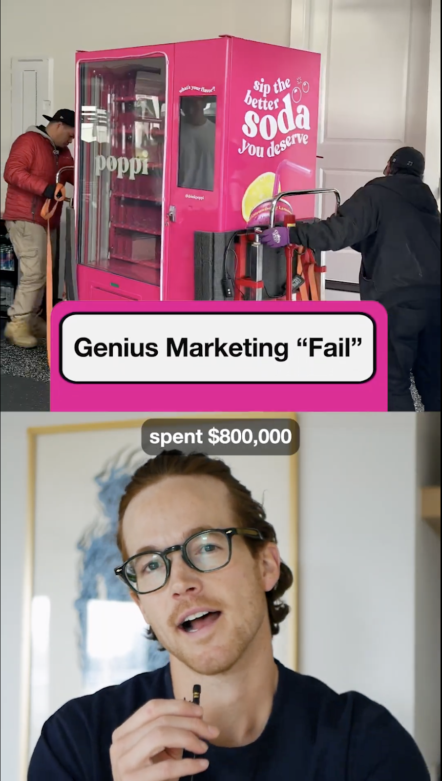
Yet what looked like a bust had a silver lining: Poppi became the talk of social media, major news outlets, and angry fans everywhere. Meanwhile, rival Olipop jumped in for free exposure. It's a fascinating case study with nuance for early-stage founders wondering if "viral" stunts or cheeky hijacks can help them grow.
Let's break down:
- The "Earned Media Multiplier" Why even negative buzz can catapult brand awareness.
- The "Hijack" Strategy How Olipop rode Poppi's wave—and why it worked for them, but might be trickier for newcomers.
Lesson 1: Big, Controversial Stunts Multiply Reach—But Not Always as Planned
Poppi shipped 32 bright-pink vending machines—rumored at $25K each—to major creators. But they didn't anticipate the backlash over "wasting money on rich influencers."
Here's why that fiasco still gave Poppi a visibility boost:
- Earned Media MultiplierThe moment a stunt becomes "drama," every reaction multiplies visibility. People with zero interest in Poppi jumped in to criticize or defend the brand, blanketing social feeds for free.
- Emotional Hooks Trigger SharingOutrage is a powerful driver. Even unplanned negativity can spark massive reach—the question is whether that translates into long-term sales or drives folks away.
ROI Calculation
If we assume a typical CPM for beverage ads is ~$8–$10, Poppi would need 80M–100M impressions to justify their $800K spend. Given that multiple influencer TikToks hit millions of views, plus mainstream media coverage, they likely reached that scale—intentionally or not.
Important: Poppi reportedly didn't aim to spark negativity. They wanted a "cool factor," not a fiasco. That's the caution: once your PR gambit is live, you lose control of the reaction.

Poppi (@drinkpoppi) • Instagram photos and videos
Why Founders Should Care—Even if You're Not Dropping $25K Machines
- Bold Hooks Can Work at Any Budget: Surreal Cereal took a more approachable path with their fake “celebrity” campaign—they found everyday people who share names with celebrities ("Dwayne Johnson," "Serena Williams") and had them endorse their cereal on billboards and social. It was cheaper, borderline edgy, and generated strong buzz. (We'll do a full newsletter on Surreal in a couple weeks—stay tuned.)
- But Bold Risks Can Backfire: Poppi's brand took hits from consumers who thought the stunt was tone-deaf. Your reputation is at stake, especially if you're smaller and less established.
- Not a Reliable Growth Engine: PR stunts are a crapshoot. Founders will almost always be better served by investing in a more predictable growth engine through proven channels (paid media, consistent organic content, direct outreach, etc.).
Lesson 2: Hijacking a Competitor's Spotlight—Why Olipop Succeeded
While Poppi battled critics, Olipop popped up in the comments, joking about the rumored $25K price tag. By engaging in that moment—and offering itself as a cooler, more down-to-earth alternative—they attracted significant attention.

But here's the nuance most miss:
- Olipop Is Already Established
- If you're truly unknown, commenting on Poppi's drama likely won't move the needle. People only noticed Olipop because they recognized it as Poppi's established competitor.
- Content Remixing Is The Real Strategy
- Simply commenting may not work for newcomers. Instead, consider what creator Kane Kallaway calls "cult hopping"—creating derivative content that remixes or responds to a trending moment.

Relatively small creator, Joefromyoutube (94.6k followers on Tiktok) reached 16.4M people with his morning routine parody.
Different Space, Example Opportunity
- Remember the Jaguar rebrand everyone hated in early 2025? Small car brands could have gained traction not just by commenting, but by creating comedic content analyzing the rebrand fail—or even suggesting their own alternatives.
- This works because algorithms prioritize content related to trending topics, giving newer accounts a chance at visibility despite having fewer followers.
Keep It Realistic
- Not Your Main Growth Lever: Piggybacking builds awareness but won't be your breakout engine. You still need an ongoing content strategy that solves real problems for your audience.
- Build The Always-On Muscle: Part of your strategy can be: "In addition to our core helpful content, we'll try to hop on at least one trend per month." Having a baseline content operation puts you in position to capitalize when opportunities arise.
- Mix With Other Tactics: Think of trend-hopping as a fun add-on to paid ads, direct outreach, or methodical brand building. The real foundation is consistent, high-value content that builds trust.
Final Thought: Balancing Hype with Substance
In the pop-soda wars, Poppi gambled big on a one-shot moment. Olipop piggybacked nimbly, scoring an easy PR win. But for most founders, the real magic is in consistent, strategic growth habits.
A splashy moment might give you a short burst of buzz—but sustaining those new leads, fans, or followers takes an always-on plan. So go ahead and brainstorm your creative PR stunts, but make sure you have a backstop: an actual product people love, systems for turning attention into customers, and baseline content to keep them engaged after the hype dies down.
The truth is, while big stunts make for great case studies, steady, predictable growth almost always beats viral breakout attempts. The companies that last are rarely one-hit wonders.
⸻
–– Team Demand Curve
(We help early-stage founders build repeatable, scalable growth. If you're looking for proven playbooks—plus hands-on support—check out our Growth Program or schedule a quick call. Let's get your traction engine running.)
Professional motion ads using Keynote
Insight from Kevin DePopas—our Chief Growth Officer.
Startups are all about rapid learning and iterating.
Ad creative is one of the highest-leverage things you can test and iterate on.
They help you quickly iterate and discover the value props, imagery, angles, and messages that resonate with your audience.
Hiring a designer or agency sounds appealing, but outsourcing too early can slow you down and eat into your budget—without guaranteeing better results.
And as we learned last week, video ads can make a huge difference.
So here's how to make motion ads yourself using Keynote
Most people think great animated ads require years of experience and hours of fiddling with excessively complicated tools like After Effects.
Even seemingly simple things can be a ton of work:

I’ve been using Keynote and PowerPoint for years to create polished, professional ads—without spending a dime on motion design.
In this quick breakdown, I show you exactly how to make an animated ad in under an hour, using nothing but Keynote (psst…you can do this in PPT too).

Inside, I cover:
- How to create smooth motion effects using Magic Move in Keynote.
- A parallax-style depth effect that makes ads look more dynamic
- How this method can make your brand look more premium—without a big budget
This is an easy way to level up your ad creative without hiring anyone or learning complex tools.
Try this tactic or send it to your marketing team or ad designer—it’ll save hours.
If you want the full, unedited tutorial where I walk through every step in detail, reply to this email, and I’ll send it to you.
For more tactical content like this, follow me on LinkedIn.
– Kevin
P.S. If you’d rather outsource motion graphic ad creation, we can do it for you. We have 3 slots left for new clients in February. Reply here or head to DemandCurve.com to book a call.
Don't be so f*cking boring.
Insight inspired by Dara Denney and David Ogilvy.
We hate "the same old shit."
Our brains evolved to detect the abnormal because it had a significantly higher chance of leading to either death or thriving.
As a result, we adapt to anything incredibly quickly—even something that initially shocked or terrified us— and it becomes part of the mundaen.
That's the whole idea behind the Law of Shitty Clickthroughs:
Over time, all marketing strategies result in shitty clickthrough rates.
— Andrew Chen, partner at a16z
For example, the first banner ad ever on HotWired had a CTR of 78%. Today, the average CTR on a Google Display ad is about 0.60%.
This, of course, happens to every channel and tactic eventually:

This rise and fall happens for two compounding reasons:
- Marketers ruin everything. Anything that works gets overused.
- We crave novelty. Something is only interesting the first few times.
So the truly fundamental rule of marketing is:
Don't be so f*cking boring.
The Man in the Hathaway Shirt
Nobody knew this better than advertising legend David Ogilvy.
Ogilvy first became famous due to his legendary ad campaign for his upstart fashion client, Hathaway:

Ogilvy randomly decided to pick up some eyepatches on his way to the photoshoot and got the photographer to humor him and take a few photos.
The ad caused Hathaway to quickly sell every shirt in the city. Hathaway and Ogilvy both became instantly famous from this ad.
All because of a stupid eye patch that cost 50 cents.
Other great examples of silly ideas
Is that a house arrest device?
Here's Dara Denney's YouTube video that inspired this newsletter:

Shoe brand Labucq cleverly slapped some sort of electronic device on the model's ankle in an ad—and gave absolutely zero context on what it is.
Guaranteed, nearly anyone who looks at the end will stare at that device and wonder what it is. They're also likely to click into the comments to see if anyone says what it is. They may even click to the website.
That's significantly more time and attention on the ad than for a boring old ad featuring someone's feet.
The incredibly slow build

This ad breaks all the rules:
- It starts completely silent.
- It takes 16 seconds for the first word.
- The scene doesn't change for 23 seconds.
- The sound cuts off again halfway through.
- You finally know what the ad is for 83 seconds into the ad.
- Then it hangs there for another 17 seconds before it ends.
But it's perfectly on brand for Guinness's slogan:
Good things come to those who wait.
This ad took a lot of guts to make and release, but it is often considered one of the best of all time.
Honorable mention
Cadbury's famous Gorilla ad used the exact same format:

I don't like it as much because it's a bit too random. At least with Guinness, the core idea of the ad matched the brand.
Comically cringe and terrible ads
These two ads are legendary.
First, Chuck Testa's taxidermy in bizarre, uncomfortable scenarios:

And then The Red House's extremely uncomfortable and confusing ad for its "Black and White People Furniture:"

What on earth is going on?
I'll let the video/visuals do the talking for these first:


They're so bizarre. They're impossible not to watch and share.
You would not believe the motherload I just dropped—and that's how I like it
This ad has one of the greatest hooks of all time (written above):

The writing is impeccable.
The overly posh English accent and dress combined with the vulgarity of her descriptive prose truly make it delightful.
Boring is the default—fight it
You can pretty much guarantee that the first idea you have is likely the same idea that nearly everyone else would have.
The best ideas are:
- Those goofy random thoughts (like Ogilvy's eyepatch)
- Wrung out of your head with a lot of creative brainstorming—ideally with other goofy and creative people.
- Ones that scare you to do. You should be worried about creating and releasing it, either because you think it'll bomb or you're worried about people's reactions.
As Rory Sutherland likes to say:
You'll never be fired for being logical.
But doing the logical thing means you'll be doing the same old boring stuff that everyone else is doing.
So, take risks.
Because not taking risks is actually far riskier in the long run.
10 research-verified ad tactics
Insights compiled from Science Says.
If you're running ads, use these to help inform both your ad copy, creatives, and landing pages.
1. Virtual Influencers vs Human Influencers 🤖
Okay this is both slightly horrifying and cool. AI influencers can sell tech better than human influencers. For example, Lil Miquela:

Takeaways:
- If your product is tech-related or innovative, use with AI-generated influencers (but make sure to disclose it’s not real).
- If your product involves the human body (cosmetics, hygiene), stick to human influencers.
- Results from a study showing participants ads for a Samsung speaker or a Calvin Klein cream, paired with either a virtual or human influencer:
- People were more likely to buy the speaker when it was paired with the virtual influencer.
- People were more likely to buy the cream when it was paired with the human influencer.
This may be a short-lived phenomenon while AI influencers are still novel.
The generalizable takeaway is that if you sell tech or innovative products, use innovative forms of marketing.
2. Be careful where you put the price💲
We talked a lot a couple of weeks ago about how the presentation of a price can significantly impact someone's perception of that price. Here's one more:
Below the product = perceived as cheaper.
- A $2.49 dental floss felt 9% cheaper when the price was below.
- Liquor store sales were 35.2% higher when prices were below bottles.

3. Slow vs. fast ads 🎬
I'll let Science Says' great graph do the talking here:

Slow-paced = better for benefits & quality messaging.
- A benefit-focused ad rated 32.8% higher when slow .
Fast-paced = better for price & features.
- A price-focused ad rated 24.7% better when fast.
If you sell Prada bags, do it slowly. If you sell knockoffs, do it fast.
4. Rule of 3 in persuasion 3️⃣
Three positive claims = most persuasive than any other number of claims.
- A cereal ad was most effective with 3 key benefits—adding more made it less convincing.
- Note that this only applies to marketing (likely due to people’s natural skepticism). Neutral reports become increasingly more persuasive with more claims.
5. Dynamic vs. static ads 🎞️
Static ads are easier to make and experiment with, but are they significantly better or worse than motion and video ads? That depends:
- For hedonic products (fashion, travel, high-end items), use video & GIFs to sell more.
- People were willing to pay $43.39 for a fancy coffee maker when shown dynamically vs. $29.91 with a static image.
- 81% picked a premium hotel room when shown in a video vs. 52% with a static image.
- If using static images, add descriptive language to help viewers imagine using the product.
- For utilitarian products, static vs. dynamic doesn’t matter as much.
6. Vertical video > horizontal video 📱
The vast majority of ad viewers these days are on phones, so this one is likely not a surprise, but in case you need justification:Vertical videos outperform horizontal on mobile.
- 57% vs. 43% views to completion in a Facebook A/B test.
- 55% vs. 45% engagement.
- Younger audiences (Gen Z) prefer vertical.
I can see why. Check out this image from Science Says showing how the same video looks on mobile phones:

Bonus tip: High-quality audio is incredibly important. They'll think better of you in every possible way. Invest in a quality microphone for ads and even Looms and ZOOMs.
7. Smaller units = more credibility ⏳
We buy from companies and people we trust and deem credible & competent.So, it may be surprising that the unit you use in your statistics can have a profound impact on how they perceive your credibility:
- People believe a “180 minutes” battery lasts longer than “3 hours.”
- A construction project seemed 46% faster when framed as “52 weeks” instead of “1 year.”
- Works best for time estimates but also applies to client count, reviews, etc. (ex: ‘34 happy clients’ vs. ‘dozens of happy clients’).
8. Too many features can backfire 🧨
Science Says summarized this perfectly, so I'm going to quote it:“
An iPod was be promoted as either:
A) iPod + Free cover + 1 free song download
B) iPod + Free cover
When asked in an experiment, 92% of participants (posing as marketers working at Apple trying to decide what to promote) chose option A. But how do consumers see it?
Potential customers were willing to pay $177 for option A. But for option B they were willing to pay $242.
People would pay 36.7% more for the option that offers less.
Takeaway: Too many features can dilute perceived value. Focus on your top benefits only. Don’t overload or dilute it with progressively weaker features and value props.
9. Eye gaze in ads 👀
We've previously talked about the power of faces and eye gaze. Here's research on when it's best to use Direct Eye Gaze or Averted Eye Gaze:

- For hedonic (pleasure-based) products: Model looking away increases sales.
- A sun hat ad saw a 30% sales boost when the model looked away.
- For practical or serious topics: Direct gaze increases trust.
- A domestic abuse petition got 75.2% sign-ups with a direct gaze vs. 53.8% with an averted gaze.
10. Fonts matter 🔣
This is a combo of three different pieces of research related to fonts:
- Italicized fonts signal urgency and a limited-time offer. Research shows that 3 times more people clicked an email and were 31% more likely to say they would buy from a Mexican restaurant if they contained with an italicized font versus regular fonts.
- Rounded fonts (vs sharp-edged fonts) sell better for pleasure-based products. When ads used a rounded font (vs a sharp-edged font), people liked:
- Mobile games 26% more
- Soda 24% more
- Milkshakes 11.2% more
- To build off #2, use handwritten fonts if your product is pleasure-based (candles, food, fashion, experiences). Use machine-written fonts if your product is functional (insect repellant candle, home repair, accounting).
Here are the fonts used in the study:

Summarized takeaways
- Use AI influencers for tech products and human influencers for human-related products.
- Put prices below products to make them feel cheaper.
- Slow-paced ads for quality & benefits, fast-paced for price & features.
- Stick to 3 key selling points—more isn’t always better.
- Use motion for hedonic products. Static is fine for functional products.
- Vertical video > horizontal on mobile (and most people are on mobile)
- Use smaller, more precise units to boost credibility.
- Highlight your best features. Don’t overload with unnecessary ones.
- Eye contact builds trust; looking away builds aspiration.
- Fonts matter—use the right type for your product.
Of course, this only scratches the surface of all the best practices for creating and running ads well. We nerd out, research, and apply this stuff daily for our clients so they don't have to.
We're opening up a new pod for our ads agency and opening up to five new clients this month. If you want startup experts to run your ads, either reply to this newsletter or reach out to us here.
How to choose a topic that makes money
Insight from Neal's Newsletter and UNIGNORABLE.
As I said, content that gets a lot of likes often doesn’t generate purchase intent.
Let’s use a somewhat extreme case to illustrate this.
There are a lot of really popular Instagram accounts that share things like:
- Funny animal videos
- Victorian Era homes
- Hilarious fake products/signs
- History facts or videos
Yet they make basically no money.
It turns out that just because you have 1M followers who love funny cat videos doesn’t mean they’ll ever buy anything you recommend or sell.
Even if they’re cat-related.
They trust you to make them laugh. They don’t trust you for financial/life decisions.
Whereas creators like Linus Tech Tips and MKBHD can make or break products with the power of their recommendations.
Choosing the right topic and angle is one of the most critical steps in the process. With the same effort, you can achieve significantly different business results.
Let’s dive into how to identify the right topic for your (or your startup’s) content:
Characteristics of monetizable content
There are a few variables here that all need to mingle in just the right way:
- Audience
- Topic
- Content
Four characteristics of a monetizable AUDIENCE:
#1. Pain
They must desperately want what you’re offering. Your content must help them relieve the pain (or at least, make them feel like it’s relieving that pain).
#2. Purchasing power
They have money to pay to relieve the pain.
- No purchasing power: Students hate spending money.
- Lots of purchasing power:
- Venture capitalists will pay a lot if you can make them more.
- Rich audiophiles will buy expensive hifi audio equipment you recommend.
This can be overcome if the audience is very large, much like MrBeast makes a lot of money from a lot of eyeballs despite most of them being broke teenagers.
#3. Social presence
They exist on the channels you plan to target, and it’s normal to talk about that thing on that channel.
For example, LinkedIn isn’t the right place if you talk about gardening even if there were a lot of gardeners on it. But it is the right place to talk about startups and leadership.
#4. It’s growing (and large ofc)
In the past several years, the fastest-growing content creators have written about crypto and AI, two booming industries on an uptrend.
Another example is someone scaling a pickleball newsletter to 150,000 subscribers in record time thanks to the sudden and rising popularity of the sport:
.jpeg)
Find the next trend, or at least one going in the right direction.
#5. Underserved
Ideally, the audience doesn’t have a lot of options already. AI newsletters grew the fastest right as the world started to wake up to AI. Now, there’s a lot more competition for AI newsletters, so it’s harder to grow.
Three characteristics of a monetizable TOPIC:
#1. Specific/niche
Leadership is a broadly appealing topic. It’s a problem for many, and it means a lot of different things. Don’t just talk about “leadership;” instead, focus on being a better startup CEO.
Help a specific buyer solve their specific problems.
Here are three ways you can niche down:
- Subtopic: Not general copywriting, but writing ad copy.
- Audience: Not “leaders” but CEOs of 100+ person companies.
- Outcome: Not “build an audience” but “make 5-figures a month from LinkedIn."
Here are some examples of each.
.jpeg)
#2. Matches what you sell
If you sell or want to sell SEO services or software, the buyers are anything from local stores, dentists, tiny startups, and massive companies.
You need content that gets in front of your target buyer, like simple “how to” guides. If you talk about nitty gritty, nerdy SEO details, you’ll attract your peers, not buyers.
But if you sell advanced SEO training or software, or are looking for a job as the Head of SEO, then nerdy talking about SEO details is perfect.
How you approach the topic changes whose trust you’ll build.
#3. Infinite game
Your content cannot solve a finite discrete task.
For example, fundraising for a startup. It’s a painful problem for someone who can pay a lot. But, once that person finishes raising money, they never want to think about it again. Your content will be interesting to them for that brief moment.
Instead, you need a game that never ends. People never stop striving to be better CEOs, parents, creators, marketers, programmers, designers, storytellers, or product managers.
Nor do people stop being interested in cars, tech, fashion, etc.
Two characteristics of monetizable CONTENT:
#1. It builds trust
Sharing memes, funny videos, and lists of hot AI tools is great and all, but in no ways does it make people trust you.
Linus Tech Tips and MKBHD have done a great job making engaging content that gives you informed and honest recommendations of tech products, and haven’t lost people’s trust by doing anything shady like take on Apple as a sponsor and then talk about how perfect their new products are.
They’re taken conflicts of interest seriously by not accepting a sponsor from a product category they review, not taking compensation to do a review, and trying to always give honest, critical and (hopefully) unbiased recommendations.
To build and keep trust:
- Have morals and stick to them
- Do right by people
- Create content that demonstrates your knowledge and expertise
- Avoid cringe things like clickbaity hooks or thumbnails of you crying that may help in the short term but make people lose respect for you
#2. Different
The exact method you use to address a topic needs to be different. You can’t just copy how another creator or company does it.
If you started posting videos identical to MKBHDs why would anyone care?
They’re going to go with the more established folks already doing it. So you need to approach it in your own unique way that’s true to you or your company.
For example, Hot Ones is just an interview podcast, but they made it completely different by forcing guests to eat spicy food.
.jpeg)
Once you nail the fundamentals, the rest is easier
Take some serious time to pause and reflect on:
- Who you’re creating content for
- What you’re talking about
- And how you’re talking about it
Because if you nail that, growth will come—even if the content isn't perfect.
If you want to go deeper into my advice for choosing a topic, read my full article.
And if you want a ton of help building your audience, consider joining the final cohort of our popular audience building course UNIGNORABLE. Enrollment closes next Tuesday.
Start with getting slapped by a baguette
Insight inspired by Storyworthy by Matt Dicks.
“The waiter slapped me across the face with a baguette, and I didn’t know why.”
This opening line to a story is significantly better than the more commonly used, “my vacation to Paris was a disaster.”
But why?
They both induce curiosity and beg a follow-up question.
The problem with the second, more general one is that only someone who cares about the person speaking would bother to ask a follow up.
It’s simply too risky.
You might be about to receive a banal story about waiting in lines at the Eiffel Tower or a French person being rude to you for speaking English.
The first, however, puts you right into the action of a specific moment
Your brain instantly paints the scene:
- You see the cute French café
- You see the waiter’s outfit
- You see his funny mustache.
- You see him swing a baguette across the person’s face
It’s tangible. It’s hilarious.
And then it leaves you with a mystery.
“What do you mean you didn’t know why he slapped you with a baguette? What happened?”
You’re hooked. You’re invested.
Better yet, you’ll be miserable if you don’t hear the conclusion.
This is what Matt Dick calls “Anchor in a specific moment” in his book Storyworthy.
And it’s precisely what you need to get people invested in your stories.
Why anchoring in a specific moment works
#1. Clarity for the listener/reader:
A specific moment helps your audience visualize what’s happening immediately. It gives them something tangible to latch onto rather than vague descriptions.
It also removes the risk of asking a follow-up question to a generic opener. They’re already hearing the story and know that they’re interested.
#2. Eliminates rambling
When you anchor your story in a moment, you avoid rambling on about random details that matter to you but don’t matter to the story—starting with a clear "where and when" lets you get to the interesting bits faster.
This is what Wes Kao calls finding the “Minimum Viable Backstory” when she recommends, “Start right before you get eaten by the bear.

#3. Creates a sense of time and place:
Anchoring helps orient the audience. They immediately know where they are, when this is happening, and often what’s at stake—pulling them into the story.
How to anchor effectively
- Start in the middle of the action: Open your story by describing something happening right now rather than explaining what led up to it.
- Example (weak): "When I was in college, I used to do a lot of embarrassing things."
- Example (strong): "I was standing on a cafeteria table, pantsless, holding a loaf of bread over my head like a trophy."
- Use the five senses: Use sensory details to help the audience see, hear, or feel what’s happening.
- "The cold metal of the handcuffs clicked shut around my wrists."
- Avoid broad generalizations: Sentences like “It was a normal day, until....” or “Life was good” are too abstract (and cliché). Be specific and drop us into the moment that matters.
- Don't make me wait: Every story is about a transformation. The opening anchors us as close to that moment of change as possible so we can follow the journey.
Let’s dissect a famous example
“Not for the first time, an argument had broken out over breakfast at number four, Privet Drive.”
Here's what's powerful about this opener to the Chamber of Secrets:
- Economical and direct: One sentence sets the scene, introduces conflict, hints about who’s involved and perhaps what it’s about, and establishes a pattern (this happens often).
- Immediacy: We’re thrown straight into the argument, bypassing unnecessary description.
- Colorful writing: Starting with “not for the first time” makes the sentence stand out and frames it in a negative (leaning into the Negativity Bias)
- Specificity: “Number four, Privet Drive” anchors the story in a precise location—that’s well known to fans, so they instantly know who might be wondering and start wondering what they’re arguing back this time.
It’s a powerful opener that’s doing a lot of work in a short amount of time.
“But I’m a startup founder. What do I care about telling stories!??”
Because humans are obsessed with stories and narratives:
- Christmas is a story.
- The concept of what “The United States” is is a story.
- The rising popularity of personal branding is a story.
- Bitcoin, gold, and money are shared narratives and concepts that have value because we believe that story.
- The US dollar goes up because people start believing a story that people start spreading because of Trump getting elected who got elected because of stories he and others told about him and the future that would unfold if he was elected.
- Tesla’s stock shoots up because Elon tells a story of a future where people don’t need to own cars because there’s a fleet of autonomous cars driving everyone around for super cheap.
- He first told this story back when the tech wasn't remotely close to doing that, but he sold the dream, which helped keep the company afloat long enough to the moment when we were getting close.
Stories are powerful.
Use stories to your advantage to:
- Sell your product
- Get investors
- Convinces people to invest years of their career at your startup
Microwave Headlines
Insight from A Self-Help Guide for Copywriters.
Linus Pauling, a two-time Nobel Prize winner, famously said
“The way to get good ideas is to get lots of ideas, and throw the bad ones away.”
Creativity is a process.
You generally need dedicated time to sit down and focus on generating a lot of ideas. Generally the first stuff you make will be kinda “meh.” Then you’ll have an idea. You’ll build on it. You’ll find ideas related to it. You find something else and build on that.
This continues until you’ve found various interesting ideas.
At least that’s what happens whenever we’re making ad creatives for clients, or whenever I’m making carousels for LinkedIn.
But what if you don’t have that luxury of time. What if someone on the team comes to you and says:
“Hey, you’re a good copywriter, what’s a clever way of saying X?”
Because with time, you can make a gourmet meal. But what if you only have 15 minutes? Well, in that case you need to use a microwave.
And that’s what Dan calls a “Microwave Headline.”
Let’s dive into 6 techniques to get a decent headline in 15 minutes or less:
1. Ask them to write the bad “facts” version
Or as Dan says it, get them to “Say it straight, say it great.”
Ask the person (or yourself) to just state the facts.
This is useful for a few reasons:
- It forces the requester to be more clear with the request by summarizing it in a sentence.
- It gives you a backup. If you can’t find a more clever way to do it, then give it an edit and send it back with your approval.
- As Harry Dry says it, all good writing and communication starts with a fact. Instead of saying: “Tiger Woods wasn’t very strong today,” say: “Tiger Woods normally averages X, and instead he’s Y today.”
- This forces the reader to think and completely removes subjectivity.
Sometimes the factual statement is actually pretty good.
2. Smile headlines
This is a concept that Dan also calls The Mullet.
- Business in front: Put the factual business message upfront.
- “Follow me on LinkedIn.”
- “People swear by it.”
- “Please enjoy responsibly.”
- Party in the back: Make them smile with a joke on the business message.
- “Or I’ll keep following you in person.”
- “And at it.”
- “The Internet never forgets”

Try that and see if you make something better than “just the facts.”
3. Common quotes/phrases
Here you want to dive into pop culture, common phrases, or quotes.
Try to think of anything remotely related to your product or market (or words that rhyme with things kind of sorta related).
The examples that Dan gives for a sporty deodorant are:
- “Don’t sweat the small stuff.” → “Don’t sweat the sweaty stuff.”
- “To be or not to be” → “To stink or not to stink.”
- “Be the change you want to see in the world” → “Be the scent you wish to smell in the world.”
I asked ChatGPT to write some ideas to pitch itself… a lot were terrible but after some prompting and editing, here’s what we came up with:
- "The pen is mightier than the sword." → "The prompt is mightier than the pen."
- "Houston, we have a problem." → "Houston, we have a solution—ChatGPT."
- Alternatively it could be “Houston, we had a problem.”
- "Think outside the box." → "Think outside the brain."
- "Ask and you shall receive." → "Prompt and you shall receive."
4. Find some opposites
I’ll do exactly what Dan did here and share a quote from Thomas Kemeny’s book Junior, Writing Your Way Ahead in Advertising.
“Clients love this shit. It’s cheap, but it works. Find some parallel you cna make in the language between opposites. You can this with just about any brief, any client, any boffer. For exdample, a bank wants you to talk about their low interest rates on their platinum cards. You can be “Small rates. Big dela.” Or “Pay a little, get a lot.” If you’re working on a car you could say, “Roars like a lion, priced lime a lamb.” Or “Giant horsepower. Tiny price.”
Here’s some examples for major tech companies I just came up with (with help of ChatGPT):
- Apple: "Powerful inside. Beautiful outside."
- Tesla: "Fast as lightning. Quiet as a whisper."
- Airbnb: "Unique stays. Familiar comfort."
- Google: "Search less. Find more."
- Amazon: "Big variety. Small wait."
- Netflix: "Big binge. Tiny cost."
5. 100 MPH Writing
That’s 160kph for the non Americans and Brits in the audience.
Here you just set a timer for 15 minutes and just write down as many ideas as you possibly can.
Just let it flow. You can judge them at the end and hopefully you vomited something halfway decent out.
6. Fill a few buckets
This is a shortened version of the meat of Dan’s creative process that I outlined in newsletter #205.
Here’s the high-level overview (this uses an example directly from A Self Help Guide for Copywriters by Dan Nelken.
Step 1: Jot down a few very high-level value props/ideas. For example, for sporty deodorant:
- You won’t stink
- You’ll smell nice
- It’s good for you skin.
Yes they’re very dumb and high-level.
Step 2: Fill 3 buckets with more flesh out ideas
For example for “you won’t stink”
- You can go from the gym to a date
- YOu can go from the gym to the bar
- You can go from the gym back to work
- You can go into an elevator without offending people
- You won’t smell like you just had a workout.
Step 3: Spend 5 minutes turning those into headlines
- “From working out to working it.”
- “From sweaty to ready.”
- “From weight room to board room.”
- “Do burpees. Don’t smell like burpees.”
Remember, writing is hard
Writing clearly is hard enough.
Writing cleverly is even harder.
Writing clearly and cleverly in a way that also increases someone’s desire to purchase your product is insanely difficult.
But use these techniques above to slam out some solid headlines in a short timeframe.
Why you buy sh*t you don't need
Insight from Neal's Newsletter.
We’ve all bought something we shouldn’t have.
Especially during Black Friday & Cyber Monday 👀
Whether it was from an Instagram ad, a late-night infomercial, a BFCM promo email, a knee-jerk purchase at a store (possibly due to some sales pressure), or a major purchase we’ve spent weeks thinking about.
We’ve all dropped our hard-earned cash on dumb sh*t.
Here I analyze 6 ways that companies get you to buy sh*t you don't need.
(Or... 6 ways you can get people to buy legitimately good products.)
Painkillers and Vitamins
First, let's go over the two fundamental types of products:
- Painkillers
- Vitamins
If you have a splitting headache, and you're in the desert, and someone has a painkiller—you'd be willing to pay an irrational amount for it.
And you won't need convincing. You'll understand the benefits immediately. Because you’re actively feeling the pain it relieves.
“Get rid of my f*cking headache!”
You'll buy a painkiller when the time comes.
And you’ll curse the fact that you didn’t have any on hand for this moment.
The important thing for Advil and Tylenol is making sure they're the brand you reach for at the drug store. They do that through branding and lots of ads.
And through clever positioning.
"Back painkillers” have the same ingredients as "headache painkillers," but if your back hurts, guess which one you’re reaching for.
I wrote about this phenomenon back in Newsletter #133.
On the other hand, you don't NEED a vitamin.
You also can't feel the benefits (if there are any).
Instead, people have been convinced of a narrative that taking a vitamin will make them live a longer and healthier life. It may be true, but it’s still a narrative that needed to be sold to them—and needs to keep being sold to them.
Most products are vitamins.
You don’t NEED them to solve a horrible and debilitating pain right this second.
These 6 tactics apply mostly to vitamins.
Read my breakdown of the clever ways AG1 has convinced people to spend ungodly amounts on their vitamin.
1. Time pressure
This is one of the most effective and easiest to use.
It’s simple. If someone feels rushed, they'll more easily part with their money.
Hence the effectiveness of Black Friday and Cyber Monday deals.
There are plenty of products that people might need, but just not right now. Or they don’t need them, but they think they might.
Time pressure helps push them over the hump to buy.
This is why sales are for a "limited time only." This is why Ticketmaster adds a countdown clock and says how many other people are looking at the event.

You feel pressured into making the decision faster.
And generally, a fast decision is in their favor, not yours.
2. FOMO or "Fear Of Missing Out"
Here they convince you to take action because doing so will cause you to miss something exciting or important.
Or at least they make it seem exciting or important.
"Be at the event, or you'll miss Bill Gates leaping over a chair. We won't be recording."
Who would want to miss that?
And yes, Bill Gates was knowing for jumping over desk chairs:
3. Social proof
If you love and respect someone, and you found out they use a product you're considering, you're a lot more likely to buy it.
Especially if you see them say how much they love it.
This works whether they
- Actually love the product.
- Are friends of the owners.
- Were paid for the endorsement.

Note: The risk for brands like Tim Horton’s is that when you do celebrity deals, you better make sure that celebrity is a saint. Otherwise, it may come out that they loved frequently P Diddy’s parties.
4. It’s been engineered to be a habit
In Nir Eyal's Hooked, he talks about how companies turn vitamins into painkillers by making their product a habit.
For example, nobody NEEDS to check TikTok or Instagram. But try taking a teenager's phone away for a weekend and see how they handle it.
Or remove a crypto trader’s ability to check the price of Bitcoin for a few hours (especially as it skirts with $100k).
They'll likely have a mental breakdown.

The companies have engineered their product to be the solution to a need. Often the need to relieve negative feelings of boredom or anxiety.
That’s how they turn a vitamin (entertainment) into a painkiller (make the anxiety go away).
5. Fear
If you don't take your daily vitamin, you will die earlier.
Or at least that's what the vitamin industry is getting at.
Another example:
Diamonds are not as rare as the price indicates. De Beers controlled the supply and pulled off the best marketing campaign in history.
"Diamonds are forever." Just like your marriage should be.
And the larger the diamond, the more you love them.
If the size and purity of your diamond are a reflection of the size and purity of your love, you better pay up, or you'll lose them forever.
This is how they created the convention of spending 2 months’ salary on a diamond ring that cost them a fraction to produce.
6. You’ve been sold a dream
A Rolex isn't 1,000x better at telling time than a Casio. But it costs that much more.
Rolex has positioned itself as the watch people wear when they've "made it." So when people earn a lot of money and want to signal it, they drop 5 figures on a Rolex.
Google "rolex famous people" and you'll see some of the top male celebrities.

Rolex has worked for decades to make sure the biggest (male) names are wearing Rolex to make people dream of one day owning one.
They want to make you feel like you can join an exclusive club with members like Tom Hanks, Brad Pitt, James Bond, and Jay-Z.
It’s not just manipulations
Yes, these tactics are used every day to get people like you to buy sh*t they do not need at either inflated or deflated prices (depending if it’s BFCM sale or not).
But they also work to convince people to buy or use legitimately useful products at fair prices.
Products that are good for humanity also need marketing.
In fact, they generally need better marketing, because good is hard, and bad is easy.
So use these tactics for good.
And try to resist when someone is using them on you.
Note: I originally wrote this piece on my personal Substack.
Company brand or personal brand?
Insight from us.
You’ve all been shouted at that you must have a personal brand.
If not AI will replace you, and your business will fail.
But do you really though?
Or is that just something ghostwriters and personal branding experts say?
I want to give you my honest perspective after creating and growing both a company and a personal brand, and having helped over 1,000 people grow their audiences with UNIGNORABLE.
First, what am I talking about exactly?
Essentially, this all falls under the bucket of “content marketing.”
Whether for a newsletter, podcast, YouTube channel, or posting on channels like Instagram, LinkedIn, X, and TikTok.
It’s just creating content to grow a business.
The core question we’re tackling here is whether you post it personally or with your company.
Company brand content marketing was the standard for years. In the last few years, however, personal branding has exploded across all channels.
People now love to cherry pick examples like:
- Elon Musk: more people follow him than follow X, Tesla, SpaceX, and Neuralink combined.
- Donald Trump: used his notoriety as a businessman & TV host to become president twice.
- The Rock & George Clooney: both created billion-dollar Tequila brands.
- Ryan Reynolds: bought a Mint Mobile and used his fame to promote it.
People love to claim that company brands are dead and personal brands are the way of the future.
Of course, nothing is ever one-sided, and there is a lot of nuance.
Let’s dive into the pros and cons to help you decide which is right for you.
Personal brands
The pros of personal-branded content
- Increases your personal optionality
- If one day you’d like to do something other than what you’re doing, you have a platform to assist you with what’s next. You can promote whatever you launch next.
- Increases your ability to network and meet people you want to meet
- You’ll attract cool people to you, and people will be more likely to reply to your DMs
- Increases your “market value”
- This could be for the job market (easier to get a job and increase your compensation for it)
- This could be your ability to raise money
- Your opportunities increase
- Since posting on LinkedIn I’ve had significantly more requests for consulting, advisory, and even podcast appearances and speaking engagements.
- You can increase your personal revenue
- Speaking engagements, sponsorships, premium subs, and consulting
- Increases your company's visibility and hopefully attracts leads
The cons of personal-branded content:
- Exiting the business can be hard
- If you want to sell your business, and its lead flow depends on you and your personal accounts, then:
- You might not be able to sell,
- It might be at a bad valuation, or
- You gotta remain working there after you sell
- If you want to sell your business, and its lead flow depends on you and your personal accounts, then:
- You have to worry about your personal image and any haters
- It’s hard to outsource given 👆. And it’s a lot of work.
- It can be challenging for the company to justify paying for something that benefits you.
- If you stop, then generally it stops. It’s hard to pass it off.
- The company has a risk if you ever leave
I love many of the benefits of growing my LinkedIn following to ~75k followers. It’s allowed me to meet some incredible entrepreneurs. And it’s helped generate more attention and customers for Demand Curve.
Company brands
The pros of company-branded content:
- The content more directly generates awareness and desire for the product/service.
- The content engine and notoriety can make it attractive in an acquisition.
- You can hire a team and outsource all aspects of it.
- You’re distanced from it, so you don’t take hate personally.
- If your company gets well known, you can still benefit in ways when you tell people you founded it or you worked there.
The cons of company-branded content:
- You don’t get the personal life benefits—unless your company gets really big and well known.
- Engagement rates can be lower since people generally prefer engaging with and following other people.
- If you leave the business, you lose the audience
I’m very thankful we built up the content and newsletter under DC. It's allowed for the brand to have its own reputation and get its own organic leads. And it's allowed for other people to work on the content.
How to decide which one to do
Ultimately it could pay off to do both. Then you get the benefits of both. And you can also use both accounts to amplify each other:
- You grow as the company grows.
- The company grows as you grow.
But if you have to choose just one, it really depends on a few things:
- Are you planning to sell the business?
- Then you probably want to build up the company’s own marketing engine since you don’t want to be tangled up in.
- Do you want the personal benefits above like the optionality, networkability, opportunities, and market value? Are you highly motivated to do it for those benefits alone?
- Then you should build up your personal accounts—and you can post about stuff related to your company to get leads in the door.
- Are you the type of person who would be anxious about what people think of you and get upset if people said things mean in comments?
- Then you should probably do it on company accounts.
- Do you want to be doing and overseeing the content yourself for an extended period? Or would you rather someone else do it?
- If you want others to do it, it’s probably better to do it via company.
There’s no real right answer. It’s very personal.
I’m glad I’ve done both since I get the best of both worlds.
But I spent years building the company one before I started with the personal one—and I had a leg up due to both the notoriety of DC and the bank of content I could repurpose on my personal account. For example:

It’s easier to do one at a time than to boot both up simultaneously.
And if you need help building up your audience
Then join the best (and last) cohort of UNIGNORABLE starting on January 20th.
We’re doing a Cyber FUNday deal on December 2nd at 9 AM Pacific.
Be there if you want $300 off and access to a free masterclass on starting and growing newsletters. Join the waitlist.
Choosing a monetizable topic
It’s official. Everyone is telling you that you must be creating content—either as a company or as an individual in the company.
- Pain: They must desperately want what you’re offering.
- Purchasing power: They have money to pay to solve the pain. Students hate spending money. Venture capitalists will pay a lot if you can make them more.
- Social presence: They exist on the channels you plan to target. For example, LinkedIn isn’t the right place if you talk about gardening.
- Specific/niche: Leadership is a broadly appealing topic. It’s a problem for many, and it means a lot of different things. Don’t just talk about “leadership;” instead, focus on being a better startup CEO. It’s a specific buyer with specific problems.
- It’s growing: The fastest-growing content creators in the past several years wrote about crypto and AI—two booming industries on an uptrend. Another example is someone scaling a pickleball newsletter to 150,000 subscribers in record time. Find the next trend, or at least one going in the right direction.
- Matches what you sell: If you sell or want to sell SEO services, the buyers are anything from local stores, dentists, tiny startups, and massive companies. You need content that gets in front of your target buyer, like simple “how to” guides. If you talk about nitty gritty, nerdy SEO details, you’ll attract your peers, not buyers.
- But if you sell advanced SEO training or are looking for a job as the Head of SEO, then nerdy talking about SEO details is perfect.
- Infinite game: Your content cannot solve a finite discrete task. For example, fundraising for a startup. It’s a painful problem for someone who can pay a lot. But, once that person finishes raising money, they never want to think about it again. Your content will be interesting to them for that brief moment. Instead, you need a game that never ends. People never stop striving to be better CEOs, parents, creators, marketers, programmers, designers, storytellers, or product managers.
How to ruin your brand with 1 tweet
Insight from us.
When is the last time you ever talked or thought about Jaguar?
Unless you’re an old car nerd, maybe never.
And if you are a car nerd, you maybe talked about the 1960’s E-Type that Enzo Ferrari called “the most beautiful car ever made.”

Or the 90s XJ220, which was (briefly) the fastest production car in the world.
Since then?
Their sales have declined by about 70% in the last 3 years, primarily due to competition releasing much cooler and more modern electric SUVs.
Why get a $100k+ Jaguar SUV when you can get modern electric options like the Model Y (number 1 car in many markets), Model X, Rivian R1S, or Porsche Macan?
It’s generally accepted that their strategy to revive themselves is to go all in on being an electric luxury brand—like all the other luxury car brands currently are.
And then they released this tweet:

In conjunction with this, they:
- Deleted all previous tweets.
- Changed their website to remove all links or references to cars.
- To be fair, they only did this for a day.
This meme summarizes the most common reaction to this move:

The other common reactions are… not appropriate for this newsletter. But let’s just say people are saying it doesn’t quite match the current culture moment with the clean sweep of Republicans.
I can only speculate the thought process behind this rebrand:
#1. “A new generation of Jaguar owners”
Jaguar mainly appealed to older generations.
So they ask themselves, how can we engage a younger audience?
But here’s the problem:
Is some crazy avant-garde fashionista video featuring meaningless combinations of words going to appeal to young, affluent people? Is that where we are at this cultural moment even?
Releasing this makes Jaguar seem tone-deaf to the current climate.
I think Tesla and Rivian have proven what that audience cares about is:
- Advanced new tech (FSD, auto-everything)
- Goofiness (whoopie cushions, light shows)
- Removal of things people thought were required (gear shifters, knobs, etc)
- Making it a “smart” vehicle (no keys, controllable remotely)
- It being “cool”
Nothing about this rebrand says any of this.
And in the process of desperately trying to appeal to a younger audience, they’ve entirely abandoned and humiliated their core audience of older white dudes who like British things.
Talk about lose-lose.
2. “We need to get people talking about us again”
And boy, have they.
At the time of writing, that tweet has been seen 50M+ times, with ~420k tweets about it in the first 24 hours:

Not to mention countless press mentions or internet creators like me writing newsletters to weigh in on it.
Perhaps they’re leaning into the adage: “No news is bad news.”
This is probably more views and mind share than they’ve ever had. Ever.
But it’s all negative. They’ve become a laughingstock.
Is that what you want when you sell $100k vehicles? For anyone who buys them in the future to be ridiculed by their friends?
And I feel like all the attention is a waste, considering there’s no product. Why not do this in conjunction with a release of a new car? Would that not make the whole thing make sense?
How long are we going to have to wait for an EV that looks sorta like every other luxury EV and in no way matches the weird promise they’ve made?
3. “Copy nothing.”
The saying is ironic.
If their future is to go all-electric, isn’t that what every other car company is scrambling to do right now?
This graph perfectly illustrates what’s going on:

Volvo and Genesis are the only luxury brands currently surviving the rapid shift. Every other brand’s market share is evaporating.
So Jaguar’s solution is to copy Tesla, which every other brand is already doing.
There’s no way they can release anything and not get ridiculed for joining the bandwagon—unless it’s so insane that it’s ridiculed for other reasons.
As Naval points out, this is likely just the beginning:

“Naval you’re crazy! Google? They aren’t even an automaker!”
What Naval is alluding to is the approaching revolution in the vehicle market. Where cars drive themselves better than the fallible human is able to.
Tesla is planning to release cars with no steering wheel in just a few years. And release an Uber-competitor where nearly every current and future Tesla is able to operate autonomously and earn the owner income when they’re not using it.
Google, which owns Waymo, already has a fleet of cars driving around like Ubers.
Why would you buy a Jaguar when you can buy a Model X or Y that can pay itself off by driving people around?
In the long run, why even spend $100k on a car if there’s a fleet of autonomous vehicles driving around that costs a fraction of an Uber to use?
What should they have done?
What Jaguar probably should have done is copy themselves, as Kevin Dahlstrom says here:

The old 60’s E-Type was a beautiful car.
If Jaguar had remade the old E-Type, it would have been “cool” based on its appearance and legacy alone.
And nostalgia is in more than ever.
Would this save them in the long run, given the impending future? Probably not.
But it would likely give them a spike in sales and make them “cool” again rather than being a bizarre and tone-deaf last attempt before filing for bankruptcy.
What’s the takeaway
If you’re going to rebrand:
- Do it without alienating your core audience.
- Make sure your product is at the heart of the story—not completely absent.
- Make sure it’s relevant to the current cultural climate.
- Make sure the slogan isn’t ironic and doesn’t set you up for failure.
- Find a way to make it interesting to people—which they did!
Use Tipping Points to convert more
Insight derived from Bangaly Kaba's article.
Last week, we discussed Adjacent User Theory—a powerful growth framework for identifying opportunities to expand into tangential markets.
As a quick recap:
- Core Users: People your product was built for and who “get it.”
- Adjacent Users: People who could use it, but it needs to be modified or communicated differently to them. The goal of Adjacent User Theory is to identify the right adjacent users to expand into.
One of the powerful parts of this theory (that I didn’t cover last week because I think it muddied the conversation) is what I like to call “tipping points.”
Think of them as moments or conditions when a user is on the cusp of becoming more engaged or converting into a paid customer.
Products (ecomm and software) have tipping points at various stages.
Let’s dive into some examples.
Slack example of tipping points
The primary thresholds that a Slack user has to cross through are:
- Not Signed Up → Signed Up
- Ex: A friend invites them to Slack
- Signed Up → Casual (occasional free user)
- Ex: They open Slack whenever they’re pinged
- Casual Free → Core Free (active free user)
- Ex: They open Slack to speak regularly
- Ex: Maybe they even start their own Slack channel
- Core Free → Monetized (active paid user)
- Ex: They upgrade to a paid user on someone else’s or their own Slack.
A tipping point is when they’re on the line between one stage and the next.
For example, Slack determined that the tipping point between a “Casual Free” and a “Core Free” was their weekly active use. If they used Slack 3 out of the last 7 days, there was a 50/50 shot they’d either churn entirely or become an active user.

Armed with this information, they knew they had to do everything they could to push people to be active more than 3 days per week. Things like:
- Encouraging them to download the mobile app
- Encourage them to enable notifications (of any kind)
- If they don’t enable push notifications, send them emails
- Seamless onboarding that lets them discover the value of Slack quickly
They knew where to focus their efforts.
Instagram example of tipping points
Here are the thresholds for Instagram:
- Not Signed Up → Signed Up
- Signed Up → Activated
- Casual → Core Usage
They discovered that if a “Signed Up” user had more than 10 followers in the first 7 days, there was a >65% chance they became “Activated.”

This is the counterpoint to the famous Twitter example where if someone followed a certain number of people, they’d be more likely to stick. Here, Instagram users were more likely to be engaged the more followers they had.
If you’re an Instagram user, you’ve definitely received these notifications before:

These trigger in various scenarios, but a common one is when someone creates an account on Instagram. It can fire them out to:
- Facebook friends
- Contacts in your phone (or if you’re a contact on their phone)
- Mutual friends
- Shared educational background on Facebook
These were created so that new users would quickly gather followers so that people became activated users.
How to find and act upon tipping points
I’ll leave you with some tactical tips on how to take action here:
#1. Make sure you’re tracking everything.
You can’t make decisions if you don’t know what users/customers are doing. Every click should be recorded and associated with the user. Do that in GA4 and/or Mixpanel/Amplitude and/or your ESP.
#2. Identify the various stages that a user goes through from discovery to full converted.
A stage can be defined by either them taking action (signing up, subscribing, purchasing) or by a more complicated set of variables (daily active, does X things per month).
See the next step for examples of different variables.
#3. Analyze the behavior of people who blew through thresholds and those who did not.
Try to identify the variables of “things they did/didn’t do” that lead to someone significantly more likely progressing through the threshold.
For example, this could be things like:
- Purchased the consumable product X times
- Have used the product on X of the last days
- Have used X and Y features (either at all or a threshold amount)
- Have opened (or clicked) X of the last Y newsletters/product emails
- Have at least X team members
- Follow your account on social media
- Have downloaded the mobile/desktop app
There are a lot of variables to consider!
Since this comes from Adjacent User Theory, you’ll also want to try to learn who these people are. Are specific personas getting stuck while others are not? If so, that could be an opportunity to change the flow/messaging to convert them better.
#4. List strategies for how to get people to reach and exceed the tipping points.
For example, if you identify that customers who buy at least 6 of your consumable DTC products are X% more likely to become paid subscribers (or loyal repeat purchasers), then list strategies to increase the likelihood they order at least 6 of the product (either all at once or in separate orders):
- Bulk discounts (shipping or discount)
- Sell a starter bundle
- Send reminder emails or texts to stock up
- Inserts into product deliveries that encourage repeat purchases
- Surprise gift (like a sample of a new flavor)
Now, go put this into action!
There are infinite ways to adjust your marketing or product to increase conversions.
Identifying tipping points helps you learn exactly where to apply force to get the maximum leverage. They provide clarity and significantly increase the odds of success for a test.
It’s not “what” but “where”
Insight derived from A Self-Help Guide for Copywriters by Dan Nelken.
Creating a headline for an ad is incredibly difficult. It has to:
- Hook them
- Highlight the problem
- Communicate the value
- Hint at who it’s for
- Be unique/novel
- Do it all as quickly and in as few words as possible
Luckily, the visual is there to help.
The text often sits on top of or adjacent to the visual. Something like this:

This tactic all about getting creative with where the headline is placed.
Ask yourself
“Where’s the most perfect or powerful or ironic place for your headline to appear?”
(Note the headline above is from A Self-Help Guide for Copywriters.)
For example, the perfect place for a NYC taxi ad is:

And if you run a chain of restaurants in Austria at highway rest stops:

And no, before you roll your eyes and go: “I run a startup, I can’t afford to start building 100 foot tall billboards!”
I agree.
You probably shouldn’t do that unless you’ve got a massive budget. But remember that with a combination of Photoshop and AI you can easily make anything look real.
Some more examples
Speaking of tunnels
This ad is extremely unignorable:

3M Security Glass
This ad has gone viral numerous times:

What better way to make a point about your product than to than to put “$3M” in a public bus stop. Note: it was there for a day, and it was only $500 of real money and it was protected by security.
Interactive ads
This is a clever two part ad:
.jpeg)
Perfect for a non-profit that helps find housing for those who need it.
For some reason benches are popular props for this:

Transforming the everyday
Use the environment to create an absurd scene your product can help with:

Using people as props

Build up to it
These two ads show that you can build up to the punchline:
.jpeg)

Remember, it doesn’t need to be in the real world
Many of these ads have gone viral one or more times since they’ve been captured and thrown online.
I think that’s proof that you could them as real or photoshopped images and run them digitally.
Here’s an example of a clever ad that was intended as an image from the start:

So get creative and figure out ways to place integrate the headline with the visual—whether it’s real or digital.
And I recommend A Self-Help Guide for Copywriters by Dan Nelken for more great ad-making ideas.
The best "political" ad I've seen
Insight from us. Ad by Progress Action Fund.
We’ve never analyzed a “political” ad before—for many reasons.
But this one is just completely different than any other I’ve seen.
As a fair warning, the first 2 seconds are NSFW, as you can tell from the thumbnail below.
Click here to start after that point.
tl;dr is that a man tries to use the contraceptive drug Plan B, and a grumpy Republican senator appears and tells him it has been banned.Here’s what this ad does incredibly well:
#1. The Hook
The average person scrolls ~43.25 feet of content daily on their phone.
If you fail to hook someone in the first few seconds, they’re gone.
This ad’s opener is very hard to ignore, both visually and aurally.
#2. It cuts to the chase
Most stories are terrible because they meander endlessly with useless context.
The stories that captivate give you only what’s critical.
This is what Wes Kao calls the Minimum Viable Backstory:

It didn’t waste precious time showing how the couple got into this scenario.
Instead, it cuts to the critical moment where the main character’s problem begins with just enough context for you to understand what’s going on and be invested.
#3. It’s laden with suspense
They hook you.They introduce the problem.
They get you invested.
Suddenly, an old man in a suit appears in the man’s bathroom.

(And the scream the man emits is delightful 😂)
You have no idea what you’re really watching or why.
It’s only 2/3 into the video do they finally introduce the “why.” By then, you’re really invested, and the surprise is hilarious.
#4. It engages an audience that is otherwise checked out
Most men ignore topics related to women’s reproductive rights. Although it’s a problem that affects all of us, it doesn’t directly affect men.
This ad does an excellent job making it their issue too.
It made the guy the main character of the ad:
- He’s the one trying to grab the Plan B.
- He’s the one being confronted by the grumpy man in the suit.
- He’s the one who will have to break the news to her.
- He’s the one being called “daddy.”
This ad does a perfect job of making the target audience acutely feel the problem.
#5. It’s relatable
The minimal viable backstory doesn’t explain the status of these two people. They could have just met. They could have been dating for a year. They could be married.
It leaves you to fill in that blank.
On top of that, according to studies, condoms break 2-5% of the time. And at least 45% of women have had pregnancy scares in their lifetime with 25% of women having used Plan B at least once.
It’s a relatable problem the target audience has experienced first- or second-hand.
#6. Most importantly, it shows, not tells
Most ads of this type are just someone talking at the camera trying to either:
- Shame you
- Educate you
- Convince you
This ad isn’t a man staring you down and bashing you over the head with their opinions about how the other side is evil/wrong.
Instead, it tells a relatable story designed to empathize with the problem.
A far more effective way to convince someone.
#7. It attempts to simplify the decision
Politics is extremely complicated. There are infinite possible combinations of opinions that someone can have about how a country should be run.
Unfortunately, in a lot of countries, we're given two options.
Given that, it can be extremely difficult for someone to weigh all the pros and cons of stuffing a round or a square peg into the amorphous blob of a hole that is your political opinion.
This ad attempts to simplify the problem by making you care first and foremost about a single issue.
And our brains love simplicity.A study showed that a single thing can heavily influence people's voting in the final days to hours before an election.
Politics aside, I hope you found this inspiring
I leave it up to you to decide whether you agree or disagree with the ad’s message.
Regardless, this ad is a masterclass in making someone care about something they might not be paying attention to.
Takeaway:
Make them painfully aware of a problem or danger through creative storytelling.
It’s about the work on your desk
Insight from Charlie Munger.
Charlie Munger died nearly one year ago at the age of 99.
His net worth was $2.6B then, thanks to his uncanny ability to identify companies to invest in and not get spooked by short-term volatility.
One of his mottos often rings through my head.
I think it does because it’s at odds with what we generally talk about here at DC.
The motto is:
It's not about the big picture.
It’s about the work on your desk.
Do the work in front of you and do it well.
And because this newsletter is all about growing startups, I feel it’d be a disservice to all of you if I didn’t occasionally pause from talking about the nitty-gritty marketing and growth tactics to truly focus on what matters:
Your product is by far the most important thing.
Let’s analyze the situation where you do lousy work/your product isn’t very good:
- People stop using you (churn is high)
- People talk about it
- You never get referrals
- You never have good reviews, testimonials, and case studies to use as social proof to close people
- Your reputation proceeds you, reducing the odds someone becomes a lead, signs up, or buys
- Your cost of acquisition increases across the board
- You have to invest more and more into marketing to make up for the poor organic growth
And in contrast, let’s say you have an exceptional product:
- People keep using you (churn is low)
- People talk about it
- Referrals drive a significant portion of your revenue
- You’re able to collect great social proof
- Your reputation proceeds you, making anything you launch convert better
- Your cost of acquisition decreases across the board
- You can invest in marketing to make things grow even faster rather than try to fight the tides. And when you do, it’s more effective.
Marketing should be about getting the word out about an amazing product—not making up for a bad one.
This is why our agency is selective with who we work with. It doesn’t matter how good our ads are if the product isn’t good. It’s setting ourselves up for failure, and our clients up for disappointment—ruining our own product in the process.
So really, the best growth tactic I can and will ever give is:
It’s about the work on your desk.
Do the work in front of you and do it well.
Consider this your primary mission as a founder
So please please please, if you’re a founder, get deeply involved in your product/service. Know it better than anybody else. Be brutally honest about how good it is and where it falls short. Obsess over making it better.
Most people are terrified to look too closely and start asking hard questions. Be one of the brave few who do.
And remember, no one will ever care as much as you, the founder. You have to be the one to go the extra mile to make it exceptional.
So, in short, do everything you can to consistently increase the average satisfaction of your customers.
Do that, and you’ll see more organic growth.
Do that, and all of these growth tactics we have covered and will cover will work significantly better.
Thanks for reading, and back to the regularly scheduled growth tactics next week.
Opinionated defaults loosely held
Insight from Adam Fishman.
The Airbnb host onboarding experience is a bit magical.
You click the CTA in the top navbar that says “Airbnb your home,” and instantly, you see this:

Whoa, I could make an extra $2k per month?
To give me this estimate, they had to make a lot of assumptions:
- That my home is where I’m accessing their site from (safe assumption)
- That I can charge $289/night for my place (average based on their data)
- That is has two bedrooms (median number of bedrooms)
- That I’d get 7 booked nights per month (average based on their data?)
- That my home is somewhat “average” and not crazy good or crazy bad (little do they know!)
- That I wanted to rent out my entire place and not just a private room
- That I’m even eligible to Airbnb my home
Some of those things could be horribly horribly wrong.
But they committed to reasonable assumptions that allowed me to immediately experience the “magic moment” of seeing how much money I could make.
A bad experience would be making me do a long onboarding form, selecting all of these before seeing my estimate. It would be terrible if I had to enter my email to see my results or, worse yet, book a call with someone to discuss them.
This is the power of opinionated defaults.
Opinionated defaults loosely held
Opinionated defaults are pre-selected choices within your product that nudge users toward desired actions—or that simply make the experience that much easier or more delightful. For example, Airbnb made several opionated defaults to show me my estimated monthly income.
Defaults are powerful for two reason:
- They anchor you. If $20 is the default on a donation field, that will be the most common donation.
- They make it smoother for the most common use cases. If chosen properly it can make the experience more seamless for the average user.
“Loosely held” meaning the user can easily change them. For example, I could easily change my location, number of bedrooms, stay type, and number of booked nights to get a more accurate estimate.
You can assume a bunch of different variables:
- Location
- Pricing
- of users
- Preferred login method
- Preffered payment method
- Template
- Pricing/tier
- More nuanced, product specific things (ex: # of bedrooms)
Let’s dive into some more real-world examples:
Uber/Lyft example
Both Uber, Lyft, and Google assume that you’re booking a ride or getting directions from your current location:

You can, of course, change this, but it defaults to your current location because 99%+ of rides/navigating likely start there. They’ve made it more annoying to use 1% of the time to make it easier to use 99% of the time—great trade off.
Patreon example
According to Adam Fishman, Patreon had the problem of all their creators choosing $1 as their support membership price—it just became culturally normal to do it after the default was set to $1—which shows the impact a default can have.
To combat this, they changed the default text to say $1 to $5, which they eventually changed to:
This change significantly increased the average monthly price of tiers—increasing revenue for both them and their users.
Figma example
One thing we’ve covered previously is Figma’s invite and billing mechanism.
Most SaaS tools work like this:
- A team member wants to invite someone to the tool so they can collaborate on a project
- But they can’t, they need an admin to approve it
- They get delayed waiting for the admin to approve it
- The admin responds 2 days later, saying, “No, we don’t want to pay for them!"
- The team member gets annoyed waiting and needs to find a workaround
Here’s what Figma does:
- Anyone can invite someone to a Figma file
- New people get added to the team but get the first month for free
- The admin gets an email reminding them of next monthly payment and tells them to check the users
- They go in (maybe) and see their team has added various people
- They either leave them or remove them
Figma made inviting someone to the paid membership the opinionated default.
And I imagine that change alone has contributed a lot to their MRR over the years because it’s significantly harder for the admin to revoke someone’s existing access than denying it in the first place.
Canva example

Templates are a common thing these days.
Pushing templates onto people is Canva saying, “Hey, you’re probably trying to do something that most other users have already done before; why not use this thing and save hours of work?”
In many cases, it works wonderfully—assuming you make templates for the most common use cases and legitimately solve the problem for most people.
Framework for Opinionated Defaults
Adam Fishman made an actionable framework for you. I could reword it for you but this image has all the necessary info.

Just remember, by thoughtfully choosing opinionated defaults, you can guide user behavior to benefit both your customers and your startup, leading to sustainable growth and a more intuitive product.
But always, ALWAYS, make sure to let people adapt things how they actually want it in case the default is wrong.
Get going, folks!
Grow by stacking S-Curves
Insight from Casey Winters.
Most startups fail because of bad ideas.
The rest?
Well, in startups, growth solves all problems.
- Low cash reserves? Growth means you get more revenue and can raise money easier.
- Hate your cofounder? Growth makes it easier to ignore. The real fights happen during the hard times.
- No systems or processes? Growth lets you throw more resources at it
- Struggling to hire top talent? Growth makes you more attractive to top-tier candidates
So, the rest fail because they either never crack a consistent growth channel or they run out of room to grow because they failed to adapt before they hit the ceiling on their current channel, market, or product.
That’s what happens when companies ride one growth curve too long:
- Markets get saturated
- The competition heats up and copies what their doing well
- Customer acquisition gets harder
- Momentum dies
Smart companies prevent this by mastering S-curve growth—a structured way to expand into new products, new growth channels, and new markets before hitting a ceiling.
Here’s how to do it.
First, what's an S-Curve
Most famously, the adoption of new technologies follows the S-Curve:

Notice that they all follow a similar S-shape (with some momentary dips). And how they're generally accelerating.
What's missing from that graph is AI, which was around for decades and was slowly, slowly getting increased adoption. Then ChatGPT came out, and suddenly, everyone was talking about and using AI.
So AI had a decades long ramp up, and then an extremely violent adoption.
How S-Curves work
Every product, channel, or market follows an S-curve:
- Slow Start: Early traction is hard. You’re figuring out positioning, messaging, features, form factor, UX, etc.
- Hypergrowth: You find a repeatable customer acquisition loop, and growth accelerates. In products, typically, it happens with some "killer app" moment like when ChatGPT was released.
- Saturation: Channels become expensive, competitors catch up, there's fewer and fewer remaining "potential users," and growth slows.
The mistake many startups make?
Waiting until Stage 3 (Saturation) to launch a new growth curve.
At that point, it’s often too late.
How to sequence growth
The best startups layer new S-curves before the first one flattens.
Again there are three types of S-Curves a company is fighting with:
- Product
- Market
- Acquisition channel
The slightly confusing part is that Product and Market are a little muddied.
A new product can enter a new market (Mac vs iPhone), or it can be the same market just with a much better form factor (Netflix DVDs vs Streaming).
Let's dive into each.
In terms of products, think:
- Uber: UberX → Uber Pool → UberEats → Freight
- Amazon: Books → ecommerce → AWS/Prime Video/Music/Medical
- Telsa: Luxury (S and X) → Mid-range (3 and Y) → Solar → Trucks (Cybertruck) → Economy (upcoming) → Semis → Autonomous (Cybercab) → Home Robots (Optimus)
- Apple: Macs → Macbook → iPhone → iPad → Watch → Airpods → Airtags → Vision
- Airbnb: Homes → Experiences → ???
Note: Many of these expansions were larger (or more profitable) opportunities than their earlier products (iPhone, Macbook, AWS, Model Y), but some of them were expansions were smaller opportunities (Watch, Airpods, Experiences).
Sometimes it's obvious that it's a bigger or smaller opportunity, and other times it's a gamble. For example, things like Apple Vision, Uber Freight, and Tesla's upcoming products like Semi, Cybercab, and Optimus are either going to be big winners or not—time will tell.
Also note: Unless Airbnb can find its next S-Curve, it may lose its dominance and stop growing due to saturation, competition, and regulation. Experiences is a small portion of their revenue currently.
In terms of markets, think:
Expanding into new markets can be done by opening the same product to more people or creating a new product that targets a different market (for example, Amazon AWS was a totally different market than those buying books)
- Slack: Developers → Startups → Enterprises
- PayPal: eBay payments → Peer-to-peer payments → B2B → Crypto
- Shopify: Small businesses → Enterprise → Retail POS (new product)
- Square: Small business payments → Enterprise solutions → Consumer banking (Cash App) → Crypto
In terms of growth channels, think:
- Dropbox: Paid ads → Referral program → B2B partnerships
- HubSpot: Content → Sales-led growth → Community-driven growth
- TikTok: Organic viral loops → Influencer partnerships → Paid advertising
For primary growth channels, reference Lenny's Racecar Growth Framework's "Growth Engine" section:

Everything else (Kickstarts, Fuel, Lubricants, Turbo boosts) help with conversions or to kickstart growth, but only the Growth Engines are likely to produce these S-Curves.
Note: For each new product and market a company creates, they also create separate S-Curves for growth channels.
For example, Square could saturate the market on Meta Ads for small business payments, then launch the Cash App, and massively open up Meta Ads again with the consumer market.
Here’s how to sequence your growth properly:
#1. Find your next S-Curve early
- Identify adjacent customer needs. What else do your existing users struggle with? Ex: Canva started with social media graphics, then expanded into presentations and video.
- Alternatively, look for new growth channels. Ex: Dropbox shifted from paid ads to referral-based growth to sales.
- Or explore new markets. Ex: Stripe expanded from startups to enterprise payments to government integrations to crypto payments.
#2. Expand through existing distribution
- Ideally, your new product, channel, or market can leverage your existing user base. Either through product-led growth or through broadcast marketing (email + social).
- Slack grew through developers, to internal teams, then expanded into enterprise sales.
- You can also layer in new marketing channels—e.g., Facebook ads → influencer partnerships → outbound sales.
#3. Test without disrupting core growth
- Avoid derailing your primary revenue stream in case the expansion is unsuccessful.
- Start with small tests or pre-sales (MVPs, beta launches, new ad channels) to validate before scaling.
#4. Time it before growth slows
- If you wait until CAC rises or retention drops, you’re already behind.
- Launch your next S-curve during your peak growth period.
Takeaway
If your startup is still finding traction, again, use the Kickstarts, Turbo boosts, etc to help get your first Growth Engine going. Here they are again:
If your startup is growing fast, now is the time to plan your next move.
Spot your next S-curve—whether it’s a new product, growth channel, or market—validate it early, and launch before your current curve stalls.
Not sure what your next growth curve should be?
Ask: "What’s the biggest pain our current customers still have?"
Their answers might define your next expansion.
— If this was helpful, forward it to a founder who needs to hear it.
Read Casey Winter's full article to learn more.
Identify growth opportunities with the Adjacent User Theory
The vast majority of homepages are incomprehensible—especially for SaaS.
Seriously, it can take a ton of brain power to figure out what they sell and to whom.
There’s a reason for this:
- Everyone on the team knows what the product is.
- They know what the internal jargon means.
- They don’t understand what it’s like to have zero context on the brand, the company, the competitive landscape, the industry, and the market as a whole.
Everyone on the team has intimate knowledge of 👆 those things.
Unfortunately, complicated jargon is often the most succinct way to describe a complex product.
“It’s the all-in-one AI hyper-personalization platform.”
I’m sure that perfectly describes it, but… HUH?
This same problem also exists for product decisions
You are a power user of your own product.
When you and your product team use your app (or product/service), you’re viewing it from a highly informed viewpoint:
- You’re very technically savvy.
- You know the product intimately.
- You know where everything is.
- You know everything it can and cannot do.
The vast majority of your current and potential users?
They don’t know any of that.
They’re fumbling around in the dark, trying to figure out what the tool does and how it can help them.
It’s not until they’ve reached some tipping point that they finally stick.
The Adjacent User Theory by Bangaly Kaba
What is an Adjacent User, you say?
Honestly, a lot of the explanations out there are confusing, so I’ll try to make it clear:
- Core Users are those for whom the product is initially built and who understand and engage with its core value without much modification or onboarding friction. These users align directly with the product's initial design and purpose.
- Adjacent Users are people interested in or could benefit from the product but don’t align perfectly with its current form or messaging. They may need a slight change in positioning, feature tweaks, or lower barriers to engage fully.
I’ll dive into examples next to help illustrate this.
Adjacent users are often accidentally ignored by teams that are too knowledgeable to understand their unique needs.
Instead, product teams focus on improving the experience for the already active and engaged core users—because they are core users.
If you want to unlock growth to a broader set of users (rather than just obsessed power users), you need to identify:
- Who these adjacent users are (user attributes and behavior)
- What exactly they’re getting hung up on
- What they are actively using and enjoying that you might not be prioritizing
- The thresholds/tipping points between inactive users and active users
- We’ll cover tipping points in a future newsletter.
Examples of identifying adjacent user behavior
Here are some examples of companies identifying adjacent user behavior and expanding to make it more appealing to them:
- LinkedIn: LinkedIn started as a site for getting a job and hiring. Then, they noticed that a cohort of entrepreneurs and freelancers used it to build a personal brand. So, they added various features like Creator mode.
- Instagram: It started as a “check-in” app like Foursquare. They noticed people were more engaged with sharing photos of their outing—and using filters to make up for their terrible phone picture quality. So, they expanded that functionality.
- Slack: Initially marketed itself as a communication tool for developers. Then, they noticed people who worked tangentially with developers (designers, marketers, etc) were being invited in. So, they broadened the appeal.
- Airbnb: Started as a platform for renting air mattresses in people’s living rooms. People looking for affordable and unique accommodations beyond hotels were interested but hesitant about staying on air mattresses. So Airbnb expanded it to staying in people’s homes… regardless of mattress type.
- Dropbox: Dropbox initially focused on cloud storage for tech-savvy users who understood file synchronization. They found that people without technical expertise needed a simpler way to store and access files across devices. So they made it super simple.
If these companies had stuck with their initial set of core users and ignored all the adjacent users, they’d all be much smaller than they are today.
How Instacart identified potential adjacent users
To understand expansion opportunities, you first need to know exactly who your core users are.
Early on, Instagram knew that 75% of its core users were:
- Women
- Urban
- Located In Certain Cities
- Head of Household
- Had one or more kids
- Were more affluent and less price-sensitive
- Willing to spend an hour filling up their Instacart Order
Each one of these attributes has an opposite (or tangential) user attribute:
- Women → Men
- Urban → Suburban
- Cities → Other Cities
- Head of Household → Members of households
- >1 kid → Smaller Families, Couples, Singles
- More Affluent + Less Price Sensitive → More Price Sensitive
- Willingness to put effort into the cart → Less willingness to spend that time
Each of those is a potential adjacent user to your core user. Here is an excellent image from Reforge for the common attributes:

Actionable takeaways
Okay, so we know who adjacent users are and the importance of engaging them.
I'll leave you with some actionable takeaways on how to do something about it:
- Identify core attributes of core users and look at opposites/tangential: This will help you find potential adjacent user attributes.
- Look for use cases you didn’t initially design for: Are there users finding value in your product in unexpected ways or segments?
- Identify small barriers for similar users: What minor adjustments would allow these “near” users to engage fully? Is it messaging, ease of use, or feature tweaks?
- Talk to adjacent users: Identify and talk to people who are using the product in unexpected ways or who are outside the core audience.
- Expand incrementally: Experiment with language and features that address those near-miss users without alienating core users.
- Simplify onboarding: If the adjacent users are less savvy and engaged, simplify onboarding as much as possible.
- Speak clearly: Instead of your copy speaking just to tech-savvy nerds, make sure it speaks to less knowledgeable people.
Remember, your core user base is only so big. Ignoring the adjacent user could prevent you from unlocking the next stage of growth.
If you want to dive a lot deeper into the full nerdiness of Adjacent User Theory, check out Andrew Chen’s full article.
PS: Ads are also a great way to experiment with these new cohorts, as you can create lookalikes from your adjacent users or target people with attributes of the adjacent user.
The art of competitor bashing
This tactic is all about illustrating your value by picking a fight with a well-known competitor on a metric that you’re superior at.
Some quick warnings:
- Make sure it’s a fight you can win
- Don’t get sued. Get clever with how you mention them.
Here are the clever ways people do it:
Secret Wink
“You know what I’m talking about.”


Surreal did a great job using the notoriety of incumbent brands to get attention and call out how they’re better.
The not-so-secret slap to the face
There’s also the other strategy where instead of doing a wink, wink, nudge, you instead just come out and say it:

First, yes, that is true. Ask your AI of choice to verify.
Second, this is a classic X vs. Y ad, but it’s done through text instead of the typical visual format.
Start with a fact and build on it
Start with a fact:
- McDonald’s has way more drive-thrus than Burger King
- People put other brands of ketchup in Heinz bottles
- There are a lot of songs about Corvettes
Then build on it:


Use them against themselves
Here, you use a unique aspect of their branding or product to your advantage. For example, this classic Pepsi Max ad:

Note: This Pepsi ad is risky. We’ll cover why below.
Or how Huel takes a shot at Athletic Greens (their most hyped competitor) by removing the label from their distinctive package:

Make fun of the stereotype of your competitor
There’s no better example of an ad campaign where a brand made fun of who uses their competitor than the Mac vs PC campaign:

This ad was extremely successful in making Macs seem like the “cool” choice, a trend that has continued nearly twenty years later.
Just be careful
Remember, when you mention a competitor, you draw attention to them. Therefore, you run the risk of that competitor winning that fight.
So, as I said before, make sure it’s a fight you can win.
But also remember that this strategy works better if you are a challenger startup going after incumbents.
Surreal doesn’t need to worry about giving cornflakes a platform that it doesn’t already have. And they’re so differentiated that they don’t need to worry.
But McDonald’s needs to be incredibly careful mentioning Burger King. Pepsi when it mentions Coke. Or Audi when it mentions BMW or Mercedes.
There’s been a few misses:
Kahlua ran ads that looked way too similar to classic Guinness ads during their prime time of year—St Patrick’s Day—when everyone is thinking about Guinness and seeing Guinness ads.

Or Pepsi reacting to Coke’s sales being 4x more than theirs:
Is this ad creative? Definitely.
But, why draw attention to the fact that your competitor is more popular? That’s social proof working against you.
And if they hadn’t made an ad about it, maybe people wouldn’t have known that Coke sold 4 times more than them.
But, if you’re a startup, think of ways to you can take shots at the big guys.
Creative Fatigue and First Time Impression
Use conflict to make people care
Insight inspired by Harry Dry's interview on How I Write.
Most people either focus on themselves:
- Their story
- Their product’s features, benefits, etc
Or they focus purely on delivering their opinion or facts:
- This thing is good
- This thing is bad
But here’s the problem:
Everybody loves conflict
Anything without conflict is typically extremely boring.
Think about the stuff that people binge-watch:
- Dating shows like Love Is Blind and Too Hot to Handle
- Reality TV shows like Selling Sunset
- Dramas like Game of Thrones
Conflict. Conflict. Conflict.
When’s the last time someone binged a textbook with its cold, hard facts and total lack of narrative or conflict?
Conflict is inherently interesting.
As a result, it’s one of the most powerful hooks.
How to make people care to take their vitamin
Educational content is an absolute vitamin.
None of you need to be reading this right now. But you are because you know it’s good for you, and I’ve made it interesting enough to keep you engaged.
Most people fail to do that.
As Harry Dry of Marketing Examples says, many people would say something like:
“Loom’s positioning is good because they do X, Y, and Z”
Whereas Harry does it by using storytelling and conflict:

If you’re paying attention, you noticed something
This is effectively what I’ve done with this very newsletter you’re reading.
I didn’t just say:
“Conflict makes for interesting content. Here’s how to do it.”
Instead, I:
- Started with what most people do wrong
- Moved on to why it’s wrong
- Then gave an example of a better way to do it
- Pointed out that’s what I’m doing and why
- Then finished with pointers on how to do it
In short:
You have to make people care enough to do the “hard” thing that’s good for them.
Often, the hard thing is just spending time to consider your product.
People are busy, and they don’t care.
You need to make them care.
Conflict can help.
Pointers on how to use conflict
As Harry says in this great interview:
“You want pickle juice and orange juice.
The pickle juice makes the orange juice taste sweeter.
The orange juice makes the pickle juice sourer.”
The contrast of the two extremes makes both more intense.
The problem seems worse.
The solution seems better
Simple ways to introduce conflict:
- X vs Y (including before and after)
- Here’s the problem, here’s why it sucks, here’s the solution
- This is the classic PAS copywriting framework.
- Here’s how they do it. Here’s how we do it
- Tell a story of someone experiencing a problem
The next time you write copy, ensure there’s an element of conflict.
It’s the only way to make people care.
And if you liked this, you’ll love Harry Dry’s Marketing Examples.
It’s not all about the CPM and CPC
Insight inspired by Barry Hott's old tweet.
There’s a common mistake that new advertisers make.
They unknowingly assume that all traffic is equal.
They focus too much on CPMs (cost per 1,000 views) and CPCs (cost per click) and not enough on how much they make from their ads.
For example, say you have two ad campaigns:
- Campaign 1: $10 CPM, $1 CPC.
- Campaign 2: $30 CPM, $5 CPC.
In other words, Campaign 2 costs 3x more for impressions and 5x more for clicks!
Campaign 1 will surely make you five times as much money, right?
After all, if your conversion rate is 2%, shouldn’t a conversion cost $50 for one and $250 for the other?
Nope.
In many cases, the $5 clicks perform better.
Here’s why:
1. The ad channels know a lot about people.
.jpeg)
They know a lot about the apps you use, the sites you visit, and the ads/posts you read, click on, and share. They know what you find interesting. And they know when you’re on the cusp of a buying decision.
Imagine you’re Meta—a public company trying to maximize shareholder value and let Zuck buy more of Hawaii and custom Porsches—and you determine that a user:
- Is a high-income earner or represents a business,
- Is prone to buying products after seeing an ad,
- Is on the cusp of purchasing an expensive product, or
- Has a behavior and interests profile of a typical customer.
Wouldn’t you also charge as much as you possible can for their click?
The more confident they are that a click will lead to a conversion, the more confident they are to charge proportionally more for it.
2. Not all placements are created equal.
Meta has a ton of different places it can show ads.
Some placements are known to be the best:
- FB/IG feed
- Reels
- Stories
- Explore
- Marketplace (when appropriate)
And some are known to be lower quality:
- Audience Network
- Right Column
- Messenger
- Instant Articles
Meta will charge you a lot less for 1,000 views of a Right Column Ad then it will for an Instagram Reel or Story.
But I bet conversion performance will be a lot worse.
In short, focus on CPAs and ROAS
If the CPMs or CPCs are cheap, there’s probably a good reason why.
Ad channels use an auction system to sell people’s attention to relevant advertisers. If their attention was worth a lot, they’d charge a lot.
Cheap traffic is likely:
- Not paying attention
- Not likely to click
- Not likely to buy
- Not actually interested
That being said, if you’re one of those rare founders who has something truly novel, exciting, and enticing to a broad range of people.
One of those rare products that immediately intrigues basically anyone.
Then you can probably go for bargain-bin traffic.
For the rest of us, the more expensive traffic is often the better option, sadly.
Just make sure you have great creatives, landing pages, and funnels to take advantage of the expensive traffic, or it’ll get very expensive, very quickly. Check out our free Growth Guide as a tactical overview of all things Growth.
7 tactics AG1 uses to justify its price tag
Insight by us.
Multivitamins have been on the market since 1916.
Greens powders the early 90s.
They are the definition of vitamin pain.
So they require a ton of fancy marketing to get you to buy them.
Athletic Greens is easily one of the top players in the market, with $112M in funding and a unicorn status valuation.
And it just so happens to be extraordinarily expensive compared to all its direct and indirect competitors—$80 per month.
In comparison, I got a greens powder from Costco for $40 with 100 days' worth of servings. This calculates out to be 6.67 times cheaper than AG1. A multivitamin from Centrum would be even cheaper still.
Athletic Greens is expensive—no doubt about it.
Therefore, their entire job as a marketing department is to convince you that their premium-priced product is worth paying for.
Consider this an analysis of how AG1 attempts to justify its price tag.
First, the vast majority of companies pitch multivitamins and greens power with (honestly, I just checked like ten brands):
- 40+ vitamins & minerals that are essential for health & normal bodily function
- Provide a safeguard to your diet.
- Great way to ensure you get enough of the right vitamins and minerals daily.
- Specially formulated for various niche groups (women, men, over 50, kids, etc)
- High-quality ingredients.
Or, to put it shortly:
- SNORE
- SNORE
- SNORE
- Okay, I’m interested. Niche targeting is powerful.
- SNORE
If you read our newsletter earlier this week, you'll notice they all appeal to reason, not interest—read the previous edition to find out why that's a bad idea.
Let's dive into eight clever tactics AG1 uses to justify its price:
High price justification #1: We replace a bunch of stuff

Here’s why this is smart:
- It leverages a famous saying from the movie jaws (”You're going to need a bigger boat”)
- It tells you what Athletic Greens replaces—an entire cupboard full of vitamins.
They aim to make people confident they can replace all the other vitamins they’re slamming back each day with one healthier and tasty drink.
The claim is: "You'll save money, and it works better than what you currently use."
Hence, this prominent part of their homepage:

High-price justification #2: It's totally different. We swear.
If you go to their website, you'll notice they do not call themselves a greenspowder or a multivitamin.
Of course not.
That'd put them in direct competition with cheaper alternatives.
Instead, they're a Foundational Nutrition supplement.

What is that you ask? Well, no one quite knows
But it sounds fancy.
Maybe AG1 is worth over six times more than a regular old greenspowder.
Right?
This is a concept from the field of category design.
Where you come up with some fancy new term for your product to help allow it to operate in a "category of its own."
High-price justification #3: Specific outcomes
As I said initially, their competitors almost all say the same boring things about general health and wellness.
Instead, AG1 focuses on specific outcomes that people care about most (even if the statements are not evaluated by the FDA):

Better yet when they're backed up with scientific research:

High-price justification #4: The highest quality possible
This is an age-old tactic. Particularly for something attached to someone's:
- Health
- Wealth
- Status
How can you make sure that yours appears like it's the best?
For health, make it appear like no one else is remotely close in terms of quality:

High-price justification #5: Trusted influencers
Their number one key to success is their influencer marketing.
The hashtag #athleticgreens has over 86.8 million views on TikTok.
Athletic Greens has recruited nearly all the top tech and health influencers to promote and recommend their product.
Not only do they pay for placements, but they also give them a cut of sales.
If you hang on to Huberman's every word, would you not be convinced that AG1 is worth the money?

High-price justification #6: Good ol' social proof
We're herd animals. We do what others do.
Therefore, they can build tons of trust simply by highlighting the nearly 50,000 verified 5-star reviews that they've done a great job collecting.
If you're putting something in your body every single day, are you going to trust the greens powder on the shelf at Walmart, or the one with 50,000 glowing reviews?

High-price justification #7: Pricing + quality hacks
Our brains are easily tricked.
If something is in a premium package, we value it more.
And if we get a bundle of things for free upfront with your monthly subscription, we feel we got a deal.
That's why their Welcome Kit is genius.
You get a premium, branded glass bottle, and tin to use with your Foundational Nutrition supplement—and to signal to everyone else that you're an AG1 user.

Is AG1 worth the money?
I have no idea.
I'm not a doctor or nutritionist, nor do I make greens powders.
It could be. But I suspect it's all just clever marketing designed to turn a commodity product into a luxury good worthy of the elevated price tag.
Coincidentally, Bryan Johnson posted this AG1 hit piece as I wrote this newsletter. If you're interested, I suggest you check it out
A cautionary advertising tale (with lessons)
Insight inspired by Yuriy Zaremba.
This is a funny cautionary tale.
In most of the US, you’re likely to see accident lawyers, churches, McDonald’s, and realtors plastered on the countless billboards that fill major cities and highways.
In San Francisco, however, it’s almost all startups selling to other startups.
This is a funny, cautionary tale of one of those campaigns, with a few actionable nuggets—including an example of how they could have done it so much better.
Here’s the billboard in question:

Say you drove past and saw this.
(Although tbh I don’t think it’s particularly noticeable)
What would you likely remember to google when you get to your destination?
For many, it’s likely “ai sdr.”
Which funny enough, is actually the name of one of the advertiser’s competitors.
The advertiser is called Qualified. And Piper, is the product.
AiSDR got an uptick in traffic and closed at least 2 deals from their competitor’s ad.
Here are some actionable takeaways
#1. Considering being clever with naming:
Choosing a name and/or domain that matches the keyword the majority of people will search can pay dividends.
This reminds me of this famous Thai restaurant in New York:
.jpeg)
#2. Use Google Ads to target essential keywords
If you are running ads where it’s likely people won’t act on it immediately (billboards, radio, podcasts, TV, or print), make sure you use Google Ads to bid on the keywords they’ll likely use to find it later.
For example, they probably won’t google “Qualified Piper AI SDR.”
Instead, they’re likely to google “ai sdr.”
People are remarkably good at forgetting everything but essential details.
And you don’t want a competitor with better SEO to get it instead.
#3. Make an ad that people can act on immediately
This ad is a FAR better version:

Here's why it's so good:
- It communicates so much in just six words
- People can immediately act (call the number)
- It’s incredibly intriguing to try out
- It leverages a familiar interface (iOS call notification) to shortcut understanding
- The phone number is simple to type in
- People can try the product within seconds of seeing the ad
- It’s absurdly simple and noticeable, with a ton of whitespace.
Here’s a snippet from Lenny’s Newsletter where he compiled a quote about this billboard:

I bet that’s infinitely more benefit than Qualified got from theirs.
Particularly since Qualified’s version increased the visibility of their competitor.
Stay creative folks.
Break the Fourth Wall
Insight from us :).
In film, stage, and TV, there’s a concept of the “fourth wall”—the unseen wall that separates the audience and the performers.
The separation between actor and audience makes for a more believable story.
“Breaking the fourth wall” is the intentional act of either:
- Speaking directly to the audience: The performer makes eye contact with the audience and talks to them as co-conspirators in the action. If you’ve seen House of Cards, Frank’s monologues to the camera are a perfect example.
- Breaking character: The performer talks about the performance—making reference to it being a movie, show, etc.
Breaking the fourth wall is a way to connect with the audience and build trust.
This is also a tactic used in a bunch of ads.
Let’s talk about both styles:
Speaking to the audience
Traditional video ads create a scene where people are experiencing a problem and the product is presented as the solution to that problem.
It’s a performance.
Other video ads are just showing the product in action and talking about its features.
Static ads try to do both with punchy copy or intriguing images.
Dollar Shave’s Club famous ad has the actor stare at the camera the entire time:
Old Spice’s famous ad takes it up a level by talking directly to the women watching and references their male partners:
Bonus points for the complicated production to make it absurd.
Lastly, this is basically every UGC ad out there
A creator or user speaks directly to the camera and talks about their experience.
Breaking character
Here instead of just speaking directly to the audience, you call out the fact that you’re trying to sell something to them.
L’Oréal’s ad is one of my favorites

This ad is genius because the hook is intriguing when contrasted with the traditional feminine image of lipstick.
Surreal and Oatly do this a lot and weave in humor


RxBar does it to lean into their “No B.S. ingredients” mantra
The core idea behind it is that even their ads are “no B.S.”

Lastly, this amazing ad from Lewis Capaldi

I love this ad because it:
- Hooks you first with an insane visual
- Rehooks you with the credibility hook style
- He leverages that credibility & social proof while also making fun of himself so it doesn’t come off as bragging
- It’s subtly breaking the fourth wall by saying “you” and “I” and is acknowledging that he’s created an ad begging for your attention.
It’s unignorable. It’s funny. And it’s quirky enough to go viral on social.
Go try it yourself
The next time you’re creating content or ads, try breaking the fourth wall:
- When creating videos, try speaking directly to the audience.
- When creating static or video content, try explicitly or subtly calling out the fact that it’s an ad.
Have fun with it!
Extra-dimensional advertisements
Insight by us. Specifically, Neal, because he stares at ads all day.
Creativity is by far the number one way to impact the success of your marketing.
Particularly for a boring product. For example, dietary fiber powder:

Unless you have a unicorn product that is so unique, compelling, and well timed that you can basically do anything (or even nothing) to sell it…
You’re going to have to get creative.
This tactic mostly relies on physical advertisements (billboards, signs, buses, cars, etc), but I find the creativity incredibly inspiring.
Let’s break down some examples.
Materials and elements
Tyrolit could just show a beautiful knife cutting some shoes or tin cans and say their slogan “Flawless forever.”
That’s what almost all knife companies do.
Or they could show rather than tell like they do in this creative billboard that lets the materials and the elements make the point for them:

Incorporating people into the ad
The Economist could just say, “Our content sparks ideas.”
But instead, this ad incorporates people into the ad to make the point for them.
And the giant light bulb turning on and off also helps attract people’s attention.

Using materials to show the problem
Most breakfast cereals, like most companies, focus on the “features” or the “lifestyle.” Examples:
- Features: Magic Spoon has Xg protein and Yg of sugar per serving.
- Lifestyle: Vector is for athletes.
This ad from Surreal, however, focuses on the largest objection people have about “healthy cereals,” and they do it in a delightful and creative way that shows the problem.

Transforming the everyday
Again, most companies focus on the obvious uses of their product.
For LEGO, that would be distracting your kid for a few hours with building the Millenium Falcon.
This ad, however, leans into the idea that LEGO fuels your child's imagination.
What better way to illustrate that, than to use LEGO to completely reimagine the mundane everyday scene of a bus stop and an overpass:

Show the problem vividly
Think of the last time you saw an ad for a glasses company.
It’s probably a bunch of attractive people’s faces wearing attractive pairs of glasses doing attractive people things, and the ad really doesn’t say anything at all.
Instead, Specsavers delightfully highlights the problem of not wearing glasses with the right prescription:

- It’s funny.
- It’s noticeable.
- And it takes a second to realize it’s not a mistake.
I’ll say it again:
Creativity is by far the number one way to impact the success of your marketing.
The next time you create a new campaign, email, post, or ad, take some extra time to think outside the (two-dimensional) box.
- How can you show rather than tell?
- How can you make it fun?
- What are my competitors not doing?
Don’t appeal to reason. Appeal to interest.
Insight from Poor Charlie's Almanack.
People are profoundly illogical.
Our actions are predominately driven by emotion.
Then, we tell ourselves logical stories to rationalize our irrational behavior.
Savvy marketers and founders recognize this and leverage it.
Here’s an example from Poor Charlie’s Almanack:

In short, to convince, don’t appeal to reason.
Instead, appeal to their selfish interests.
Let’s dive into tangible examples:
1. High-end electric car (ex: Tesla)
- Reason:
- Environmental benefits.
- Savings on gasoline.
- Low maintenance costs compared to traditional gasoline vehicles.
- Interest:
- Prestige from owning the newest Tesla.
- Break-neck acceleration.
- Quirky and novel features (whoopie cusions).
- Futuristic Full-Self Driving that your friends will be wowed by.
2. Fitness mobile app
- Reason:
- Cost-effectiveness compared to a gym membership.
- Convenience of working out at home.
- Variety of workouts that can cater to different fitness goals.
- Interest:
- Desirable outcomes, such as getting into shape quickly for a wedding.
- Ability to workout at home and not feel like you’re being judged or creeped on.
- Personalized training plans that make the user feel special and catered to.
3. Luxury skincare products
- Reason:
- The scientific research behind the products.
- High-quality ingredients.
- Benefits of using a scientifically formulated skincare regimen.
- Interest:
- Sell the dream of flawless skin.
- The allure of using products loved by celebrities.
- The exclusivity of having a luxurious skincare routine that not everyone can afford.
4. Educational children’s toys
- Reason:
- Explain how the toys enhance learning and development.
- Discuss the safety of materials used.
- Made from durable, high-quality materials.
- Interest:
- Promote how these toys can make their child smarter.
- The free time parents will have because the child will be distracted.
- How the toys will help their children succeed in the future.
5. Organic food products
- Reason:
- Detail the health benefits of organic eating.
- Absence of harmful pesticides.
- Positive environmental impact of organic farming.
- Interest:
- Emphasize the taste superiority of organic products
- The lifestyle connotation of health and wellness that comes with organic eating,
- The social status associated with making environmentally-conscious decisions.
We all know that we shouldn’t eat sweets and fried foods.
They’re bad for our health after all.
Yet almost every single one of us does.
So clearly the logical argument is not compelling.
The next time you’re writing copy, stop to notice whether you’re appealing to reason, or their selfish interests.
Twisted visual. Straight line.
Insight by Dan Nelken and Bob Gill.
This tactic is about the juxtaposition of the absurd and the normal.
As Dan Nelken calls them:
- Twisted visual. Straight line.
- Twisted line. Straight visual.
When creating ads or promos, maximize the absurdity of either one or the other.
Making both the visual and text absurd makes the ad overwhelming and less powerful. It also ruins your ability to control how they experience the ad.
Let’s illustrate this with examples of both:
Twisted visual. Straight line.
Hook with an absurd visual. One that takes your core idea and takes it to 1,000.
Then, state the core idea plainly with unassuming text.
For example:

The unique leaf catches your eye. You focus on it to discern what it is. You then scan for the text to explain it. You then have the “aha” moment.
Or this eye-catching ad from Sirius:

The basketball-playing punk nun catches your eye. The headline contextualizes it. The footnotes explain it.
Or this hilarious ad for Nicotinell

The old woman lighting a cigarette with a candle is shocking. Your eye then goes to the 42. You’re momentarily confused. You scan the ad, looking for an explanation. The text snaps it all into clarity and makes you laugh.
This tactic is powerful:
- The visual grabs their attention and piques their curiosity.
- They scan the rest of the ad for an explanation.
- The text then contextualizes the image, causing them to close the curiosity loop.
- Ideally, it makes them feel something, like a laugh.
Now, let’s explore the inverse.
Twisted line. Straight visual.
These ads let the absurdity of the words do the work.
For example, this viral ad from fiverr:

This ad was perfectly timed in 2023, when everyone feared AI replacing jobs.
The gigantic text makes you think it's a warning about the horrors of AI... but the juxtaposition with the smile on her face confuses you.
You then read the smaller text, and it makes you chuckle.
Then there’s this hilarious and beautiful storytelling ad from Mount Sinai Hospital:

This is one of my favorite ads. It again makes you think it’s going one way, and leaves you with a laugh. The simple image of a child on a beach enhances the emotion of the mini-story.
Then there’s this classic ad from Porsche:

I love that this ad starts with a fact that makes you say, “Okay, so what?” and then leaves you with a funny twist. You then notice that the car has a tire lifted.
Remember: It’s key for these ads to have fairly simple images because you want the words to be the star of the show. The image contextualizes them.
Okay, so what?
The next time you’re creating an ad, a social post, or even a section of a landing page, try both:
- Twisted visual. Straight line.
- Twisted line. Straight visual.
Set a timer and create a few variations for #1. Then do it again for #2.
Play with the design, fonts, and placements to control how the person experiences the ad.
For more ad inspo, check out our ever-growing Ad Vault. And for more creative advice on writing great headlines, check out A Self-Help Guide for Copywriting by Dan Nelken.
Reframe your flaws as benefits
Insight by us. Specifically, Neal, because he stares at ads all day.
Ironically, I won't waste time jumping into an example.
Guinness needs to be poured slower than every other beer (here’s why). Instead of figuring out a way to pour it faster, they’ve leaned into this slogan:

My personal favorite is how Stella Artois leans into a powerful psychological bias:
The more something costs, the more people value it.
This is why I love their slogan, “Reassuringly expensive,” and the clever ads that go along with it:
.jpeg)
.jpeg)
We all know Buckley’s famous line: “It tastes awful, but it works.”

This is clever because people are more likely to believe its claims of potency. After all, it tastes so weird and medicinal. (I’ve written previously about how Red Bull uses both the price and taste to its advantage.)
And lastly, Avis was famous for reframing their “number 2” position as a positive with “We try harder.”

They know people default to the market leader, so they decided to address that head-on and turn it into a benefit.
Here’s a swipe file of a bunch of their ads leaning into that concept.
To do this, you need to decide what you’re not
- Stella decided they’re not a budget beer for the everyman.
- Buckley’s decided to keep their product tasting terrible.
- Nintendo decided to make the Switch portable (and slower), instead of competing directly with Xbox and Playstation on performance.
- Tesla decided only to make electric vehicles. No hybrids. No gas cars. No fuel cell vehicles.
The framework here is:
- Decide/figure out what you aren’t.
- Use that to figure out what you are (it’s easier to invert).
- What are the downsides of that?
- How do you flip that on its head?
We all suck at something.
You might as well make it work for you.
Be candid with your flaws
Insight from us.
It’s human nature.
Very few people (and companies) are willing to:
- Admit their flaws
- Turn people away
- Upset people
It’s part of why being extremely candid with your flaws can be so powerful.
Because others aren’t.
Be willing to insult yourself
It’s incredibly bold to insult your product on a quality many consider important.
Like this classic VW ad calling their cars ugly:
.jpeg)
Or this one calling their cars slow:
.jpeg)
I love the old VW because they were brave enough to draw a line in the sand:
“We focus on reliability and practicality. We’ll let all the other brands fight over the fastest, the prettiest, and the most advanced.”
Side note: Today, nearly all car companies sell all kinds of cars. Lamborghini sells an SUV. Volkswagen sells luxury models. Hyundai sells trucks. I suspect this is why their advertisements are all so boring and similar now.
Being candid with your flaws works for a few reasons:
- It builds trust. If you’re willing to be candid about your product’s flaws, people trust you’re telling them the truth about its strengths.
- It tells you who it’s for. We all want a product that’s tailored to our specific needs. Yet most companies try to be all things to all people.
- A flaw is also a strength. There are always trade offs. When you make something better at one thing, it gets worse at others. If your car is pretty, it’s probably expensive. If your car is fast, it probably uses a lot of gas. If you car has room for 7, it probably will be filled with kids.
This Atoms’ ad tackles these trade offs head on:
.jpeg)
Be willing to alienate people
This old SAAB ad takes #2 (telling you who it’s for) to the next level:
.jpeg)
Instead of insulting the product, they insulted people who buy their competitor’s product—which candidly, is a small pool of people that can afford to buy a sports car.
The beauty of this ad copy is that it implicitly admits that the SAAB is nobody’s dream car.
That’s a brave thing to admit.
SAAB didn’t even trying to compete with the Ferraris and Corvettes of the world.
Instead, they put their car in its own category: A practical and affordable car that’s also sporty.
Be willing to turn people away
Do what nearly all other brands are not willing to do:
- Admit your flaws.
- Turn people away
- Upset people who aren’t your target customer
It'll attract the right people to you.
By the way, I’ve been curating and analyzing some of the world’s best ads on my LinkedIn. I’m now starting to use that to fill up our Ad Vault.
The goal is to make it a comprehensive, searchable, filterable resource for the best ads in the world—with quick explanations of the tactics they’re using.
It’s a work in progress, so keep checking back as we fill it up.
Be a little unclear and cryptic
Insight from me, collected from a few sources.
Every copywriter will tell you to be as clear as possible.
Today, I’m telling you to be the opposite.
Being cryptic can be powerful.
For example:

The beauty and hilarity of this ad/public service announcement is in its lack of clarity.
It’s not saying: “Don’t drink and drive or else you’ll be arrested, go to the hospital, or maybe even die.”
If it did, it would have elicited an eyeroll.
Instead, the unusual sight of the 4 cars and 4 people hooks and intrigues you.
You read the line.
You look at them again.
A light bulb goes off.
You get it.
Dopamine surges through your brain.
You chuckle.
All because they didn’t tell you everything you needed to know. Instead, they presented all the information, left some key things unsaid, and let you bridge the gap.
Some examples of this done well
This is one of my favorite ads from The Economist:

This ad cleverly nods to the horrors of smartphones/watches:

This ad leverages the familiar image of the Hulk’s hand to shortcut understanding:

And lastly, this ad makes you put two and two together to explain the weird scene:

Don’t always be crystal clear
As Charlie Munger said in his 1996 Stanford commencement speech about a lesson his father taught him:
Instead of just pounding it in, he told it to me in a way that required a slight mental reach. I had to make the reach myself in order to get the idea that I should behave like Grant McFayden. And because I had to reach for it, he figured I’d hold it better. And, indeed, I’ve held it all the way through until today, through all of these decades.
These types of ads are intriguing, memorable, and funny.
Which is hard to say about 99+% of ads.
But hopefully, now, I'll be able to say it about yours 😉
Taking advantage of a familiar interface
Insight from us.
Let’s play a game.
I’ll share 3 ads, and you tell me why I think they're clever.
Okay, here they are (click for high-res):
.jpeg)
Figure it out?
That’s right. They each reuse an absurdly common interface: Texts, Calendar, and right-click tooltip.
These ads are clever and effective for a few reasons:
- Familiarity Bias: We gravitate to familiar things.
- Peculiarity: They’re completely unignorable. They stand out, demand closer inspection, and are shareworthy:
- You don't expect to see a message thread on a sign. You’d walk up to it.
- You don’t expect to see a calendar at a bus stop. You’d stop to read it.
- You don’t expect to see a tooltip on a photo of a woman’s face. You’d assume it was a mistake, pause to take a closer look, or take a picture of their mistake, and then you’d notice it’s intentional.
- Memorable: Most people don’t need the product when they see an advertisement. It’s critical that your ads are so memorable that they think of you when they do need it.
- They’re funny: Each leaves you with a smile.
Why does that all matter?
Consumer neuroscience research has found that highly successful ads score well on three key dimensions:
- Attention (familiarity + peculiarity),
- Conversion to long-term memory (peculiarity + humor),
- Emotional engagement (humor)
These ads hit the mark for all 3.
Here are a few more examples of ads that leverage this tactic
These ads all mimic apps that every Apple user knows:
.jpeg)
And these two mimic Instagram DMs and stories:
.jpeg)
Here’s McDonald’s using their classic format of replicating their BigMac with color symbols, but doing it in a calendar interface that tells a story:

There are infinite ways you can do this.
The key is to find interfaces or environments that your ideal customer is intimately familiar with then to use them in a completely unexpected context:
- For accountants: Quickbooks, Xero, or Excel.
- For salespeople: Salesforce, HubSpot, Gmail, Spam, or Zoom.
- For gamers: Twitch, Discord, Steam, or Fortnite.
- For lawyers: a golf course.
Or you can leverage the classics that everyone knows: texts, calendars, calls, Windows, email, excel, and PowerPoint.
PS: I couldn't resist an opportunity for a Rick Roll.
What are you really selling?
It’s a hot day. Your kids bounce off the walls, and you scroll Instagram to de-stress.
You’re hit with an ad for a Springfree trampoline. The ad shows kids double bouncing each other into the air and off the enclosed walls.
Your eyes gloss over, and you start to scroll past.
And then the ad says:
“They’ll be distracted for hours while you lounge peacefully inside.”
You perk up. Now you’re interested.
Finally a way to get some peace and quiet.
When someone buys a trampoline, what they're really buying is peace.
Find the benefit of the benefit
When you write copy to sell your product, sometimes it’s helpful to look at the “benefit of a benefit.”
Note: this is more obvious when the buyer is different than the user, but that's not a requirement. Use this exercise to uncover clever ways to pitch your product.
Step 1:
Write a list of your product’s benefits AND its downsides.
You’ll see why in a second.
Step 2:
Analyze each and ask, “what’s a unexpected / obvious / helpful / interesting / funny / convenient / comforting / amazing / wild / beautiful / exciting / weird… benefit of this benefit/downside?”
In other words, what’s a second-order benefit of that benefit/downside?
It can either be directly for the user (kids on a trampoline) or for the real buyer/user (relaxed parent).
A bunch of examples:
Trampoline → fun for multiple kids → parents get some time off
Sports car → no back seats (drawback) → no room for kids (there's a theme here)

Dog bed → dog will have a place to sleep → he won’t sleep in your bed
Electric car → no visiting gas stations → not caring when gas prices go up
Durex → no unexpected pregnancies → no kids stuff (Durex = cheaper than baby)
.jpeg)
Jeep → amazing off road vehicle → can park anywhere

McDonald’s → open 24/7 → only food available on a late party night → good at interpreting drunk people (note this is a benefit of a benefit of a benefit).
.jpeg)
You get the point.
Do this simple exercise the next time you write copy for your site, an ad, an email, or a piece of content. List all the benefits and downsides of your product. Then find the second (or third) order benefit of each.
A lot will be rubbish. But you might strike gold.
Shoutout to Dan Nelken’s great book, A Self-Help Guide for Copywriters, for this insight. I highly recommend its process for generating a bunch of great copy ideas.
Harry’s three fundamental rules for good copy
Insight from Harry Dry’s interview.
Harry Dry is my favorite copywriter.
He obsesses over brevity and clarity.
And leverages visuals to enhance both.
Here are Harry’s three fundamental rules to good copy:
- Can you visualize it?
- Can you falsify it?
- Can nodody else say this?
As Harry says:
“If you have three no’s, you’ve probably written a lot of rubbish. If you have three yes’s, you’re on to something”
Let’s dive into each.
But first, here’s an ad that does all three:
.jpeg)
Rule #1: Can you visualize it?
If you can’t visualize it, you won’t remember it.
The more concrete and specific the visual, the better.
For example, most companies write copy like this:
- Worn by everybody
- Get fit again
- 32GB storage capacity
You can’t visualize the first. The second is ambiguous. The third is too broad.
Here are better examples of each:
- Worn by supermodels in London and dads in Ohio
- Couch to 5K
- 1,000 songs in your pocket
.jpeg)
Rule #2: Can you falsify it?
Can your words be proven to be true or false?
This weeds out meaningless copy like this:
- Revolutionize an industry
- Quality you can trust
- Next-generation technology
- World-class service
To do this, point at concrete facts and examples. Don’t just describe.
Let’s illustrate with an example:
You’re setting up a date for your best guy friend. Most people say things like:
- Smart
- Funny
- Good values
- Tall and attractive
Those are all subjective descriptions that don’t tell you anything about him. But instead if you say:
- Reads every day
- Has made me pee myself laughing
- Volunteers with seniors
- 6’2” and looks like Ryan Gosling
Now they have a real idea of who this person is, what they’d be like to be around, and whether they might be someone they’d be interested in.
And Heinz can prove that people put competitor’s ketchups in Heinz bottles:
.jpeg)
Rule #3: Can nobody else say it?
Draw a line in the sand and say something unique to you
That makes someone buy your product instead of your competitors.
For example, Volvo points out that their odometers have more numbers than everyone else:
.jpeg)
Note: Volvo used “speedometer” because at the time “odometer” was an uncommon word. They define it in the body copy.
Chevrolet points out that Corvettes are the fuel for countless songs:
_(1).jpeg)
Next time you’re writing copy, pass it through this test
- Can you visualize it?
- Can you falsify it?
- Can nodody else say this?
Keep re-writing until you get three yes’s.
I highly recommend watching the entire interview with Harry Dry on How I Write.
And if you want to get more of Harry’s copywriting tips directly from the man himself, subscribe to his newsletter, Marketing Examples. It’s one of my faves.
What are you really selling?
Insight from A Self-Help Guide for Copywriters by Dan Nelken.
It’s a hot day. Your kids bounce off the walls, and you scroll Instagram to de-stress.
You’re hit with an ad for a Springfree trampoline. The ad shows kids double bouncing each other into the air and off the enclosed walls.
Your eyes gloss over, and you start to scroll past.
And then the ad says:
“They’ll be distracted for hours while you lounge peacefully inside.”
You perk up. Now you’re interested.
Finally a way to get some peace and quiet.
When someone buys a trampoline, what they're really buying is peace.
Find the benefit of the benefit
When you write copy to sell your product, sometimes it’s helpful to look at the “benefit of a benefit.”
Note: this is more obvious when the buyer is different than the user, but that's not a requirement. Use this exercise to uncover clever ways to pitch your product.
Step 1:
Write a list of your product’s benefits AND its downsides.
You’ll see why in a second.
Step 2:
Analyze each and ask, “what’s a unexpected / obvious / helpful / interesting / funny / convenient / comforting / amazing / wild / beautiful / exciting / weird… benefit of this benefit/downside?”
In other words, what’s a second-order benefit of that benefit/downside?
It can either be directly for the user (kids on a trampoline) or for the real buyer/user (relaxed parent).
A bunch of examples:
Trampoline → fun for multiple kids → parents get some time off
Sports car → no back seats (drawback) → no room for kids (there's a theme here)

Dog bed → dog will have a place to sleep → he won’t sleep in your bed

Electric car → no visiting gas stations → not caring when gas prices go up
Durex → no unexpected pregnancies → no kids stuff (Durex = cheaper than baby)

Jeep → amazing off road vehicle → can park anywhere

McDonald’s → open 24/7 → only food available on a late party night → good at interpreting drunk people (note this is a benefit of a benefit of a benefit).

You get the point.
Do this simple exercise the next time you write copy for your site, an ad, an email, or a piece of content. List all the benefits and downsides of your product. Then find the second (or third) order benefit of each.
A lot will be rubbish. But you might strike gold.
Shoutout to Dan Nelken’s great book, A Self-Help Guide for Copywriters, for this insight. I highly recommend its process for generating a bunch of great copy ideas.
Tap into relatable truths
This is one of my favorite tweets about startups:
.jpeg)
Clearly, it resonated with quite a lot of other people, too.
Why?
It summarizes a truth that I immediately got but failed to articulate previously:
Every successful person got lucky, and their success is near impossible to replicate.
Note: Paul Graham says that a founder’s best way to replicate this is to increase their luck surface area by meeting people, writing online, building an audience, living in a major city, etc.
This tweet taps into one of the most powerful ideas behind impactful marketing: relatable truths.
Tapping into relatable truths makes your message more powerful and memorable.
In the book A Self-Help Guide for Copywriters, Dan gives examples of relatable truths you can tap into during Christmas holidays:

Notice how you felt after each of them. Did you find yourself nodding along?
I know I did.
Let’s dive into the different types of relatable truths.
Here are a few ways to categorize relatable truths:
- Context: Truths related to where the message is seen. For example, an ad in LA:

- Holidays/events: Truths related to the current or recurring events such as advertising your product during Valentine’s Day, Christmas, a US election, a recession, or a global pandemic.
- Industry: Truths related to the specific industry you operate in. For example, startups/business (like Andrew’s tweet), kids toys, dating, clothing, and for marketers:

- Cultural: Truths related to social, societal, or cultural trends. Ranging from:
- Hype trends: AI, crypto, Clubhouse, BeReal, and Squid Game.
- Culture shifts: Sustainability, remote work, DEI, personal brands, creator economy, urban diaspora, video > books, anon accounts, and mental health awareness.
- Technological shifts: Internet, mobile, AI, blockchain, virtual reality/metaverse, 3d printing, quantum computing, and nuclear fusion.
- Memes: rick rolling, ok boomer… too many to list.
_(1).jpeg)
- Human: Truths related to core human behavior and psychology. This is the most broad-reaching and hardest to categorize. For example, how people act in an embarrassing moment:
.jpeg)
Spend time brainstorming relatable truths for your product, industry, culture, and context. And add to this list whenever you come across one.
They’ll help your marketing resonate.
The perfect landing page checklist
Insight from Tuff Growth and Demand Curve.
Your marketing efforts are wasted if the landing page sucks.
Luckily, it's a good idea to use a proven template rather than get too creative.
Wait, don’t I constantly tell you to be creative?
Yes, 100%, your marketing needs to be creative to stand out.
But creative layouts confuse people.
So, be creative with marketing (ads/content/email) and practical with conversion.
Here's a checklist for nailing the perfect landing page (high-res version):

Thanks to our friends at Tuff Growth for creating this A+ infographic—particularly Sean Tremaine, the genius writer and designer behind it.Let’s dive into each of these sections some more.
✔️ Hero Section:
The hook is everything:
- Header: Clearly state what you do and why it matters.
- Subheader: Expand your headline. How do you do it?
- Image/Video: Visually communicate your product.
- Call-to-Action (CTA): Place an OBVIOUS button that guides the user to the next step.
- Navbar: Key conversion pages/sections only (Pricing, FAQ, Features)—and make it sticky.
✔️ Social Proof #1
Social proof is one of the biggest motivators:
- Display usage numbers or logos of well-known customers to build credibility and trust.
✔️ Benefits/Features Sections:
Features = talking about yourself.Benefits = talking about them.
- Benefit Headers: Clearly state your product or service's main benefits.
- Feature Subheaders: Explain how they get that benefit with your product’s features.
- Image: Use visuals to reinforce the benefits and show your product in action.
- Use bullet points & icons for easy reading.
- Repeat your CTA button for each section.
✔️ Social Proof #2
There’s no such thing as too much social proof.
Go deeper with testimonials/case studies/reviews.
- Testimonials: Include quotes from satisfied customers, ideally with names and photos, to add authenticity.
- Case Studies: Highlight the results your customers have had.
I dove deep into the science of using reviews here.
✔️ FAQ Section:
- Don’t assume they read the page. Repeat key details.
- Handle the most common objection.
- Don't lay on the marketing speak, just give the facts.
Tip: Ask support and sales for common customer questions and objections.
✔️ Final CTA Section:
Make it glaringly obvious how you can help and how they can take action:
- Hammer in the top value prop.
- Make the CTA clear and persuasive.
- If a form, use as few form fields as possible.
✔️ Footer Section:
- Only link to key conversion pages.
- Make it painfully obvious how to contact you.
- Privacy and Cookies Policies and Terms are mandatory.
Note: Of course, you can layer additional sections as appropriate for your startup. You can add pricing sections. Problem agitation. How it works. Product gallery. Your mission. And so on.This is a purely skeleton to build on top of.
Quick Tips
- 90% of the work is done by the hero. Make it hooky.
- Your CTA Button should be the most glaringly obvious thing on the page.
- Be short and clear. Optimize for scannability.
- Mobile friendly is mandatory.
- If you have the traffic volume, A/B test regularly to find the copy and images that convert best. If not, get a lot of feedback from people.
Check this off next time you build an LP, and you'll be ahead of 90+% of folks.
Want to get ahead of the rest?
Get our extremely detailed guide walking you through how to perfect each section.
FaaS: Friction as a Service
Insight written by Enzo Avigo from June.so. Edited by Neal.
Deleting a Digital Ocean instance is an exercise in patience.
You have to:
- Open Digital Ocean’s dashboard,
- Click a “Destroy” menu item,
- Then a “Destroy this instance” button,
- Then manually type in the droplet’s full name,
- And finally, click a red glowing “Destroy” action.
It takes 30 seconds, at least.
Yet perhaps that’s the correct level of gravity for something that can take your entire business offline forever—the software equivalent of requiring that two people turn two keys to launch a missile.
A bit of friction makes it nearly impossible to destroy a server… or city accidentally.
Friction is not such a bad guy
We’ve been trained to believe that seamless, frictionless experiences are the ultimate goal in product design.
This is true in many cases, particularly for established businesses or categories.
People know what they want and what you offer, so get out of their way.
But it’s not true in all cases—especially new businesses in emerging categories/markets.
Wait, wasn’t it earlier this week that I talked about removing friction through the power of opinionated defaults? Am I now contradicting that today??
Not entirely.
Nothing is all good, and nothing is all bad.
Adding the right kind of friction—positive friction—could be the key to driving engagement, learning from your users, and achieving product-market fit.
Here’s why everything memorable (and valuable) is often hard—and how you can apply this insight to your early-stage startup.
The case for positive friction
Think about Gmail.
When it launched, it was invite-only, creating buzz and a sense of exclusivity. Here's an example of these invite emails from Hash Milan's blog:

Compare that to signing up for most tools today, where the process is so effortless it’s forgettable (ironically partly due to the ease and ubiquitousness of Google login).
The Gmail invite hunt and getting it before your friends made it memorable.
Superhuman took it further.
Its onboarding process involved:
- A survey,
- A 30-minute call with a rep, and
- Deep customization for users
The friction wasn’t a barrier—it was a feature. It helped users feel valued, understand the product, and justify the $30/month price tag for something that’s always been free.
It worked so well that the playbook is frequently run by new startups.
Positive friction can make your product stand out.
It can create anticipation, teach users its value, and build long-term loyalty.
Good friction vs. bad friction
Bad friction is frustrating and pointless—think of the hoops Adobe makes you jump through to cancel a subscription.
Or when you’re signing up for yet another ebook and you’re asked:

When really, all they need is your email address. The rest was likely added to fulfill various requirements for sales and marketing departments.
Positive friction, on the other hand, helps you learn more about your users and makes your product memorable.
Here’s a guide to the types of positive friction and how to implement it, starting from day one.
Pre-Product Positive Friction
1. Early Access Programs
Rather than opening the floodgates, use an early access program to build desire and learn about your customers.
Your job here is to manufacture desire and turn that into action. So invest in design at this stage, and make your landing page look as nice as possible.
Start with a landing page, collect signups, and filter through surveys and calls to identify the most engaged users. This builds FOMO and lets you focus on feedback from your most promising audience.
Speaking of collecting signups for something upcoming...
Due to the success of our paid media agency's first pod, we're at capacity and taking a waitlist for our next pod. We're assembling the next team of rockstar media buyers and creative strategists to scale startups.
We're only accepting 5 startups to start. Join the waitlist now.
2. Strategic Pricing
Skip the free tier—at least for now.
Charge enough to attract serious users who see value in your product.
Pricing acts as a filter—people willing to pay are far better users than the random free trial tire kicker.
Take this up a level, and don’t disclose pricing initially.
Is it annoying? Yes.
But it allows you to dynamically experiment with pricing and see their non-verbal feedback as you disclose pricing.
3. High-Touch Onboarding
Resist automating everything early on.
Manual processes like one-on-one walkthroughs or even handling customer imports by hand help you deeply understand what your users want. You’ll learn which features matter and build lasting relationships.
Example: Airbnb started to see success after they did their own professional photographs of the properties on their platform. Check out these examples from Snappr’s article.

Post-Product Positive Friction
1. Usage-Driven Features
Like gaming’s level-up mechanics, unlock features based on usage. Hacker News requires participation before you can downvote. MidJourney’s web app was rolled out first to its power users (more than 10,000 images generated)
This approach encourages engagement and mastery of your product.
2. Viral Invite Mechanics
Take inspiration from Dropbox’s referral program, where users earned extra storage by inviting friends.
And it’s a perfect viral loop because the more people you collaborate with in Dropbox, the more files you’ll store, the more storage you need, and the more likely you—and each of your collaborators—are to pay and upgrade.
You amplify your reach by tying rewards to engagement and collaboration while reinforcing your product’s value.
3. Intentional Support Friction
Instead of making support effortless, add small steps to ensure high-quality interactions. For example, Arc browser requires users to include a screenshot when reporting bugs.
This reduces frivolous requests and speeds up resolution times, creating better user experiences.
But don’t go this far:
.jpeg)
Friction drives traction
The goal isn’t to frustrate—it’s to focus.
Add friction where it helps you learn, where it aligns with your values, and where it turns casual users into loyal advocates. Because sometimes, a little effort makes all the difference.
Thanks again to Enzo Avigo from June.so for this.
Follow Enzo on LinkedIn for his insights, memes, and cheatsheets on product management and PMF.
Check out June.so if you're a B2B SaaS tool wanting better analytics.
Play the long game with soft-sell ads and content
Insight from Nice Ads and DC.
Hold up, what’s the difference between hard and soft sell ads?
A hard sell is classic direct-response advertising. Think:
- Bold claims
- Coupon codes, offers, trackable links
- Sometimes (though not always) a focus on product features (not benefits)
- The goal is an immediate sale or at least get you into a funnel
For example, this static ad from Vessi:

Can’t get more hard sell than that really.
With soft sells, the goal is to connect with the viewer by showing them you understand their lifestyle, values, and pain points. It’s not about an immediate sale but rather forming trust that you can trade for a sale (or referral) later.
A soft sell looks like this:
- No pushing for clicks
- No discount codes
- Highlighting your product’s benefit to the viewer (not the features)
- Solving a problem the viewer is experiencing
- Gently positioning your product in the context of something the viewer already finds valuable
- Tapping into the user’s identity
Let’s look at three examples: a B2B one curated by me and two B2C ads curated by Nice Ads.
This first one is from Thermacell

What I love:
- Feels like an organic post. The creator walks through a solution to a familiar audience problem: mosquitos. This is the type of content most folks follow this creator for.
- The creator highlights the product's benefit (rather than a feature). We don’t care how the Thermacell works. But we care a lot about a fun evening outdoors without mosquitos.
- It’s a soft sell. There’s no link. No discount code. They’re earning trust and playing the long game (and hopefully increasing branded searches).
This second one’s from Jack Links:

What works?
- It’s goofy and entertaining.
- The entire video is raw. You can’t tell it’s an ad until the creator specifically highlights Jack Links halfway through. Even then, it’s about 2% of the video.
- This is the type of content people follow this creator for. Simple, but that’s what makes the ad engaging.
- Again, it’s a soft sell. The mention of Jack Links is concise and positions the product as a solution to this audience’s known problem. Hungry while out adventuring? Jack Links is for you.
Last one, B2B this time, and an ad for Instantly
Check out the full post here, but here's the opening:

Why I like it:
- It's legitimately useful content for people trying to set up a modern cold outreach practice. It gives free value.
- It shows how Instantly fits into a workflow, removing the confusing guesswork for them.
- In no way does it feel like it's promoting Instantly. They aren't mentioned until tool #4, and there are 4 other tools mentioned.
This organic post is now being promoted by Instantly as an ad to drive leads to their product (using the Thought Leadership ad type on LinkedIn).
Often the best ads are great organic social posts.
Just so we're clear, we don’t hate hard sell ads. Far from it.
They’re valuable and have a place in most solid ad strategies.
The ideal playbook is a combination of hard and soft sell ads, for example:
- Hard-sell ads targeting folks who watched or engaged with soft sell ads.
- Soft-sell when using influencers (as they’ll be concerned about enraging their audience, and a more organic plug will likely perform better).
- Or even soft-sell organic content and promote it if it does well.
- Hard sell for retargeting campaigns.
Use both in your ad strategy to grow fast and far 🙂
Generate hundreds of copy ideas
Most people jump straight into writing a bunch of headlines.
Worse yet?
A lot of them just roll with the first idea that comes to mind.
Here’s Dan Nelken’s process for generating hundreds of ideas for your next copywriting project.
Step 1: Create your idea buckets
Instead of jumping into finished headlines, start extremely high level. Create at least 20 idea buckets. As Dan says, you’re on the right track if they're too obvious.
List benefits, attributes, insights, and general truths for whatever you’re selling.
Here’s what this might look like for Udemy:
- You can learn from home
- You can learn from the comfort of home (slight word change)
- You don’t have to go to school
- You don’t have to commute
- Classes start whenever you want them to
- Add new skills to your resume
- They offer free courses
- Countless 5-star reviews
- Students can rate teachers.
- Over 40,000 courses to choose from.
And so on.
Notice how high-level and obvious these are. They are just simple truths about the product and the company.
Some tips:
- Just jot them down.
- Make slight wording changes to previous ideas.
- Get more specific with ideas.
- Look at the opposites. "Not slow" may give interesting ideas versus "fast."
- Research product pages, competition, FAQs, socials, and reviews.
Step 2: Fill your buckets with ideas
Let’s dive a little deeper. We’ll jot down ten first-thought ideas for each bucket.
For example, for the bucket “You can learn from home:”

Some tips:
- This is a painful process. You’re flushing all the bad ideas out to find gems.
- Resist the urge to write headlines. Just jot down the ideas.
- Look out for relatable truths. Ones that make you say, “That’s so damn true!”
- What’s the benefit of the benefit? Or phrased differently, what are you really selling? Trampolines are fun for kids but also give parents a break.
Step 3: Craft the ideas into headlines/ads
This is the trickiest step. This gets into the entire field of copywriting, which I can’t teach in a 100-ish word section of a newsletter.
You want to take your collection of ideas and turn them into clear (or clever) and compelling headlines.
Here is a collection of copywriting/ad creation techniques I’ve either created or collected in my time:
- The 10 ways to hook people: Our free 12-day email course on the different ways to write hooks.
- 3 fundamental rules of good copy: Brilliant advice from one of the best copywriters, Harry Dry.
- Twisted visual. Straight line: A simple framework to create compelling ads.
- Be candid with your flaws: How to win their loyalty with candor.
- X vs. Y: Control the narrative with clever framing.
- Re-using a familiar interface: Leverage the familiar to your advantage.
- “Ugly ads”: Purposely ugly. Delightfully charming.
- The Mullet: A simple way to write a headline that leaves them smiling.
I’ll keep sharing various frameworks in the future, ultimately culminating into a big resource for all the various ways to do it.
Stay tuned ✌️
It’s ugly, but it works.
Insight from Barry Hott and Neal’s carousel.
The Internet used to be extremely ugly:
- Flashing banner ads
- Under construction signs
- Horrible font and color choices.
To compete, stand out, and build trust, people started making websites look prettier, more trustworthy, and higher production value.
With each new competitor and campaign, we all kept raising the quality bar.
The problem now?
Everything is incredibly manicured and over-engineered.
YouTube is all $50k camera and lighting setups. Instagram photos are heavily edited and filtered. Some websites look like pieces of art.
How do you stand out now? By reverting back to the ugly days.
“Ugly ads” and low production value content is on the rise. We talked previously about Sam Sulek’s massive success on YouTube despite (because of?) ugly thumbnails, terrible titles, horrible lighting, and zero production value.
When taken to an extreme, ugly ads stand out, make you double take, and make you share them.
But they can also masquerade as regular, organic content.
Here are some amazing “ugly,” yet effective, ads
Brand: Surreal

- Screenshot of interface on a billboard, lolwut?
- Hilariously bad graphic design
- Purposely lazy, fourth-wall breaking ad copy
Brand: Wandering Bear

- “In the wild” shot of the product in action
- Looks like your dad took a photo of his fridge and posted it
Brand: Nuts.com

- Excessive close-up with odd cropping
- A+ pun work
- Scribbled ad copy on a box and post-it
Brand: birddogs

- X vs. Y comparison making alternative look bad
- Instagram story aesthetic
- Emojis for familiarity and casualness
Brand: Harry’s
.jpeg)
You can find the full video in this collection.
- Low budget phone video of their competitor in store
- Looks completely organic
- Makes you immediately curious
Ugly Ads work for a few reasons:
If they’re over-the-top hideous:
- They look completely different than everything else in our feeds.
- It's incomprehensible someone would make an ad that simple or ugly, so it's surprising and delightful.
- Like when Surreal creates an entire billboard of a screenshot of a horrible, fourth-wall-breaking ad made in PowerPoint.
If they’re just low production value:
- They look and feel like organic posts.
- We crave authenticity, simplicity, and rawness.
Next steps
Next time you’re creating ads and content, try taking the opposite approach to what you’re used to. Specifically make an ad that looks low production value.
And shout out to the king of ugly ads, Barry Hott for making a lot of these. Follow him for inspiration.
To learn more:
- Check out a repository of Barry Hott’s ugly ads
- Check my carousel with 6 more examples of ugly ads and why they work—my top LinkedIn post of all time.
Three of Oatly’s insane campaigns
Insight from Oatly and Neal’s carousel.
Oatly asked a kind of dumb question.
“How can we sell oat milk to people who don’t drink it or want to drink it?”
Aren’t we supposed to sell to people who actually want your product?
But by doing so, instead of going after the small market of not-milk drinkers, they went after the gigantic market of cow milk drinkers. And they did that with bold branding, going after baristas, and some insane marketing campaigns.
Last week we talked about how companies in boring categories (like oat milk) need to either keep it super simple (puppies on a toilet paper package) or need to make it interesting by being over the top fun/ridiculous. Oatly has taken the over the top route.
Let’s highlight 3 of their most clever campaigns:
It’s like milk but for humans + F*CK OATLY
This is one of Oatly’s primary marketing messages—subtly reminding people how odd it is that we drink milk intended for baby cows:

These ads got Oatly banned or sued in countries like Ireland and Spain with influential dairy unions.
In response, they created fckoatly.com, pretending to be anti-Oatly:

They didn’t stop there; they made various satirical sites pretending to hate the anti-Oatly or anti-anti-Oatly sites. Here’s fckfckoatly.com:

They go all the way to fckfckfckfckfckoatly.com until they ask you to call a number.
The Dairy Deal
Next, they went after the dairy industry’s climate impact by buying billboards and print ads like this all over the place:

They’re challenging the dairy industry
And if you go to the URL in the corner (oatly.com/DairyDeal), it takes you to a full site pitching the deal to dairy reps (actual deal with up to 140k GBP value):

Note: I think it would have benefitted them if they published the number somewhere in the marketing since otherwise people wouldn’t really know these stats:

Paris cleverness
Paris has some funny laws.
A mural advertisement can’t contain both text and an image of the product. So they painted a bunch of bold, text-only murals, and then cleverly positioned objects in front of the walls to complete the picture:

To dive more into some of Oatly’s top ads, I’ve compiled them into a carousel.
The Toilet Paper Rule
Insight from Alex M H Smith.
We want to be the Patagonia of dishwasher tablets.
We want to be the Apple of accounting software.
We want to be the Lululemon of toilet paper.
We want to be the Tesla of bathroom grout.
Being the something of something is attractive because it’s shorthand for a lot of hard to describe elements that make up a brand.
But obviously these above statements are all a bit ridiculous.
What makes them ridiculous is the total mismatch between the brand's sexiness and the product category's utter lack of sexiness.
In short, as Alex puts it, “the inherent interest level of a category determines how nuanced and complicated the strategy can be.”
- Interesting = nuanced, sophisticated and rich brand strategy
- Boring = simple and to the point strategy
Here’s Alex’s complex graph to illustrate the concept:

Let’s dive into examples to illustrate this.
Examples of inherently interesting categories:
- Cars
- Health
- Beauty
- Fashion
- Investing
- Furniture
- Travelling
- Technology
With all of the above you can think of various examples of interesting brands that spend countless dollars building a rich brand identity. Tesla, Nike, Athletic Greens, Apple, Airbnb, Lululemon, Patagonia, IKEA, LVMH, L’Oréal.
People spend countless hours researching these categories. They’re hobbies. They’re down-right obsessions for some people.
Examples of inherently boring categories:
- Cleaning supplies
- Office supplies
- Toilet paper
- Accounting
- Appliances
- Insurance
- Oat milk
- Taxes
- Paint
- Law
Most people want to spend as little time thinking about these categories as possible—get in, buy something, and get out. Please never mention it again.
If you sell toilet paper, a legitimate strategy is to slap some puppies or kittens on the package to indicate it’s soft. People already know why soft is good. Try to sell people on your brand values and people will roll their eyes.
Here are some examples of brands who have managed to make their boring product more interesting by keeping their strategy simple:
Oatly
Non-dairy milk alternatives is a boring category. So Oatly differentiated with absurd branding, advertisements, and marketing schemes:

Liquid Death
Is there anything more boring than water?
Liquid Death opted to be the opposite of all other boring water brands by leaning into absurd death metal vibes and wacky advertisements like this:

Who Gives A Crap and Dude Wipes
Toilet paper is one of the most boring and uninteresting categories.
Both Who Gives A Crap and Dude Wipes didn’t try to win you over with complicated brand values, instead they went for “let’s be a fun toilet paper brand”
Who Gives A Crap relies on its funny name and fun packaging:

Dude Wipes leans in harder with puns (and a more specific audience):

How to determine if your category is interesting
A great test to measure a category's inherent interest level is to look up how many big YouTubers exist in the category and its subcategories.
There are countless YouTubers who just talk about cars. There are even a ton who just talk about Teslas. Therefore, cars are clearly interesting, so you must have an interesting and nuanced strategy to compete.
None exclusively talk about toilet paper.
Therefore, it’s clearly not interesting, so you must keep it simple.
Check out Alex’s full article for more, or read his book. And otherwise, check out our Growth Vault for more lessons on strategy.
The Irresistible Offer Formula
Insight from Write With AI.
New marketers focus on features.
Intermediate marketers focus on the benefits/outcomes.
Advanced marketers focus on both the problem AND the solution.
To make someone truly care about your solution, they need to acutely and intensely feel the pain of the problem first.
Here’s why.
There are two psychological tendencies from Daniel Kahnemann and Amos Taversky called:
1. “All you see is all there is.”
Our brains neglect details that aren’t currently in front of us.
2. “Nothing is as important as when you’re thinking about it.”
When the problem isn’t staring you in the face, you suck at remembering how painful it is.
When the problem is finally staring you in the face, it seems like there’s nothing as important as solving it.
Before talking about what you sell, get them into a state of mind excited to listen.
Here’s a simple framework from Dickie Bush and Nicolas Cole at *Write With AI.*
The Problem Formula
We have to educate them on four things:
- Specific Problem: If you can perfectly articulate someone’s problem, they will trust you can solve it.
- Reason Why: Reinforce this trust by explaining WHY the problem occurs.
- Consequence of Problem: Twist the knife and make them acutely feel the pain of the problem.
- Ultimate Negative Outcome: What’s the ultimate cost of inaction? This makes the cost they need to pay seem worth it.
Here's the example Write With AI gives:

You want people’s brains to be dominated with “Okay, but how can I solve it?”
Now, let's move on to the second half of the formula.
The Solution Formula
Now that they’re acutely feeling the pain tell them how to relieve it.
- Specific Solution
- Reason Why
- Benefits of Solution
- Ultimate Positive Outcome
And to continue their example:

Don't shill your product/services hard.
This is a soft sell.
The goal is to build and preserve their trust.
Just talk about the problem and the solution without shoving your product down their throat.
They’ll get the idea that you’re the one who can help solve it.
The Ultimate Irresistible Offer Formula
Here’s the script; use it like mad libs.
- Most {Specific Audience} struggle with {Specific Problem}.
- The reason is because {Specific, Tangible Reason Why}.
- When this happens, {Specific Consequence Of Problem}.
- Until all of a sudden, {Ultimate Negative Outcome}.
- What I/we do is I/we specialize in {Specific Service} to {Specific Desirable Outcome}.
- The reason why I/we recommend {Specific Service} is because it’s the single most effective way to {Solve Specific Problem}.
- And the benefit of {Solving Specific Problem} is {Specific Benefits}.
- All of which allow you to {Ultimate Positive Outcome}.
Fill in all the blanks (or change the script, but follow the 8 steps).
If you’re having trouble with any of them, use ChatGPT or Claude.
Their article has a Claude prompt at the end if you activate a free 7-day trial for their Substack. If that intrigues you deeply, I’d suggest grabbing it and canceling the trial (unless you really want it)
Then refine and edit.
Then you can turn it into LPs, emails, videos, ads, etc.
Control the narrative with X vs. Y ads and posts
Insight from Neal O'Grady's carousel.
“What you see is all there is.”
– Psychological bias coined by Nobel Prize-winning psychologist Daniel Kahneman.
Brains are lazy. We tend to only evaluate the information that’s currently presented rather than tapping into all our knowledge about the world.
Smart marketers use X vs. Y content to leverage this psychological bias.
For example, this ad for Loop earplugs:

Now, you’re only comparing Loop earplugs to the old foam ones—not the much better custom-molded earplugs.
This comparison causes you to tunnel vision on how they present the options, allowing them to control how you perceive them.
Take note of all the clever things the ad does to make the alternative look unappealing in comparison.
This is called the X vs. Y content type, where you compare two things, situations, or states of being, usually one “good” and one “bad,” with an interesting takeaway.
Usually, the “good” represents the thing you sell, either directly or indirectly.
This is easiest to understand with more examples:
X vs. Y examples
You can use X vs. Y in ads or in organic posts.
And you can either directly compare your product to competitors or indirectly compare two things related to your product.
Let’s dive into what this looks like:
Direct product comparisons:
This healthycell product is a bit odd. People expect to take a pill to help sleep, not use a tube of gel. This ad quickly demonstrates what it’s for and shows the entire pharmacy you’d have to swallow to replace it.

And this Huel ad positions the product and controls the narrative effectively by comparing a Huel meal to just instant noodles (not a home-cooked meal) on metrics it can easily crush it on:

Here I launched our ads agency for startups by comparing how most ads agencies work versus how ours works:

Indirect comparisons:
These examples don’t compare two products. Instead, they compare more complex things, but the goal is still to build intention for their product.
The most famous of course, is Apple’s “Get a Mac” campaign, where instead of comparing a Mac directly with a PC, it compares the type of people who use them:
.png)
This optometry company shows how the world view you with and without glasses:

Nikolas Konstantin is a CEO Coach with a focus on mindfulness. He uses this graphic to illustrate people’s errors in how they approach health. His mindfulness coaching services are more attractive when you share that world view:

Rob’s carousel doesn’t directly compare his SEO agency to others. Instead, it sneakily highlights his values and expertise in SEO:

Ways to frame X vs Y ads/posts
- Using your product vs Not using it
- Competitor vs You
- When you do X vs Y (or don’t do X)
- Before vs. After
- Past vs. Present or Present vs. Future
- What people want vs. What they get
- What people think vs. Reality
- Group A vs. Group B
- Perspective X vs Y
There are endless ways to do this. Use the above examples to get started.
Dive into my carousel for 17 examples and their timeless marketing lessons.
Use power words in the right order to trigger the right emotion
Insight from SmartBlogger, Contagious, and Demand Curve.
Read this ad (forwards and backwards):

Source: @dailyadcoffee
Copywriter Jon Morrow defines power words as “persuasive, descriptive words that trigger a positive or negative emotional response. They can make us feel scared, encouraged, aroused, angry, greedy, safe, amused, or curious.”
These emotions drive action.
What’s remarkable about this ad from Patagonia isn’t that it uses power words. All great copywriting does.
But it taps into different emotions depending on the order you read it.
- Reading from the top down, they cause anger and anxiety: screwed, it’s too late, we don’t trust anyone, we don’t have a choice.
- From the bottom up, the emphasis changes entirely to hope and encouragement: choice, livable, imagine, healthy future.
Brilliant. Read it again to notice how this affects you.
(tbh I also love the hook of "we're all screwed.")
The poem is followed by the tagline, “Buy Less, Demand More.” That’s shocking from a retailer and extremely affecting.
The takeaway? Appeal to your readers’ emotions.
We justify with logic, but emotions drive our actions. Emotions are why we:
- Share things that go viral
- Donate to causes
- Buy what we buy (or don’t buy what we don’t need, in the case of Patagonia).
Let's dive into the data of the viral power of emotions:
The viral power of emotion
Jonah Berger's (author of Contagious and Wharton professor) research shows that activating emotions like anger, excitement, amusement, and awe drive action more than happiness, sadness, and contentment.
Here are the stats from analyzing thousands of New York Times articles:
- Awe inspiring = 30% more likely to share
- Anger = 34% more
- Anxiety = 21% more
- Amusement = 29% more
- Sadness = 16% less
And positive emotions are 13% more likely to lead to being shared. So much for the classic adage, "If it bleeds, it reads."
Consider how your copywriting instills awe, fear, amusement, anxiety, arousal, anger, greed, safety, or curiosity. If, instead of triggering a high-arousal emotion, it makes you feel merely content, a little bit sad, or just kind of bored—rewrite.
Thanks for reading.
Dive into 50+ copywriting tactics in our Growth Vault.
6 tips to improve your copywriting
Insight from Neal O’Grady.
Copywriting is one of the most important skills.
Particularly for founders and marketers.
Here are 6 simple and effective tips to improve your copywriting.
Use them to rewrite your ads, landing pages, and that email in your drafts asking your boss (or cofounder) for a raise.
1. Make it about them—not you (your product)
People don’t care about your product. They care what your product can do for them.
What problem are you solving for them? And how does their life improve as a result?

Here are some company examples:


2. Make it relatable
Selling something novel or complex?
People don’t buy things they don’t understand.
Relate your product to something they already understand perfectly. They’ll get it immediately.
Metaphor example:
- Bad: Portable MP3 player with 8GB of storage
- Good: 1,000 songs in your pocket
Analogy example:

Note: The “no fees” is an example of “objection handling”—preemptlively addressing the most likely objection.
Ask current customers how they explain your product to a friend. Find the analogies and metaphors they use.
3. Cut the fluff
Do free flow writing. Then ruthlessly cut words that don’t add value:
- Adverbs
- Adjectives
- Filler
Fluff weighs down copy and makes it harder to read.

4. Use simple words
Even someone with an IQ of 160 enjoys reading at a 5th grade level:
- Avoid industry jargon.
- Pretend you’re explaining it to your grandma or nephew.
It doesn’t matter how educated your audience is:
Harder to read → less engagement → less growth

Tip: Use the Hemingway Editor to check the readability.
5. Be specific
Don’t make people think—be specific and concise.
Specificity helps people quickly understand your value.
Numbers and descriptive details work great. But only if they show the value customers get from you.
Remember: Only you think your value is obvious.


x6. Use active voice (not passive)
Active voice results in shorter, sharper sentences that are easier to follow.
But what does that mean exactly? Here’s an example:

The active voice makes your customer the hero of the story, and your product is the supporting character—not the other way around. This makes it far more compelling and easier to imagine.
Copywriting cheatsheet

Which is your favorite? Hit reply and let me know.
The Bullseye Exercise Framework
Insight from Traction by Gabriel Weinberg and Justin Mares.
The Bullseye Exercise Framework helps you narrow in on the most effective marketing channels for your startup—rather than spreading yourself thin over all 19 growth channels.
It’s not perfect as presented and leaves some things to interpretation
But I’ll help fill in some blanks with other frameworks/data.
Let’s walk through it step-by-step:
Steps to Implement the Bullseye Exercise Framework
- Brainstorm: Generate ideas for each of the 19 traction channels (see below).
- Rank: Prioritize the channels based on their potential impact.
- Test: Conduct cheap tests to validate the highest potential channels.
- Focus: Double down on the most effective channels.
Let’s dive in.
Step 1: Brainstorm
Identify all potential traction channels that could be used to attract customers. The 19 traction channels are:
- Viral Marketing (going viral organically on social platforms)
- Public Relations (PR) (pinging journalists)
- Unconventional PR (going viral with publications)
- Search Engine Marketing (SEM)
- Social and Display Ads
- Offline Ads (billboards, radio, etc)
- Search Engine Optimization (SEO)
- Content Marketing
- Email Marketing
- Engineering as Marketing (product-led)
- Influencers
- Business Development (BD)
- Sales
- Affiliate Programs
- Existing Platforms
- Trade Shows
- Offline Events
- Speaking Engagements
- Community Building
Write down at least one idea for each channel, even if it seems impractical.
Step 2: Rank
Rank the channels based on three criteria:
- Potential: How big is the channel’s audience, and how well does it align with your target market?
- Writing the hilariously large size of the channel’s audience is silly and feels like something you'd do in a business plan. I would focus on how well it aligns with your target audience.
- Cost: How expensive is reaching and converting customers through this channel based on the channel and your resources? For example:
- Ads = $$$
- Outreach = effort
- If you're a skilled writer, you can create content yourself.
- Feasibility: How realistic is it to successfully execute a test in this channel with your current resources and capabilities?
Ex: If you have zero budget, a lot of ads is off the top.
Prioritize the top three to five channels that score highest across these criteria.
I feel like this part is missing a lot of guidance.
Not all of these things work for all kinds of businesses. I recommend using this chart from Right Percent as a guide (I wrote about it previously here):

Step 3: Test
Startups have limited resources. Always best to test first.
Red Bull can commit to the Stratos jump because they can afford to. But you should start small scale.
Design inexpensive tests to validate the potential of your top-ranked channels.
The tests should provide enough data to understand if the channel can be a significant source of growth.
Let’s use Lenny’s Racecar Growth Framework (covered here) to give better guidance on how that might look. Check out the Kickstarts and Turbo boosts:

Other testing methods include:
- Running a small ad campaign. It likely won’t be profitable at first, but as long as it’s generating conversions roughly in the right ballpark.
- Reaching out to a handful of journalists for PR.
- Creating content on LinkedIn for a couple of months.
- Setting up a basic affiliate program and contacting your list.
Measure the results in terms of cost per acquisition (CPA), conversion rates, and overall engagement to determine which channels are worth further investment.
Look for clear winners.
If there are no clear winners, keep testing.
Step 4: Focus
Once you find a winner, go hard.
In the Racecar Growth Framework, that’s the Growth engine. The self-perpetuating engine where growth begets growth (ex: profitable ads → more budget to run ads). Another name for these is Growth Loops.

Allocate more resources to these channels and scale your efforts. Continue to monitor their performance and make adjustments as necessary.
Practical example
Let's say you're launching a new productivity app.
After brainstorming, you decide to rank and test the following channels:
- Sales: Cold outreach campaigns.
- Community Building: Create a community.
- Social and Display Ads: Run Facebook and Google Ads.
- Influencers: You convince or pay influencers to talk about you.
You run small tests for each:
- Sales: Create very targeted lead lists using LinkedIn. Write very personalized messages and offer free value.
- Community: You become active in existing productivity communities—easier than making your own.
- Ads: You run a small-scale ad campaign pushing towards the product/lead magnet.
- Influencers: You recruit a few micro influencers to post about you.
Then based on the results, you’ll decide to lean into one of these and make it more scalable.
The goal is to find a scalable growth engine that’s right for your startup where it is now. Use this framework to help you find it.
How to sustain interest throughout a video
Insight from Jenny Hoyos on Marketing Against the Grain.
Jenny has 1.6B views on 124 YouTube Shorts, averaging ~13M views per video.
Previously, we covered the overall structure she uses for her videos, but she recently shared a teardown line-by-line, second-by-second for one of her videos with 21M+ views, How Many Ice Cream Flavors Can You Get with $1?
Let's dive in!
Note: These tips apply to any short-form video content, including B2B video ads.
The Hook
Here’s the opening Hook:

Hook Takeaways:
- Get right into it. No pre-ample. Just start doing it and explain as you go.
- Don’t waste time saying anything explained visually. She didn’t need to say “of frozen yogurt” because you know that already.
- Use visuals to aid comprehension. The $1 bill on the cup visually reinforces the concept of “she only has $1, and it’s going to be spent on froyo.”
Note: Hook and explain quickly. Check out the 1,3,5+ framework for more.
Foreshadow/Context
Next, she sets the stage with conflict and stakes with the line: “That’s going to be like $20 and it’s only vanilla:”

Takeaways:
- Quickly give context on what they need to watch the video. If a cup with a single flavor costs $20, then it will be hard to get a lot of flavors for $1.
- Her over-the-top facial expressions are to show you how to feel.
Transition
Then, she Transitions into the main action of the video seamlessly: “So I brought a tiny cup to get every flavor without spending more than a dollar.”
Takeaways:
- Transition into the action quickly and seamlessly. Don’t waste time standing in front of the camera intro’ing. Just explain as you’re doing it.
- Recap the concept again. You’re hitting people with a lot of info at once, and you randomly came up in their feed. Keep reminding them and re-hook them.
Body
Then she fills the tiny cup with froyo and does a lot to keep you engaged:

She adds drama to make it interesting:
- The machine spits, and her mom says: “They’re going to kick you out.”
- She introduces the main struggle (with intense music), “I was more concerned that the more flavors I added, the less space I had in my cup.”
- She purposely makes a “mistake” by adding the same flavor twice.
- She eats a bit of the double flavor and asks, “Is this cheating?” and her mom says they’re going to call the cops on her.
She inserts her CTA halfway through the video with a subtle comment from her mom: “All this for one subscriber,” which gets people in the mindset to subscribe.
- Add CTAs in the middle of the video at peak action rather than at the very end. A big virality signal is someone re-watching your video—a boring CTA at the end prevents that.
- But it’s also smart, as many people will bounce right after they get the payoff from watching the video (seeing how many flavors she can fit and if it’ll cost less than a dollar). If you do the CTA first, almost everyone will see it.
She adds a visual reminder of the concept and the progress:
.jpeg)
Conclusion
- As she finishes and walks towards the scale, she says: “14 ice cream flavors, is it going to be less than a dollar? This reminds people of the premise, so they’re more invested in the answer.
- Her mom says: “No, I don’t think so,” to add drama.
- She stands there holding $1 and looking stressed to add drama and continue to reinforce the concept.
- She uses intense, crescendoing music and a series of fast cuts between her face and the cup, like a drum roll, to add drama and intensity again.
- She subtly encourages people to watch her other related video by ending the video with her mom saying, " No ice cream for you again!”
- It ends abruptly, as her mom says that, so the video's retention rates are high throughout (if you linger after the high note, people won’t re-watch).
- Again, don’t put the primary CTA here. Put it earlier in the video when everyone is hooked on watching it, or do it subtly as she did.
Want to learn more? Watch Jenny’s full video, her analysis, our previous breakdown of her Short structure, and her interview on Creator Science.
It doesn't matter if you make organic content or ads; this is key info.
Timeless marketing lessons from print ads
Insight from Demand Curve.
Ever heard of this adage?
New problem, new solution.
Old problem, old solution.
Say you’re setting up a Shopify store or trying to grow on LinkedIn. You should probably go to YouTube and blogs for the most up-to-date resources, not consult classic literature.
But if you’re trying to figure out how to eat healthfully? This is an old problem. Humans have been shoving food in their faces for hundreds of thousands of years. Old solutions have stood the test of time. The latest diet trend has likely been tried dozens of times throughout history.
This also applies to marketing. Capturing attention and convincing others to do something are some of the oldest problems.
Today, we’ll show you three old newspaper print ads, and how you can use the principles in your copywriting today to grow.
Let’s dive in.
Sandtex show don’t tell
These ads from 1984 are smart:
.jpeg)
.jpeg)
What they do well:
- They’re visually interesting and grab attention. Extreme close-ups of two objects. One smooth; the other cracked. The words are huge.
- They succinctly show the benefits. In 8 words and 2 objects, they tell you what it is and why it’s better than competitors.
Cheetos daring below the fold

This one is surprising. Usually, in copy, you want to captivate your reader in the first three seconds. But here, the first 90% of the words have absolutely nothing to do with the product.
It takes a whole 33 words to get to the punch line. Which is literally below the fold—you have to open the folded newspaper just to see what this is all about.
It shouldn’t work. But it does. Here’s why.
- It’s daring. It does the opposite of what we expect: to be sold something right away. It zigs where others would zag.
- It’s sensory. When we finally do get to the punch line, it’s in a high-contrast bright orange—just like the person’s fingertips. And those fingers tap into three senses: sight, taste, and touch.
- It makes you think and chuckle. You have to put two and two together to get it. That gives you a nice hit of dopamine and a chuckle.
- It’s curiosity piquing. Your brain is a categorization machine. It demands to know what connects seemingly unlike things.
To write memorable copy, make it different, make it vivid, and make it curious.
Porsche’s “before vs after”

Here’s a classic car copywriting tactic in action.
BAB: before-after-bridge.
- Before: The problem/pain point your audience is facing. Like driving behind a Porsche in a car that’s not a Porsche.
- After: What life is like when that problem/pain point is resolved. Hands grip a sport steering wheel.
- Bridge: The solution—your product—bridges you from before to after.
I like BAB because it spotlights experience. Try to zero in on and accentuate what it’s like to have or not have your product.
The Sandtex and Porches ads broadly fall under X vs. Y, a very common and powerful format in ads and organic content.
Wrapping up
These ads? Old but gold. In short:
- Lean into striking images, be succinct, and show the benefits.
- Be bold, different, and peek curiosity.
- Use the before-after-bridge copywriting framework to sell the dream.
Want to be inspired by old print ads? Find more here and here.
How to write marketing emails that convert
Insight from Demand Curve.
- Ads get attention and pique interest.
- Landing pages convert interest into intention.
- Emails convert people over time when they're ready.
Remember: It’s rare to see something for the first time and buy it immediately.
Use these steps to write email sequences that sell for you and make your acquisition efforts more profitable.
We need folks to open, engage, read, and take action. Let’s dive in:
1. Get people to open
Only three things dictate whether someone opens an email in their inbox:
- Your reputation (the “from”)
- The subject line
- The pre-header (shown in most email tools)
Here’s what those look like:

A reputation is earned slowly. The subject line and pre-header are more immediately controllable. They need to hook people to get them to open.
Three triggers that cause people to click:
- Self-interest: Offer email subscribers something that's going to help them.
- Example from Spotify: “Playlists made just for you”—save them time and effort.
- Emotional interest: Spark positive emotion.
- Example from Typeform: “You're invited to the premiere”—make them feel special.
- Relational interest: Get them to like you, trust you, and want to hear what you have to say.
- Example from Allbirds: “Leave a lighter footprint”—build connections to the brand and mission.
Write subjects and pre-headers that spark one of these three interests, and they’re more likely to open.
There are many more ways to hook. Subscribe to our free email course on Unignorable Hooks.
2. Get people to read it
Email copy needs to check these boxes:
- Aggressively concise. Don’t waste time with fluff.
- Not clickbait. Fulfill the expectations you set in your subject line.
- Keeps hooking them. Your subject line gets them to open, your opener gets them to keep reading. Continue to build interest and keep them engaged.
- Make the email valuable itself, but promise even more value that’s only delivered when subscribers click your CTA.
Help your readers. And do it succinctly. Frameworks like PAS and AIDA can help:

3. Design it for engagement
Words aren’t everything. Once people open your email, they reflexively decide if they’re going to read it, skim it, or bounce based on their first impression.
Here are a few tips for designing attractive, engaging emails:
- Make it easy to read and skim. Use a standard, large-ish font (12px to 16px).
- Design for mobile, then adapt that design to desktop. Most people will read your email on mobile.
- Hi-fi or lo-fi. If you’re going hi-fi, make it look great and on brand. If lo-fi, make it look like a regular old email sent by a person. Either can work well.
A job well done from Starbucks:

It’s simple, attractive, and easy to read on mobile.
4. Get people to take action
Why are you sending this email?
Optimize the email to achieve that goal. If your goal is:
- To increase webinar signups, a possible CTA would be “book your spot” (which we think is a bit more motivating than the standard “register now”).
- To get feedback, your CTA might be “take the 1-minute survey and get 20% off.” Adding a time frame clarifies the commitment level.
- To drive sales, your CTA might be “Get 20% off today only.”
These examples are specific and directly relevant to the page at the other end of the click. We call these calls to value. Instead of generic prompts, they provide clear value to the reader.
Here’s an example of steps 2, 3, and 4 done right:

Why Cameo’s email works:
- It’s personal—timed just before the recipient’s birthday.
- The paragraphs are short and conversational. They use vivid language that paints a picture: You can have socks, or you can celebrate with a celebrity. That’s an appealing either/or.
- The CTA “Celebrate…” is a clear, specific next step to getting value that leaves you curiously wondering: “which celebs?”
5. Measure, then improve
Don’t just create once and call it done. Monitor performance, figure out what needs improvement, and keep experimenting.
Pay close attention to click-through rate (what percentage of folks are clicking your CTAs) and, if your goal is a sale, revenue per email/subscriber.
We cover the most important email KPIs and how to use them in an article here.

There you have it!
Email funnels are the perfect supplement to a strong ad and organic strategy.
Use this process to write good emails and place them in your sequences to convert more of your traffic.
10 Ways to Write Hooks
Insight from Neal's Newsletter and UNIGNORABLE.
A meh post with a strong hook will significantly outperform a strong post with a meh hook.
It’s just a fact of human nature.
We ignore everything that does not appear to satisfy our needs.
We’re constantly assessing each new stimulus (of which there are a near infinite amount these days) to quickly determine if it will fulfill our needs or not.
In developed societies, our needs have become primarily psychological (feel good) rather than physiological (get food).
We want to feel:
- Inspired and in awe
- Superior (the feeling around being outraged at some bonehead’s behavior)
- Like we’ve “learned” something
- Useful
- Entertained while we procrastinate doing work
We make snap judgments. Once that judgment is set, it becomes the anchor.
If you start weak, you have to work hard to get yourself out of the hole.
If you start strong, you have more leeway.
Success and failure compound
Every time someone fails to make it past your content's hook, they're less likely to get past it in the future.
Your reputation will precede you.
Some creators (like Huberman) write huge walls of text. He gets away with it because he’s built a reputation that what he posts is worth reading. To develop that, you must create things that people want to read consistently.
Here are the 10 hook types that get someone to consume your content:

Just remember, this applies to more than just social posts. It applies to ads, posts, sales emails, articles, podcasts, newsletters, and pitch decks
They all need to hook someone in or risk losing them.
Let’s dive into each of the hook types now.
#1. Establish credibility.
Tell them WHY they should trust you.
- Your own accomplishments: “I sold my last company for $600M.”
- Your own efforts: “I spent 100+ hours analyzing the top hooks on LinkedIn.” – Naim Ahmed
- Someone else’s: “The 12 smartest things ever said by Simon Sinek.” – Eric Partaker
#2. Pique curiosity.
Open a loop they want to close with a question:

Or the start of a story:

#3. Celebrate wins.
People like to celebrate, and it gives them an obvious thing to comment.
- “Today is my 35th birthday.”
- “I just hit 250,000 newsletter subscribers.” ← combo of credibility
- “I just sold my company for $10B.” ← combo of credibility
#4. Embody the counter-narrative:
Challenge a commonly held belief.
- “People do not have short attention spans.” – Julian Shapiro
- “Everyone is wrong about the metaverse.” – Shaan Puri
5. Surprise them.
Surprising facts often go viral as they grab your attention, make you feel something, and make you want to share it.
- “75M baby boomers will retire by 2030.” – Codie Sanchez
- “The average age of a successful entrepreneur is 46.”
#6. Promise value
Tell them what they’re going to gain from reading and why that’s important.
It can be as simple as these:


#7. Speak to their identity:
Call out exactly who it’s for and why they should care.
- Use a Barnum-style statement/question:

- Label them directly: “A rare find for my fellow movie nerds.” – Julian Shapiro
#8. Scare them a little:
- Fear of Missing Out: “If you’re not mastering AI, it will master you.” – too many people
- Fear of Being Outdone: “I run a $400k/yr business with 0 employees” – Katelyn Bourgoin
- Fear of Doing it Wrong: “Most companies suck at onboarding new team members.” – Wes Kao
- Fear Itself: “LinkedIn can ban your account. YouTube can delete your account…” – Jake Ward
#9. Speak eloquently:
Label a feeling they’ve had but haven’t know how to articulate. You want them to say either:
- “Finally, someone said it!”
- “That’s so damn true.” **
- “I never thought about it that way.”
- “Your number one job as a parent is to provide unconditional love to your kids, because it’s the one thing that they can’t get anywhere else.” – Naval
#10. Show your face
We’re hard-wired to look at and respond to someone’s face. We look where they’re looking and assign more value to it. We mirror the emotion displayed on the face.
This can be done tastefully (just showing your face), or it can be done less tastefully like you might see on YouTube:

Combine them for max benefit
Treat these as the fundamental building blocks. They hit the core emotions, but you will often hit one or more of these with an opener.
For example:

And that's all folks. If you wanna dive deeper, I go deeper in my article.
Otherwise, here are a few resources I’ve created to help:
- The 10 types of posts and how to use them. Use these to systematize your content creation process.
- 10 Copywriting Tips. 80/20 tips to improve copywriting.
- 7 Copywriting Frameworks (with cheatsheet). So you don’t have to start from scratch; these frameworks make “fill in the blanks.”
- Breakdown of the top 30 hooks on LinkedIn. Each hook is color-coded to show the smart thing each creator did to hook you.
- Breakdown of the top 26 hooks on Twitter.
- An analysis of the top 20 female creator's hook. Due to the total lack of gender diversity of the top 100 creators, I created one for the top 20 women.
- 12 ways to hook with Thumbnails. A hook can be an image, too.
There's one week left to enroll in our last and best cohort of UNIGNORABLE, where we dive deep into how to grow an audience—of which hooks are a small but crucial part of it. Enroll now.
The best marketing channel for your business
Insight from Right Percent.
There are only so many fundamental ways to grow a company. And not all ways work for all businesses.
Place your product on this chart to get a general idea of what will likely work:

Large bubbles = more money spent. But it generally also means that it works at scale for many companies. Smaller bubbles mean it either has a smaller impact, works less often, or people don’t give it enough credit.
Here's the data used for this chart.
If you haven’t seen the Racecar Growth Framework, it breaks down the “growth engines” and the “boosts/accelerants” that drive true growth, and recommends the order of operations.
Let’s dive into the 4 quadrants (and edge cases):
- Top-left – Random people would want it + they’re looking for it:
- Very broadly appealing stuff people actively search out when needed, like kitchen scissors, a plunger, a marketing agency, or a software tool. Usually, that’s done by searching on Amazon or Google.
- You can’t control who searches for what on Google, so the broader the user, the better.
- Top-right – Specific people + looking for it
- You can control which trade shows you go to. And people typically go to them to find things to use/buy.
- You can also do your best to get onto review sites by contacting the creator or incentivizing past customers to post reviews.
- Bottom-left – Random people + not looking for it
- Very broad things people don’t really need or are likely already using, like kids' toys, Tide, Dove, Colgate, etc.
- And dumb new products people didn’t know existed in infomercials like the Slap-Chop, Shamwow, and dumb fitness doo-dad.
- Bottom-right – Specific people + not looking for it
- If they’re not looking for it, you must go to them. You create lists of people that might be interested and contact them via email or mail.
- Or you use LinkedIn’s great but expensive targeting.
- To be honest, you can use social ads to do pretty specific targeting by uploading your lists of prospects to the ad channels.
- One acquisition channel missing here is communities. Whether they’re on Facebook, Circle, Skool, Slack, Mighty, Meetup, or Twitter/X.
Things that fall in the middle generally mean that “it depends.”
For example:
- Reddit: Sure, it has a very broad user base, but the people in subreddits often have niche interests so it could be a viable way to find your audience.
- Facebook: Posting organically is broad. Groups are similar to subreddits, you can find or create niche ones. And for ads, you can get pretty niche if you do clever things like uploading custom audiences of people you’ve prospected.
- Social Channels: All the social channels are broader if you post organically and can be a lot more niche if you run ads.
- Affiliate: This depends because affiliates can have very niche audiences.
- Magazines: Some are industry-specific, but newspapers, not so much.
Find where your product/audience fits on this chart, and focus your efforts on the proven channels. Check out:
- Our Growth Vault for tactics for each of these,
- Our guides on making/running ads and content marketing.
- And the Racecar Growth Framework for more granular recommendations:

Remind customers that the product is helping them
Even if someone uses your product a lot, they'll start to take it for granted. They'll forget what life was like without it.
Reminding them of that value helps make them value you.
Instacart, the grocery delivery app, does this for time and money.
They continuously remind you of the amount you’re saving due to being a premium user (free delivery and reduction in fees), as well as the time you’ve saved so far.

And to celebrate submitting an order, they show you how many hours you’ve saved and how many orders you’ve completed since you’ve started using Instacart:

This is clever because it makes me:
- Feel like my $100 per year Premium subscription is justified
- Appreciate how useful Instacart has been
- Realize just how many times I’ve used it. They use your past behavior as proof.
A few more rapid-fire examples
Opal tells you how much you’ve reduced screen time
.jpeg)
Imperfect Foods tells you the impact you’re making
“Groceries that help you fight food waste.”
So it makes sense to highlight the impact:

Toothpaste and mouthwash famously does this
Does mint make your mouth cleaner? No.
Does mint make your mouth feel cleaner? It sure does.
Just like manufacturers add palm oil to shampoo to make it foamier. Because foam is a cue that shampoo and soap is working, even if it doesn’t do anything.
Lastly, Wealthsimple reminds you how much interest you’re earning on your money:

Some quick tips
- Remind people of your value as they use it and asynchronously with emails, push notifications, and texts. Keep doing it for as long as they're a customer.
- Only focus on what they likely care about most:
- Time
- Money
- Impact
- Efficacy
- Remind people of the:
- Immediate value: what you’re getting now
- Historical value: what you’ve gotten so far
- Future value: what you’ll get if you keep doing it for life
- Make the impact seem larger by increasing the time scale.
- You’ve saved 300 hours since downloading the app.
- You’ll look at your phone 11 years less in your lifetime.
- If your product does things in the background (like Wealthfront’s tax loss harvesting), send push notifications indicating it’s working hard for them.
- Look for ways to make your product feel like it’s working. That could be both from clever psychological tricks (mint in toothpaste) or by leveraging the labor illusion (showing the effort you’re putting in).
Remind them how you’re helping them, and your customers will value you more and for longer.
Convert more with your homepage
Insight from Demand Curve.
Buyer journeys aren’t nearly as clean as we like to imagine. Most people won’t see your ad → visit your landing page → buy immediately.
It’s more likely to go like this:
- They see your ad while doom-scrolling Instagram. They click.
- Something distracts them away from their phone.
- They remember later in the evening (or 3 weeks later) thanks to a Trigger Event.
- They google your company name.
- They visit your homepage—not the conversion-focused landing page you intended them to hit.
(At least, that’s how I tend to buy things online.)
Is your homepage optimized for conversion? If not, you may be leaving growth on the table.
Yes, your homepage has many jobs (too many). One is to orient people to your brand and everything you do. But don’t forget that high-intent visitors often visit your homepage late in the funnel.
Design it with conversion in mind.
Here are some quick ways to make sure your homepage converts:
1. Start by nailing the above-the-fold
Your above-the-fold (ATF) is the portion of your website that’s immediately visible to visitors—your hero header, subheaders, imagery, and calls to action.
Header and subheaders: Keep your copy short. Concisely convey what your product is and why they should care. Visitors shouldn’t have to scroll to understand what you offer and how they’ll get value from you.
Imagery: Static images, slides, video—whatever you choose, keep your products at the forefront. Photos with people are optional, but they have a proven track record of increasing conversion.
Call to action (CTA): Your ATF is the most important part of your most important page, and your CTA here might be the most important part of your entire site. This is what drives action. CTAs for ecommerce tend to be “shop now.” For services, “get started” and “try now” work well. Make sure your CTA is high-contrast and unignorable.
Here’s an example of an above-the-fold done well.

- Concise, punchy header and subheader explaining what Mosaic is and why you should care.
- Attractive visuals of the product
- Clear, high-contrast call to action (although they should depart from their monochrome design and make the CTA a contrasting color to make it pop).
We wrote an entire playbook on ATF alone. When you’re ready to create your ATF, you can follow our step-by-step process.
2. Handle objections in your below-the-fold.
Below the fold, you briefly address any objections visitors might have.
Some elements you might include here:
Social proof: Share reviews, press, user-generated content, testimonials, and endorsements, ratings, customer logos, and customer stats.
- Include social proof near your CTAs to handle their objections at the key moment where they’re deciding to click or not. Trust leads to action.
- There’s basically no such thing as too much social proof.
Product features: Highlight unique product features that address common concerns.
- Worried about quality? Here’s why we’re the best you can get.
- Worried it’ll take too long? We’ll have you onboarded in 5 minutes or less.
- Worried about not liking the product? If you don’t like it we’ll give you a full refund.
FAQ: Take it a step further and add an FAQ section.
- Start with the most common or highest-friction questions.
- Assume they didn’t read the whole page and repeat all the key points.
Bestsellers: If you have several products, highlight your flagship and most popular items. Or highlight a “starter pack” or samples.
Footer: Include pages in the footer that you want to give visitors access to but aren’t critical to the conversion journey, like your exchanges and returns policy.
I like how MUD\WTR uses their FAQ section to address common questions (objections):

Include CTAs throughout your homepage so visitors don’t have to scroll back to the ATF to take the next step in their buyer journey: the product, pricing, or sign-up pages. CTAs in a sticky nav work well, too.
3. Run an A/B test.
But wait, it’s easy to make changes and assume they’re better. Time to test that:
Filter for people who have already visited your ad landing pages—these are the warm visitors we’re experimenting with. Send half to your current homepage and the other half to your new, conversion-focused homepage. See which performs better.
Put a little love into your homepage, you might see a big bump in conversion.
Dive into our Above the Fold playbook and Landing Page guide.
6 lesser-known ad remarketing strategies
Insight from Ladder.
The highest ROI campaigns will always be to warm audiences. Whether they’ve:
- Visited your homepage
- Visited key parts of your site (FAQ, return policy, pricing, checkout)
- Purchased previously
- Filled out a lead magnet
- Jumped on a sales call
Cold audiences need a ton of convincing.
Warm audiences sometimes just need to be reminded that you exist. Or you need to overcome whatever unresolved objection they may have.
Here are some lesser-known remarketing strategies to boost sales & reduce churn.
1. Retarget high-performing audiences on cheaper channels
Use top-tier channels and targeting to find quality people, then use cheaper/lower-quality channels to remarket to them. For example:
- Ensure all your ad sets and ads have unique UTM tags.
- Find your top Google Ads keywords or Facebook/LinkedIn audiences.
- LinkedIn is very expensive but has great targeting.
- Create custom audiences on Twitter or Display Ads targeting people who visited with those unique UTM tags where people’s attention is cheaper.
Find them where it’s expensive, focus where it’s cheaper.
2. Cross-sell, up-sell, and re-engage inactive customers
After a sale most companies just rely on email to do all the engagement and closing. But, the average open rate on emails is 30~40%.
And a lot of people just open and archive without reading. Instead, use remarketing:
- Identify cohorts of people who are:
- Not reading or engaging with your emails.
- Less likely to repurchase or more likely to churn (haven’t been actively using the product)
- Run retargeting ads to these segments on social platforms (Instagram, Twitter, LinkedIn, etc) to re-engage them.
Here’s how Amazon does it:

3. Remarket for months to come
A lot of folks focus on remarketing within the first few days. Abandoned cart emails or ads after the first day or two. After a couple of week or so, they kinda give up.
Remember: Someone will rarely hit your site and be ready to buy at that moment.
Usually, it’s not “no”. It’s “not yet.” For example:
- For shoes, maybe they don’t need a new pair right now, but they might next spring/summer.
- For B2B services or tools, maybe it’ll take the company months to figure out if they actually need you or if the time is right.
It’s still a decent idea to use a higher budget the sooner the interaction because they are hotter. But try remarketing to people months later.
As a rule of thumb, you should get more salesy the longer it’s been. Don’t overwhelm someone while they’re deciding; it might turn them off. But if you wait 6 months and they’ve forgotten details, hit them with a more direct pitch.
4. Don’t just optimize for purchases
Ad platforms can tell when someone is close to purchasing and charge more for their eyeballs or clicks if your ad campaigns are optimized for sales. Instead:
- Identify or create pieces of content that lead to leads/sales.
- Make sure there’s a strong CTA embedded into the content.
- Send people to that content and optimize your ads for “engagement”:
- 50% scroll depth
- 20+ seconds on the page (or longer)
This may lead to more conversions at a lower price. Example:

5. Get creative for sniffing for intent
Focus on more than just the obvious pricing pages, product pages, checkouts, and free trial events. Here are other ideas:
- Return policy page
- Clicked on 3+ FAQ items
- Clicked on numerous product photos
- Spent X time on the pricing page & scrolled through the different comparisons
- Used search or filtered
- Clicked to numerous pages on the site
Get creative with sniffing for intent and combine it with:
6. Be specific
Specific will always outperform general. Customize ads and emails to match users' confirmed interests and interactions. For example:
- If they visited a specific product page, hit them with an ad or email featuring that specific product.
- If they talked to a specific sales rep, include them in an ad for familiarity.
- If they spent a bunch of time on the pricing page, they might need help figuring out which plan is right for them.
- If they visited the return policy, maybe they're worried they won't like it
Example: Chaiirish used a product the user visited and added some urgency:

Remember:
- Warm > cold
- Specific > general
- Creative > same-old
If you want some ad inspiration, check out our Ad Vault. And if you want to dive deeper into ad tactics, check out the 461 tactics in our Growth Vault.
The horrors of horizontal tabs
Insight from The Baymard Institute.
Here’s an example of my hatred:

As I said, it’s super common on ecommerce product pages, but I also see them on SaaS/service landing pages like this:

The thinking behind horizontal tabs is reasonable:
- We don’t want to overwhelm people.
- It’s vertically compact, so it doesn’t require loads of scrolling.
- For product pages, this allows all the info to be above the fold.
- Only people who care to see the info will click it.
But there are a few problems.
Let’s dive into each:
1. 1 in 4 users never find the info hidden in them
27% of users in a study of Sephora’s old product page never even discovered the content in the unopened horizontal tabs.
For REI’s old site, it was a staggering 43% never noticed the horizontal tabs:

Look at what’s contained in those tabs; Specs, Reviews, Shipping & Returns info, and Ingredients—all key pieces of info people use to make purchasing decisions.
18% of Sephora's users and 21% of Crutchfield's users never saw the tabs despite trying to find the information they contained.
That’s 1 in 5 users desperately trying to make an informed buying decision that will likely turn to a competitor.
2. They have an unclear ROI
When you see something listed in a horizontal tab, you don’t know what it contains or whether it’s worth it to click to see it.
Numerous users in the study were disappointed when they clicked the Reviews tab to find that it was completely empty. Or a Specs tab with three dinky bullet points.
Once they fail you once, you’re less likely to keep exploring.
3. They limit your ability to stumble upon info
As Baymard says it:
When content is hidden in “Horizontal Tabs” layouts it’s very difficult for users to “stumble” onto content that could end up being extremely valuable to their purchasing decision — for example, a fuller description of the materials used, or a discussion of production ethics (both of which were observed to be happy “accidental discoveries” some users had when exploring product pages).
Users have to actively choose to see the title of a tab and click it. So it better be clear and enticing
4. They can be confusing to navigate
Tabs like Reviews, Shipping, Specs, and Materials are really clear what they care.
Tabs like the ones below, however, are not immediately obvious what’s contained within them:

For example, where do you go if you want product dimensions? Maybe Details?
Well, they’re actually just in Overview.
5. The title is everything
As you can see, the title of the tab is really doing a ton of the work.
And due to design considerations, you often need to summarize it with a single word, which may not be enough to accurately convey what’s inside.
For example, “Details.” Details about what exactly?
6. It pigeon holes you to the horizontal tabs
Okay, you realize that maybe the horizontal tabs aren’t great for a lot of things.
So you decide to put some some info in the tabs, but other, more important information in separate sections below the fold.
Well this actually performs very poorly. This causes confusion because:
- Some people won’t find the horizontal tab info.
- Those that do might assume that all info is in there.
- Many will be confused due to the complexity of info being in different places.
These little confusions end up mattering a lot when you’re talking about thousands to millions of people navigating a page.
Alternate formats
There are two major formats to use instead:
#1. Vertically collapsed sections
This has become increasingly common on modern sites.
For example, this is what Sephora does today:

Here’s why it’s better:
- It’s far easier to find everything.
- They can auto-expand the critical sections and auto-collapse the rest.
- This decreases the importance of enticing titles.
- Each section can be designed to present the information best.
- There are no limitations on the number of words used in the titles.
#2. Long page, sticky TOC
Present all the info in separate vertical sections, with no collapsing.
Have a sticky nav that lets people bounce between them.
This has nearly the same benefits as above. The primary consideration is whether you want anything to be auto-collapsed or not.
Takeaway
Designers often create something because it:
- Looks good
- Feels efficient
In reality, it confuses and obfuscates essential information.
Confused people don’t convert.
So, the next time you design a page on your site or an app, prioritize usability and clarity above all else.
7 types of landing pages to test
Insight inspired by @oliviercroguy and adapted by us.
It's incredibly easy to waste money on ads (either by losing it or not getting the most out of it).
Sending your ads to a generic landing page is a surefire way to do just that.
The same concept applies to all marketing channels and campaigns, but it's particularly painful when you're paying for the clicks.
Top startups use custom funnels and landing pages for their ads to drive higher conversion rates.

This tactic is saying two things:
- Don’t reuse existing ads with new landing pages. Create custom ad creatives for each funnel type to match the user journey.
- Don't reuse the same landing page for all your ads. Match the landing page to the ad copy and creative.
Example: An ad creative comparing your product to a competitor should send them to a page that compares them to that competitor—not your homepage or a product page.
@oliviercroguy had a great thread about this a few years ago that shared 7 proven landing page types.
I've used it as inspiration and tweaked the list below.
Let's dive in.
#1. Interactive Calculators
Landing pages don't need to just do a hard sell. They can also be useful:

Offer a tool (e.g., ROI calculator, savings estimator) where users input data, see tailored outcomes, and are prompted to buy or sign up while using or after.
This is great for any company where the user has a complex question they're trying to answer that can be solved algorithmically. For example:
- Health/Fitness: Macros, BMI, protein needs, etc.
- Marketing: ad budget calculator, LTV calculator, growth calculator, etc.
- Finance: Rent or buy, mortgage, car loan, compound interest, etc
2. Competitor Comparison
If your ad directly calls out a competitor, send them to a page that directly compares and contrasts.
Webflow directly compares itself to Squarespace on a variety of metrics.
Note: If you're going to do that, make sure that you're honest and make your competitor win where it actually wins. If you win every single category, it becomes less believable.
Shopify does a great job showing all the reasons why people choose them over Woocommerce with this thorough landing page:

Takeaway: Don't just compare in the ad, go deep and compare yourself to your competitor side-by-side. Highlight your product’s superior features, pricing, or benefits, with a CTA to purchase or sign up.
#3. Pre-Sales Landing Page
Normally marketing advice is focused on reducing the number of steps. Here you're doing the opposite and purposefully putting a page in-between the ad and the product page (or the App/Play Store).
For example, Ritual had a page that tells a story about personalize nutrition, and then links to their product page for vitamins:

Takeaway: warm up cold traffic with storytelling and persuasive copy to build trust before redirecting to a product page (or App/Play Stores).
Use a narrative-driven approach (pains, product benefits, “why now”), visuals, and a clear CTA to transition to the product page.
#4. Free Trial/Welcome Offer
There's a reason why brands are constantly running promos—they work.
This landing page type's focus is getting them an exclusive welcome offer. For example, here's AG1:

And here an example of an ad they used to get there:

Takeaway: Test an exclusive welcome offer and make a landing page completely dedicated to it.
#5. Quiz Funnel
People hate risk.
A quiz is a great way to reduce the perceived risk in a purchase decision.
This is why bra brands like Third Love have quiz funnels to help you feel more comfortable committing to a purchase:

And here's an ad that links to this quiz.
Takeaway: A quiz funnel works best for products where personalization, education, or tailored recommendations increase conversions. Here's a comprehensive list of examples.
#6. Advertorial (a.k.a. Blog Post)
Another way to soft sell is to link to a piece of content that educates your audience and introduces your product naturally.
Here's an example from PetLabCo

We actually used to do this using my cofounder's old "Growth Guide" (which he's now turned into a Startup Guide on his site).
This guide was a primary driver of both agency leads and Growth Program students for 2+ years.
Because it had proven itself to generate leads, we sent both cold and retargeting traffic to it—which worked quite well.
Takeaway: Optimize the content for SEO and it can work both organically and for ads.
#7. Listicle
A listicle is one of the 10 primary types of content that is quite similar to an advertorial but it's more directly product focused.
Generally best used for retargeting since it is more of a hard sell.
A listicle, as the name implies, is a list of things (reasons, tools, ways).
Here's an example from baby food brand Yumi:

A classic listicle style is to compare the "best X tools" and then you include your own tool and present it as the best. Here the listicle that Kit/ConvertKit made about the 13 best newsletter tools that conveniently ranks Kit first.
A few other rapidfire ideas:
- Match the copy/imagery to the ad: A super simple hack is to simply tweak the copy and images on the landing page to match the ad copy and creative. Matching landing page copy to the keywords used on Google Ads is a classic tactic.
- Influencer: If you have a famous customer, affiliate, or super fan (and you have their permission), you can highlight them on the page.
- Demo video: Make the page's focus an in-depth demo of your product or service.
- Flash sale/limited promo pages: Make custom landing pages highlighting short-term promos.
- Super minimal: Try a hilariously short and to-the-point page.
- Super long: Try one of those insanely long ClickFunnels-esque landing pages that take 20 minutes to read.
- Social proof: A page where social proof is the star of the show with walls of testimonials, reviews, case studies, and stats.
- Case studies: An advertorial of sorts where it's entirely focused on the results your product/service has achieved for your customers
- No landing page: Lead-gen ads where you collect their contact info directly in the platform can also work wonders.
Start small, expand from there
Don't go out and create all of these right away. Here's how to start:
- Pick one funnel type and create custom ads and landing pages for it.
- Look at your existing top-performing ads and create ads that build off the copy and creative.
Once you see wins, iterate and expand to other funnel types.
12 Pricing Psychology Tips
Insight from Katelyn Bourgoin.
Your price and how you present it are huge.
Here are 12 tips (lovingly acquired from Katelyn Bourgoin) on how to present prices/numbers so they appear either big or small (depending on your goal)
1. Big Font = Big Price
Brains are lazy. When we see a big thing, we associate it with bigness. When we see a small thing, we associate it with smallness.
So a big font = big price. Small font = small price.
.jpeg)
If you want a price to seem small, make it small.
If you want a number (like social proof) to seem big, make it big.
2. Dollar signs can trigger “pain of paying”
Paying for things hurts.
Paying with a card is less painful than handing over cash.
Leaving off the dollar sign can reduce the association between the pain of paying and the price.
3 & 4 Exact numbers appear larger. Abbreviated numbers appear smaller
Which feels bigger:
- $1,302,859.53 or
- $1.3M
Or even:
- A grand
- One thousand dollars
If you want a number to feel BIG (competitor’s price or social proof), streeeeeeeeeeetch it out with commas and decimals.
If you want a number to feel small (your price), abbreviate it.
5. The first number we see is the point of comparison
If you open a wine list and the first bottle is a Bordeaux that costs $4,800, then the $20 glass of local red wine seems like a steal.
If you first see the $10 glass of red house at the top of the wine list, then the $20 glass seems pricey.

List higher priced items first to encourage people to spend more.
6. Numbers in red feel like a bargain
Over the years, we’ve been conditioned to associate red with bargains and sales.
Show sale prices in red.
7. Numbers that end in 99 appear cheaper
This is a retail classic. It’s not $6.00 but $5.99.
Hell, even car companies do it with financing/leasing costs:
.jpeg)
That’s because you see the 2 in front and think, “It’s only $200!” This is a mistake I’ve heard my mom make countless times.
This old trick is called “charm pricing.”
Consider using charm pricing to appear low-cost.
Doing $.99 makes it appear cheap, so Tesla removes decimals on leases ($299). On the car price, they distance away from “cheapness” even further by doing $73,490 instead of $73,499 or $73,499.99.

8. Odd numbers appear cheaper than even ones
Here’s an odd one.
For some reason, our brains interpret odd numbers as lower than even ones.
So $120 seems significantly more expensive than $117 or $119.
End prices with an odd number to appear smaller (without looking cheap)
9. Round numbers = more expensive
Charm pricing and exact numbers are classics for budget options—it makes them appear low-cost and that the price is chosen based on margins/costs.
So, what do luxury brands do?
They use round numbers to signify, “Our product is worth what it’s worth.”
.jpeg)
Use round numbers to sell luxury.
10. Specific numbers anchor expectations
If your agency does projects ranging from $1,000 to $100,000. If you say “starting at $1,000” then a lead will be really shocked if you quote $50,000 for a project.
This is also true for quantities!
Snickers grew sales by 38% simply by changing the anchor from ‘them’ to ‘18.’ Suddenly, buying a handful of Snickers at once became socially acceptable instead of just one.
.jpeg)
Be careful how you anchor with prices or anchors.
11. Comparisons help us decide
Whenever we see a price, we want to compare it to something else to make sure we’re getting a decent deal.
Which is what was clever about Basecamp’s old pricing that showed the cost of all the software you’d need to use instead:
.jpeg)
Tesla also loves to include “gas savings” into the price estimate:

Strategically compare your cost against your competitors to make yourself look like a deal.
12. We’ll buy more to get something for $0
If given the choice between “Buy One Get One Free” or “50% off when you buy 2,” the BOGO offer is more compelling even though they’re the same thing.
In other words, we’d rather feel like we’re getting the second pair for free than getting both pairs for half off.
Silly brains.
This is why “free shipping for orders over $100” is so powerful—even though we’re buying more than we intended.

Free bonuses often beats discounts.
Spend some time rethinking your product/service's price and presentation. They can greatly impact how your leads react to it.
Use the AIDA and 1,3,5+ Frameworks to optimize ads
Insight from Bell Curve.
My favorite metric: Thumb stop rate.
A measure of how effectively your ads grab people’s attention (by getting their thumb to stop scrolling). But your ad needs to do far more than just get attention, it needs to build intention.
To make sure our ads do that, let’s use two key frameworks to create and optimize them:
1,3,5+ Framework
People have zero attention span on social media. You have to get your point across within seconds:
- 1-second mark: Grab attention with something visually striking to stop the thumb.
- Note: ~70% of users don’t have sound on. Make sure the visuals are all you need, but add audio to delight the 30%.
- 3-second mark: Get the point across and intrigue them to keep watching. They should know what the product does (and/or problem it solves).
- 5-second mark: Assume they’re gone by now, so leave them with a clear understanding of the product and be motivated to take action.
- Beyond: For those that are still around, build upon the benefits and features and social proof.
This primarily applies for video ads, but the principles apply for text + image as well. Hook with an interesting visual and opener. Get the point across quickly. Assume people are gone within seconds.
AIDA Framework
Next let’s use the classic copywriting framework, AIDA, to create great ads:
#1. Attention: Does your ad grab people’s attention?
Use the thumb stop rate in Meta Ads to tell you if your ad’s hook was enticing enough to get users to stop scrolling.
It’s a custom metric you need to enable. Make sure to use a percentage format and calculate this as 3-second video plays divided by impressions.
Aim for at least 10%; the higher, the better. If <10%, improve the hook.
#2. Interest: Does your ad sustain people’s attention?
Again this is most applicable to video and carousel ads because there’s no good metric for evaluating static image ads. Gauge people’s interest by looking at video average play time or carousel engagement.
Also look at your video ads’ drop-off data to find out at what point users stop watching your video ad and adjust the video where the drop-off is steepest:
.jpeg)
#3. Desire: Does your ad make users want to learn more?
Look at link clicks (or unique link clicks), Meta’s version of clickthrough rate (CTR). If the clicks are low, change the CTA or focus more on building purchase intent.
Note: Meta offers several different CTRs, which include clicks to your FB page and clicks on something other than your CTA. We recommend looking at link clicks specifically because it looks only at clicks on your CTA button.
.jpeg)
#4. Action: Do users convert after seeing your ad?
The cost per result metric, Meta’s version of CPA, measures the amount spent per whatever conversion chosen for your ad objective, like purchase or app install.
Of course, you want this to be lower than the amount made from the conversion. It probably won’t be at first while Meta and you are learning what resonates, but the goal is to optimize it down to be around ⅓ of the lifetime-value of a customer.
Some recommendations:
- If the CPA is too high, it could be the landing page, the targeting, or the ad.
- Continue the same message and “feel” from ad onto the landing page.
- Craft the landing page to speak to the exact people you’re targeting in the ad.
- Tailor the conversion goal to the warmth of the audience and the price of your product. If it’s inexpensive or a warm audience, go straight for sale. If it’s expensive or a cold audience, try a lead magnet and nurture via email.
- Reduce friction by removing extra form fields and steps to convert.
Next steps
Obviously, there’s a lot to the process of spending money to get people to buy things they weren’t intending to buy today. These two frameworks help but there’s tons of nuance and expertise within it. Here are some resources:
- Check out 54 other ad tactics we’ve shared in this newsletter.
- Browse our Ad Vault for inspiration with 164 Meta Ads from top startups.
- Work with us, we’ll run the ads for you :)
- Read our 5-part TikTok Ads Guide.
- Read our popular Growth Guide to learn the full funnel.
How Calm grows on autopilot from YouTube
Insight from Strategy Breakdowns, Foundation, and The Innovator’s Solution.
Calm makes $7.7M per month and has 150M+ downloads for their meditation app.
~50% of Calm’s social traffic comes on autopilot from handfuls of YouTube videos, getting thousands of views per hour on videos that are upwards of 7 years old.
You might suspect they’re all related to meditation, but they’re not. They’re almost all related to sleep:
.jpeg)
Calm realized that their biggest usage time was between 9PM and 11PM.
Clearly, people used their app to help calm their minds and go to sleep. So targeting people who are pulling up videos to help them sleep is a high-intent audience that would be interested in their product.
It turns out related keywords have a ton of search volume on Google and YouTube:
.jpeg)
So they created videos related to sleep: bedtime stories, rain noises, white noise, ocean sounds, and deep sleep meditations.
And then they subtly funnel viewers to their app:
.jpeg)
There’s no other pitch besides the Calm logo as a watermark during the videos.
The beauty of this is that someone will likely pull up the same video every night and see Calm’s logo and CTA every time.
This is not only a great example of using data to find the next growth opportunity, but it’s also a great example of the law of conservation of attractive profits.
Law of conservation of attractive profits
“In the face of technological disruption, profit opportunities shift from the main product to specialized, hard-to-replicate components or services.”
This law was created by Harvard Business professor Clayton Christensen.
Chris Dixon (a16z) summarizes it with an analogy in his book Read Write Own:
“Commoditizing a layer in a tech stack is like squeezing a balloon. The volume of air stays constant but shifts to other areas. The same is true for profits in a tech stack (roughly). The overall profits are conserved but shift from layer to layer.”
For example, Google started as a Search engine and now makes over $50B per year. To maintain their profits from Search, they’ve tried to own more of the stack required to access it: browser (Chrome), device (Google Pixel), operating system (Android and Chromebook), and telecommunication network (Google Fi).
Even still, they pay Apple $12B per year to be the default search engine on Apple devices to maintain their dominance—that price would be much higher if Android didn’t emerge as a massive contender to Apple’s smartphone dominance.
Takeaway: You can steal away land from your competitor by offering what they sell for free. As Bezos said: "Your margin is my opportunity."
Similarly, IBM invests in open-source operating systems (Linux) not to “give back.”
They just don't want to share profits with corporations like Microsoft. Meta is investing in open-source large language models (LLMs), so it doesn’t need to pay to use OpenAIs.
Now, Google’s strategy is to create free and just as powerful versions of ChatGPT. So far, they are not winning that battle.
Calm has done something similar to a smaller degree.
Most people post videos on YouTube to generate ad revenue.
Calm has created a mobile app that generates $8M per month. They don’t need to monetize YouTube videos for sleep, meditation, and relaxation sounds.
Instead, they want it to have as much reach as possible and build as much affinity as possible so they can convert more people to their app.
So, Calm can have the best sleep sound video with zero ads. That matters to people. This is the most popular ad from Calm’s most popular video:

HubSpot can pump out insane amounts of free marketing content because they don’t need to make money from selling education. They make all of their money from their CRM.
Alex Hormozi doesn’t need to charge you for his book or courses because he’ll make way more money by being able to buy into your business for a low valuation because of the affinity he’s built. This gives him a big edge against other creators who have to charge or add sponsors.
Takeaway question: What are people paying competitors for that you can offer to them for free?
For deeper dives into Calm’s YouTube strategy, check out Strategy Breakdowns and Foundation.
The art of naming your startup/product
Insight from Demand Curve and The First 1000.
What's in a name? That which we call a rose by any other name would smell as sweet.
Shakespeare’s famous line from Romeo & Juliet is wrong.
First, our perception is very sensitive. The color and shape of a spoon can make something taste sweeter. The sound of a deep fryer can make food taste crunchier.
So, if a rose were named “trash,” it might not smell quite as nice.
This is called the labeling effect.
Second, the popularity of roses might not have taken off if the word didn’t sound as lovely as it does. Products named with softer sounds are often seen as more luxurious (think Chanel or Moet) compared to products with harsher names, which might come across as lower quality or even unpleasant.
Think how many people are named Rose versus the harsher words Geranium or Orchid. Could that not have something to do with the popularity of roses?
All that is to say, the name of your startup or product is very important.
Metrics to optimize when choosing a name:
- People’s perceptions. As discussed above, the name should evoke the appropriate emotion or set a certain expectation. This is why grocery store names imply lower cost (Costco) or high quality (Whole Foods).
- Memorability. You want a name that is not easily forgotten, or they’ll remember your competitor.
- “Googlability.” They need to be able to find you online.
- For example, the name Demand Curve is not particularly SEO-friendly.
- “Spellability.” They need to know how to spell it when they hear it.
- This is a major sin of many startups trying to be clever.
- “Sayability.” They need to know how to say it when they see it. And it should be nice and easy to say.
- People don’t like to feel or look dumb. If it’s hard to say, they won’t.
- Understandability. When people hear it, can they guess what it is? If not, does it make sense when they know what it is?
- The “bnb” in Airbnb implies accommodation. VRBO is meaningless.
- Distinct. You want something that’s not easily confused with something else.
- .com preferred. Try to find something you can get a good domain for without spending insane amounts of money.
And yes, ChatGPT is an atrocious name on a few metrics:
- It’s quite a mouthful to say.
- GPT is a meaningless acronym to everybody but AI nerds, so it’s taken months for my girlfriend not to say ChatGTP (not memorable, and people don’t like things that make them feel dumb)
At least chat hints at what it is, but GPT means nothing (low understandability).
But it is googleable and distinct. However, it’s a rare product that was so good and revolutionary that the name didn’t matter. 99.9% of products aren’t that lucky.
So, let’s use the 8 naming strategies from Ali’s The First 1000 to name our startup/product. His article gives way more examples, so check it out, as I’ll just be doing a higher-level overview.
8 startup/product naming strategies
Here’s the great image created by Ali as a summary:

Creative names
1. Mashups
Two words become one. There are two main types:
1.1 Compound Names (fusion of 2 complete words):
Slam together two complete words.
- Ticketmaster: Ticket + Master
- YouTube: You + Tube (slang for TV)
- Paypal: Pay + Pal
- Coinbase: Coin + Base
1.2 Portmanteaus (Blending sounds and meanings of 2 words):
Blend parts of words together to create a new one:
- SpaceX: Space + Exploration
- Netflix: Internet + Flicks (movies)
- Duolingo: Duo (meaning two) + Lingo, from "Linguistics" (which comes from “tongues”)
- This can mean “you and your language learning partner”, or
- “Two tongued” which is exactly what “bi-lingual” means.
- Binance: Bitcoin + Finance
2. Play on words
Words that describe the product, service, or value
Here, Ali says they need to be creatively spelled. I’ll break this category into two.
Creatively-spelled words:
- TikTok: Sound of a clock ticking away as you waste hours of your life
- Reddit: “read it”
- Google: googol (the number one followed by 100 zeroes)
- Nvidia: from the Latin word “invidia,” meaning “envy”—as in, you’ll make people envious. And the “vid” implies it’s for video (which GPUs were for).
Real words, creative meaning:
- Stripe: The black strip on the back of a credit card
- Twitter: Birds making tweet, tweet noises.
- Kindle: Suggests warmth and inspiration. Curling up beside a fire reading.
3. Paying tribute
This category includes companies named after someone (or something) significant to the founder.
3.1 Tribute to the past [mythical or historical figure]
- Starbucks: Tribute to Starbuck, a character in "Moby Dick."
- Apple: Sir Isaac Newton’s apple
- Tesla: Nikola Tesla (inventor of DC current)
3.2 Personal tribute
- Walmart: named after founder Sam Walton (combined with Mart)
- X: named after Elon’s old payments company.
- Roku: means 'six' in Japanese. Roku was the founder's sixth startup.
4. Aspiration
Names that reflect the company’s mission or goals.
4.1 Expression
- Uber: from the German word über, meaning "over, above.”
- Target: symbolizing becoming the go-to shopping destination.
- AgelessRx (our client): implies their goal of increasing longevity.
4.2 Personification
- Nike: The Greek goddess of victory.
- Amazon: The South American rainforest, reflecting size and diversity
Practical names
5. Easy to remember, write and pronounce nonsense
Meaningless words that are short and memorable (ideally, they rhyme or have a .com available)
- Temu
- Hulu
- Tubi
- Brex
6. Value/service descriptor.
Words that simply describe the product/service.
- Threads
- Telegram
- Shop
- Messenger
- Bible
- Weather
Apple loves doing this.
7. Domain name
- The company/product name is just the domain:
- Character(dot)ai
- Booking(dot)com
- Customer(dot)io
This is my second least favorite.
It can get annoying to say. And it’s annoying it Slack/messages when the URL always unfurls. People often start writing things likes booking(dot)com or crypto(dot)com—like I did above to prevent your email tool from autolinking.
8. Abbreviation
When all else fails, use an abbreviation.
- VRBO
- CVS
- ADP
Choose an acronym that’s distinct and easy to say and remember. GPT is terrible. CVS is not bad. At least when evaluated for "is this nice to say?"
But tbh, this is one of my least favorite since acronyms don’t have any soul.
So what’s next
Honestly, I’d recommend shoving this article (both what to optimize for and the naming strategies) into ChatGPT (or fave AI). Then, describe your product/startup and ask it to generate a bunch of ideas.
Then, evaluate each one yourself. Base it on the 8 metrics above and how you feel about it. Remember, the perception and feeling is important.
Then, ask some friends and some people in your target audience what they think. What it makes them feel. How they would say it or spell it.
Keep doing this until you find an obvious winner.
Ideally, it should stand out like meeting your long-term partner. It just clicks and makes sense.
Check out Ali’s article, and the rest of his great newsletter!
12 Go-to-Market Strategies (and when to use them)
Insight from Ali Abouelatta’s First1000.
Getting your first batch of customers can be one of the hardest or easiest parts.
It’s really hard if you do it incorrectly for your product type.
How you approach it depends on:
- Purchase intent of the customer (high vs low)
- High: Something people already know they need. A known problem that people know there’s a solution for.
- Low: Something people don’t know they need yet! An unknown problem or an unknown solution.
- The competitiveness and makeup of the market
- How broadly appealing the product is
- If they’re actively looking for a solution
- If the customer has switching costs (aka opportunity costs)
- Complex vs simple product
- Product category (B2B vs B2C)
- Geographic constraints
- Self-serve vs high-touch
Luckily, Ali created two flow charts depending on customer purchase intent.
GTM motions for high-intent customers
Here’s the flow chart, explanations of each channel below:
.jpeg)
#1. Produce discoverable content:
High-intent, no competitors, looking for solution
Create content that people find while searching for a solution. This can be on Quora, Reddit, communities, YouTube, TikTok, or good ol' fashioned Google.
#2. Overservice 1 customer:
High-intent, no competitors, not looking for solution, complex product/solution
For complex, high-ticket products, go above and beyond for a single customer. Create a product/service that absolutely wows them.
Then, get referrals and create a case study.
#3. Hack a distribution channel:
High-intent, no competitors, not looking for solution, simple product/solution
Use clever hacks on existing marketplaces to get visibility:
- Airbnb: Automatic “post to craiglist” feature to increase visibility. [Source]
- “Tiktok: Appended “for Facebook & Instagram” at the end of the app name on the app store to get in front of people looking for FB or IG. [Source]”
- “Paypal: Created bots that reached out to eBay sellers pretending to be real customers and insisting on paying only via PayPal. [Source]”
Note: Quoted examples are from Ali’s article.
#4. Fish on forums/communities
High-intent, competitive space, no switching costs
Similar to #1, except you find existing posts/questions on Quora/Reddit/Forums, answer their question, and link to your product.
Don’t be spammy.
#5. Cold outreach (and reduce the friction)
High-intent, competitive space, high switching costs
If it’s harder for customers to switch from competitors, reach out to your customers directly, offer free value, and be willing to help them migrate. ConvertKit famously did this to get creators off of competitors like Mailchimp.
GTM motions for low-intent customers
.jpeg)
#6. Launch somewhere (+ PR)
Low-intent, enterprise competitors, self-serve product
If your customers are massive, slow, clunky enterprises, get in front of the small guys. Launch on Product Hunt, Techcrunch, Hacker News, Indiehackers, or KickStarter, or do a PR push (see #12).
A great way to have a big launch is to be “building in public” (see #10) for months before launch.
#7. Warm outreach/intro
Low-intent, enterprise competitors, high-touch product
Low-intent, no competitors, B2B
Find people in your network who likely have the problem but haven’t found a solution (in person or via LinkedIn), overdeliver, and ask for a referral.
In general, warm outreach is infinitely better than cold outreach, so putting yourself out there is an excellent way to increase response and close rates.
#8. Embed yourself in a community
Low-intent, modern competitors, niche appeal
If the product is niche, be a key member in communities around this niche. These could be on Reddit, Facebook, Stack Overflow, campuses, community centers, or dedicated sites and forums.
Or create your own community around it on Reddit, Facebook, Meetup, or Circle.
#9. Grab attention [on the streets]
Low-intent, modern competitors, broad appeal, geographically constrained
Place objects and signs where your customers hang out. For example, “the dating app Honeypot (now Thursday) got its first users by placing whiteboards with quirky messages around the streets of London. [Source]”

#10. Build in public
Low-intent, modern competitors, broad appeal, worldwide
If your product is broadly appealing and the market is competitive, then use social platforms to build an audience that likes and believes in you and your product. Attract people to you by being authentic.
#11. Use influencers
Low-intent, no competitors, B2C
If it’s a new product category targeting consumers, strike deals with micro and nano influencers to share your product on TikTok, Instagram, YouTube videos, and blogs.
Or, at the very least, get them using it.
Note B2B influencers are also on the rise ;0
#12. Full blown PR
Low-intent, strong social mission
If you have a strong social mission, like Tom’s “buy 1 give 1” business model where they’d give shoes to those in need, then you’re a strong candidate for a full blown PR cycle. You can manage this by contacting editors/writers at publications or working with a PR agency.
Ali gives examples of companies for each in the full article.
Takeaway: Find yourself in the flow chart, and then focus on that channel.
10 science-backed tips for customer reviews
Insight from Ariyh (Academic Research in Your Hands).
Nothing sells better than a happy customer.
Here are 10 research-backed recommendations for getting and displaying reviews:
Encourage comparisons in reviews
A review that compares your product to another is far better than a regular review:
- Positive reviews that compare your product increase sales by up to 26%. They anchor your product as being better than competitors. For example, “The iPhone 15 has a better camera than my friend’s Google Pixel” is better than “The iPhone 15 camera is really good.”
- Negative reviews that compare are up to 47% less harmful. We attribute their dislike to their personal preferences. Example: “The iPhone’s battery life isn’t as good as the Pixel” is less harmful than “The iPhone battery life sucks.”

Encourage reviews to compare your product by asking: “How was it compared to a similar product you’ve tried?”
Expert recommendations vs customer reviews
Should you display simple customer reviews or expert recommendations?
It depends on how easy it is for people to judge the product's quality by using it:
- If it’s easy to judge the quality, then do customer reviews. Examples: T-shirts, food, hotels.
- If it’s hard to judge and requires expertise, do an expert recommendation. Examples: insurance, dentists, educational institutions, software, agencies.
- Would you trust “Bob Smith” to recommend a heart surgeon? Or would you trust your family doctor more?
How incentives boost reviews
Most happy customers will never bother to leave a review. Even if you ask them.
But incentivizing them with free products, cash, gift cards, or contest entries makes it much more likely that they will leave a review, and it’s more likely to be positive.
Here’s the data:
- Home improvement store product reviews were 83.4% more positive when incentivized via sweepstakes entries.
- Even a modest $0.25 incentive paid immediately for rating and reviewing a video proved effective, leading to a 20.6% increase in positivity
Do not ask for a positive review. That might backfire and is against Amazon TOS.
Don’t ask for reviews too soon

Getting asked to review a product you just got is like a popup modal asking you to subscribe before you even know what the website is.
Recommendation: Wait at least 10 days before asking for a review to increase the chance they review by 40-60%.
Additional recommendations for software reviews:
- Don’t do it based on time after signing up; do it based on milestones of usage (for example, they just hit their "aha" moment with your product.
- Don’t ask them when they’re clearly in the middle of something.
Some negative reviews are good for you
You see a 4.9-star-rated espresso machine and start reading the reviews. They’re all resoundingly positive…, but you start to get a little suspicious that they’re all fake.
You check the 1-star reviews and see: “There is a considerable difference in taste when mineral or filtered water is used rather than tap water”
You laugh and say, “That has nothing to do with the machine, you bozo!! Well, if that’s all people have to complain about, then it must be good.”
Oddly enough, a low, fairly irrelevant review will improve your perception of a highly-rated product by ~15%.
Takeaway: Don’t hide negative irrelevant reviews, or maybe even showcase them!
Show “likes” on the product page
Leverage the engagement your product has received on social media:

Oddly enough, this only increased sales during non-work hours. However, each additional like received increased sales by €0.26, about 0.14% of the product price.
Takeaway: Show a product’s likes and a few profile photos of people who liked it.
The first review sets the tone
We’re the pinnacle of herd animals.
If the first review is negative, you’ll get fewer sales, fewer reviews, and more negative reviews. This effect can last for 3 years or more.
And the opposite happens if the first review is positive.
Here are some recommendations:
- Launch products to a select group of customers mostly likely to rate it highly.
- Launch on new marketplaces (like Amazon or Walmart) the same way.
- Reach out to early customers that you think are happy and incentivize them to write a review about it.
- If you get a negative review early, do everything you can to correct it.
Order matters
Sales are up to 84% higher if the first review is 5-star versus 1-star, and we rarely read more than 10 reviews before deciding.
Takeaway: Display at least one positive review first before displaying others. Never display a negative review first.
4.3 is better than 4.9 (if it’s your own website)
Oddly, sales peak between 4.0 and 4.5 stars and dip down at 4.5 to 5.0. At really high ratings, we become skeptical and assume the results are manipulated (the study focused on specific retail websites and not a marketplace like Amazon).
Takeaway: Don’t delete or hide all reviews lower than 5.
Reply to all reviews
Replying to reviews has various benefits:
- It can make an upset customer change their mind and increase their rating (and maybe even stay a customer).
- It signals to people that you care about customers.
- And a study showed it increased the number of reviews by 12% and increased the average rating by 0.12 stars.
So make sure to reply to all of them!
–––
Use these 10 research-backed ways to get the most out of customer reviews.
Check our Growth Vault for 84 other CRO tactics (and 373 growth tactics).
The 4 high-level ways to drive growth
Insight from a great article from MKT1.
Fundamentally, there are only 4 high-level ways to drive growth.
This image from MKT1 summarizes it perfectly:

A startup can do a million things to grow (we’ve covered over 455 of them here), but given extremely limited resources, you should find the highest leverage place to apply pressure to grow now.
Understanding these 4 primary levers helps you prioritize. Let’s dive into each:
1. Get more $$$ from your current slice of pie
- Charge more money from existing customers (make sure to increase perceived value too).
- Sell more products to existing customers (upsell/cross-sell)
- For SaaS, increase revenue per customer by adding new features and tiers, increase the number of seats they use, or increase product usage.
- Reduce churn so revenue can grow over time. The SaaS Quick Ratio is a handy metric for determining whether your growth and churn are healthy.
2. Capture the same pie more efficiently
You’re always getting new customers, but you can do it better. You can generate more revenue with the same or less cost and effort.
There are really only two fundamental ways to do this:
- Increase conversion rates with better funnels (copy, landing pages, lead magnets, sales, etc).
- Lower acquisition costs with better creatives, targeting, lead quality, (and conversion rates ;0)
Note: Check our Growth Vault for 84+ tactics to increase conversions
3. Capture more of the same pie
You’re growing within the same market segment but can get MORE leads:
- Double down on what’s working, but always experiment with creative ideas.
- Watch out for diminishing returns (increasing acquisition costs), especially on ads, if you’ve been going after the same market for a while and keep increasing budgets. That’s especially true if it’s a niche market.
- If you’re steadily growing, don’t wait until you cap out before expanding the pie because it takes longer than you think.
- Set up a different growth engine (content or sales instead of ads)
Note: No matter how good you are, you will never get the whole pie, sorry!
4. Expand the pie (or test new pies entirely)
- Go after new markets/segments (industries, company sizes, geos, verticals).
- If you’re very early stage, this is just trying to find product-market fit.
- Depending on the new segment, you can either use the same growth engine (ads) or you need to set up another one (i.e., outbound or content).
- Create new content, messaging, and funnels tailored to the new “pie”.
- Always run small tests before going all in. Make sure to prioritize your tests using the RICE/DRICE frameworks.
- Double down if you have similar or higher conversion rates with this new market or segment.
How to use it
Every few months, pick one of these to prioritize and go hard on it. What matters most will depend on your current circumstances (and likely stage). For example:
- A very early-stage company is either focusing hard on one market/segment or testing several to find product-market fit.
- A startup with PMF will likely want to improve conversion rates with well-optimized funnels, great onboarding, and strong retention.
- Then they'll want to focus on capturing more of the same pie by ramping up their current growth engine (ads) or setting up a second (outbound).
- Then they might want to get more from their current customers by charging more and upselling and cross-selling.
- Then, they might want to expand markets/segments as they reach saturation in their current ones.
To dive deeper into this concept, check out the rest of MKT1's great article.
Leverage your Marketing Advantages to grow faster
Insight from MKT1.
We’ve talked about unfair advantages before, which are more general:
- Money – Access to capital or financial resources.
- Intelligence & insight – Natural ability, education, or unique knowledge.
- Location & luck – Right place, right time, and fortunate circumstances.
- Education & expertise – Skills, training, and credibility.
- Status & connections – Social background, network, and influence.
A founder's job is to identify and exploit their unfair advantages.Here, we'll do the same with your company's Marketing Advantages (a framework developed by MKT1).Marketing advantages break down into four categories with three subcategories:

Of course, you can only learn so much from an icon and a few words, so let’s explain these a bit deeper.1. Product Advantages (Yellow)
- Product virality or network effects – Your product becomes more valuable as more people use it, making it easier to acquire new users organically (ex: Slack, WhatsApp).
- Free offering that converts well to paid – A freemium model or free trial that effectively transitions users to paid plans (ex: Figma, Notion).
- Figma has a smart strategy where they let users invite others for free (to make it frictionless) and then sneakily add them onto the next month’s billing cycle.
- Obvious & major differentiator – A unique, highly visible feature that sets you apart from competitors (ex: Tesla’s full self-driving tech, and Superhuman’s speed focus).
2. Ecosystem Advantages (Pink)
- Partnership potential (affiliate, channel, influencers) – Strong opportunities for partnerships that drive adoption (ex: Shopify’s app store, HubSpot’s affiliate program, how AG1 seems to own every single podcaster/influencer).
- Integrations – Seamless connections with other platforms that make your product more useful (ex: Zapier’s gigantic integration library).
- Category or market tailwinds – Industry trends or regulatory shifts that naturally favor your business (ex: AI-driven tools benefiting from rapid AI adoption, or crypto companies benefitting from deregulation efforts).
- It’s better to be WordPress in 2003 than a newspaper.
3. Marketing Fuel Advantages (Green)
- Standout company story or vision – A compelling brand narrative that resonates deeply (ex: Patagonia’s sustainability mission, SpaceX’s vision to colonize Mars).
- Demand for educational content – A topic where deep knowledge and content marketing drive engagement (ex: Ahrefs’ SEO content strategy, Demand Curve’s newsletter 👀).
- Customer love or proprietary data – A passionate user base or exclusive data insights that create defensibility (ex: Duolingo’s gamification loyalty, Spotify’s music recommendation algorithms).
4. Marketing Engine Advantages (Blue)
- Clear GTM Wedge & Ability to Expand – A well-defined initial entry point into the market with a clear path to scale (ex: Stripe started with devs before expanding into enterprise).
- Highest Organic Traffic in Category That Converts to Pipeline – A dominant SEO presence or word-of-mouth traffic driving leads (ex: HubSpot’s SEO dominance, or ).
- Audience Seeks Out Events or Community – A strong user base that actively engages with events and discussions (ex: Webflow’s design community, Notion’s ambassador network).
Okay cool but what do I do with this info?Here’s how to make use of Marketing Advantages:
- Identify your advantages: Analyze your product, market, and brand to determine which marketing advantages apply to your startup.
- If you can’t find any, that might mean something.
- Develop a strategy: Create a marketing plan to accelerate these advantages. For instance, if your product has network effects, implement referral programs and simplify onboarding (ex: Figma dumps you straight in).
- Take action: Invest in areas that amplify your identified advantages, such as content creation for thought leadership or partnerships to build an ecosystem.
- Monitor and evolve: Strike a balance between giving things time to work and being ready to pivot if it’s not working out.
The last you want to do is identify an advantage and then do nothing about it. Because if you don't, you better believe one of your competitors will.
10 types of posts and how to do them
Insight from Neal's Newsletter 🍉
How people/companies normally create an article or post:
They randomly pick a topic out of the air and start writing, not really knowing where it's gonna end up. The structure kinda just happens as they write.
They hit publish, and that topic is “done.”
Right?
Unfortunately, four things make that the wrong way to do it:
- People need to hear the same message numerous times in numerous ways for the message to sink in.
- You can’t guarantee that everyone will see a given post, article, or newsletter.
- Companies only have so many core ideas to communicate.
- Generating ideas and creating content is a slog if done haphazardly.
Finding ways to share the same idea in dozens of ways is critical.
How they should create content:
- Use a system to generate ideas (like listing out all your customers' problems)
- Turn each idea into numerous, clearly-defined posts
To achieve #1 and #2, you need to understand the 10 fundamental types of posts you can create. Using them you can turn a single topic into dozens of pieces of unique-feeling content.
The 10 types of posts
The easiest way to illustrate this is with a visual with examples baked in:
_(1).jpeg)
Here’s a high-res version to save for future use.
An example using a single topic
Let’s come up with a post for each type for "writing strong hooks:"
- Actionable: "How to write a fear-based hook"
- Observation: "The best creators' hooks don't feel like hooks"
- X vs Y: "When you use a hook vs When you don't"
- Motivation: "How a powerful hook got me featured in Forbes"
- Analytical: "Hooks from LinkedIn's Top 30 Creators"
- Listicle: "10 books for writing hooks"
- Contrarian: "Most hooks are clickbait"
- Testimonial/Client win: "How my client grew to 50k followers"
- Personal story: "How obsessing over my hooks changed my business"
- Meme: idk some meme about hooks
These are just off-the-cuff ideas. You could approach each one quite differently:
- There are endless memes.
- You can share multiple client stories over time.
- You can share various frameworks on writing hooks.
- You can analyze specific people’s hooks.
In short, you could easily generate over 100+ post ideas about writing hooks using these 10 post types as a guide.
And that’s just for the content idea of “writing hooks,” which could be a subtopic within broader topics like creating ads, copywriting, or audience building.
Plug these into your content creation system, and it will be much easier to generate a ton of great post ideas. Read the full article for examples and frameworks.
Business in the front, party in the back
Insight from Dan Nelken's great post.
With ads and landing pages, you have seconds to:
- Communicate what you sell
- Why it matters to them
- Make them feel something
Energizing emotions such as excitement, amusement, and awe drive action—clicking, buying, sharing, or engaging. Ads that make you feel something are also a lot more memorable.
The Mullet (aka The Smile) is a simple and effective way to check those boxes in a single, powerful headline.
- Business in front: Put the factual business message upfront.
- “Follow me on LinkedIn.”
- “People swear by it.”
- “Please enjoy responsibly.”
- Party in the back: Make them smile with a joke on the business message.
- “Or I’ll keep following you in person.”
- “And at it.”
- “The Internet never forgets”
Got it?
Nah, of course not. Let’s dive into some examples (all from Dan Nelken’s post):


The Mullet is a powerful way to quickly get the important message across and leave them with a smile on their face. People who see your mullet will:
- “Get” what you sell
- Feel positively towards you (which is rare for an ad)
- Remember you (so they think of you after a Trigger Event)
- And most importantly, more likely to take action
Dan even uses this technique for his copywriting newsletter 🤣:

Experiment using The Mullet in your next ad or landing page header.
And if you need help figuring out your value props and writing a header and subheader for your site, check out our popular Above the Fold Playbook.
Teardown of an emotionally powerful ad
Insight sourced from Aazar Ali Shad.
How many of you would, at least on occasion, like to be out of the relationship you’re in?
That’s the powerful opening line for an ad (here’s the video) from MasterClass for their course with renowned relationship therapist Esther Perel:

It’s a powerful ad that doesn’t feel intrusive or overly promotional. It’s emotional and thought provoking. It’s filled with credibility building and social proof.
Here’s the line-by-line analysis (click here or the image for a high-res version):

Key learnings:
- For longer videos like this, use various cuts to keep people engaged
- Use a strong hook to get people interested, then use another hook halfway to keep their attention (ex: ”Would you say, coming out of your childhood…”)
- Layer credibility and social proof throughout the video to add weight to what you’re saying
- Use social proof/testimonials to pitch the product instead of doing it directly
- Sell the benefits, not the features
- Leave the CTA subtle in the video and use the ad itself to do the pitch.
Want ad inspiration from top startups? Check out our Ad Vault.
How to actually write a strategy document
Insight from Alex M H Smith.
As Alex starts his post: “What should a strategy actually LOOK LIKE? What is the "thing"? What is the format?”
It's not a 50-page business plan or an Excel file with 10 years of projected cashflows.
Instead, here’s how to write a simple & effective strategy: as a Google or Word doc.
It’s divided into 4 sections:
- The strategy argument: Outline your interpretation of the market, your plan, and why you think your plan will work.
- The strategy statement: A short practical statement of the strategy. Boil it down so your friend can understand it when you tell them over drinks.
- The implications: A list of the key things you must do to execute the strategy.
- The execution flow: A suggested order and prioritization of these actions.
Strategy argument
Structure your argument in a narrative flow:
- The status quo: This is what the market is like right now
- Why this sucks: Why the status quo needs to change
- Our belief: How we think differently to everyone else (our breakthrough insight)
- Our solution: Based on our breakthrough insight, this is how we will fix the status quo and deliver massive value

The narrative flow helps you refine the weak parts of your thinking.##
The strategy statement
Our brains are lazy. Even exceptionally intelligent people like simplicity.
The best strategies can be summarized in a simple sentence.
Everyone on the team should be able to hear this statement, understand it, remember it, and help it shape their thinking.
As Alex recommends:
- Don’t make it pretty (or cute)
- Don’t make it too short (or you’ll confuse people)
- Don’t make it sound like a tagline (this isn’t marketing copy)
Just make it clear. Unambiguous. Practical. Usable.
For example, when Tesla started, EVs were small and boring. Tesla could have said:
"Use EV technology to create luxury, high-performance vehicles to attract people to the segment and grow the size of the market (before going down market).”
(The bolded text is my addition to Alex’s example.)
In other words: “Make electric cars cool and desirable, then make them accessible.”
The implications
Outline the changes that need to take place to bring the business to a position where it is obviously delivering the strategy.
Obviously means that an external observer could explain your strategy to you simply by looking at what you’re up to.
For example, we never explicitly told the world that our strategy was to create a media/education business to provide free value to early-stage founders so that they trust us and want to work with our agency. But that became obvious to many people.
Break this down into sections across different parts of the business. Product, Brand, Marketing, Sales.
What does it mean for each of them? How do they each need to change?
Execution flow
If you nailed the strategy, it should be easy. If it’s not, your strategy isn’t clear enough.
Sketch out the order of the high-level actions to implement this strategy:
- First we need to do this
- Then this
- Then this
This isn’t every single task. That’s what Asana, Basecamp, and ClickUp are for. Instead, these are the high-level things your company must do to fulfill its strategy.
For example, to create a media/education business to provide free value to early-stage startups so they trust us and want to work with our agency, that could have been:
- Start a free growth community
- Start a free newsletter to nurture the community
- Create free resources and distribute them on our website and social media and include mentions of the agency
- Grow the audience and traffic to these resources
What’s next
Run the strategy by the team and friends. Then, start implementing it.
And stick to it. Don’t get distracted or compromise until the strategy is proven wrong.
If you want to dive deeper into some of Alex’s strategic ideas, I’ve written about 3 of them in previous newsletters:
- Play the Opposite’s Game with your strategy
- “Normalize the Weird” or “Weird the Normal”
- Contrarian Value
I also recommend his book No Bullsh*t Strategy.
Or you can read through the 48 strategy tactics we've had in the newsletter.
Go extremely over the top to go viral (and make it count)
Insight from us, but with loads of examples.
I’ve spent far too many hours scrolling through the top posts on Reddit, YouTube, X, and Instagram to reverse-engineer what made them go viral.
Three distinct types of posts go viral:
- Remarkable world news: pandemics, wars, explosions, new presidents, etc. This goes viral because of its real-world impact.
- They’re cute, hilarious, funny, amazing, inspiring, infuriating, or heartwarming.
- A woman’s car melted by a fire, but her Stanley mug remains pristine.
- The Dallas Zoo simply tweeted: “The Zoo is closed today due to a serious situation.” Comedy gold.
- Greta Thunberg dunks on Andrew Tate.
- Someone went extremely over the top and did something 99.9999999% would not. More on this below.
#1 and #2 are quite hard to manufacture.
But with #3, you have a serious chance if you’re creative and put in the work.
Some examples of going over the top:
- Mr Doodle spent 2 years doodling all over the walls, floors, ceilings, and furniture of a completely white house and filmed it as a stop motion video – 6.4M views on YouTube and 158k upvotes on Reddit
- MrBeast spent 17+ hours saying "Logan Paul" 100,000 times – 23M views
- This is MrBeast’s thing. Doing insane stuff that no one else will: recreating Squid Game, burying himself for 50 hours, rebuilding Willy Wonka’s Chocolate Factory, or going through the same Drive-Thru 1,000 times.
- A man turned his missing eye into a working flashlight –192k upvotes on Reddit
- KamuiCosplay spent 1.5 years creating an insanely detailed cosplay costume with over 1,000 LEDs – 152k upvotes on Reddit
- Richard Linklater filmed the movie Boyhood over 11 years with the same cast to accurately portray growing up – $57.3M box office on a $4M budget.
The above are flashy consumer examples, but it can be applied to B2B as well
The bar (and the viral ceiling) is often much lower. Some simple and effective examples:
- The massive CopyHackers guide Every Copywriting Formula Ever. It's an obvious bookmark as a copywriter.
- Lenny’s Newsletter’s goes incredibly deep in his articles, often featuring quotes from dozens of people he interviewed at hot startups.
- Naim Ahmed’s post, where he analyzed 100 hooks in detail.
- Richard van der Blom’s annual 100 page PDF reports on the LinkedIn Algorithm.
- GrowthInReverse’s deep analyses of how creators grew to 50,000 subscribers.
You want someone to say: “Wow, this is insane! I can’t believe someone did this.”
Because if they do, they’ll forward it to someone else.
An important caveat
So yes, this may be the most likely way to go viral.
But it requires a really good idea and a TON of work (that's the whole point).
To be more than a simple flash in the pan, you need to find something related to what you sell. Otherwise, it's just a cool thing that people share, and you don't get anything lasting out of it. Your product/service needs to be an inherent part of the story.
Takeaway: Make your message so integral to the narrative that people can’t tell or experience the story without it.
Mr Doodle's is a great example of that. He took his regular art to an unparalleled level. If you liked the video, you'll love his art. You can't tell the story of the video without talking about his art.KamuiCosplay, too, created a great piece of marketing by highlighting her skill.
But, the man who turned his missing eye into a flashlight got nothing but a few days of dopamine from all the fleeting attention. No one knows or cares who he is specifically.
So find something that no one in your industry has ever done or is likely willing to do, and do it in a way that makes your product an integral part of the story.
I recommend the book Contagious: Why Things Catch On by Jonah Berger.
The First Commandment of Content Marketing
Insight from our Growth Guide.
The typical company hires an SEO agency that pumps out low-quality content at high rates. Or they hire meh contract writers to write fairly meh content that are thinly veiled sales letters. Or they write surface-level and basic stuff.
And the typical person spends less than 30 minutes writing a LinkedIn post and wonders why it flops.
Which brings us to the first commandment of content marketing:
Thou shalt write for extremely high quality.
Until you've earned a reputation for quality in the reader's mind, they don't read closely. Instead:
- They skim.
- They don't fully appreciate your arguments.
- They assume you're just trying to sell to them (instead of educate).
The ultimate “hook” is the author's reputation. In other words, the “from line” is more important than the subject line. The author more than the title. The podcast more than the episode title. The YouTuber more than the thumbnail.
You want to train people to see your name (or brand) and associate it with being worth the time investment to stop and read it.
Because most content is not.
You can do that by not shying away from great, in-depth content.
People don't have short attention spans for content: They finish three-hour Joe Rogan episodes and binge fourteen hours of Netflix.
They have short consideration spans: they must be hooked quickly. To do so, ensure your first minute is incredible.
Extreme quality stems from four factors:
- Engagement — Are you hooking readers with your intros? Are you exciting them about what they're about to learn? Are you effectively conveying how valuable the material is? Does it spread out hits of dopamine? Does it break up lots of text with images?
- Concision — Are you conveying your points without fluff?
- Depth — Are you offering a thorough analysis that exceeds the self-evident parts of the material? Are you giving them access to knowledge or data they wouldn’t normally have access to?
- Novelty — Are you sharing counter-intuitive thoughts that readers wouldn't have pieced together on their own? That's how you trigger dopamine hits.
Yes! All of this matters for SEO as well. A huge factor in SEO is whether someone clicked a link in Google and terminated their search on your post. It has to be good if the person stopped trying to find other resources to answer the question.
The criteria for different content types
Search-driven (SEO) content should fulfill these criteria:
- You have something comprehensive and actionable to say about the topic that can resolve someone’s query.
- Potential customers search Google or YouTube for this topic.
- The topic can naturally segue into a pitch for your product.
Sharing-driven (social) content should fulfill these criteria:
- You have something novel and surprising to say about the topic.
- The novelty resonates emotionally or intellectually, which prompts sharing.
- The topic can naturally segue into a pitch for your product or cement you in their mind as an expert in that topic.
And both types of content benefit if you go over the top. It makes it noteworthy, shareworthy, “bookmarkable,” and “linkable” (in other blogs and newsletters). The best backlink strategy is making content that people organically link to—also known as the Skyscraper Technique.
In short: quality is king
The world doesn’t need more content. But it desperately needs better content.
Across almost every industry or niche, there is opportunity to become a respected name by writing in-depth, quality content.
Train people to associate your name with quality, and you’ll have their attention.
What’s next?
This is an edited opening of our Content Marketing guide. Continue reading here.
Here are some additional resources:
- I enjoyed this podcast episode on Lenny Rachitsky’s writing process (writer of a 7-figure, 650,000-subscriber newsletter).
- My guide to writing hooks.
- My cofounder's guide to Writing Better (read by hundreds of thousands)
- Go through the 64 content marketing insights shared in this newsletter.
The perfect SEO blog post checklist
Insight in partnership with our friends at Contact Studios.
You don’t need “link building” trickery to rank in Google.
Here’s a startup whose only SEO strategy was to consistently publish perfectly optimized blog posts a few times per week:


They started with zero authority, zero backlinks, and a new domain.
So what makes a blog post “perfectly optimized?”
It's a blend of art, science, and choosing the right keywords.
Let’s dive in.
The anatomy of a perfect blog post:
Before we do, an important message:
A perfect blog post is optimized as much for humans as it is machines. You need to make it engaging, thought provoking, and thorough. It needs to solve the person’s problem and sustain their interest throughout the process as time on site and “terminated user’s search” are strong SEO signals.
#1. SEO Metadata
No, this is not for SEO ranking. It’s to improve clickthrough rates when your post shows up on Google. Treat it like ad copy—it must be compelling.
- Title: Craft a compelling title with your target keywords. Though not a direct ranking factor, it's bolded in search results and should include a CTA.
- Description: Treat it like ad copy, hook their interest so they click.
- URL: Ensure it matches your target keywords. Avoid duplicate page structures and refrain from including years in URLs.
For example, if you’re targeting “blog post checklist” do “/blog-post-checklist”
Resources to help:
- Above the Fold Playbook (teaches header + subheader writing)
- 10 Ways to Hook People
- All our copywriting tactics
#2. Schema markup
- Implement schema types like Article, BlogPosting, and Breadcrumbs so your content displays on the Search Engine Results Page (SERP). If yours doesn’t, someone else’s will.
#3. Original images
- Every image should have a descriptive Alt attribute for SEO visibility and accessibility. Don’t just lazily say “image of UI.” Describe the key elements as if someone can’t see them.
- Break up or replace large amounts of text with visuals.
- Stock photos, no thank you.
#4. Content length:
- Aim for a minimum of 700 words, adjusting based on:
- Competition: If competitors are at 1,000 words, make a more thorough article that’s 1,500+ words.
- Query specificity: A shorter article is probably sufficient if the keyword is super specific. If it’s broad, like “brand marketing,” then a very broad and thorough article is likely required.
Don’t just add random nonsense like AI blog post writers seem to do. Instead, add contextually relevant sections and examples to round it out.
#5. Table of contents with anchor links:
- For longer articles (1,000+ words), add a table of contents to make it easy to jump to what they care about.
- Use anchor links throughout the content for easy navigation. Google indexes these, enhancing user experience (UX) and providing valuable data.
#6. Heading structure:
- Use only one H1—the title of the article, ideally with the target keyword.
- Add supporting text under each heading to add context.
- Use H2s, H3s, and H4s appropriately.
- Make headings compelling. You have to keep them interested.
#7. Internal links:
Internal links are extremely important. Many SEO experts say they’re more important than backlinks.
- Ensure every page has internal links leading to and from it. This aids in crawl efficiency and contextual relevance.
- If you have a long article targeting a high-level keyword ( ), each section in that article could link to another dedicated blog article (ex: top brand marketing examples, what is brand marketing).
- Aim for posts to have upwards of 7+ internal links by cross-linking related articles.
#8. HTML elements:
- Use lists, tables, and accordions to capture featured snippets. It also makes the article more legible and delightful of readers, increasing time on site and chance they terminate their search with your article (and maybe subscribe).
#9. YouTube embed:
- Ideally, pair each blog post with a complementary YouTube video. Embedding videos act as backlinks and enhance visibility on both Google and YouTube.
- Shopify grew their YouTube to 230k subscribers in 18 months with this strategy.
#10. Clear, compelling CTA
- Add clear CTAs throughout the article to turn readers into leads. This can lead to better interaction metrics and conversions.
- Add contextually relevant lead magnets (email courses/PDFs) to each article.
- Add popup modals that trigger based on time on the page (a few minutes) or scroll depth (>50%).
To practice what we preach, here’s a helpful visual to go with it.

Use this checklist when creating blog posts and it’ll resonate with readers and search engines alike.
Thanks to our friends at Contact Studios for help with this one.
If it’s helpful, we collaborated with them to create 4 free blog post templates. They’ve used them to generate millions in organic traffic in the past 8 months.
Zero pressure, of course. You can easily write articles without them, but they’re a nice starting point.
Lessons from two clever ad campaigns
Ad creative (imagery) is the number one way to make your ads profitable—or not.
Your job as a marketer is to:
- Think out of the box
- Draw inspiration from others
- Make it clear what you sell
- Make it hooky and to the point
Here are two great ad campaigns to learn from:
Chirps: Sharon, not Karen

2.4M views on YouTube and 5.6M views on Facebook.
And a lot of love in comments:

And it’s just an ad. An ad one of our team members saw on TV of all places.
What this ad does well:
- It starts in “TikTok format,” showing a woman yelling at people. This is a big “pattern interrupt” when you’re watching on a TV where everything has a high production value and is in a landscape format.
- It plays off of the popularity of the “Karen” meme, and who doesn’t love the spicy outrage from watching a Karen yell at someone?
- If you notice the comments on Facebook, many people are tagging their friends named Sharon. It's a perfect excuse to engage and spread it.
- It then switches to reality TV/documentary style with a dynamic back and forth between her, her Karen-like actions, and her husband’s take.
- It transitions to the product nicely and pitches it in a funny way that keeps you watching. It’s not a robotic ad read.
Gett’s black cab ads
Gett is an Uber competitor. They’re much smaller and can’t compete on speed, cost, brand recognition, or ad spend.
Here are the ads they made to display in London to advertise their taxi booking service.
For context: The ubiquitous taxi in the UK is the “black cab.” A big car that looks straight out of the 1950’s:

What these ads do well:
- They’re fighting a different fight. Uber and Lyft battle over cost, wait times, and ride options. They’re basically the same app. Instead, Gett focuses on the benefits of the quirky black cab: they’re big, they use bus lanes, they’re iconic, and they’re a great way to show up to a fancy event in heels.
- They’re funny, memorable, clever, and tongue-in-cheek. It leaves you with a positive association with the brand—which a lot of ads do not.
One of the most important metrics for an ad is memorability. It’s rare that someone sees an ad and immediately buys, particularly for in-person ads, but even digital ads.
Typically, people hear about a brand or product dozens of times when they don’t need it. Then a Trigger Event causes them to finally take action. They’ll typically buy the ones that first come to mind that they have positive associations with.
Creative, rhyming, and tongue-in-cheek copy help make you the one they think of.
Additional resources for ads
- 52 growth tactics about Ads. And 55 on Copywriting.
- Our popular Growth Guide’s Making Ads and Running Ads sections.
- Browse our Ad Vault (a library of 164 curated ads) or the Meta Ad Library.
- We can run your ads for you. Everyone on our ads team has 10+ years of experience.
- I also recommend saving great ads to find as inspiration. Save them to Facebook, Instagram, Notion, mymind, or whatever tool you prefer.
Chirp’s Karen Ad
2.4m views on YouTube. Bunch of compliments in the comments.
24k likes on Facebook. Bunch of compliments in the comments.
It's just an ad. A video ad I saw on TV actually.
The ad basically goes: there is someone named Sharon, everyone calls her Karen, because she "acts like a Karen."
It plays on the Karen meme really well, references TikTok, and is genuinely pretty funny and well-done for an ad.
The ad plays sort of like a reality TV episode, and it transitions to the product really well. It remains enjoyable throughout, even during the ad part.
I'd say the actionable takeaways here would be mostly to make it have relatable storytelling:
- Referencing the Karen meme attracts a massive audience
- Putting the format into TikToks attracts a massive audience, and also piques people's curiosity since it's unique
- The start of it being a Karen montage is an extremely good hook, since most people love watching those compilations anyways--use a hook that is known to work
- The start of it also seeming like it's real is a hook, because most people are turned off by the instant monotony of ads
I feel like there is so much to take away from this ad and how to make your ads better, not even just video ads.
On YouTube: https://www.youtube.com/watch?v=Rjw8u8yHZeg
Frameworks to decide how to move the needle: From RICE to DRICE
What you don’t do is as important as what you do.
1 person businesses up to $1 trillion businesses have to decide what to focus on.
The smaller you are, the more important it is to spend precious resources on what matters. The larger you are, the more important it is to prevent a horde of people from doing a lot of the wrong things.
Many startups use the RICE prioritization framework, in which you rank each initiative on four factors (Reach, Impact, Confidence, and Effort) and combine them into a score. Then, you prioritize the ones with the highest score.
Let's dive into the parts of RICE:
#1. Reach
How many customers would see the change (product), or how many new potential customers would it reach (marketing)?
How to rank it:
- The exact # of people you expect (50, 1k, 50k). You’d need to assume “per year” or “per month” for all your answers.
- Or something like this:
- Most/All = 10
- About half = 5
- A fraction = 2
#2. Impact
How much would it affect the business if it worked? For example, how much more revenue this year?
How to rank it:
- A 1-3 or a 1-5 scale
- Or something like this:
- S (<5%) = 3
- M (5-10%) = 5
- L (10-20%) = 10
- XL (>20%) = 20
#3. Confidence
How likely is it to work?
How to rank it:
- A percentage confidence like 10%, 25%, 50%, and 80%
#4. Effort
How much time, money, or energy it takes. This is the only “negative” factor. You want this to be as low as possible.
How to rank it:
- A 1-5 scale
- The number of hours, days, or number of person-weeks or person-months
- Or something like this:
- Trivial (XS) = 1
- Few Days (S) = 2
- 1-2 weeks (M) = 5
- 1 month+ (L) = 20
- Quarter+ (XL) = 60
Note: Everyone does the scoring and calculation differently depending on how they want to weigh the different things. Some do Low, Medium, and High on each. Some do more complicated ones. The “Or something like this” values above are from this template made by Alexey Komissarouk, which I recommend.
An example
For example, if you want to decide between re-doing your drip email campaign for new subscribers to promote your product and adding a blurb to your weekly newsletter, everyone would have various opinions about which is better.
But let’s RICE it:

Based on this scoring, even though the drip email rewrite would have a greater impact at a higher confidence level, it’s still worth doing the newsletter blurb first because it requires minimal effort and reaches more people.
Now, the team can objectively agree to prioritize that.
This becomes even more important when there are 100+ different ideas rather than just two. It makes it far easier and more objective to choose.
As important, however, is that everyone on the team can throw ideas to the list, and you can go through and RICE each one and choose the winners. Everyone can feel their ideas are heard, and they can understand why they aren’t chosen.
It becomes objective rather than subjective or personal.
And if people feel comfortable submitting ideas, they’re more likely to do so, especially when the ideas are a bit crazy. You’ll not only be better at prioritizing ideas, but you’ll also have a team that’s better at generating interesting ideas.
And interesting ideas are the ones that often move the needle in a big way.
Get the whole team involved. There is no bad idea. Just put it in the table and RICE it.
Again, I recommend this template.
If you want to go even deeper
RICE is great, but the 30 seconds of evaluation are often guesswork.
So, for larger, more sophisticated companies that have already picked all the low-hanging fruit, you should do an even deeper analysis. This is what Darius and Alexey call the DRICE framework—a Detailed RICE.
Here are the components:
- Hypothesis: Briefly explain the idea with justifications for its effectiveness.
- Impact estimate: A bottom-up financial model estimating the idea's impact. For example, Darius and Alexey’s article provides a more detailed impact estimate.
- Cost estimate: Roughly break down the idea into smaller tasks and estimate the number of hours/days/weeks expected from the team for each (with a buffer) plus additional costs like production or legal costs.
The same components as RICE, just more detailed. You might discover that the impact or cost is significantly different than you first anticipated.
Check out Darius and Alexey’s article for more detail :)
Aurora Cold Email AI Writer
Don’t get AI to write emails. Get it to fill in the blanks
Insight supplied and sponsored by Aurora.
AI still doesn’t write usable copy.
It’s verbose and either overly formal or casual. People’s internal AI-detection algorithms are already well-tuned to sniff it out.
This is particularly true with cold emails. People are already wary of you.
But AI is good at writing tightly constrained variables. You can use these variables inside templates written by humans to make them feel fully personalized to get responses like this:

Here’s how to use AI to make cold emails that work
When I talked with Matt from Aurora, their process really impressed me:
#1. Pick a specific dream customer.
Draft a specific email for them. This is a forcing function to write a great email you’ll use as a template.
#2. Break down the dream email.
Identify the static parts (your name, company, etc) versus the parts that should be customized for each person.
Don’t just constrain yourself to boring variables like company name. Instead, think:
- Common pain points your customers experience
- “Jobs to be done” of your product or their product
- Summary of LinkedIn posts or company/personal bios
- Their current goals as an organization (fundraising, scaling a channel, etc)
For example:

#3. Use the 3 C's to build prompts to fill in the blanks.
- Context: Give ChatGPT the context it needs to know what to do.
- Creative Constraints: Tell it exactly what you want the output to look like (x words or less, casual, lowercase, no quotes, etc.)
The data you feed into the prompts can come in two forms:
- Explicit data:
- Data from LinkedIn, like a company's description or a post.
- Scraped data from company pages, job boards, fundraising databases, etc.
- Inferred data: Input for a prompt can be the output from another earlier prompt. For example, for the first email in Aurora’s outbound campaign (example above)
- Use the LinkedIn company bio + scraped homepage as inputs to build a “dream ICP” output from ChatGPT.
- The ICP output (and the company bio + scraped homepage context) can all be used as inputs to another prompt to output a "pain moment" output.
- Both are used as inputs to determine what companies should look for in their prospects' job posts and whether they need their service.
What the above template looks like when you get AI to fill in the blanks (read Matt’s post for example prompts used):


^ Notice this doesn’t have a CTA. He’s just sharing an idea for free. He’s not trying to close a sale immediately. It warrants a response since it doesn't feel like a pitch.
If Mutiny or LexCheck want to run with the idea themselves, cool. If they want to learn more and maybe work with Matt’s agency, even better.
Setting this up is a bunch of work
It’s far less work than manually writing thousands of emails, but it still takes time and expertise to get it all set up, running, and converting. And way more effective than "spraying and praying."
If this is interesting, we recommend working with the folks at Aurora who supplied this tactic. They’re experts in all of this.
Yes, they sponsored this post, but I love this tactic because most cold emails are terrible, and AI is making it worse.
Resources to help implement this yourself
- Read Matt’s blog post that dives deeper into all of this. It includes ChatGPT prompts and examples.
- Matt recently published a comprehensive playbook on infrastructure, copywriting, and AI-powered personalization at scale, which you can read here.
- He also has a few rough notes with more example prompts.
- Read our past tactics on Sales, Copywriting, and Email.
- Learn how to write really good hooks for your emails.
- Follow Rob Lennon. He's got some pretty good posts and courses on using AI.
How to get more out of your SEO articles
Insight from Tim Hanson of penfriend.ai
SEO articles are not “one and done.”
It’s an iterative process that depends on how well the article is ranking and its trajectory.
First, here’s evidence of WHY you should consider this. SEO expert Tim Hanson updated some stale articles when he discovered they were trending downwards. You can see the difference they made:


Here’s Tim’s process:
- Pop up Search Console every quarter.
- Go through all your articles that are at least a few months old. Find articles that are trending downwards and add them to a list.
- For each page on that list, apply the below changes depending on how they currently rank.
Ranking 1-7 and getting traffic
These are the articles doing well. They rank for their target keywords and get a decent number of eyes and clicks. Once an article gets 100+ visitors a week change your goal from SEO increases (views) to conversion increases (sign ups, purchases).
Consider things like:
- Adding CTA’s/signups/relevant next blogs
- Adding videos to go deeper
- Creating lead magnets and content upgrades
- Potentially adding more context to the article
Do not fundamentally change the concept of the content.
Google has placed it high for a reason, and that reason is usually the “feel of the whole blog”. Don’t change that. Changing that more often than not results in losing rank.
Position 8-25
Content ranking here is on the right track, but needs a little something extra.
Often the article is not addressing the actual search intent. Why are people searching what they’re searching for? Are you actually answering that question or just addressing it? Are you answer their next question?
You’ll want to add things like
- Core keyword in the H1/H2’s. You’re likely missing it
- Shorter paragraphs and bullet lists to making skimming easier (improve readability)
- More internal links
- More focus on the key search intent
- Expanding further to answer their “next question”
Pos 25+
Assuming the blog is at least a few months old, it’s likely stuck.
The most common reason why it’s stuck is it doesn’t match search at all. It’s not even close. Go and take a deeper look at the pages ranking for the keyword you’re going for. See what patterns they all follow.
How are they talking about the keyword/keyphrase you’re trying to rank for? More than likely you’re missing something obvious that 5+ pages on the SERPs are doing well.
The second most common reason why you’re not ranking? Likely word count. Check the average word count and make sure you’re matching that average. Shorter is unfortunately not considered better in SEO most of the time.
Pos 50+
Rewrite entirely. If you’ve been holding this position for your core keyword for 6-12 months. You likely need to rewrite the whole thing. No one is ever going to see this page.
Quick note
The problem with content marketing is that every time you publish something, you're giving yourself future homework to edit and update it in the future—especially if it's about topics that shift and update frequently. This can become quite unwieldy quickly.
It's one of many reasons we recommend less, but better content.
Some SEO resources
- Our past and future tactics about SEO and Content Marketing.
- Newsletters/blogs from SEO creators like Kevin Indig, Eli Schwartz, Backlinko, and Marie Haynes
- Some of our fave SEO tools: ahrefs, Semrush, Exploding Topics, and Surfer.
Use Wallet Opening Words to increase conversions
Insight from Katelyn Bourgoin and Phill Agnew's Wallet Opening Words.
Tiny word changes can massively impact how people feel and react.
Our partner, Katelyn Bourgoin, and Phill Agnew (host of Nudge) coined the term “Wallet Opening Words.” Powerful words that cause people to reach into their wallets.
Here are some of my favorite lesser-known ones that are simple to implement:
Because bias
Simply telling people WHY you’re making a request is powerful. Even if it’s meaningless.
An experiment showed that 60% of people allowed the researcher to cut in line at the photocopier by saying “I have 5 pages. May I use the xerox machine?”
By simply adding "because I'm in a rush" raised compliance to 94%. Surprisingly, adding the obvious "because I have to make copies" also reached 93% when there was 5 pages, but had no change when they said it was 20 pages.
Specific prices
Specific numbers are both more believable and more memorable than round numbers. We’ve taken advantage of this by running sales for UNIGNORABLE for 37.5 hours vs 24 hours.
A study found that beggars received +60% more donations by asking for oddly specific amounts rather than the typical quarter, dollar, dime, etc.

Framing
There’s a classic psychological bias called “what you see is all there is.” We often take what is presented and evaluate it without bringing in all our knowledge about the world.
A powerful way this manifests is that you can control how someone perceives and experiences something by framing it a certain way. For example:

If you know the job your product does for customers (an indulgent snack), you can better frame it as being really good at doing that job (an unhealthy lassi). Whereas if you tried to frame your lassi as a healthier alternative to a milkshake, all the people seeking indulgent snack would go buy a milkshake.
Authority
Would you rather talk to a customer support person or the founder? Which would you more likely believe and reply to?
Turns out, letters from a dentist’s office saw a 54% reply rate when signed by the dentist, but only 18% when signed by the dentist’s secretary.
Emails that come from the founder will always perform better than emails that come from Bob the SDR. This donation request coming from Obama was the most successful email of his 2012 presidential campaign:

Present tense
People commonly write in past or future tense on websites and in emails.
But, present tense is far more powerful. A study found customer reviews using present tense receive 26.4% more upvotes and increase product purchase intent by 12.3%.
Studies also found that languages that use present tense to describe future actions (i.e. “I buy that tomorrow” rather than “I will buy that tomorrow”) are better at saving for the future because it feels more tangible.
Words are powerful
Just because you run a few ads or send a few emails that flop, doesn’t mean that no one wants your product or service. The words you choose are critical.
Here are some helpful copywriting resources:
- Above the Fold Playbook: This will walk you through rewriting the most important part of your website: the beginning.
- The Growth Guide: We walk through how to write copy for your landing pages and ads in this free guide to growth marketing.
- My copywriting articles: I have written a few free articles on copywriting ranging from copywriting frameworks and 10 ways to hook people.
- Wallet Opening Words: This newsletter is a snippet of 5 of the 26.5 techniques that Katelyn and Phill cover in WOW.
- Julian’s Guide to Writing Better: My cofounder Julian spent months developing his free writing guide after getting millions of views of his content.
The Innovator's Dilemma that kills companies
Insight from Clay Christensen (Harvard Business Professor) and various sources.
52% of the Fortune 500 companies in 2000 went out of business by 2020. These are the world's largest companies with the biggest budgets.
And most of them died in just two decades.
Companies have two options to stay or become relevant:
- Sustaining Innovation. You make iteratively better products that you can charge more money from your current customers/market.
- Disruptive Innovation. You make products cheaper and more accessible for people outside your current market, which undercuts current products. Or you completely change the technology or form factor to make it way better.
Examples of this playing out
- Toyota emerged and made gas cars cheaper (which actually helped reliability). Ford had to decide if they tried to compete (#2) or make bigger and bigger trucks and SUVs (#1). Meanwhile, Tesla invested in electric, futuristic cars and became worth more than every other gas car company combined.
- Kodak made film cameras and focused on improving them each year. Nikon, Canon, Fuji, and Sony invested heavily in creating digital cameras and killed Kodak.
- Google focused on making more money from Search. Despite having more data to train AI than anybody else, a startup, OpenAI, creates ChatGPT and replaces the need for many Google searches because you can get nuanced responses.
- Lockheed Martin and Boeing made insanely expensive rockets and satellites. SpaceX emerged and made them way cheaper and reusable. It has already launched more satellites than all other companies combined (which is also acting to disrupt traditional Internet Service Providers with Starlinq).
If a company doesn't do #2, someone else will and kill them over time.
Most companies focus on #1 for a simple reason:
They’re made up of individuals trying to accumulate short-term evidence of achievement to demonstrate an upward life trajectory. This means more money, promotions, and awards.
And avoid evidence of incompetency, such as demotions, firings, or failure.
A company is a collection of individuals.
Individuals within the company all focus on accumulating short-term evidence of achievement. And profit this quarter or this year is king.
Employees and executive staff are often compensated with annual bonuses. Companies don't retroactively take that money back if the company fails 10 years later.
To maximize profit (and bonuses), they focus on improving current products for current customers and charge more money. An example of this is the iPhone. The iPhone 4 cost $199 to $299. The iPhone 15 costs $899 to $1599. Consumers are happy paying that because the iPhone 15 is so much better.
However, many companies neglect to invest in long-term, risky bets that could make their products cheaper and more accessible (but often worse) or completely different (and often better).
Startups are initially less profit-focused.
For them, short-term achievement is gaining any market share at all. And hungry, young founders are often driven by longer-term big payouts rather than short-term marginal gains.
Startups also typically can’t compete with incumbents on the best. But they can compete on different.
Startups are run by ambitious founders. Massive corporations are run by committees.
If it ever happens, it’s unlikely Apple will ever choose to disrupt the iPhone. iPhone sales are 52% of Apple’s revenue. Disruption could kill the cash cow.
It will most likely be a startup that does unless Apple can maintain a culture of pushing disruptive innovation, even if it hurts in the short term. But I think that's unlikely now that a committee runs Apple.
Quick takeaway, you need both:
- Sustaining Innovation to sustain or increase profit and keep customers happy.
- Disruptive Innovation to stay or get ahead, and wow new or existing customers.
I recommend three videos and one article to dive deeper into these concepts:
- Clay Christensen's TEDx talk and Harvard Business Review interview, which inspired this newsletter.
- George Hotz's take on Lex Fridman's podcast, where he discusses the difference between companies that are "alive" and can pivot (ex: Facebook pivoting to Meta) and innovate and companies that are "dead" and cannot (ex: Google being so focused on Search that it missed generative AI). Here's the timestamp.
- Clay Christensen's theory narrowly focuses on innovative disruption in making things more accessible and undercutting the market. Ben Thompson's 2013 critique of the theory says that's more true in B2B than B2C. Above, I discuss undercutting (Toyota and SpaceX) and drastic technological shifts (Tesla, digital cameras, OpenAI) as the two major forms of innovative disruption.
Add friction to increase conversions
Insight from First 1000 by Ali Abouelatta.
Classic maxim: If you want to increase a behavior, make it easier and more fun.
But this tactic flies in the face of that. It’s about intentionally adding friction in the form of:
- Additional steps (more pages or more things to click or fill out)
- More information or reading (more text, less images)
- More decisions to be made (annual vs monthly, Pro vs Premium)
Here are examples curated by Ali Abouelatta of how adding friction increased conversions:
Additional steps + reading – Headspace
Headspace increased conversions by adding an intermediary page before the paywall to prime people with “why” they should subscribe.

Additional steps + decisions – Duolingo
Duolingo found that removing the 14-day pre-selected option increased retention. The pre-selected option is a quick “yeah, whatever, next!”
Having to stop and make a conscious decision causes you to take the goal seriously.

More reading + more decisions
Peloton used to have a super smooth one-click button to start their trial. Then they replaced it with a dense page with a lot to read. And you had to decide between two tiers. I suspect this did better because it highlights all the cool things you’re gonna to get, and you feel more in control.

People enjoy control.
So don’t just try to remove steps. Strategically make the process a little harder to get people to feel more in control and bought in.
The only way you find the best version is by experimenting.
Ali has a few more examples of Positive Friction here. I also recommend going through Growth.Design’s visual case studies.
The Sales to Fulfillment Continuum
Insight from $100M Offers by Alex Hormozi.
A common mistake service-based founders make:
“I currently charge people $$$$ for my expertise, and it’s a ton of work. I'll make a $49 course and sell it to a LOT of people. It’s scalable, and they’re getting a big discount.”
Sadly, in most cases, that does not work.
Here’s why: the Sales to Fulfillment Continuum (from $100 Offers by Alex Hormozi):

Let’s use an example to illustrate this.
You’re a busy founder. You know the importance of growing a personal audience. You see two people online that can help you with it:
- For $10k/mo, Person A will 100% do it all for you: come up with ideas, write the content, engage, DM people, and set up meetings. All you have to do is answer questions upfront, meet new people, and sell them. They’ll start posting next week, guaranteeing you at least 10k followers and 10 leads/month in 6 months.
- For $100, Person B has a 50-hour video course that teaches you everything you need to do it yourself. However, it will take you 10+ hours per week at minimum, and there are no guarantees it will work.
Unfortunately, option 1 would sell much more revenue than option 2 (and be a nightmare to fulfill as it scales). Sure, fewer founders could afford it, but it’s a way easier because:
- They’re experts, and they guarantee results (high perceived likelihood of success)
- More followers + leads (tangible dream outcome)
- You don’t have to do anything (no effort or sacrifice)
- Starts next week, and results guaranteed before summer ends (short time delay)
Whereas option 2 will take you hours to get through the content, there’s a low chance you’ll succeed (in fact, you haven’t finished most courses), and it’ll require a ton of effort and time away from your business and family.
According to the Value Equation, that makes Option 1 a lot higher value in your eyes:

It might be tempting to create a DIY product or course so you can stop doing service work, but it’ll be a hard sell.
Only those with large audiences or a ton of existing demand can pull it off. Here’s a way to do it instead:
- Start with a “Done For You” option. Try to systematize and simplify things as much as possible and document how to do it.
- Switch to “Done With You” 1:1 coaching. Give them your systems and help THEM do it. Iron the bugs out.
- Then, offer DWY small group coaching.
- Then, create a cohort course that many people can take at once, with less individual help from you.
- Then, create a self-serve version (with accompanying tools/templates).
At each step, only move forward if you have proven demand and customers are seeing results. If not, keep tweaking it.
Solve all of their problems
Insight from $100M Offers by Alex Hormozi.
If your product misses just a single piece of fixing someone’s problem, they often won't buy.
Let’s use the process Alex Hormozi details in $100M Offers to generate product ideas.
This is a quick overview. Here’s a thorough example I made.
1. Map out everything users need to do to achieve their goals or solve their problems.
For example with losing weight: Buying healthy food, cooking healthy food, resisting unhealthy food, choosing a gym, getting to the gym, choosing exercises, exercising regularly, preventing injuries…
Be thorough, you don’t want to miss anything. You only need to do this once.
2. Map out the problems (either real or imaginary) for each of them. For example, buying healthy food:
- “I don’t know what to buy”
- “It’s gonna be expensive”
- “I’m not gonna like it”
- “My family won’t like it”
- “It’s gonna take a lot of time”
- “I travel too much, I won’t stick with it”
3. Think of solution statements for each problem
Ask yourself, “What would I need to show someone to solve this problem?” Then, reverse each problem into solution-oriented language.
- “I don’t know what to buy”: How to make buying healthy food easy and enjoyable
- “It’s gonna be expensive?: How to buy healthy food without increasing your grocery bill
- “I’m not gonna like it”: How to cook delicious healthy food
- “My family won’t like it”: How to cook healthy food your kids will love
- “It’s gonna take a lot of time”: How to buy and cook healthy food quickly
- “Travel too much…”: How to get healthy food while travelling
4. Write down specific ideas on how to achieve that solution.
There are various ways to solve every problem. Different ways require different amounts of your time and effort and have a greater impact for customers. As you’re creating solutions, use this to help you think through different ways you could help:

For example, for “How to make buying healthy food easy and enjoyable”
- In-person grocery shopping tour + lesson
- Selfie-style tour of a grocery store (live or recorded)
- Personalized grocery list
- Full-service shopping
- In-person lesson (not at store)
- Text/phone support while shopping to help them if they get stuck
Be as creative as possible, even if it’s not something you want to do. The next step is to trim. Let ideas flow.
5. Trim and stack.
Go through the list of solutions and figure out the rough costs to service. Remove all the expensive and low-value ones. Then remove low cost, low value. Ultimately, you want to optimize for things that (as quoted from the book):
- They financially value
- Cause them to believe they’ll be likely to succeed
- Make them feel like they can do it with much less effort and sacrifice
- Help them accomplish their goal and see the result they want with far less time investment
Here's a thorough example using our audience-building course, UNIGNORABLE.
Repurpose content into a dynamic database
Insight from us.
Newsletters are ephemeral.
Once they're sent out, reads trickle in only for a few days. People do not re-read old emails.
If you put your newsletter on your website, you get additional longevity from people promoting it, bookmarking it, stumbling upon it, or finding it via Google.
Or, if you're lucky, you'll earn some backlinks with steady referral traffic.
But for that, it needs to be a thorough guide (like our Growth Guide and my 10 Ways to Hook People) or reference material, like Lenny Rachitsky's benchmark articles:

Our newsletter isn't conducive to any of those. It's 3 separate tactics in one edition. As a result, they receive little organic traffic after they're sent out.
How we're solving that problem: The Growth Vault

Instead of hiding our tactics across 163 newsletter pages, we've created a searchable and filterable database of 435 startup growth tactics (and counting).
Not only does this provide additional value to subscribers, but it's also something:
- People can bookmark.
- We can share on social media.
- We can launch on Product Hunt.
- That can earn organic backlinks.
- That can generate even more subscribers.
If you generate content on an ongoing basis, find better and better ways to package it and let people consume it.
Check out the Growth Vault.
How Tim Hanson scaled SEO traffic from 0 to 450k in 6 months
AI hasn’t killed SEO quite yet.
In fact, this is how SEO expert Tim Hanson built a site about AI tools using AI tools and then scaled its search traffic to 450,000 views in 6 months.
The context and process:
- They host an AI tool listing website. Basically if there’s a new AI tool, it gets created with info about the product.
- To create the listings they used ChatGPT and a bit of magic to get all the details to create unique pages for each tool on the site as fast as possible. Before anyone else is the goal.
- The first version of the article was generic, meh, and only about 600 words, but were cheap and scalable to make. They rank in Google purely because they’re the only one for a while.
- But, because the articles were generic, they started to lose traffic as competition cropped up. So, Tim built a custom dashboard to flag when a page started to trend downwards. It signalled that the page had met minimum traffic threshholds but now needed to be rewritten to beat the competition. The green arrows are when it was triggered for an article:

- He then used a more comprehensive AI prompt to take the article from 600 words to 2,300 words (and a lot better). You could even have a human edit it to take it to the next level. Tim graciously shared his prompt with us if you’d like to see it. As you can see above and below, this helped to spike the traffic multiple times for different articles:


- Repeat this process for hundreds or thousands of pages for a trending topic and you can scale a site quite quickly.
Of course, marketers ruin everything
So this strategy isn’t quite as effective as it was just a few months ago. But it can still work for keywords not yet overrun with AI competition.
And you’ll probably want to use dedicated AI blog writing tools which have more sophisticated prompts. For example, Tim’s tool penfriend.ai has a 9,000 word prompt with 9 API calls just to generate the first few paragraphs of text for a blog article. Then there’s prompts for other parts of the article (ex: title, body).
Of course, AI writing tools are more expensive than using ChatGPT, but the quality is higher.
So I have two additional takeaways:
- Quality content that solves someone’s problem will always reign supreme. “Good enough” works when you’re the only one. But to compete, quality matters. In general, we don’t need more content, we need better. This is true for SEO articles, social media posts, newsletters, podcasts, and YouTube videos.
- Acting fast on new opportunities can pay off big. Jumping on the hype of AI allowed Zain Khan to scale his newsletter about AI to 600,000 subscribers in one year. Starting a newsletter about AI today would require a lot more thoughtful and quality-focused approach. Whereas before Zain could just be “the first and only.”
Overview

How we spiked traffic to this listing page twice, with page updates and good timing.
This is a software listing page on the site I own.
We have thousands of these pages. Most of them rank well for terms like “product name” + “review”.
The site aggregates AI apps and we list them in the right categories. To pull all the listings we’re using ChatGPT and a bit of magic to work out all the new company listings and get unique pages about them on the site as fast as possible. Before anyone else is the goal.
While the speed to publish is great, the process is a little generic for all apps.
And so, comes a content refresh every so often.
We need to see what apps pages are doing well and need to be updated to include better information.
This is one of those times where we did that twice, and got lucky in updating the page just after big product announcements were made.
This is how we did it.
First of all we saw the page was losing traffic and it got flagged in our dashboard for updating.
I built a custom dashboard in Coda that pulls search console data and shoots me a slack message with the days best and worst performers. If an app is on that list for 7 days in a row it gets highlighted and I check it out.
(i got the emails where the green arrows are.
I’d been working on a better prompt to make these pages more detailed and pull in reviews etc.
The first green arrow is where I got to test it live.
Using the prompt we rewrote the entire page. From 600 words to around 2,300.
The first version of the prompt looked something like this -
[asdasd]
You’re welcome to take this prompt as it’s kinda crap compared to what we have working now 😀
But, the output was huge compared to what was being used already. The main issue is this prompt cannot be scaled with the API as it relies on plugins to do the heavy lifting. Hence why you can have it because we have API’s to scale this to the moon now 🚀
Turns out, using this prompt was more than enough to launch the listing page to the front page of Google and get a lot of clicks.
The second green arrow is the next slack message I got and a chance to test the scaled version of the listing pages prompt.
We’ve done this process over and over and over again. Have the page AI built first, then once the traffic slows we go in and make the page amazing. A huge overhaul. To pretty much the same results every time.


To address the elephant in the room. I don’t think this works quite the same right now as it did 6 months ago.
Which is why we’re slowing down the page creation side of things and putting them through a modified version of Penfriend to keep the quality as high as we possibly can.
Content
Racecar Growth Framework
Insight from Lenny’s Newsletter.
The different stages of startup growth and the common tactics within them (click for a high-res image):

You use the different components of the race car at different stages:
- Get the race car moving with Kickstarts and maybe a few Turbo boosts. These are the “things that don’t scale.” Good for bursts of growth, but aren’t scalable.
- Then, invest in getting the Growth engine running. These are the self-perpetuating engines where growth begets growth (ex: profitable ads → more budget to run ads). Another name for these is Growth Loops.
- Once your Growth engine is running, invest in Lubricants to help it run more efficiently and the occasional Turbo boost to boost growth. And consider adding Fuel to do it faster.
- Next, invest in Mid-stage accelerants to expand the reach of that Growth engine.
- Before you max out your first Growth Engine, experiment with and kickstart another Growth engine while continuing to Lubricate your existing growth engine(s).
- Once the various Growth engines are running, create additional products, expand to new segments (e.g., enterprise), and grow revenue with current customers.
Lenny has a monster article about all these concepts. Dive into it here to learn more.
How to run a promo people talk about
Insight from Contagious by Jonah Berger.
Promos work thanks to urgency and scarcity. You give people a reason to act now.
But most promos cause people to just quietly use them. Few cause people to talk about them.
Wharton professor, Jonah Berger's research tells us how to make a promo that people tell others about:
Make it big
5% off = meh
50% off = whoa
Big discounts are more share-worthy because:
- They’re more helpful than small ones. A 5% discount is barely helpful.
- They’re remarkable. They’re surprising, impressive, and exciting.
Note: People judge a deal based on the original price. Don't just say 50% off as that requires them to do math. Don't make them do math. Always show the original price.
Limit availability
Urgency causes action. Scarcity causes desire. Ideas:
- Limit time. Example: Deal last 37.5 hours.
- Specific, unrounded numbers are more believable and remarkable.
- Limit total quantity. Example: Limited to the first 420 copies sold.
- Limit quantity per customer. Grocery stores love this one. It makes it seem more valuable. And it’s a suggested quantity to buy, also know as “quantity anchoring.”
- Limit quantity at different discount tiers. Start at 50% for first 100. 40% for next 100. And so on. Creates urgency and shows social proof from past sales.
- Limit to "members only.” Example: Prime Days.
Note: If the promo isn't limited, it's interpreted as the regular price.
Apply the Rule of 100
$5 Product: $3 off seems like nothing. But 60% off seems like a lot.
$10,000 Product: 10% off seems minimal. But $1,000 off seems like a lot.
Rule of 100:
- Price < $100: use a % discount.
- Price > $100: use a $ discount.
Make it obvious and public
We mimic the behaviour of others. But most sellers don’t make the popularity of their promo obvious.
- Show a site notification every time someone purchases during the promo.
- Display how much people have already saved during the promo.
- Limit quantities and display how many are left.
- Automatically tweet for every sale.
- Encourage social sharing in exchange for a bonus gift after the purchase.
Ads Launch Checklist
Overview
Content
The Job-to-be-Done of a Milkshake
Insight from Clayton Christensen.
What job do you hire a milkshake to do?
Your customers “hire” products to do certain “jobs” for them.
Often, they’re not consciously aware of this.
The milkshake example is from a restaurant client of Clayton Christensen’s. To sell more milkshakes, the restaurant polled customers to see what attributes of the milkshake they liked best and what could be improved (chocolateiness, thickness, etc.).
They improved all of the most common answers. Nothing happened to overall sales.
Unsurprisingly, customers didn’t have insight into their purchase preferences.
Instead, the answer was much deeper.
So, Clayton’s team dove into WHO the customers are, WHEN they’re buying milkshakes, and WHY they’re buying them at that moment. Here’s what they found:
- 50% of milkshakes sold before 8AM to solo customers who drove off in their cars.
- After confronting customers in the parking lot to ask them WHY they were doing it, they eventually determined they used it for breakfast during a long commute.
- The milkshake optimally achieved that because it fit in the car’s cupholder, required only one hand, was clean, and lasted throughout the commute.
So compared to most other breakfast items like bagels, muffins, fruit, cereal, a plate of eggs, and doughnuts, milkshakes (and likely smoothies) performed that job best.
Knowing what customers cared about made improving the product and marketing it easier.
Here’s Clayton’s famous talk about his so-called Jobs-to-be-Done Framework:
Examples of famous products’ non-obvious jobs:
- Rolex/Ferrari: Make me feel like I’ve succeeded and signal that to others.
- Doordash: I’m too exhausted to cook tonight or go out to eat; bring me food.
- Slack: Email crushes my soul. I want to feel like I’m texting with my team.
- Duolingo: I want to feel smart, but I want it to be fun and easy.
- Airbnb: I don’t want to feel like an annoying tourist. I want to feel like I live there.
- TikTok: I don’t want to do this thing I’m procrastinating on.
Internet Pipes
Overview
Content
The upsell power of Remote OK
Insight derived from Remote OK.
Remote OK is a remote-only job board with ~3M page views and 1.1M unique visitors per month. (Note, I know this because their analytics are completely public, which is a genius idea for a job board.)
Their purchase page is an upsell and CRO gold mine. Let’s dive into it:

Some key things to pull from this:
- A ton of upsells. Massively increasing the LTV of each purchase. And they frame the upsells directly to the benefit you’ll get (and likely care about most). Bonus that a few of them are auto-applied so you have to click to remove them (and remove views), triggering loss aversion.
- A ton of social proof. Testimonials. Big name companies. Lots of positive reviews.
- A ton of objection handling. The number one concern job posters have is whether the job will get seen by a lot of people and get applicants.
Creating a job post requires quite a bit of work for the poster. Lots of form fields that will take quite a bit to fill out. All of the elements above help to encourage people to put in the effort by proving to them it’s worth the effort.
Use this page for inspiration for your own checkout page.
Saas Metrics to focus on
Overview
General overview of the insight & notes.
Content
The draft & written content of the tactic to go into the newsletter.
NDR
Rule of 40
LTV:CAC
https://www.growthunhinged.com/p/your-guide-to-2023-saas-benchmarks
https://www.growthunhinged.com/p/your-guide-to-cac-payback-period
Ishikawa Diagrams (or Fishbone Diagram)
Overview
This is an effective, very visual model to source and map root causes to problems that may be disrupting the flow of business. Though it was first created for the manufacturing industry, it works across any domain, whether it’s engineering, service, or product development.
It’s a simple way to get a holistic view at how a process may be contributing to problems, and identify areas of improvement in a rational, deliberate, and structured way.
Content
https://www.techtarget.com/whatis/definition/fishbone-diagram


How to optimize your pricing page
Insight derived from Kyle Poyar and modified.
The Pricing page is arguably the most important page on a SaaS site.
Everyone wants to know:
- What this gonna cost me?
- How much am I gonna get?
- How do costs scale?
- Is this a good deal?
Here’s Kyle Poyar’s (and our) advice on how to optimize it:
#1. Benefits > features. Do not just copy-paste the pricing table you used internally. Instead of “ZOOM, Slack, and Google integration” do “Connect existing ways of working to Miro with 100+ apps and Integrations like ZOOM, Slack, and Google Drive.” Here’s how we did it for Un-ignorable:
#2. Reinforce the key value props over and over again. People visit your pricing page quickly and are often barely familiar with what you sell. Hammer in your value props over and over in the pricing table. Treat it like a marketing page.
#3. Handle objections. Add testimonials, reviews, FAQs, and social proof (logos, # of users, etc), and handle the biggest objections your salespeople hear on calls with leads.
#4. Don’t use jargon or acronyms. No one knows what an MTU is. Don’t use internal terms. Instead, use terms that are commonly used by your customers.
If you must have something potentially confusing, add a tooltip explanation.
#5. Leverage behavior psychology.
- Anchor: Offer a higher tier to get buyers to trade up, or to cause them to perceive lower tiers as a deal. Hence the VIP plan above.
- Guide: Highlight the most popular plan to visually guide buyers to select it. Ex: “Recommended” or “Most popular.” Above we used the blue bar on the Core tier.
- Deal effect: Make certain tiers look like a bargain by playing with price points and features across tiers. For example, 2x the price gets you 5x of the “core thing.”
#6. Don’t overwhelm. Don’t have 10 pricing options; do 2-4. Don’t list 100 different features; do 3-10 of the top ones and bold key details. You can list all the features in a big matrix below the main table.
#7. Price annual plans based on lifetime value. As mentioned in Newsletter #141, instead of doing the standard “2 months free,” base the annual price on the average retention of a monthly user. If retention is 5 months, price it at 6 or 7 months. If retention is 20 months, then don’t offer annual plans (like Netflix).
Treat your pricing page/table like royalty. It’s one of the most important conversion elements.
The dynamic long-tail SEO of Nomad List
Insight derived from Marketing Examples and Nomad List.
Nomad List had 1,200,000 visitors from Google last year. The top 100 pages account for only 500,000 page views, with the 100th most visited page receiving 1,000 organic views.
That means they get 700,000 page views from Google across thousands of other pages with only tens to hundreds of annual views each.
First, some context: Nomad List is a crowdsourced database of cities for digital nomads. You can filter the cities by hundreds of categories: temperature now, region, cost, “least racist,” cost of living, and dozens of more categories.
As you apply filters the URL of the page changes. For example, cheap-places-near-a-beach-in-europe-with-fast-internet when I apply the filters of “<US$2K/mo”, “Europe,” “Near beach,” and “Fast internet.”

This is useful for two reasons:
- It’s easy for someone to share the results with someone else.
- Each one of these pages can rank in Google for long-tail keyword searches.
Take the keyword, “least racist places in United States” for example—whose page on Nomad List had 17,000 views last year, you can see Nomad List in the 3rd and 5th position:

Again, these are simply autogenerated pages created by combining two Nomad List filters: “Low in Racism” with either “United States” or “North America.”
The “Low in Racism” + country/continent pages generated ~27,000 views from Google last year, over 2% of their search traffic. 10,000 for the filter “<$2kUSD/mo.”
As Harry from Marketing Examples said: “Aggregating all combinations of filters together, you're looking at several thousand indexed pages, hoovering up organic traffic from long tail keyword phrases:”

Takeaway: If you have a lot of filterable data that people search for, create auto-generated pages for every combination of filters and target the URL to the most desirable keywords.
Wallet Opening Words
Overview
Content
https://today.duke.edu/2009/06/dining_study.html
Most popular / best seller


Limited to

Alliteration
Earned


Because bias
The experiment showed how 60% of people allowed the researcher to cut in line at the photocopier by saying “because I need to”.
Simply saying "because I'm in a rush" raised compliance to 94%. Surprisingly, "because I have to make copies" also reached 93%. However, removing the word “because” and saying “I need to” dropped compliance to below 50%.

Authority


Missing letters


Fun/mystery

About them

Present tense
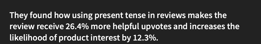

Profanity
https://journals.sagepub.com/doi/full/10.1177/00222437221078606


Specific prices
In a 2006 study by Schindler (Rutgers University) and Yalch
(University of Washington), ads stating that a fictitious
deodorant lasted precisely 47% or 53% longer were deemed
around 10% more accurate by 199 participants, compared to a
generic "50% longer" claim.

Framing


Negations

Relatable

Questions for claims

Novelty

Perception vs Perspective
Overview
The spy trick that former spy Andrew Bustamante can give us the edge in life, business, and relationships.
Perception is about us and how we view the world. We think that the world operates the way we perceive it. But it’s tainted with our biases and frame of reference that we don’t readily recognize.
Perspective, on the other hand, allows us to see the world from the outside in. With practice, we can see the world as it is, not what our perception tells us it is.
Content
Starts at 3:30:25
https://www.youtube.com/watch?v=T3FC7qIAGZk
The SaaS Quick Ratio
Insight from the ether.
Here’s a great metric for helping track the health of your SaaS business:

What this all means:
- New MRR: Monthly recurring revenue from new customers in that period (month, quarter, etc).
- Expansion MRR: Additional revenue from existing customers, such as upgrades, upsells, and cross-sells.
- Churned MRR: Lost recurring revenue from canceled subscriptions.
- Contraction MRR: Lost revenue from downgrades and refunds.
A high SaaS Quick Ratio indicates that your startup is growing revenue quickly and effectively managing churn. A low ratio suggests that churn is negating growth efforts.
Some benchmarks
- A ratio of 4 or higher is considered excellent, indicating strong, efficient growth, particularly if it can be sustained month over month.
- A ratio between 2 and 4 suggests healthy growth but with room for improvement in acquiring new customers or reducing churn.
- A ratio between 1 and 2 signals you might be at risk, with churn significantly impacting growth. It's a call to action to either accelerate customer acquisition strategies or find ways to reduce churn.
- Below 1 indicates that you’re losing MRR faster than it’s growing. Code red.
Of course, if you have some large enterprise accounts that churn, you may have months that look grim, but the idea is to keep the SaaS Quick Ratio above 2 (and ideally above 4) on average throughout the year.
It's a helpful metric for getting a quick pulse on growth vs churn.
For over 450 tactics to grow revenue and reduce churn, check the free Growth Vault, which includes every tactic we’ve shared in this newsletter.
Ryan Trahan's Penny Challenge Series
Overview
Quick run-down of the premise:
Ryan Trahan is a YouTuber that does vlog-like challenges. He started a challenge where he was going to work up from one penny, and every single cent he was going to spent had to come from that penny.
In the series, his goal was to get across the US to get to Mr. Beast and give him a penny.
Though, his overlying goal was to raise $100,000 for Feeding America.
Why I think it's worth talking about:
He not only managed to raise 10x his goal for Feeding America (currently at $1.4 million), but he also managed to get 253 million views and gained 2.3 million subscribers. In one month.
The key principles here I feel like are:
Authenticity:
- Ryan is very true to himself. He is weird and awkward, but forces through it to make the videos. There is no drastic production quality, it's mostly just his experience. It's all a real experience, and isn't staged. His story is being told live, and each video is uploaded like 2-3 days after it happens.
- We get to see him strive, fail, and overcome. He is more focused on the challenge rather than the content, and even acknowledged it. But this really just makes the content better.
- The editor often includes him making mistakes behind the scenes, or doing silly things that are meant to be off camera or not included, just to really highlight that Ryan is being himself.
Consistency:
- Daily uploads at the exact same time, with the exact same introduction, and the exact same expectations. It became a part of everyone's daily routines (many comments say this, me included).
- Lots of iconic moments that were consistent throughout the entire series:
- THE GREAT RESET
- The game plan
- Chipotle burrito, white rice, chicken and cheese (don't forget to slap it)
- McDonald's iced coffee and McChicken
- His nod of approval after he takes a loud sip of the McDonald's iced coffee
- "Good morning sleepy heads!"
- His morning routine
- All of the music he uses is pretty much the same throughout each video. It's like three royalty free tracks, but they're all used at specific moments. It made each soundtrack to me feel like it was his lol.
A lot of this is props to the editor, who btw sat in the back of a van and went with him the entire time. He also had a cameraman with him who was sometimes with him.
Storytelling:
- With the entire structure of his plans and goals, it would always set expectations for the audience. He always had a "game plan" that described his goals for the episode at the beginning of the day. Then, he'd say his goals of the next episode at the end of the day.
- He had some good donation incentives
- $1,000: your name will be placed in the end of the video
- $5,000: verbal shoutout
- And some story-changing incentivse
- $50,000: THE GREAT RESET, which he mentioned and prepared for every video (and it happened quite a bit) which would bring him back down to $0.01 and mess up the rest of his plans
- $100,000: A tattoo of whatever you want. And he had to get two of them I believe DURING the series.
My thoughts:
You really don't need Mr. Beast quality. You need what social media is now lacking: to be yourself, and to do actually exciting shit. Personality I feel like is the biggest kicker.
Content
The draft & written content of the tactic to go into the newsletter.
No results found. Clear Search.
More growth resources
Work with our growth agency, join our community of 90,000 founders and growth pros, and explore our free content.
Ads management
Most ad agencies don't work for startups. So we designed one that does.
Growth Newsletter
Advanced growth tactics sent via email.
Matchmaking
We'll match you with a vetted growth agency or freelancer for free.
Growth Guide
The most popular guide to growth marketing on the Internet.
Growth Playbooks
Free tactical growth guides.
Growth Blog
Comprehensive articles on growth topics.
Growth Vault
450+ tactics to grow your startup.
LP Teardowns
In-depth breakdowns on what top companies are and aren't doing well on their websites.


