How do you write an enticing homepage?
This resource covers how to write and design a homepage (landing page) that converts visitors into customers.
Let's start by identifying the three common landing pages:
- Homepage — Your catch-all for all visitors.
- Persona landing page — A page tailored to a specific persona (audience).
- Product page — A page that walks through how your product works.
These pages can be structured identically using the following template. Generally, the more you detour from the template, the more confused the average visitor becomes.
Think of your landing page from the perspective of a visitor's likelihood to purchase:
Purchase Rate = Desire - (Labor + Confusion)
To increase a visitor's purchase rate, increase the visitor's desire while decreasing their labor and confusion:
- Increase desire — Entice visitors with how much value you provide. Create intrigue.
- Decrease labor — Reduce the work your visitors have to perform so they don't get tired or annoyed. Be concise and ensure every word and element is of value.
- Decrease confusion — Don't confuse visitors with obscure or verbose messaging. Ensure every sentence can be easily understood. And make it self-evident which action they should take next (e.g. sign up or purchase). And ensure your action elements (e.g. buttons) are unmissable.
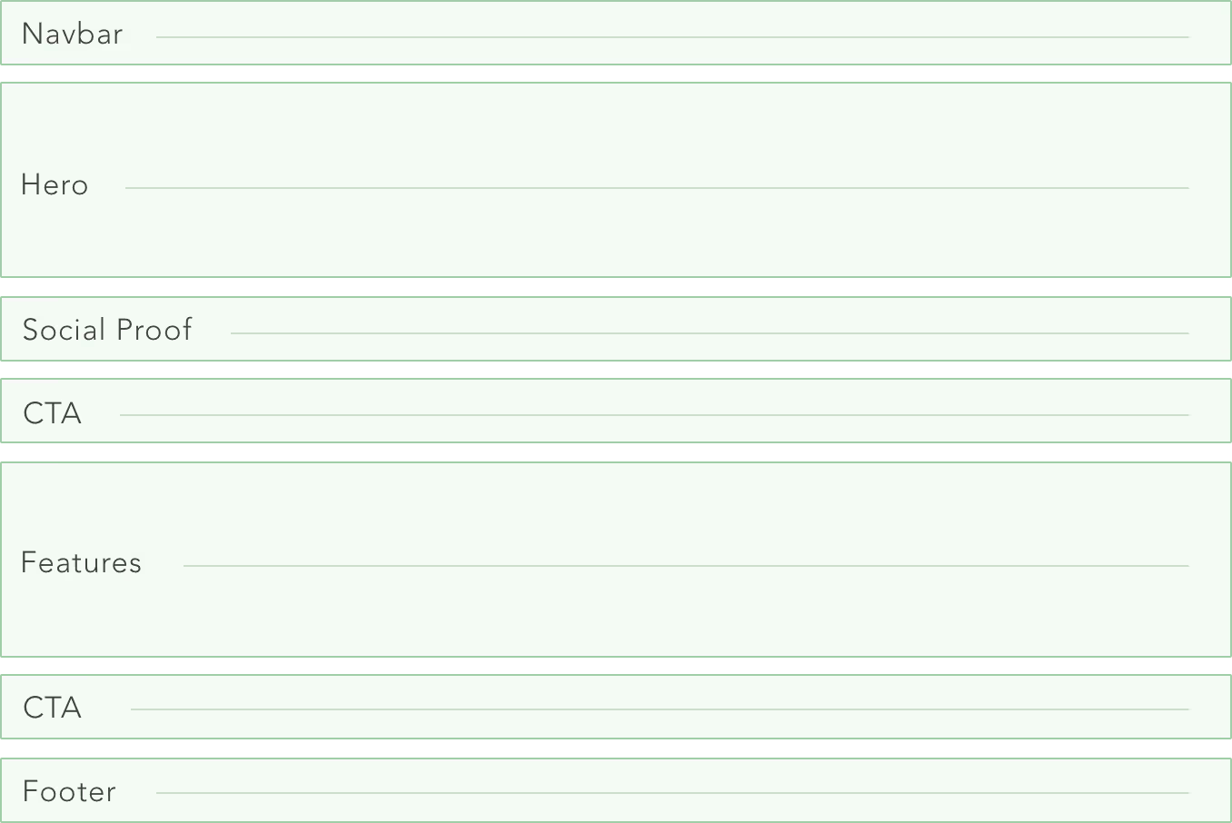
This means we shouldn't do something avant garde with our homepage structure unless we have a good reason to. Here’s the typical structure we'll be using:
- Navbar: The top of the page — where your logo and navigation links are.
- Hero: The main section at the top of the page, which includes your header text, subheader text, and captivating imagery.
- Social proof: Logos of press coverage or your well-known customers.
- Call-to-action (CTA): Your signup button and a concise incentive to click it.
- Features and objections: Your key value propositions fully written out.
- Repeat your call-to-action
- Footer: Miscellaneous links.
Here it is visualized:
We'll walk through each of these elements.
Want landing pages built for you? That's one of our core services. See how we build pages that convert.
Element — Hero
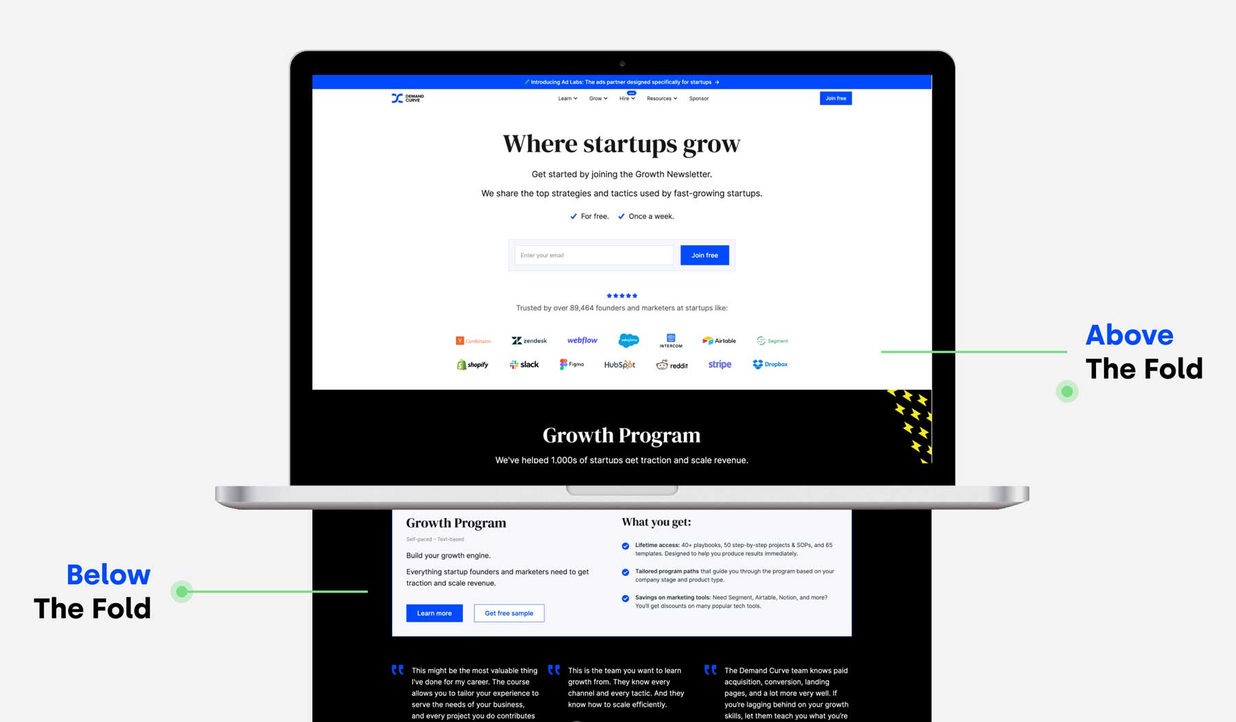
"Hero" is jargon for the big section at the top of your page—what visitors first see before they scroll down. It's also called your above-the-fold.
Your hero consists of header text, subheader text, and often an image. You must put a lot of thought into each of these. Nailing header copy has the highest impact on whether people continue scrolling and reading. Consider how people don't actually have short attention spans:
- They finish 3 hour Joe Rogan episodes.
- They binge 14 hour shows.
Instead, they have short consideration spans: they must be hooked quickly. So, don't fear writing a long homepage. But, ensure your hero is incredible.
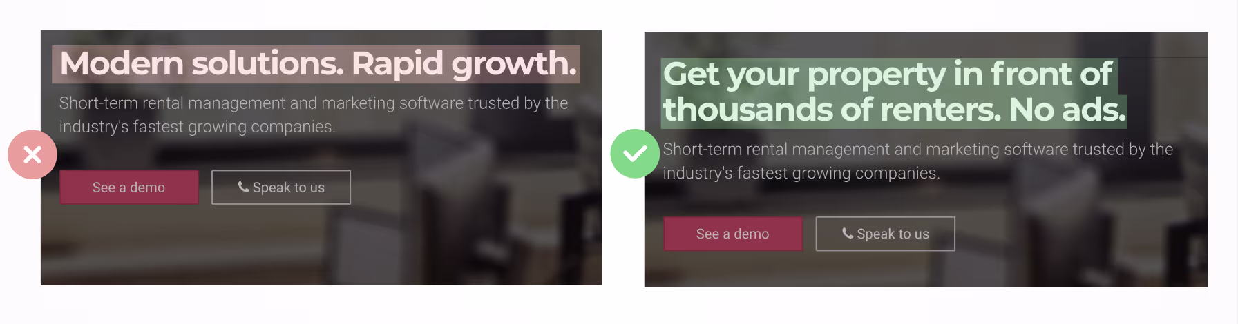
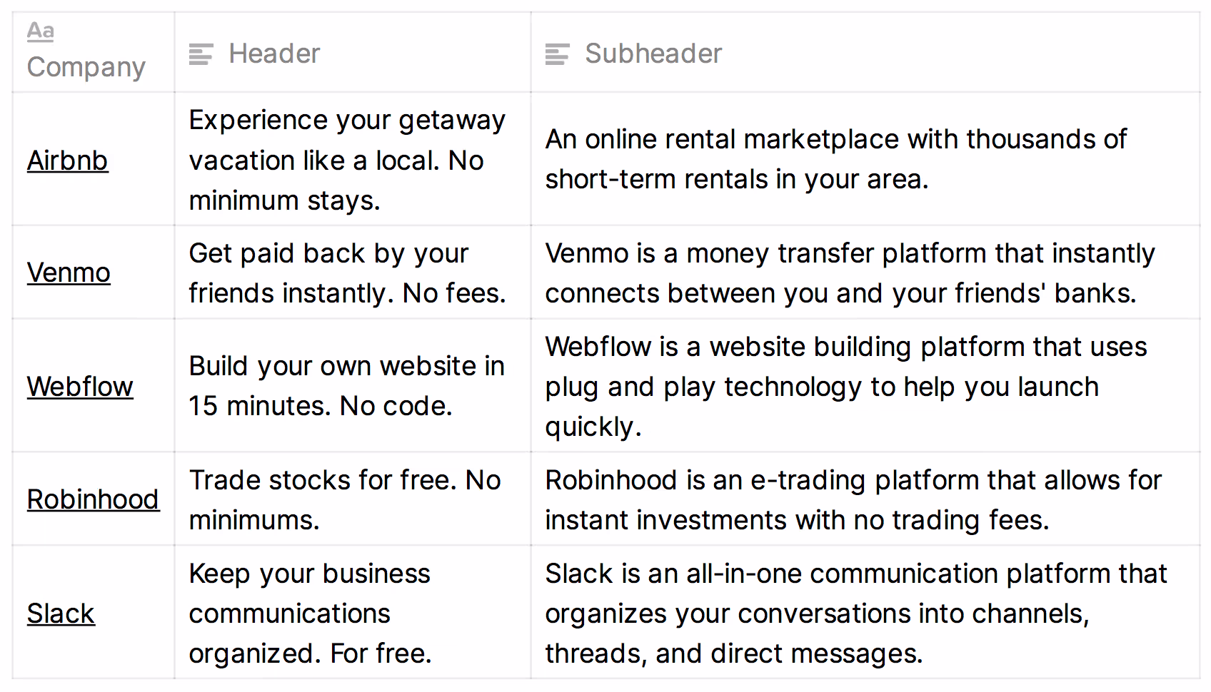
Hero — Header
The header must be fully descriptive of what you're selling. Because, if the visitor doesn't understand precisely what you do immediately upon landing, they'll bounce out of laziness or skim-read the rest of the page and risk getting the wrong impression.
Here's the litmus test for whether your header is sufficiently descriptive: If the visitor reads only this text on your page, will they know exactly what you sell?
Bad headers—found all over the web—are those that read like slogans instead of descriptions. For example, "Improve your workflow!" or "Supercharge your collaboration!" are useless. If that's all we read on your page, we'd have no idea what the product actually is. And we'll probably leave.
What does a good, descriptive header look like? Like this:
- For a website design tool — "Visually design and develop sites from scratch. No coding."
- For a grocery delivery service — "Groceries delivered in 1 hour. Say goodbye to traffic, parking, and long lines."
- For a home rental service — "Rent people's homes. So you can experience a city like a true local."
Those help us understand what you're selling. And we can immediately self-identify as someone who does in fact want what you're pitching, which means we'll have patience to read through the rest of your site to get the details.
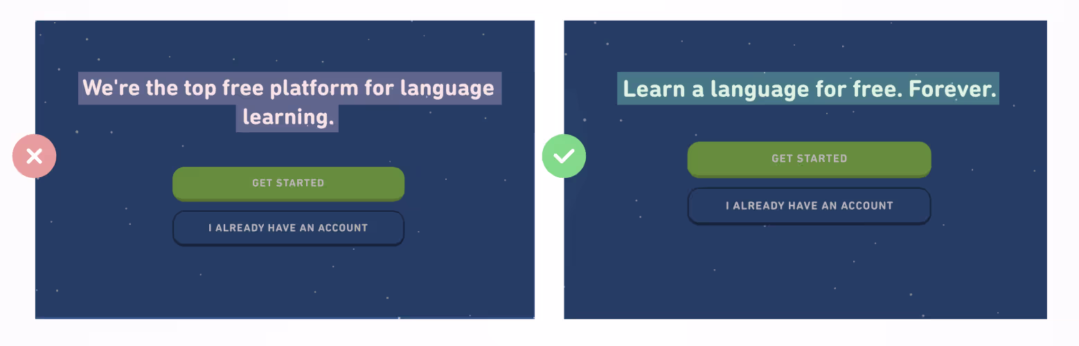
Let’s look at more examples.
On the left, we have a bad header. Pay attention to what makes the right example better.
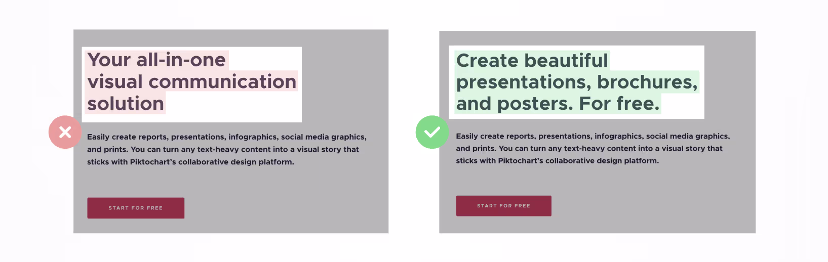
The right one is better because:
- It no longer sounds like corporate speak.
- It describes the specific benefit of the product.
Again, the right one is better because:
- It no longer uses vague phrasing.
- It describes the specific benefit of your product.
Another:
The right one is better because:
- It doesn't talk in self-congratulatory terms. It talks in terms of benefits to the visitor.
- It clarifies the specific outcome of using the product.
What these improved examples have in common is increased specificity.
Specificity is step one to strong header writing.
Header writing process
To write our header and subheader text, we'll follow two steps:
- Identify how users get value from your product
- Add a hook—to get them to keep reading
1 Identify how users get value
Value props are the ways people "get value" from your product.
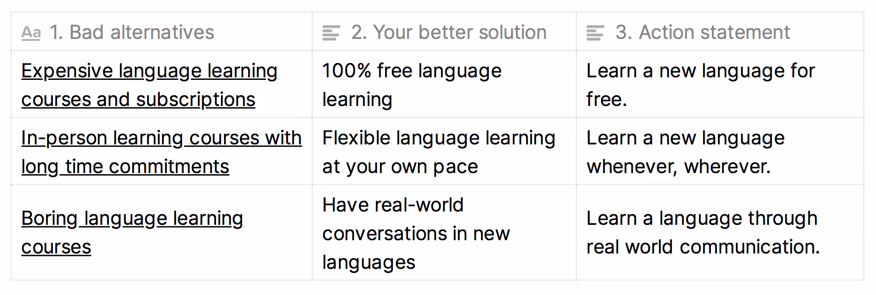
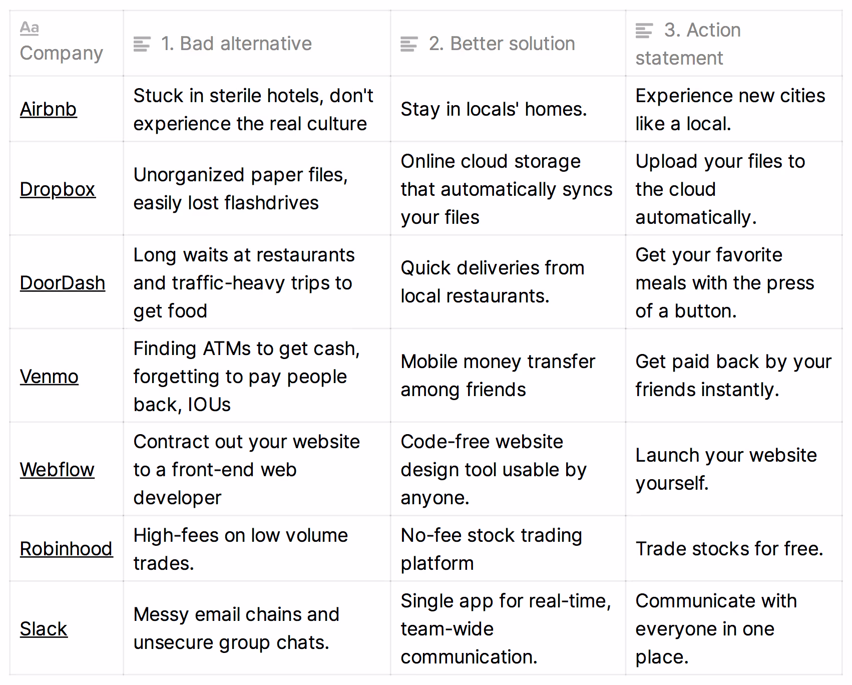
Here's an exercise for finding your product's value props:
- What bad alternative do people resort to when they lack your product?
- How is your product better than that bad alternative?
- Now turn the last step into an action statement—that's your value prop.
As an example, let's use the free language learning app Duolingo. It offers short-form, interactive lessons.
A few more examples:
2 Add a hook
Adding a hook to your header can take two forms:
- A bold claim
- A response to likely skepticism
Hook option #1: Add a bold, specific claim
On the left, we have a vague statement. On the right, we have a specific, bold claim about the benefit users will receive.
Now that's more enticing. Readers want to know how that's possible. So they keep reading.
Another example:
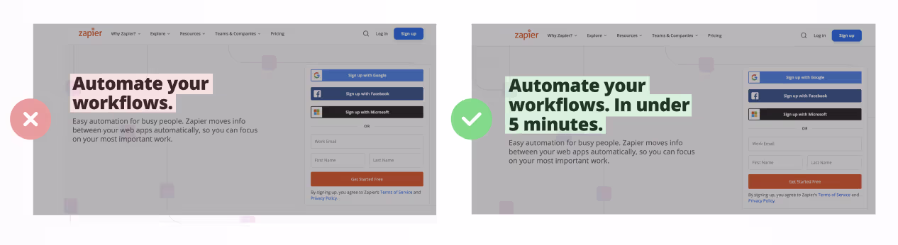
In short, a bold claim is:
- Highly specific
- Triggers a dopamine hit of "wow, I didn't know that was possible."
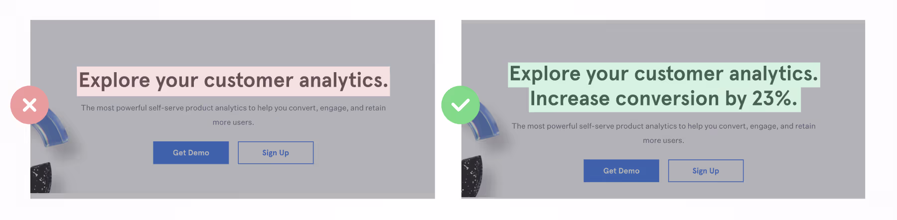
Hook option #2: Address objections
As an alternative to including a bold claim, another way to create a hook is by addressing a key objection in your header.
Let's use the website design tool, Webflow, as an example. Below is their header copy, which hasn't yet been paired with a hook:
"Build your own website."
Upon seeing this, objections readers have could include:
- But, I don't know how to code. Don't websites require coding skills?
- This will take too long. I don't have the time. I'm not a trained designer.
- This will be low functionality and constraining like other site design tools.
Your job is to identify which of these is a major buying objection—and to proactively address it. Don't let visitors retain their unaddressed concerns that cause them to bounce before scrolling. See below:
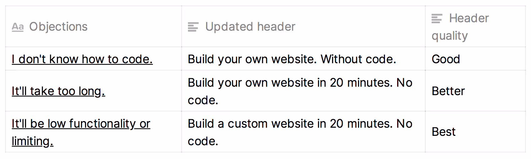
In the examples above, we're expanding our header's first sentence plus adding a second—in pursuit of our handling a key objection.
This requires balance. If you bloat your header with extraneous details, it becomes hard to read. Don't try to address every objection—you can do that with the rest of your page.
Backing up, how do you go about identifying your customers' biggest objections? Survey them:
- "What almost stopped you from buying?" That's an objection.
- "Why do you think non-customers haven't bought from us yet?" That's an objection.
Let's revisit our earlier examples—this time with objection handling:
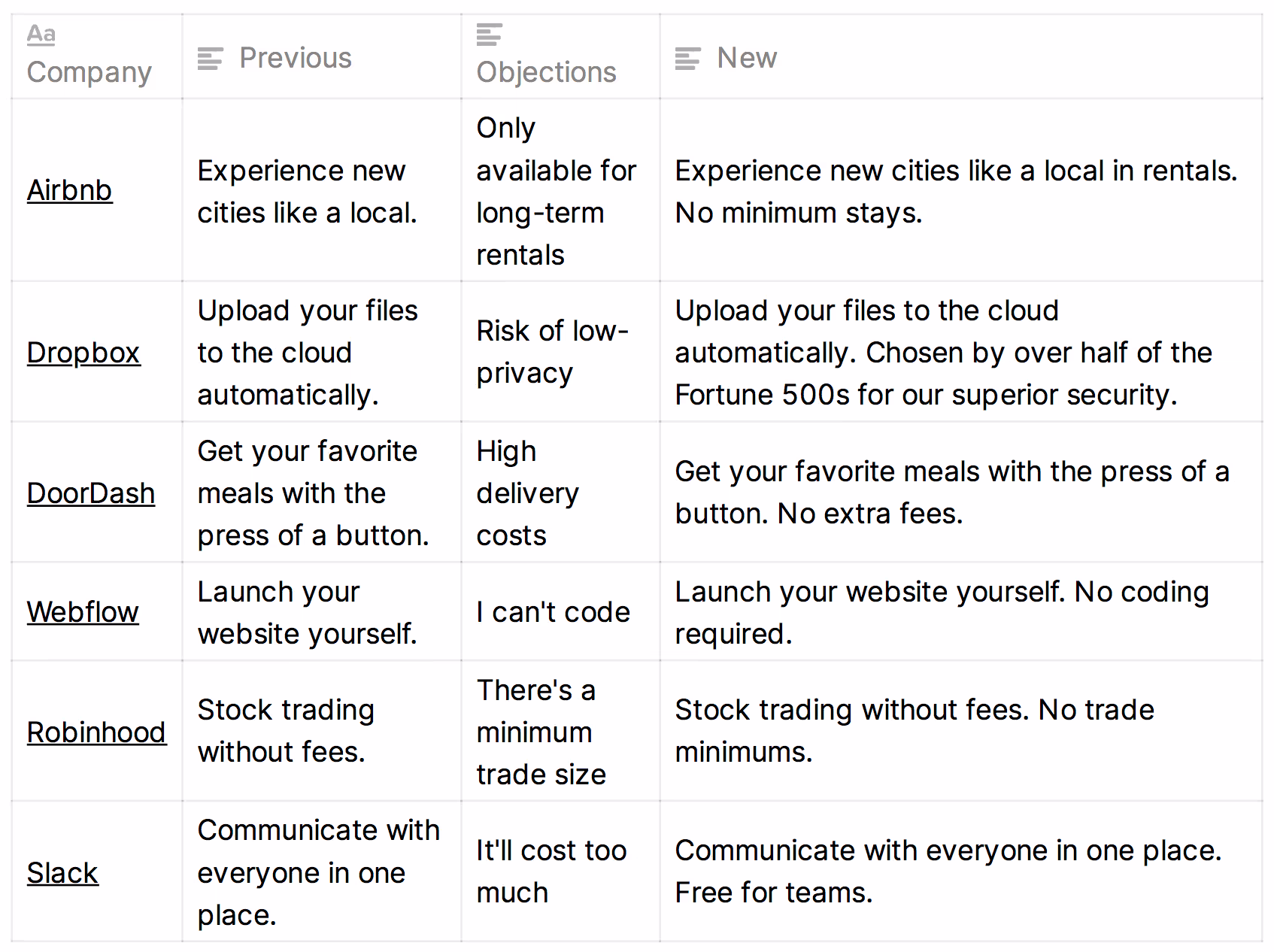
To recap, once you've identified your value prop, add a hook: either inject a bold claim or proactively address an objection.
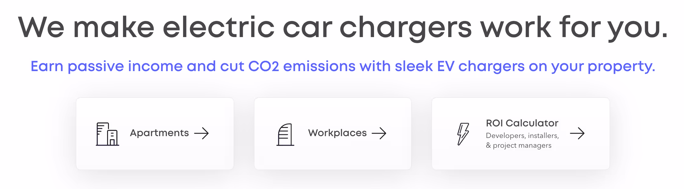
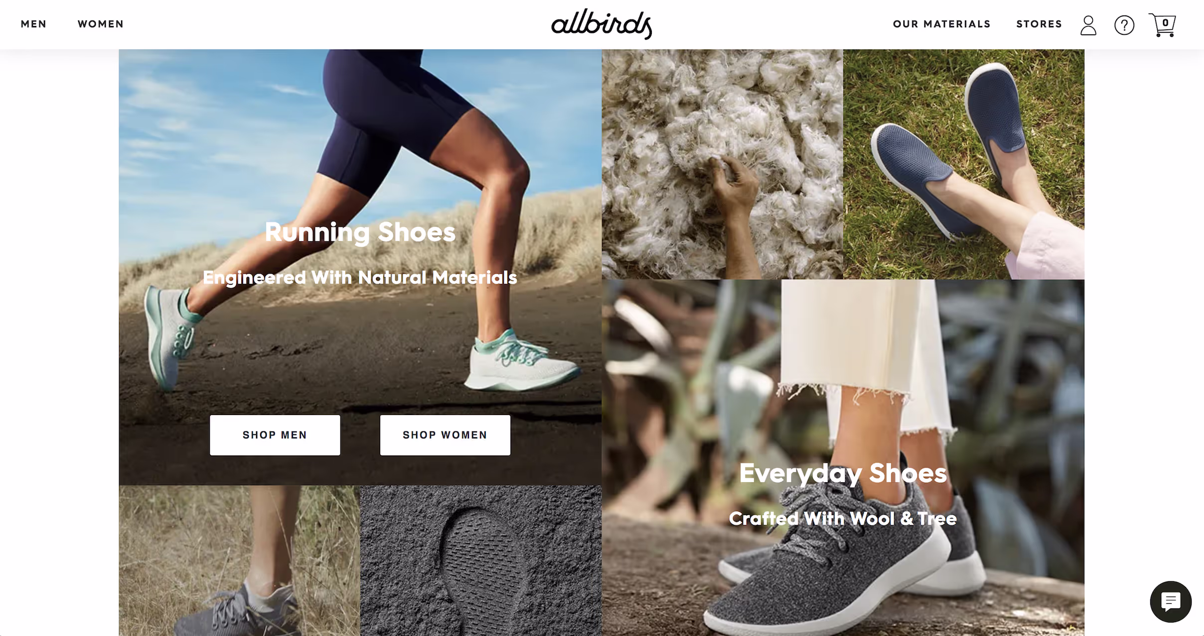
If your product targets multiple major personas, you can prompt visitors to choose which persona they fit into at the top of your page. Then route them to the appropriate section of your site. We call this "choose your own adventure." In the example below, Xeal Energy creates different paths for apartment and workplace owners:
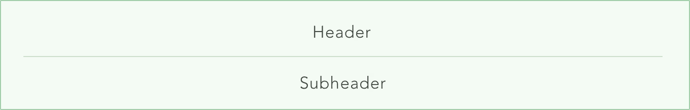
Hero — Subheader
It's time to complement our header with a subheader, which will expand on what makes our product special.
The subheader is commonly used for expanding on two thoughts:
- How does our product work exactly?
- Which of our features make our header's bold claim believable?
For example:
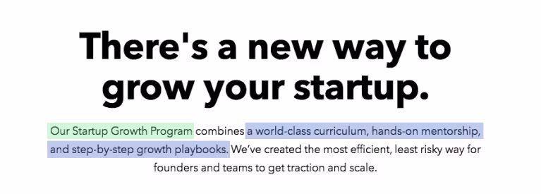
In the example above, we address what our platform is (green) then we explain how its claim ("new way to grow your startup") is possible (blue).
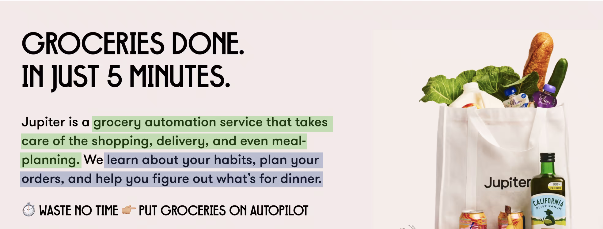
Similarly, Jupiter's first sentence explains what their product is (green). Then it explains how its claim ("In just 5 minutes") is possible (blue).
As a rule of thumb, your subheader should only be one or two sentences. Don't make this an essay. Keep reading breezy so visitors sustain their momentum.
Let's look at more examples:
Element — Social proof
Let's re-orient where we are in our page's structure:
We're on row three now: social proof.
Your social proof section is a collage of logos showing off your press coverage and/or your most well-known customers. Or if you're an ecommerce product, you can state how many customers you have (if it’s an impressive amount).

Your goal is to make it seem like everyone in the world already knows about you, and to make the visitor feel left out of all the excitement. Foster dat FOMO, am i rite.
Effectively, that's the goal of social proof: creating intrigue by getting people wanting to be part of your elite club.
If you don’t yet have noteworthy customers, you can provide your product for free to people at well-known companies. Then place their company logos on your site if they wind up using you.
Element — Features and objections
The Features and Objections section spans the bulk of your page. Its job is to deliver your product's complete sales pitch.
To put this back into context, see "Features" below:
This section contains multiple features—often 3 to 6. Each is a value prop paired with copy addressing objections that arise upon hearing that value prop:
- The header that states value prop
- A paragraph explains the value prop and handles objections
- An image reinforces the value prop
For example:
The best feature sections carry a running narrative: Each feature ties back to the dominant value prop pitched in the hero section.
For example, if your hero value prop is “We help you put down your phone so you can focus on the rest of your life,” a description of your Push Notification Blocking feature could include a callback to the header such as this: “… so that you put an end to the habit of constantly looking at your phone for updates.”
If you’re having a hard time deciding which value props and objections to highlight, study your competitors' sites to learn how to differentiate yourself from what people already know about your space.
Feature — Header
For a feature header, write a short value prop. Don't use vague language like "Empower your sales" or "Revolutionize your workflow." Just bluntly describe the value prop so visitors can quickly decide whether the value prop is relevant to them and whether they should read the feature paragraph.
For example, here are feature headers for a portable grill:
- Cooks and sears
- No clean up
- Cooks more than just meat
Feature — Paragraph
In your feature's paragraph, concisely describe the feature and optionally address objections if they're important ones that often prevent people from purchasing.
If this is a complex or unintuitive feature for which going into extreme detail is will materially improve apprehension, either link to a separate page where visitors can learn more or have a button they can click to reveal additional details.
The latter is preferable because it keeps users in the flow of your current page.
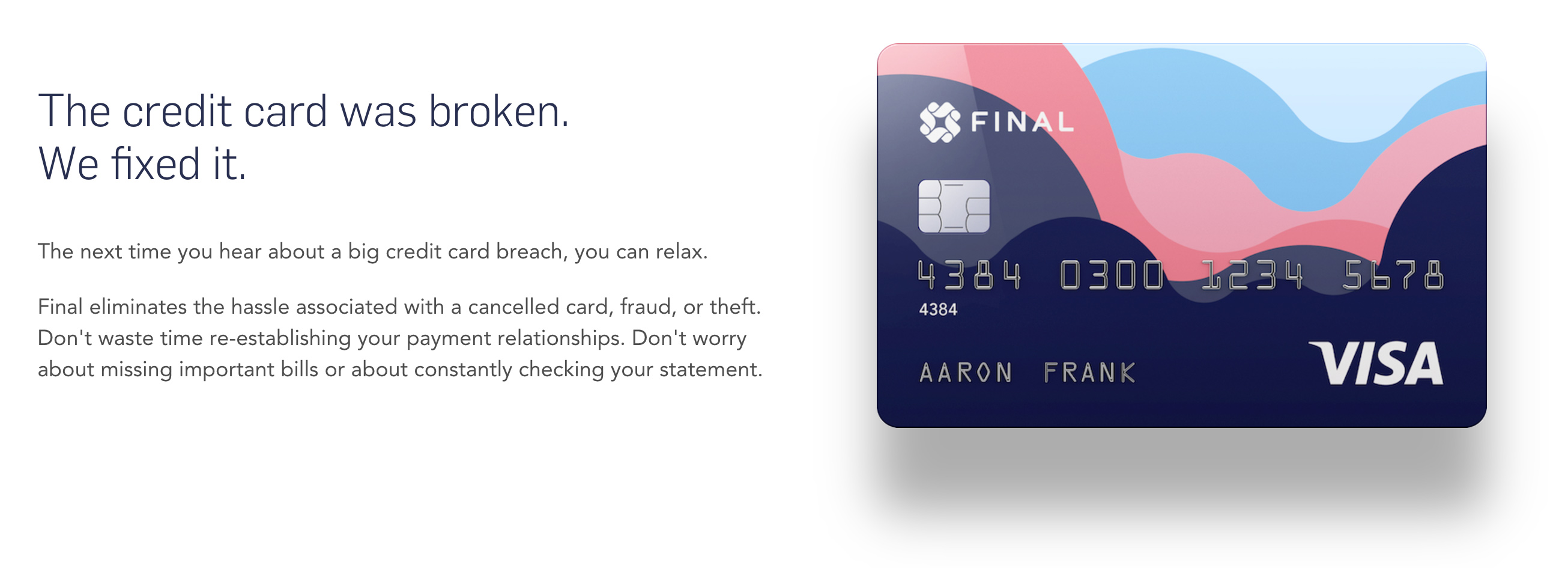
Feature — Image
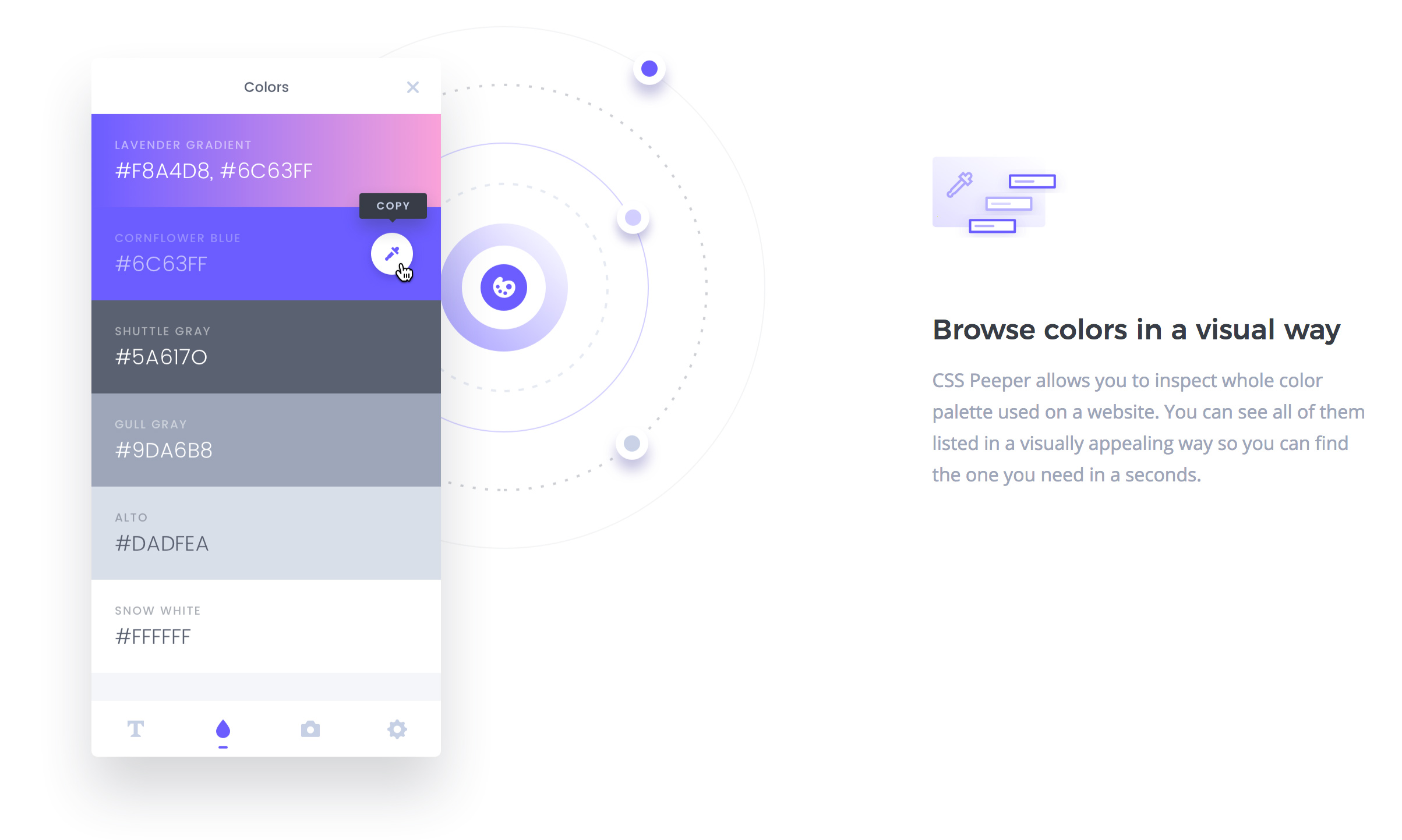
Features are paired with an image so that your landing page isn't a giant wall of text and to reinforce what you're describing.
For your feature image, consider two goals:
- Make images visually appealing—modern, clear, and pretty. Pay a designer if you aren't one.
- Have the images demonstrate the value of your product. This is often done by showing the product in action. For software, avoid useless abstract imagery.
In the example below, HelloSign includes a GIF of their product in action. It's showing us what we're about to sign up for. It's de-risking our time investment and removing the uncertainty.
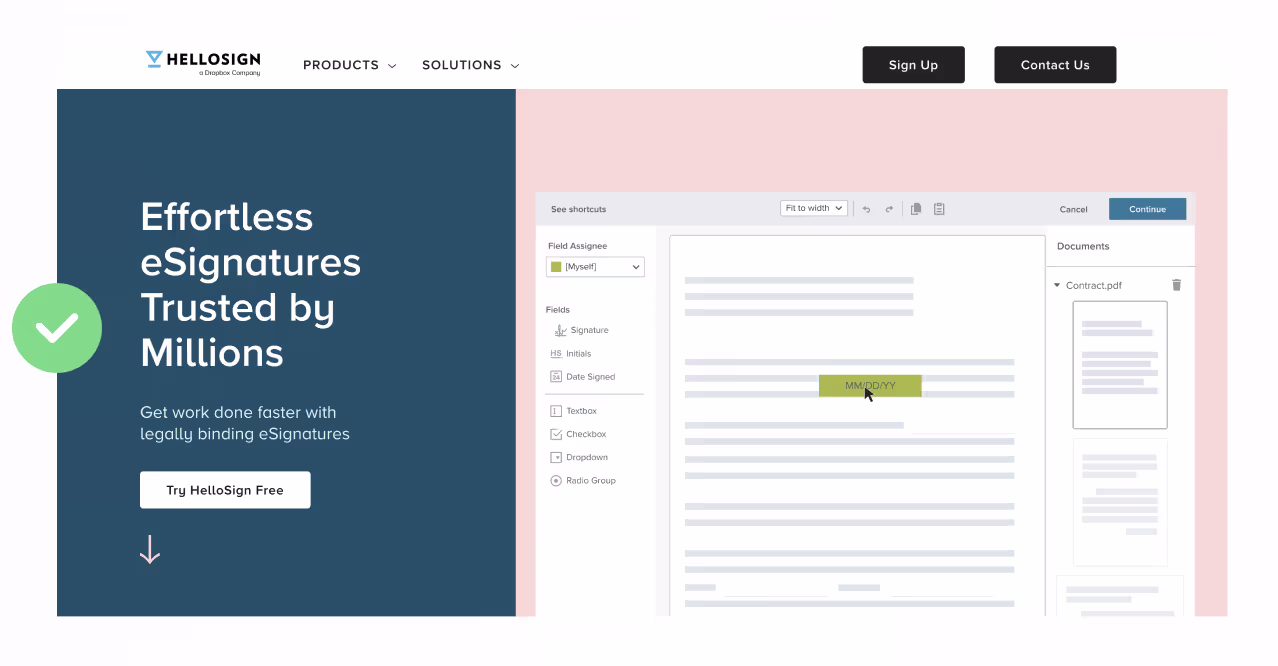
Further, instead of making the visitor read tiny text, they blur it out so you can focus on what matters: how the product works.
Another example: If you're selling physical goods, consider doing two things: (1) show off the various use cases and (2) show close-ups of the build quality. This gives visitors a fuller appreciation of the product's magic.
Element — CTAs
Let's talk about the "call-to-action" (CTA) buttons on your page.
Think of your CTA as the actionable next step to fulfilling the claim in your header. Below, we have two strong examples. "Find food" and "Start learning" are continuations of the magic teased in the header copy:
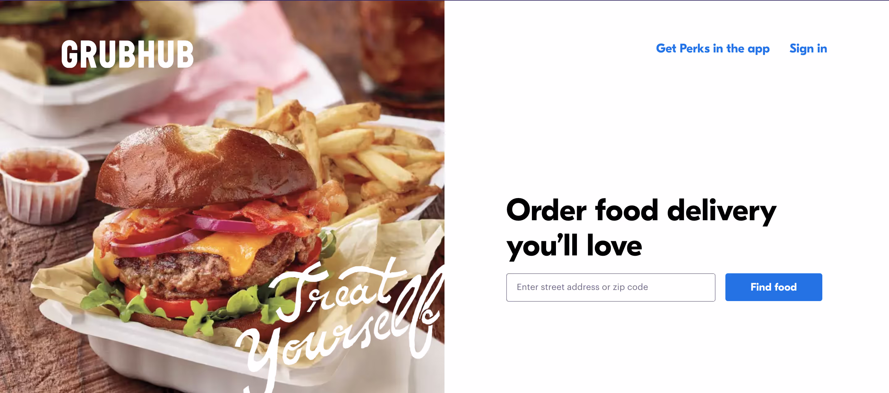
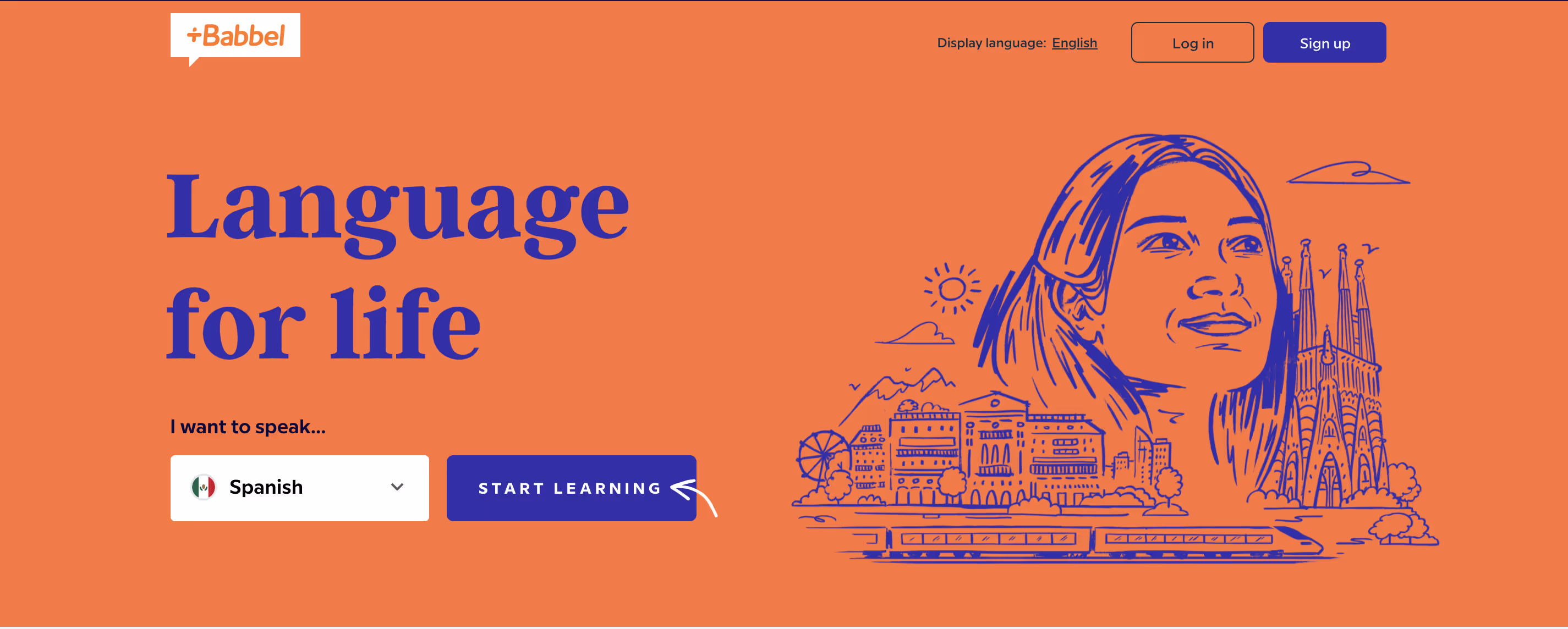
It feels natural to click these CTAs because they help the visitor continue the narrative the hero kicked off.
In contrast, below is a weak CTA.
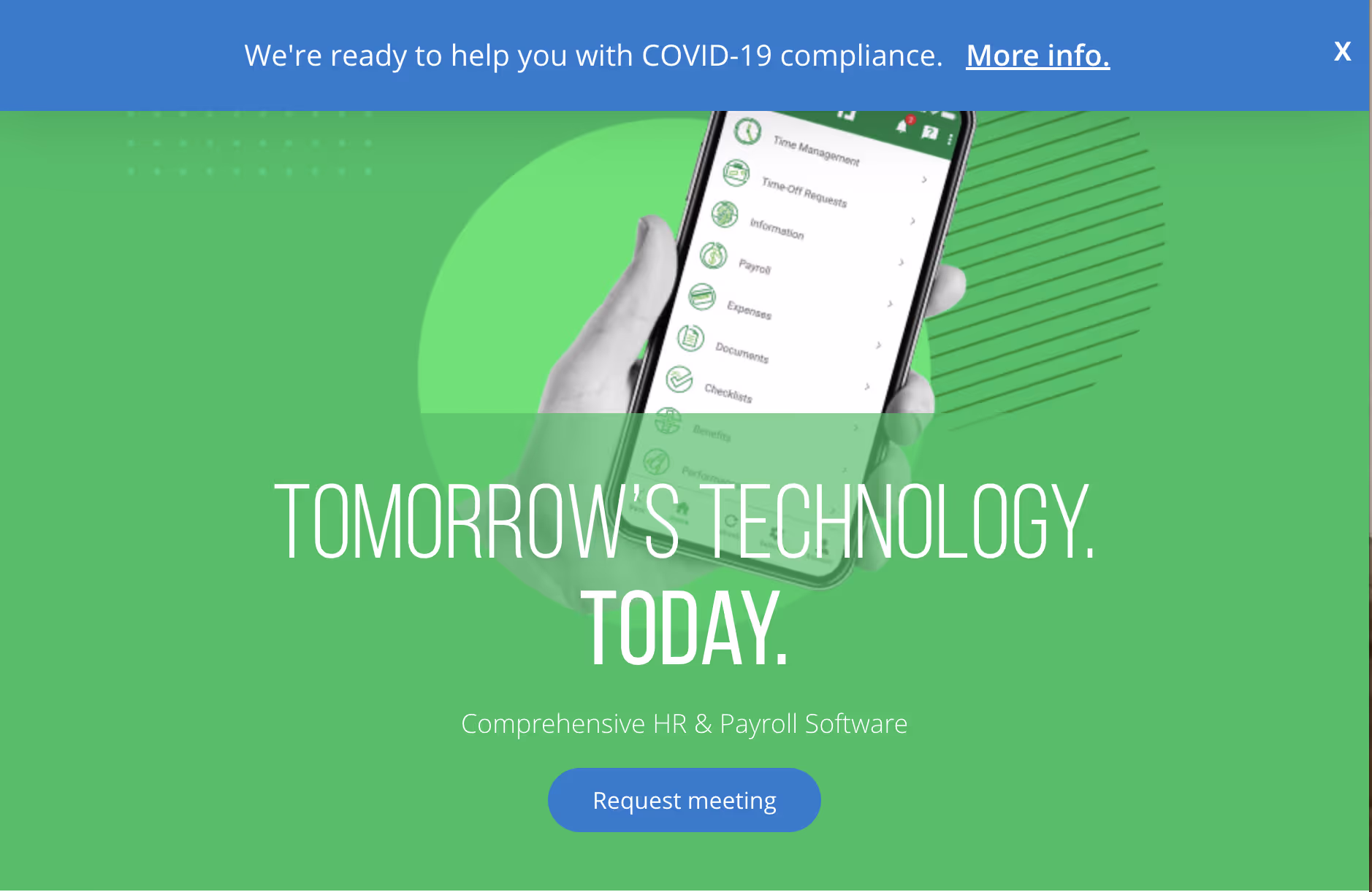
The copy is vague and it's not clear what the product is, so why would we request a meeting?
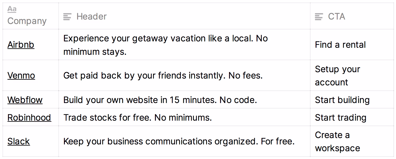
CTA examples
Getting feedback on your page
Once you have a landing page draft, pass it by two types of reviewers:
- People not in your market — Learn how appealing and comprehensible your copy is to those who aren't familiar with your market or product. Do you give them enough context to want to know more? This will help cover the common problem where your site over-assumes base-level knowledge on behalf of your audience. There may be many people on the edge of your market who'd become customers if they merely better understood why they should be.
- People in your market — Learn if your messaging is sufficiently unique and descriptive to convince people high in intent to choose you over the competition.
For both types of reviewers, ask them to assess six criteria for you:
- Conversion — Are you willing to hand over your credit card and sign up right now? If not, what would you need to see to get to that point?
- Interest — Rate how well the page sustained your interest on a scale of 1-10. What do you suggest be rewritten or redesigned to help it better sustain your interest?
- Clarity — What’s unclear? What unanswered questions are you left with?
- Expansion — Did you find something awesome you wanted even more details on?
- Brevity — If you had to delete half the page's imagery and copy, which would it be?
- Disbelief — What triggered your “Untrue! That’s scammy sales speak!” reflex?